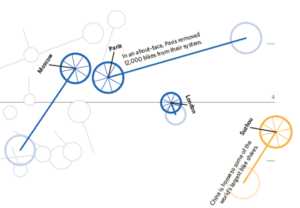
When we create a map or chart we should ask ourselves three questions:
- Who is it for?
- What will the map be displayed as?
- Why is it being produced?
These are important because they will influence the information we include, its design and how we might share it. For example you cannot use video if you are creating a map to be printed on paper, and you wouldn’t use very technical language with lots of detail for a map that might be shown for a few seconds on TV to encourage an evacuation to safety.
Take these maps of Hurricane Ida as an example. Although they show the same hurricane you can see each have a slightly different Who, What and Why…
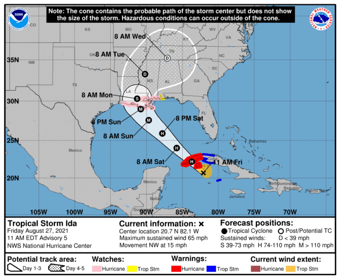
- Who: Policy makers & planners, the media, emergency services
- What: Presentations, National Hurricane Centre website
- Why: An official source of emergency information essential for planning a response.
- Who: Followers of the NASA Earth Observatory website.
- What: Website, social media.
- Why: To show the path of the storm and its wind speeds.
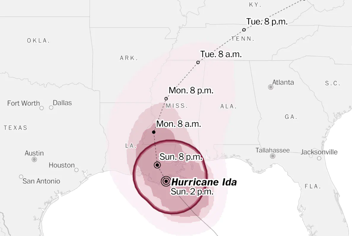
- Who: Readers of the Washington Post newspaper and website.
- What: Website, print, news apps, social media.
- Why: To report news and spread story to a wide non-specialist audience.
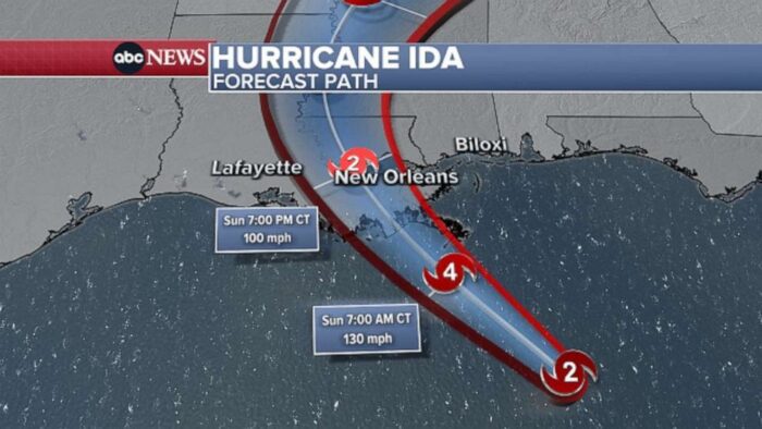
- Who: Viewers of ABC News
- What: Live TV, video websites
- Why: To report news and spread story to a wide non-specialist audience.
If you contrast the ABC News map to the National Hurricane Centre’s you can see big differences. ABC have applied visual effects to the ocean, lots of red (an eye catching colour for danger) and only 3 icons for the hurricane along its expected path and not much else. The NHC map has much more information as well as caveats to explain uncertainty in the map – it’s clear but takes more time to study and understand.
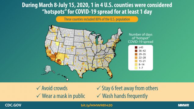
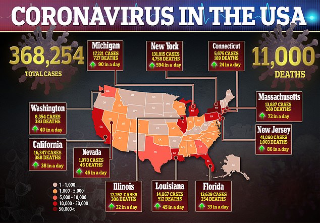
Here are two more examples, this time showing COVID-19 cases and deaths. The first is a map from a report created by an official government agency – the CDC – in the USA. The second is from the Daily Mail website (taken from April 2020).
Reflect on the different ‘Who? What? Why?’ for each.