Click here to access the Google Doc of these resources.
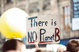
In these materials we explore how some parts of the planet have become brighter, whilst others have darkened over time. These changes can be observed thanks to satellite technology.
Look at the Light Levels map and spend some time observing carefully the patterns and how the text explains them. Remember that the colours on the map show how the light emissions in that place changed from 2012-2016.
How may changes in light emissions be related to levels of development?
Choose three examples from the places shown above and explain how the changes in light emissions are related to levels of development in these places.
Example 1:
Example 2:
Example 3:
China and India

Both China and India have developed rapidly in recent decades, but their patterns of change in light emissions from 2012 to 2016 look different.
Look at the Light Levels map to find out about changes across these two countries. What patterns can you see?
In the book the authors explain that for China the number of long-distance migrants increased from 163 million in 2012 to 169 million in 2016. As a result, rural areas are dimming as cities light up.
Whilst in India Prime Minister Modi promised electricity to all of India, a country where many were off the grid. Since then more than 25 million households have received a free or heavily subsidized link to the national grid as part of the plan, which in 2017 he named Saubhagya, Hindi for ‘good fortune’.
Why has this happened?
Check your understanding of these terms by writing a definition of each:
Long-distance migrant
Off the grid
Heavily subsidized
What impact may this have?
What impact do you think these changes may have on the quality of life of…
… households connected to the national grid in India?
… people in rural areas in China?
… people in coastal cities in China?
Many areas of China and India on the map are grey, showing that light levels haven’t changed. How can human and physical factors account for this?
Conflict
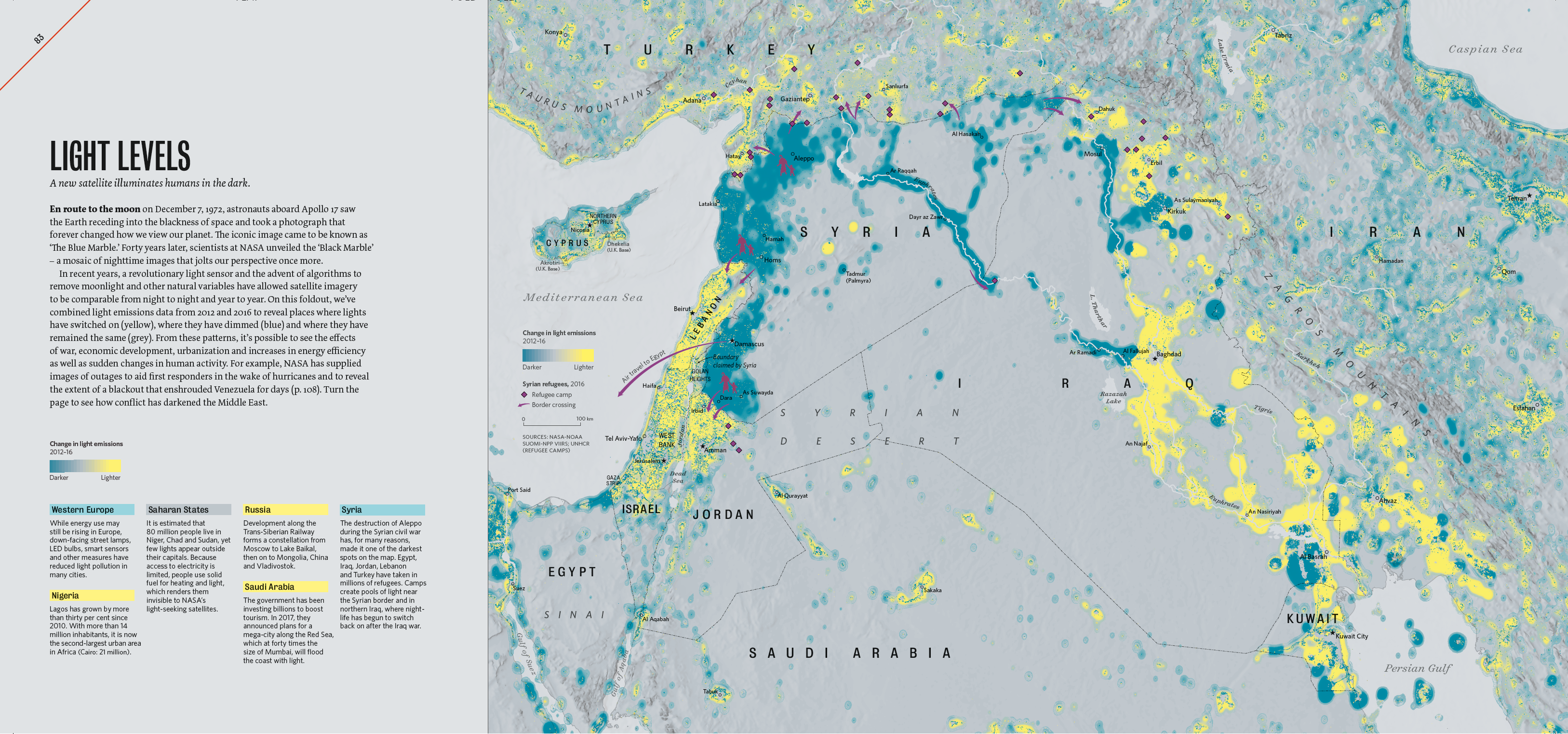
Aleppo was the largest city in Syria in 2010, with a population of 4.6 million. In 2011 a series of protests against governments spread across Northern Africa and into the Middle East. In Syria this led to armed conflict when the protests were suppressed by the government. Aleppo was bombed by Syrian forces in 2012, followed by fighting across the city. Many people fled from the city, with refugees heading to camps in Egypt, Iraq, Jordan, Lebanon and Turkey.
In 2018 Aleppo’s population was 1.8 million. Damascus is the capital city of Syria and the oldest capital city in the world. As the population of Aleppo has reduced, it is now the largest city in Syria.
Look at the Light Levels – Conflict map and find the cities of Aleppo and Damascus.
How have light levels changed in these two cities between 2012 and 2016?
What could account for these changes?
What does the map tell you about patterns of migration from Aleppo and Damascus in 2016?
Iraq was invaded by a coalition led by the US in 2003, with US troops withdrawing in 2011. A civil war between the government of Iraq and its allies and the Islamic State of Iraq and the Levant followed, lasting from 2013 to 2017. Whilst there is still civil unrest in Iraq, life has started to ‘switch back on’ following the conflicts.
Look at the second Light Levels map and find the country of Iraq.
Which areas of Iraq show a decrease in light levels from 2012-2016?
Which areas of Iraq show an increase in light levels from 2012-2016?
What could account for these changes?
Alternative technology

Western Europe seems to have become a little darker between 2012-2016. This is because alternative technologies have been developed to reduce light pollution, including down-facing street lamps, LED bulbs and smart sensors.
Using the Light Levels map, give three examples of places in Western Europe that have got darker.
1.
2.
3.
LED street lights don’t just reduce light pollution, they use less electricity than other lights, they last longer, produce little heat and switch on straight away (without having to warm up). They don’t contain mercury (which is highly toxic) and their bright, white light improves CCTV footage in areas where they are used.
How could the use of LED street lights improve quality of life for people living in areas where they are used?
Areas that have got brighter on the map include Khartoum in Sudan, Accra in Ghana and Lagos in Nigeria. Lagos has grown by more than 30% since 2010 and is the second largest urban area in Africa, with over 14 million people living there.
How could people in these areas be supported in using alternative technology to enable urban areas to develop in a more sustainable way?
Is brighter better?
Use these outlines for notes:
On one hand, is brighter better?
On the other hand, is brighter worse?
Overall, what is your conclusion?