James Cheshire, UCL and Rob Davidson, UCL
In March 2020, the UK government’s chief scientific adviser, Patrick Vallance, presented to the nation a graph showing “the shape of an epidemic”. The red line depicting the number of predicted COVID cases rose to a steep peak before falling again. Vallance explained that delaying and reducing the height of that peak was essential to ease the strain on Britain’s healthcare system. Boris Johnson, then prime minister, put it much more succinctly: “Squash that sombrero.”
In the two years that followed, both men must have spent many hours discussing graphs like this. But as we’re now learning through Vallance’s testimony in the COVID inquiry, it seems the prime minister struggled to understand what was shown in these graphs, despite his daily exposure to them.
Inquiry chair Baroness Hallet spoke up for the former prime minister: “He wouldn’t be the only person to struggle with graphs. I confess to struggling with graphs myself on occasion.”
Her point is an important one: communication is a two-way street. It’s not always fair to blame the person looking at a graph if they misunderstand it, it must be made intelligible in the first place.
During the inquiry, much has been made of the need for policymakers to grasp basic statistics in order to make informed decisions, especially when the stakes are high. So how can scientists create better data visualisations to help solve this problem?
To find the answer to this, we can look back 160 years to Florence Nightingale, namesake of the temporary hospitals created in the early days of the pandemic. Nightingale was a pioneer of using effective data graphics to change policies during a time of crisis.
Following her experience nursing soldiers dying from preventable diseases in the Crimean war (1853-1856), she waged her own battle against the British military. To convince them of the need for sanitary reform, Nightingale worked with other statisticians to create graphs that were sent out to key establishment figures, including Queen Victoria, with Nightingale hoping “she may look at it because it has pictures”.
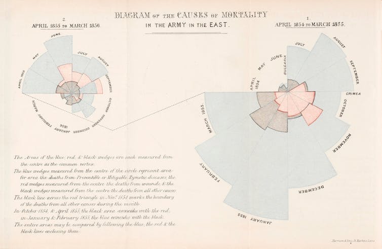
Her charts visually separated the stats on monthly deaths before and after sanitary reform, and showed how few deaths were caused by the wounds of battle. Nightingale left readers in no doubt that poor living conditions were killing soldiers in their barracks. This inspired reforms that saved countless soldiers from dying from preventable diseases.
How scientists can better communicate data
Since Nightingale’s time, there has been a great deal of progress in the use of statistics to improve public health. Here are two very simple improvements to charts that can make a huge difference to their readers: better colours and more considered use of text.
An entry in Vallance’s notebook details Johnson’s confusion over the colours in a line graph. Scientists can be prone to using unclear colours in their visualisations. Colour choice has been shown to affect how accurately users read maps, with recent research suggesting it can be confusing to use “cheery” colours to visualise grim data.
There are many guides on how to avoid poor colour choices hindering important decisions or making data inaccessible to people with colour blindness.
Vallance told the inquiry he was also concerned that Johnson was not retaining messages from the graphs. Very little can be done if the audience is not paying attention, but a 2016 study found that people were more likely to remember the message of a visualisation if it contained titles and annotations that spelled out information already shown in the graphic.
Time is of the essence, since readers can form their impression of a graphic within 500 milliseconds. Alan Smith, head of visual and data journalism at the Financial Times, encourages his team to use active verbs in their titles. As he writes in his book How Charts Work, this approach will “give a chart focus, providing a real narrative sense of purpose”. https://www.youtube.com/embed/2moJvFVM50M?wmode=transparent&start=0
How you can be a better graph reader
There are also things that we, as readers, can do to better understand the graphs, charts and data visualisations that are part of daily life. Here are a few things to look out for.
Some charts can mislead by being selective in the values used on their axes. A common trick – which politicians have mastered – is that they don’t start at zero in order to exaggerate an increase or decrease in something. There may be good reasons for this approach, but not always.
You should also look out for a source, and confirm that it’s a reputable one such as the Office for National Statistics. If the source isn’t shown, ask. If there is no credit at all, then you are right to be sceptical.
Finally, be just as curious about what the graph doesn’t show. Is there data missing, or does the plot only show one aspect of a problem? Do other charts of the same data show something different?
Often there are no perfect answers to these questions. But they are important conversation starters – especially if, like Vallance and Johnson, the person who can explain the graph is right in front of you.
James Cheshire, Professor of Geographic Information and Cartography, UCL and Rob Davidson, Postgraduate Researcher in Human Geography, UCL
This article is republished from The Conversation under a Creative Commons license. Read the original article.
