Skip to content
James Cheshire
About
Blog
Teaching
Papers
Tag:
dataviz
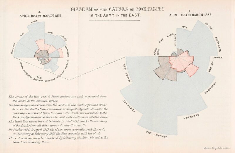
COVID inquiry heard Boris Johnson ‘struggled’ with graphs – if you do too, here are some tips
Nov 30, 2023
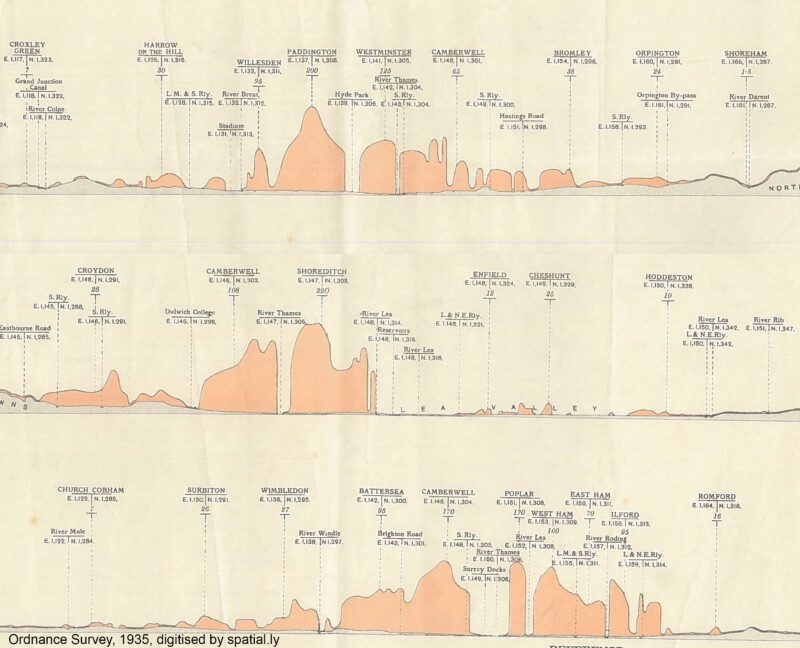
London's Population Profile in 1935
Nov 10, 2017
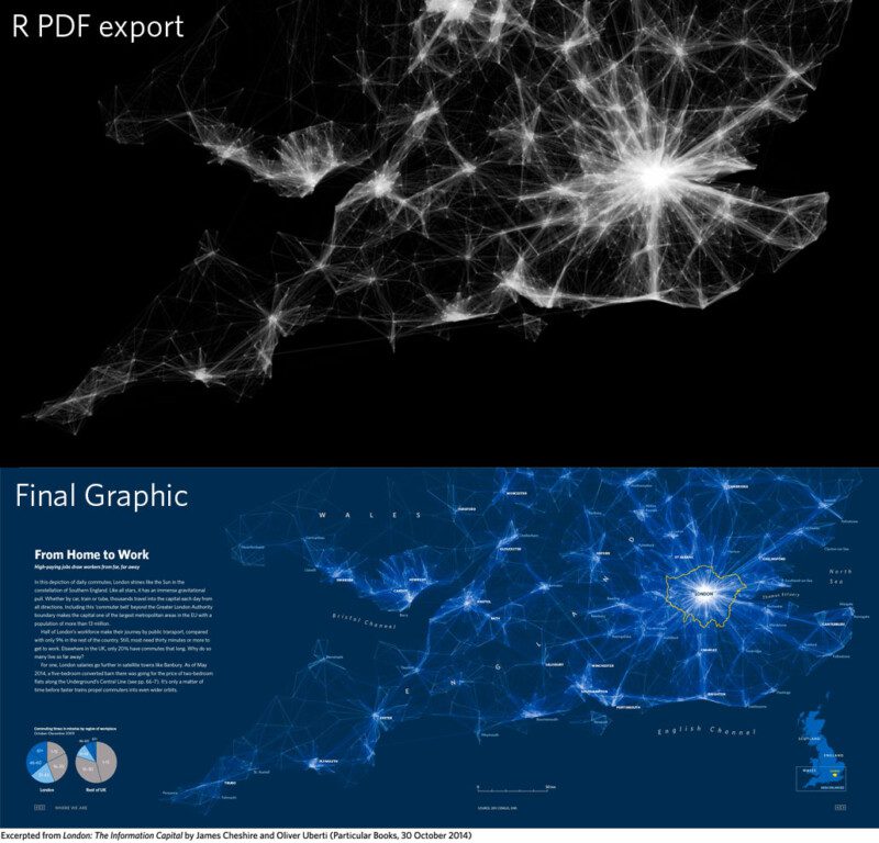
Improving R Data Visualisations Through Design
Nov 6, 2014
In Maps We Trust
Aug 17, 2012
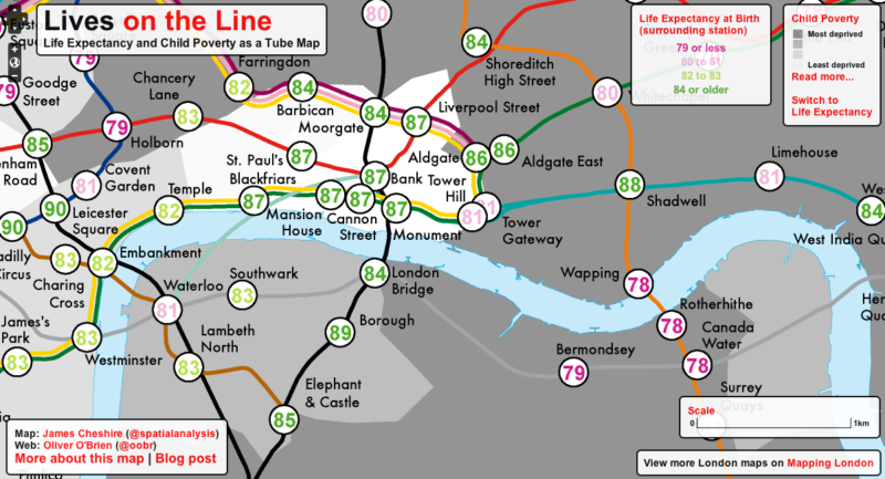
Lives on the Line: Life Expectancy and Child Poverty as a Tube Map
Jul 19, 2012
In Praise of Paper Maps
Jun 28, 2012
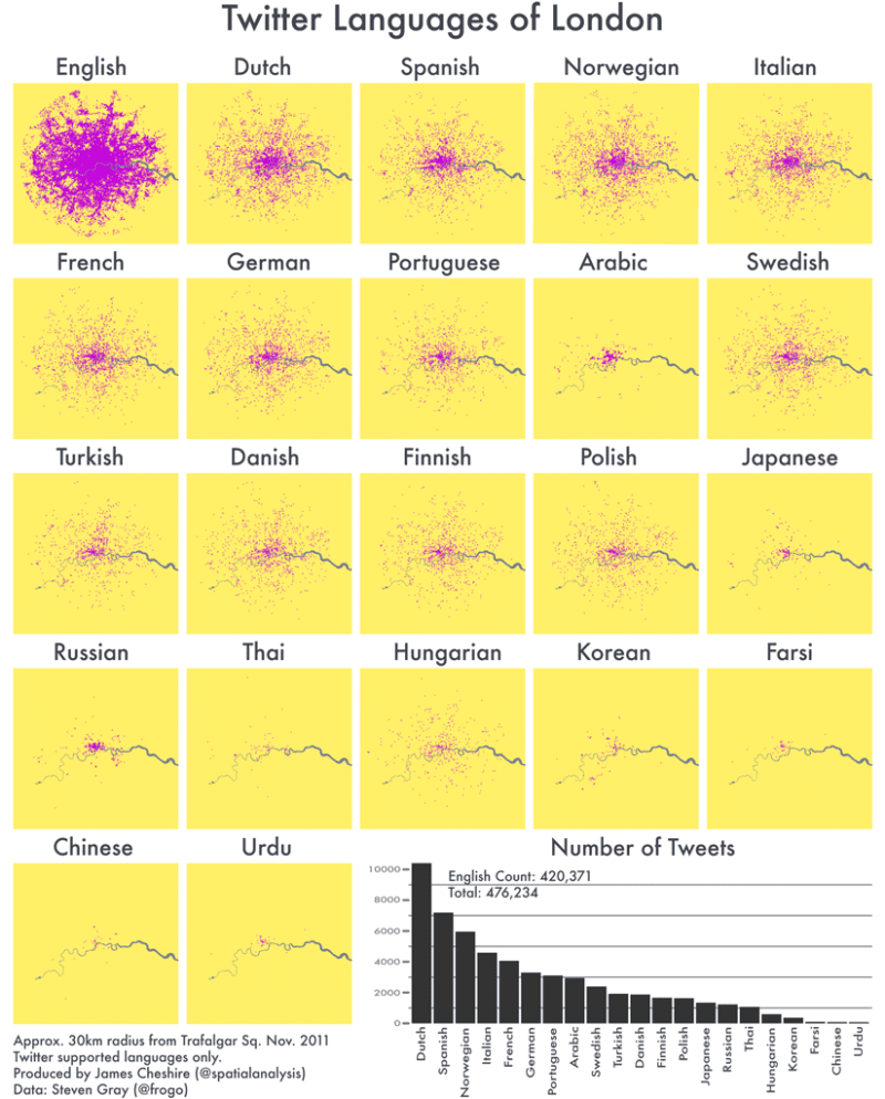
The Twitter Languages of London
Apr 13, 2012
Fast Thinking and Slow Thinking Visualisation
Mar 1, 2012
Coming of Age: R and Spatial Data Visualisation
Jan 10, 2012