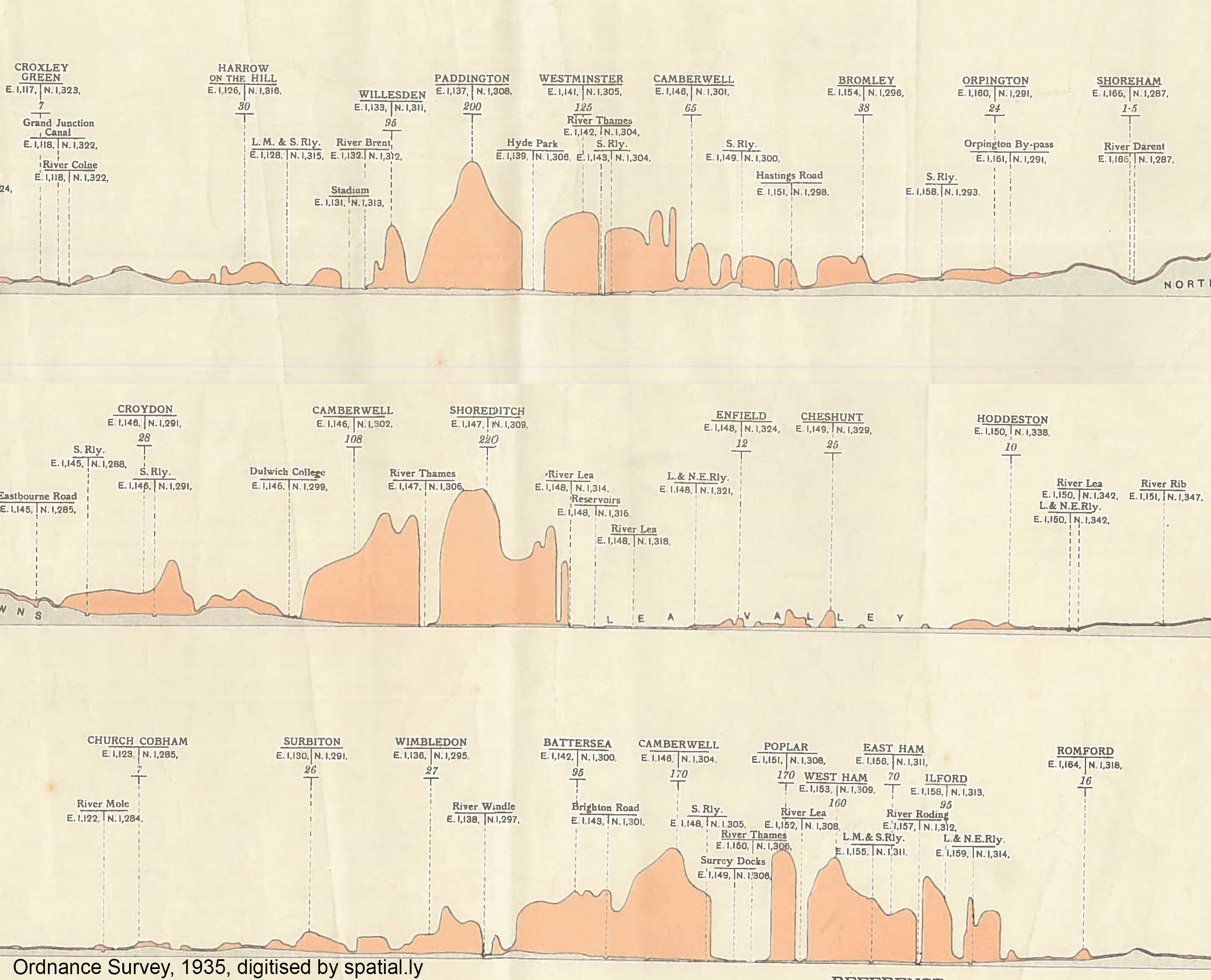
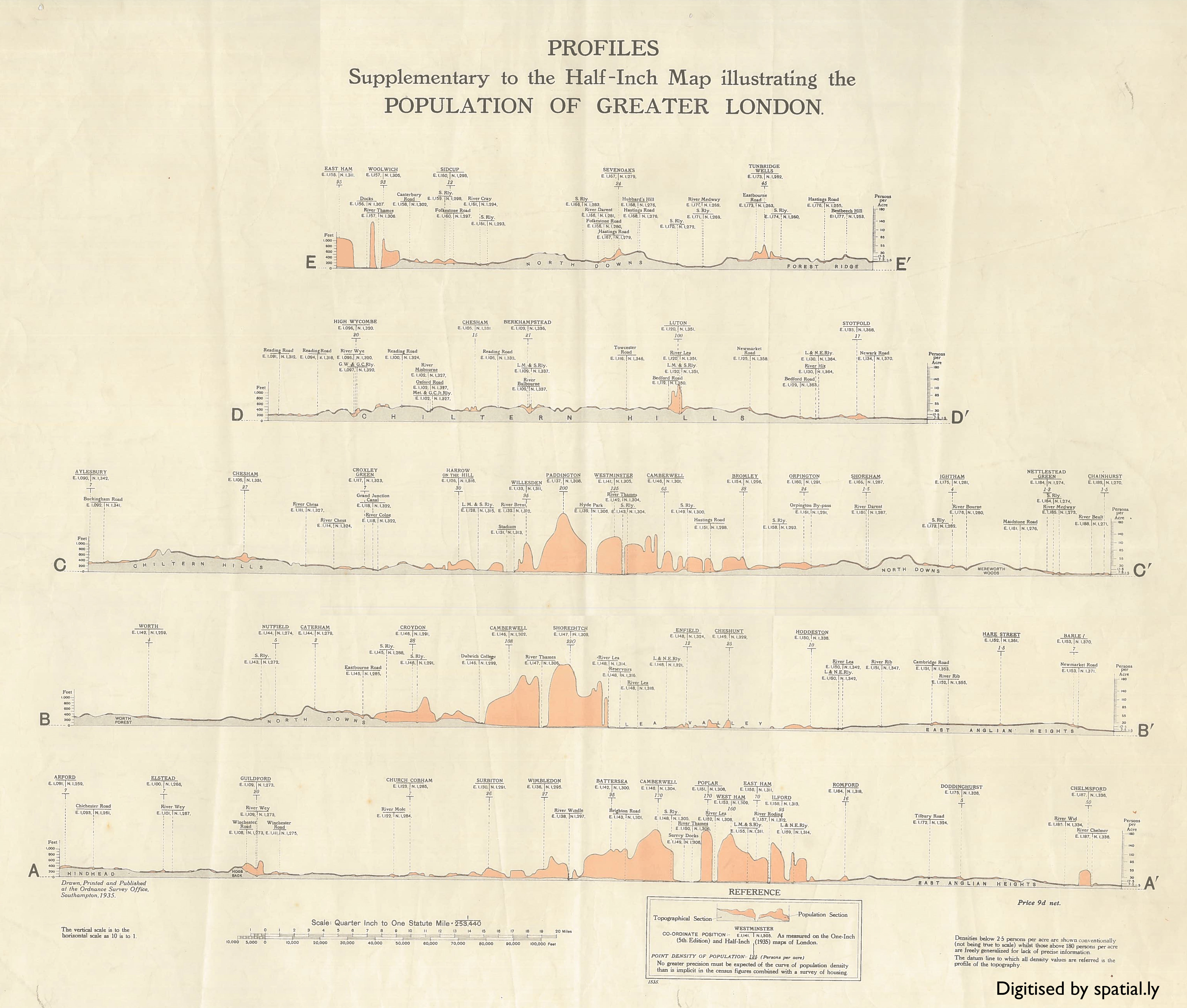
The graphic below shows the population of London across a number of transects overlain on the city’s underlying terrain. It was produced by Ordnance Survey in 1935 and is one of the few early examples I’ve seen of the organisation producing “data visualisations” alongside their famous maps (they do a lot more of this now – see here).
For what it’s worth I really like the way that this approach shows how London is built in a basin and how the population is dissected by rivers and parkland etc (this pattern hasn’t changed much since 1935). But it is a tricky graphic to read if you want to extract more precise info. I’m missing the companion map that would help with orientation, but I’m struggling with extracting values from the graphs since they are essentially adding terrain and population values together in a kind of streamgraph. The axes at either side of the plot therefore don’t really work, although I do like their caveat that “no greater precision must be expected of the curve of population density”.
Here is the full version (I had to scan in 4 sections so it’s a little distorted I’m afraid).
London's Population Profile in 1935
Tags

James Cheshire is Professor of Geographic Information and Cartography in the UCL Department of Geography and the inaugural director of the UCL Social Data Institute. A world-leading map maker and geographer, his cartographic creations have been enjoyed by millions.