Skip to content
James Cheshire
About
Blog
Teaching
Papers
Author:
James Cheshire
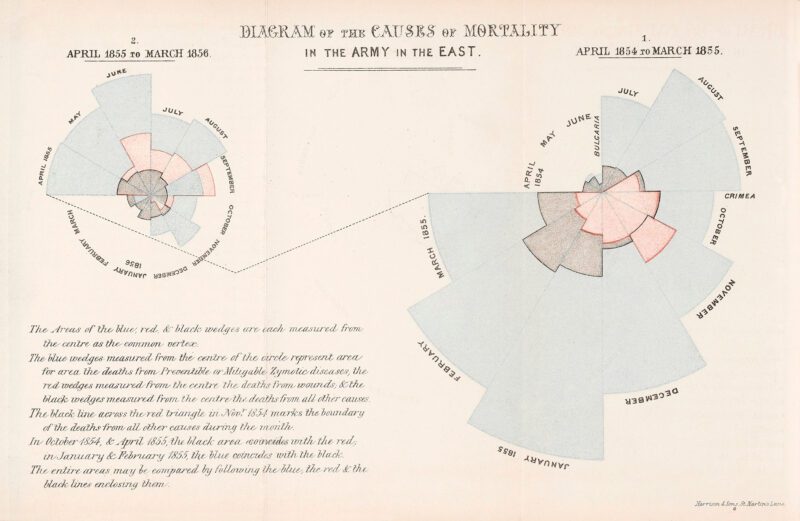
COVID inquiry heard Boris Johnson ‘struggled’ with graphs – if you do too, here are some tips
Nov 30, 2023
The era of the megalopolis: how the world’s cities are merging
Nov 24, 2022
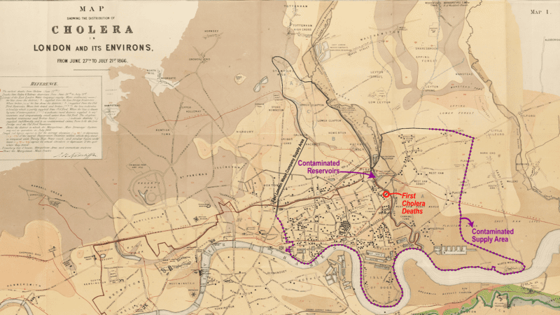
The long history of using maps to hold water companies to account
Oct 8, 2022
The Scarred Landscape of the Climate Crisis
Aug 10, 2022
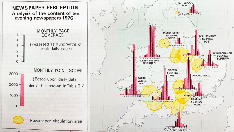
Newspapers and the 1976 Drought
Jul 21, 2022
Atlas des Unsichtbaren
Mar 15, 2022
More than arrows
Mar 4, 2022
PhD Opportunity: An Atlas of Health and Social Inequalities
Feb 2, 2022
Do Maps Lie?
Jan 18, 2022
The Importance of Data and Geography in Education
Jan 18, 2022
1
2
3
…
13
Next Page