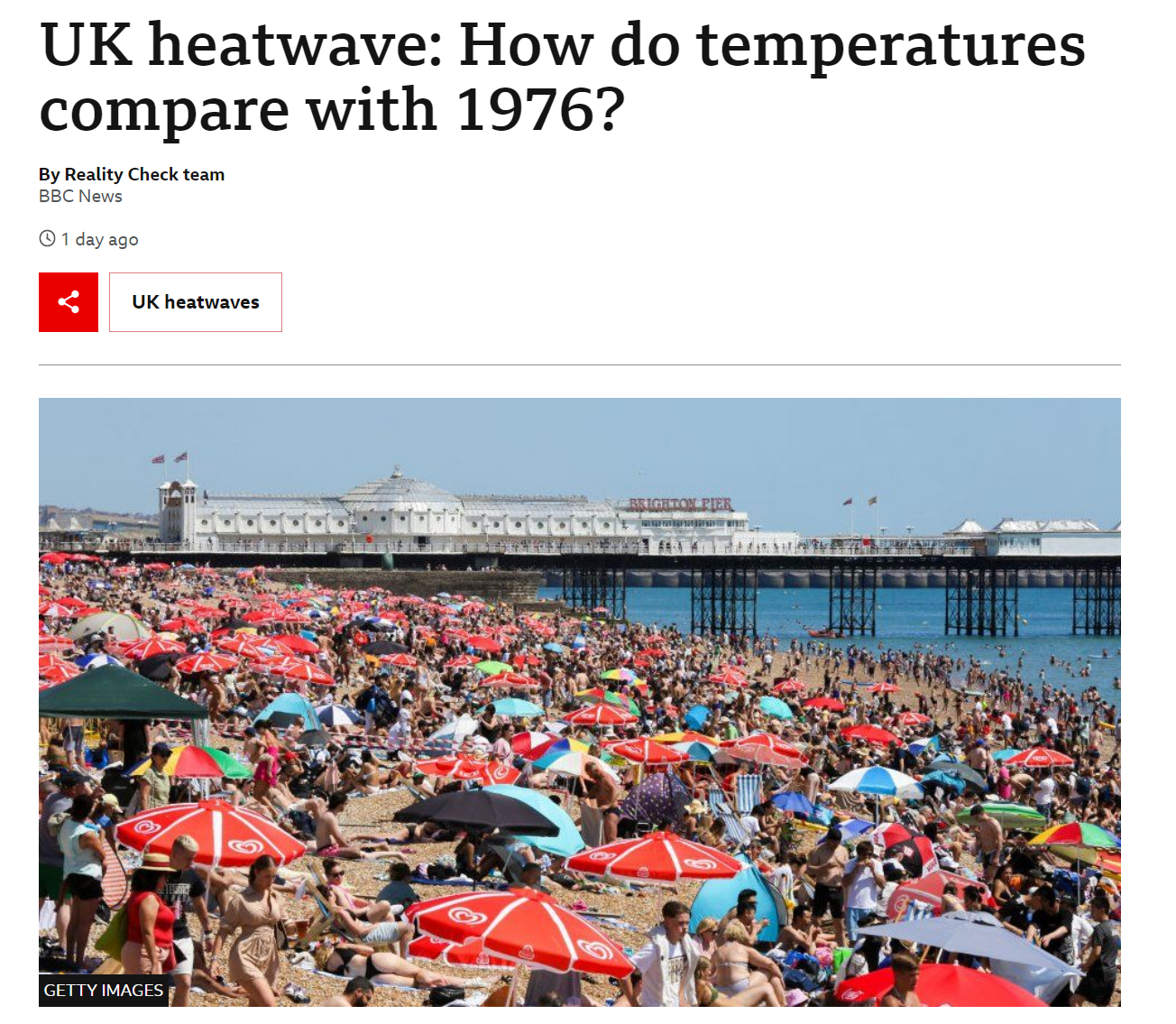
With each new temperature record that tumbles the UK, climate skeptics have a standard stock phrase: ‘it was this hot in 1976’. Of course it wasn’t, and crucially the planet overall was not as hot then as it is now. Parts of the UK media have had their part to play in fueling skepticism about the seriousness of the situation and I was struck by how quickly the headlines changed from ‘how bad can it be?’ to ‘this is really serious’ as temperature records tumbled and fires began to rage.
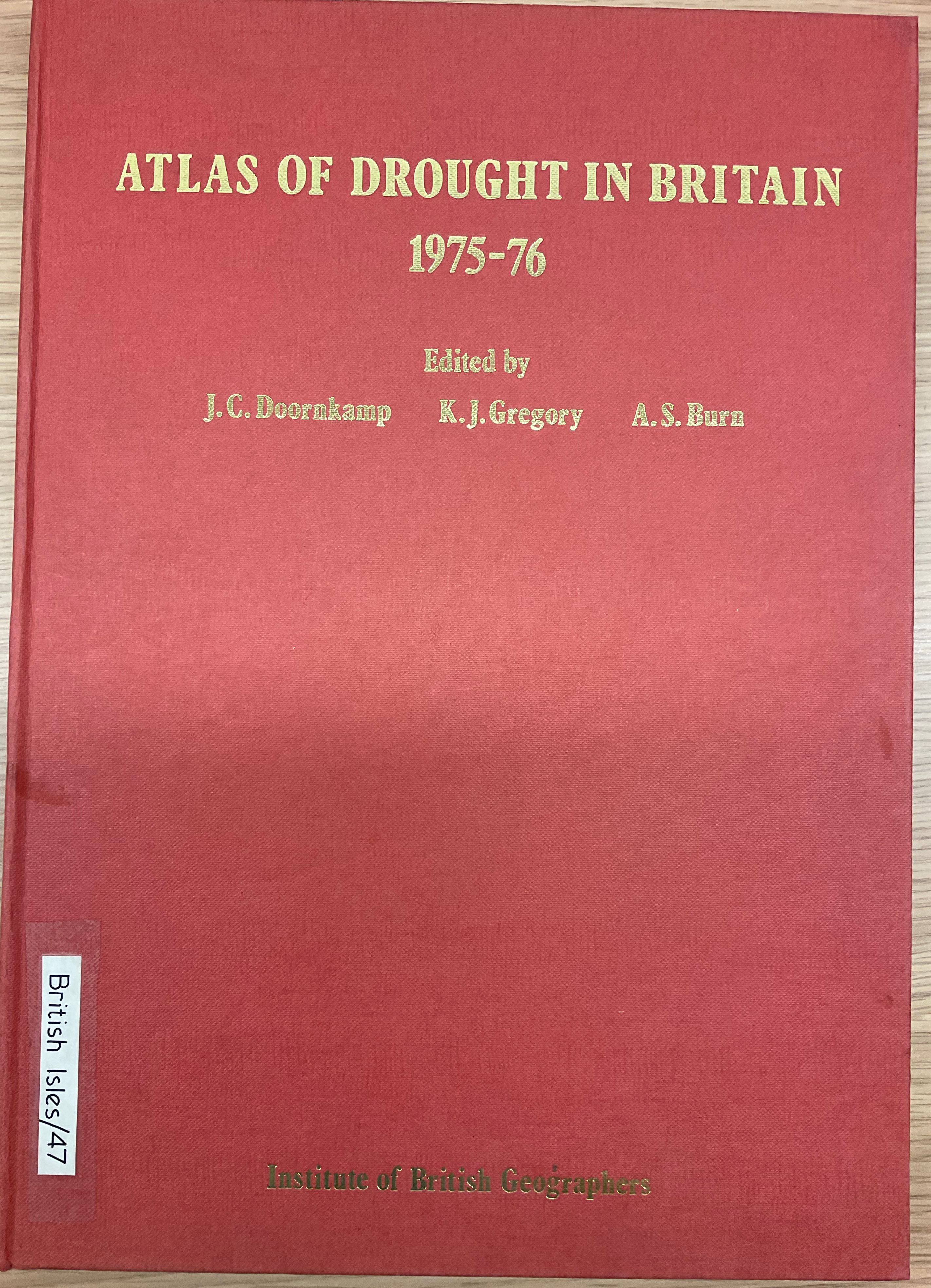
It got me thinking about a map I had spotted within the Atlas of Drought in Britain 1975-1976 – a book I’d happened upon in the UCL Geography map library.
Amongst the various maps showing demands on the water supply and ground water there was a page on the ‘newspaper perception’ of the drought.
In his accompanying text Ken Gregory writes:
Extremes of weather conditions such as the 1975-1976 drought can be approached objectively employing established scientific methods, but the significance of the characteristics of a specific period of weather as perceived by the population as a whole depends upon the diffusion of information and upon the way in which it the physical events are portrayed by press, radio and television.
I think this is a fascinating insight given how firmly lodged ‘the heatwave of 1976’ is so firmly lodged in the public consciousness of the UK thanks to the media’s reminders of it.
So to see the level of media interest in the 1976 heatwave/drought Gregory set about measuring the column inches devoted to the issue and then calculating a point score to gauge the amount of coverage. A front page spread would be given a higher score than the same spread appearing on page 20, for example.
From this he was able to produce a map that showed media interest over time across 9 regions of England & Wales.
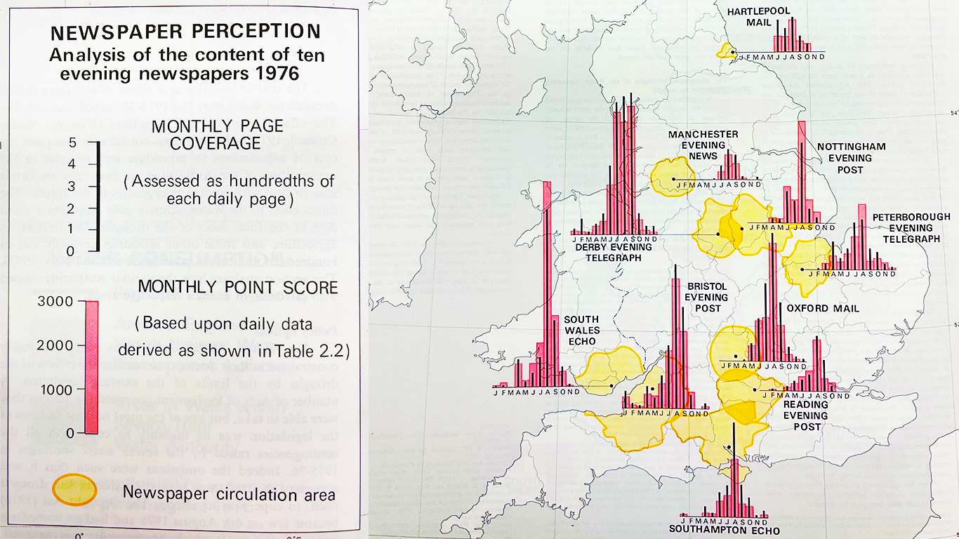
He found both national and regional patterns across ‘three phases of reaction’.
- Legacy of below average rainfall during the winter of 1975/76 leading to concern in South Wales about low reservoir levels.
- Late June & early July 1976 when the heatwave hit which was two weeks of shade temperatures exceeding 32 degrees C for two weeks.
- By August the extent of the drought was becoming clear, leading to a peak in interest.
There were interesting geographic differences in the length and timing of the reaction. Gregory noted that, for example, those regions benefitting from groundwater supplies, such as Southampton and Reading, moved on much more quickly from the issue during the autumn of 1976, whereas areas such as Derby were still suffering the effects of near empty reservoirs. The plot below gives an indication of how quickly interest grew and then slowed set against key events that year.

Source: Atlas of Drought in Britain 1975-1976
Of course the Internet and the decline in local media outlets means that such a map would not be possible to create today so we’d struggle to recreate Gregory’s analysis, but I would love to do a follow up to see how the media back then generated a collective memory that still impacts on perceptions of the record breaking summer of 2022.
