Southern Water was handed a record fine of £90 million in July 2021 after pleading guilty to illegally discharging sewage along the rivers and coastline of Kent, Hampshire and Sussex. More than a year later, the headlines have not improved for Britain’s embattled water companies who have recently discharged more sewage close to dozens of beaches.
The Environment Agency has called on water company executives to face jail due to the ongoing failings on environmental performance. And with the onset of drought, complaints about leaky water pipes have gone from a trickle to a stream.
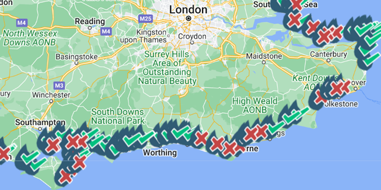
Maps by conservation organisation The Rivers Trust and campaign group Surfers Against Sewage lay bare the extent of sewage dumping into rivers and the sea. They have proved to be a highly effective tool, not just to warn of the risks to bathers but also to provide evidence of environmental damage.
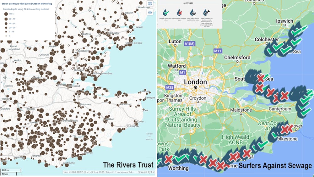
These maps pull together data from sensors along the sewage network that detect discharges, making it clear where the worst offenders are and encouraging users to contact their local MP requesting more rapid action on sewage discharge. They are easy to share on social media and on local news sites, they have inspired viral tweets and they make for awkward viewing for the water companies themselves.
This is not the first time maps have been used to hold private water companies to account. Some of the most famous maps of mid-19th century London, when it was gripped by successive outbreaks of cholera, helped reveal the cause of the deadly illness and identify the water companies responsible.
Deadly supply
John Snow was a renowned physician who walked the streets of London during the 1854 cholera epidemic, recording the deaths in grim detail. He mapped the cases, revealing clusters around a communal water pump in Broad Street, Soho, which confirmed his theory that cholera came from dirty water. He duly removed the pump handle, the outbreak in that area stopped and the rest – as they say – is history.
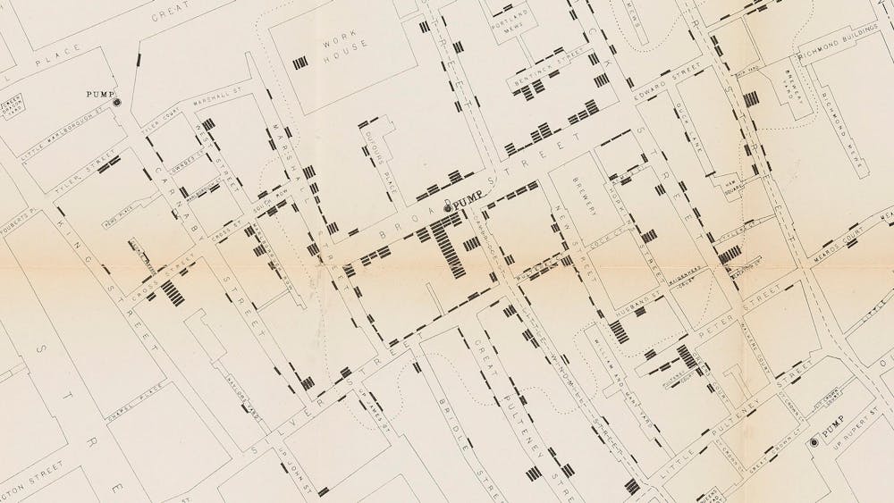
At least, that’s the simple version many people are already familiar with. In fact, the story is much more complex because Snow’s theory that the cholera pathogen was waterborne was not accepted by most scientists or policymakers at the time. He needed more proof. Snow therefore devised a “grand experiment”, which hinged on the way different areas of London were served by different water companies. This meant he could compare one supplier against another in a kind of natural experiment. Snow knew that cases of cholera were not randomly distributed across the city. As he showed in Soho, they tended to be grouped together. So what if some water companies had more cases than others?
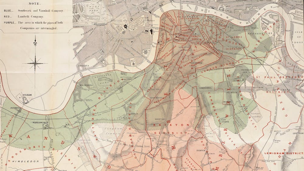
Snow mapped out where Londoners were being supplied by the Southwark & Vauxhall Company (blue-green) and by the Lambeth Company (red, while brown areas are a mixture of both) during the same epidemic. Lambeth had recently stopped drawing its water from the Thames, which was hugely polluted at the time as it was the main route for sewage to leave London. Its customers were dying from cholera at a rate of 37 per 10,000. Meanwhile, Southwark & Vauxhall was still extracting the polluted water, and their customers were dying at a rate of 317 per 10,000.
This should have proved once and for all that cholera was spreading thanks to foul water supplied into Londoners’ homes. But it wasn’t emphatic enough to trigger decisive change. Worse, a government report in 1856 commended the “considerable improvement which had taken place in the … supply of the water to the Metropolis”.
A decade later, and eight years after Snow’s death, London was suffering another cholera outbreak. The man charged with finding its cause during the summer of 1866 was William Farr, a statistician who had criticised Snow’s ideas. Even so, Farr was struck by how concentrated the cases appeared to be in East London and his mind must have turned to Snow’s grand experiment.
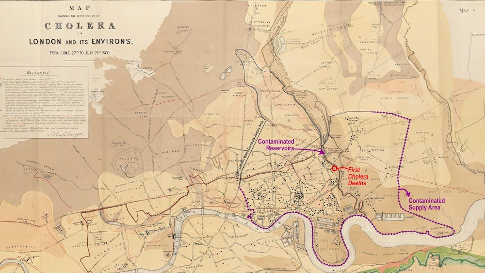
By mapping the cases, Farr showed that they fitted neatly within the area served by the East London Waterworks Company. Inhabitants of the area were complaining about the quality of their water, with some even finding eels in their pipes. A representative of the company wrote to the Times newspaper reassuring customers that “not a drop of unfiltered water has been supplied”.
But in his report, Farr found that in July of 1866 water levels were running low so a sluice was opened to allow homes to be supplied by stagnant water from a reservoir that the company had said was no longer in use (because the water within it had not been filtered). Farr was finally convinced that Snow had been right about the origins of cholera, and his map offered irrefutable evidence that East London Waterworks was guilty of supplying water that had caused the deaths of nearly 6,000 Londoners. It was to be London’s last cholera outbreak.
The power of maps
The maps of Snow and Farr were essential for guiding reforms that won better sanitary conditions in the growing city. Today, we live in an era where maps are created from data that they could only dream of, allowing us to see the national picture in real time and pinpoint who is pouring the most effluent into our streams. For the Victorians the fight for safe drinking water was a matter of life and death, but we too can use maps to make the case for a cleaner environment.
As I look at today’s maps of sewage discharges I can’t help but think of a letter the influential scientist Michael Faraday wrote to the Times in the summer of 1855, where he sets out his concerns about the dire state of the Thames after a boat trip along it:
I have thought it a duty to record these facts, that they may be brought to the attention of those who exercise power or have responsibility in relation to the condition of our river … If we neglect this subject, we cannot expect to do so with impunity; nor ought we to be surprised if, ‘ere many years are over, a hot season give us sad proof of the folly of our carelessness.
James Cheshire, Professor of Geographic Information and Cartography, UCL
This article is republished from The Conversation under a Creative Commons license. Read the original article.
