Tag: Visualisation
Big Data and Design
I recently had the pleasure of giving a Creative Mornings talk. Each month there is a new theme that the presenters need to refer to – mine was “fan...
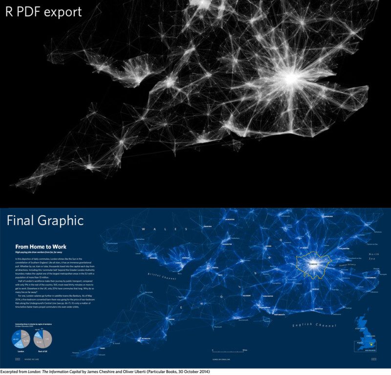
Improving R Data Visualisations Through Design
When I start an R class, one of my opening lines is nearly always that the software is now used by the likes of the New York Times graphics department or Facebo...
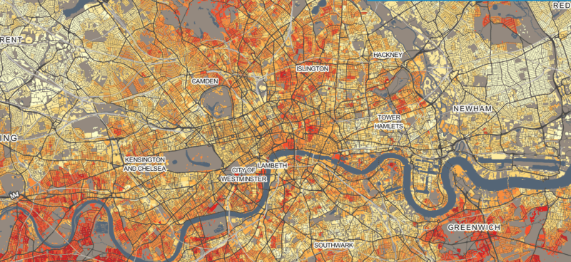
Welcome to DataShine!
Last October I was fortunate enough to be awarded an ESRC “Future Research Leaders” grant. These run for up to 3 years and offer the opportunity for...
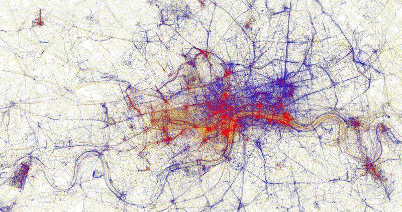
Visualising for Human Geography
The publication of the International Benchmarking Review of UK Human Geography back in March was a major event for the discipline. The report concludes that the...
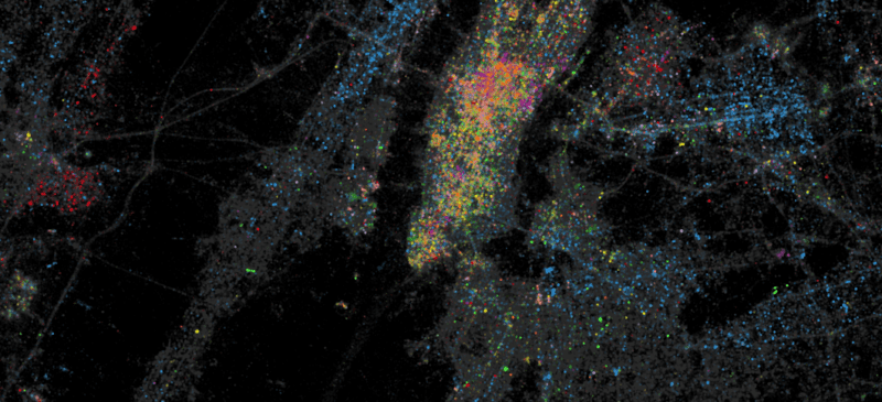
Mapped: Twitter Languages in New York
Following the interest in our Twitter Tongues map for London, Ed Manley and I have teamed up with Trendsmap creator John Barratt to offer this snapshot of New Y...
Editorial: Visualisation Tools for Understanding Big Data
I recently co-wrote an editorial (download the full version here) with Mike Batty (UCL CASA) in which we explored some of the current issues surroundi...
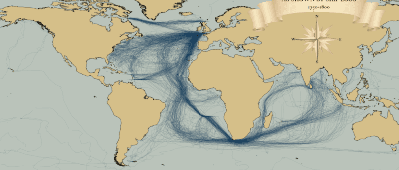
Mapped: British, Spanish and Dutch Shipping 1750-1800
I recently stumbled upon a fascinating dataset which contains digitised information from the log books of ships (mostly from Britain, France, Spain and The Neth...
Global Migration Maps
Migrations of people have existed for millennia and occur at a range of scales and time-periods (from small-scale journeys to work through to intercontinental ...
Brilliant Boris Bikes Animation
Some of us at CASA can’t get enough of the Barclay’s Cycle Hire data. We have had Ollie‘s hugely successful flow maps, journey time heat maps,...