
The publication of the International Benchmarking Review of UK Human Geography back in March was a major event for the discipline. The report concludes that the UK human geography community is setting the intellectual agenda for the subject and can therefore consider itself the best in the world. Whilst this is a great achievement, the “relative weakness in quantitative methods and GIS” (p16) was also highlighted. The authors flag the growing interest in data visualisation, and its value for information dissemination and impact, but suggest that human geographers may not be ahead of the curve in the same way as they are in other parts of the discipline.
Compelling data visualisation is the key to communicating results from research widely and, perhaps most importantly, a means to inspire current and future students to work with quantitative data. More maps (and other visualisations) than ever are being produced, but many are methodologically flawed or misleading because the people who created them are great with complex software and data manipulation, but less good at placing their visual outputs in context. I would argue that human geographers, with their knowledge of population processes, are uniquely placed to perform a “sanity check” on the many graphics that stem from analysis that has set off down the wrong path. Human geographers are also well-aware of the power of maps to change perceptions of the world (both for the better or worse) so they are perhaps a little more cautious in the way they portray data and make doubly sure that they have produced something that is both representative and defensible.
So, it is more important than ever for geographers to engage with the many relevant datasets that are now available and also with the communities (largely of computer scientists and designers) that are currently grappling with them. We don’t all have the skills to manipulate large datasets, or visualise them, but we can still contribute to the creative process and ensure the outcomes are representative of the data used to produce them. The benchmarking review lists four people/ groups that have made a start in this regard [Hans Rosling (of GapMinder), Simon Rogers (formerly, the Guardian), Danny Dorling (and colleagues) and CASA (where I work)]. Interestingly only two would probably badge themselves as geographers. I thought I’d speculate a little about what makes each of these groups successful in this context and also add a few more groups that I think could offer the inspiration needed to get more people visualising human geography.
Hans Rosling and Gapminder
Gapminder helped to kick-start the interest in the power of data visualisation to explore the complexities of global development. The website, and energetic videos by Hans Rosling, have raised the profile of the many datasets compiled by global organisations, such as the UN, and offer a means for students to engage with data in an interesting way. For people starting to think about data, Gapminder should be one of the first websites they visit.
Simon Rogers & the Guardian Data Store
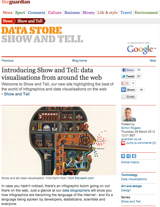
The Guardian Data Store and its associated blog have raised the profile of human geographers in the UK more than any other website over the past couple of years. Simon Rogers and his team have actively sought visualisations to feature (including many from this blog) and this has often resulted in interest from a range of other media outlets. Some of the graphics featured have been a bit dubious, but there has always been scope to comment and the team have taken criticisms on board. This has facilitated an important dialogue that is a great success story in terms of academic/ media engagement. The blog and the push for freely available data has been a great force for good and as Simon moves on to Twitter, I hope it will continue to promote the work of geographers.
Danny Dorling and Worldmapper

I think the work of Danny Dorling and his team at the University of Sheffield is notable for two reasons. The first is their promotion of cartograms. Cartograms distort the world according to a particular variable (in the map above it’s population) so that areas with the highest values become larger at the expense of areas with smaller values. The impact of this approach is the way that it draws attention to the places on the map that matter. This slightly trippy cartography is also a powerful way of changing perceptions of the world (so often based on the Mercator projection) and can form the basis for discussions about representations of geographic data.
Secondly, Danny has done a huge amount to promote spatial equity by making population data accessible to a wider audience. At the moment I am reading his latest book that walks readers along the 32 stops of the Central Line in London (a similar idea to the map I produced last year), exploring the lifestyles of those along it as portrayed by population data. Such data are used everyday by government and industry to alter people’s lives, but many are unaware about what it says about them and also how it can be used to promote equality. This kind of work is controversial at times but forms an important component of the informed social debates that human geographers can contribute to through good data visualisation.
The UCL Centre for Advanced Spatial Analysis (CASA)

At CASA we have produced a fair number of visualisations (many I have featured on this blog). Most of what we do requires a collaboration between geographers, computer scientists and others to collect the data, format it and visualise it. We are lucky to have such a rich mix of disciplines in the department and I think it represents a successful template for geography departments more broadly as the need for quantitative methods increases with data volumes. We also run a great masters course…
Floatingsheep
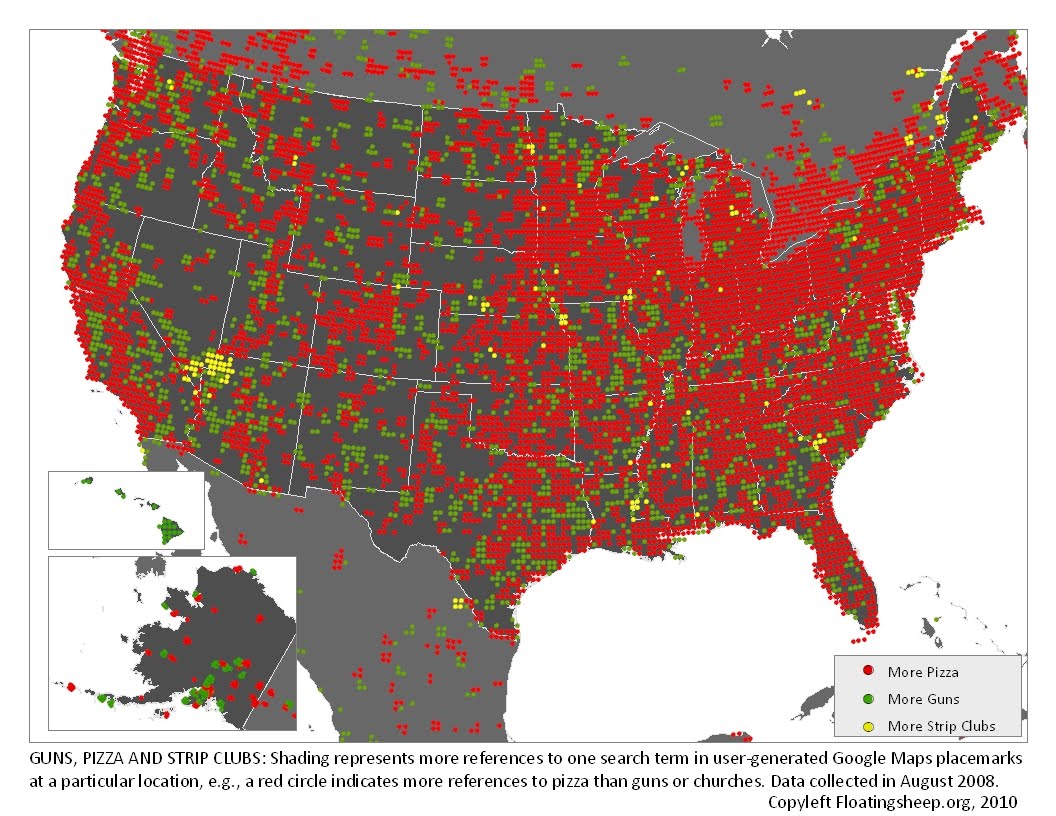
Despite their slightly baaamy (see what I did there) name, the team behind floatingsheep are seriously getting to grips with the new forms of data produced online. With maps entitled “The Beer Belly of America” and “The Price of Weed“, students will be instantly engaged. There is also a long list of academic publications available that explore the more substantive research questions associated with the geography of the internet.
New York Times Graphics Department

The New York Times Graphics Department excel at high quality data visualisation that is eye catching and informative. The graphic above speaks for itself.
Stamen
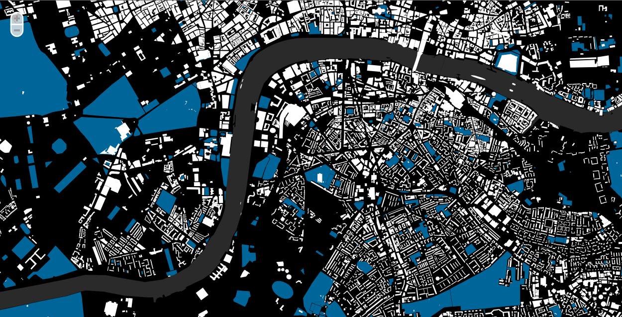
Stamen Design have produced a series of interactive visualisations from a range of datasets that have consistently raised the bar in terms of what is possible for geographic data. If you are creating anything interactive and online, their base maps are especially useful as they enhance the appearance of the data overlaid on top of them. There is no longer any reason to use the default Google cartography!
I have read the annotation and know that this is a very strong antidepressant, it is even considered as Xanax No Prescription drugs. You can buy it by a prescription.
Eric Fischer

Eric Fischer has led the way in producing stunning visualisations from social media data. Social media datasets, especially from Twitter, are creating a lot of hype at the moment in quantitive human geography and no-one maps them better than Eric.
Nathan Yau of Flowing Data
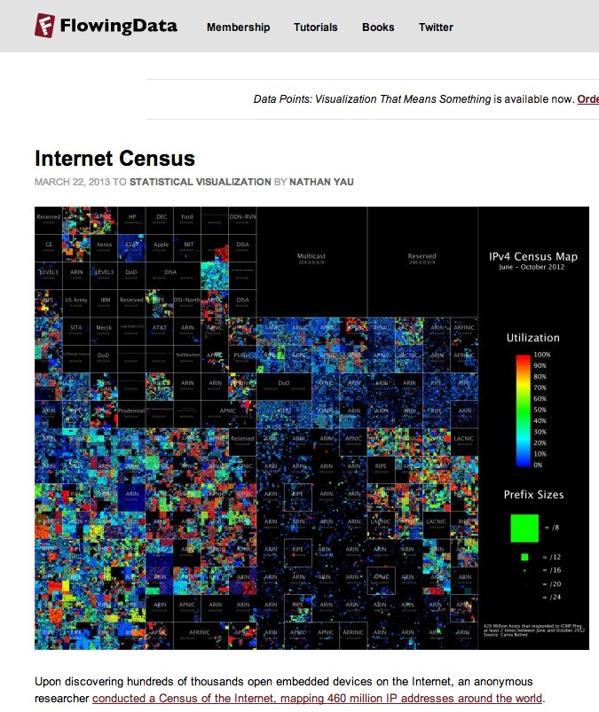
Finally, Nathan Yau’s flowingdata frequently features excellent examples data visualisation with geographic data. The blog has a huge range of examples and a number of tutorials that would be of benefit to human geographers, especially when teaching.
