Skip to content
James Cheshire
About
Blog
Teaching
Papers
Category:
Resources
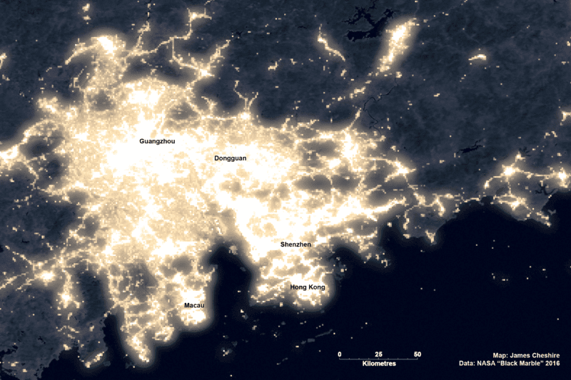
The era of the megalopolis: how the world’s cities are merging
Nov 24, 2022
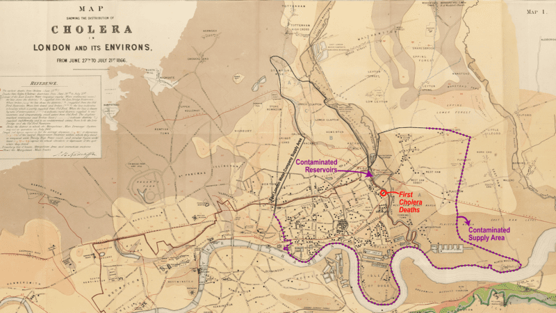
The long history of using maps to hold water companies to account
Oct 8, 2022
More than arrows
Mar 4, 2022
The Importance of Data and Geography in Education
Jan 18, 2022
Failure is part of the visualization process
Nov 4, 2021
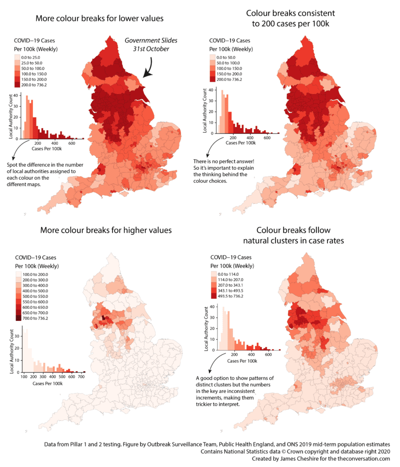
Next slide please: what’s wrong with the UK government’s coronavirus charts
Jan 12, 2021
Different Maps, Same Data
Nov 3, 2020
Mapping Nitrogen Dioxide Across Europe
Aug 24, 2020
Maptastic: How map makers will win the 2020 US election
Aug 21, 2020
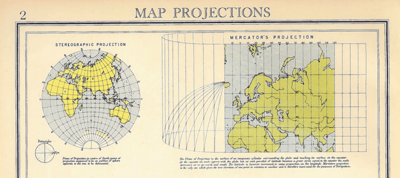
Map Projections
Oct 30, 2017
1
2
3
Next Page