Skip to content
James Cheshire
About
Blog
Teaching
Papers
Category:
Resources
Joy Division, Population Surfaces and Pioneering Electronic Cartography
Jul 28, 2017
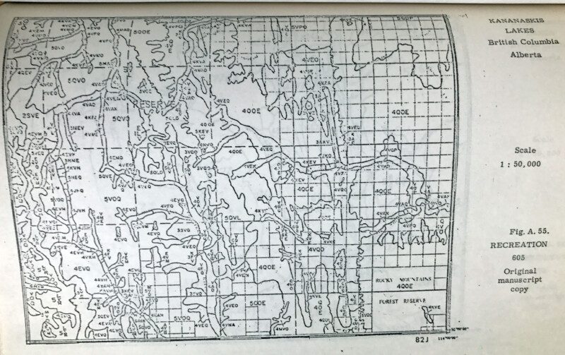
Roger Tomlinson's PhD: The first in GIS
Jul 12, 2017
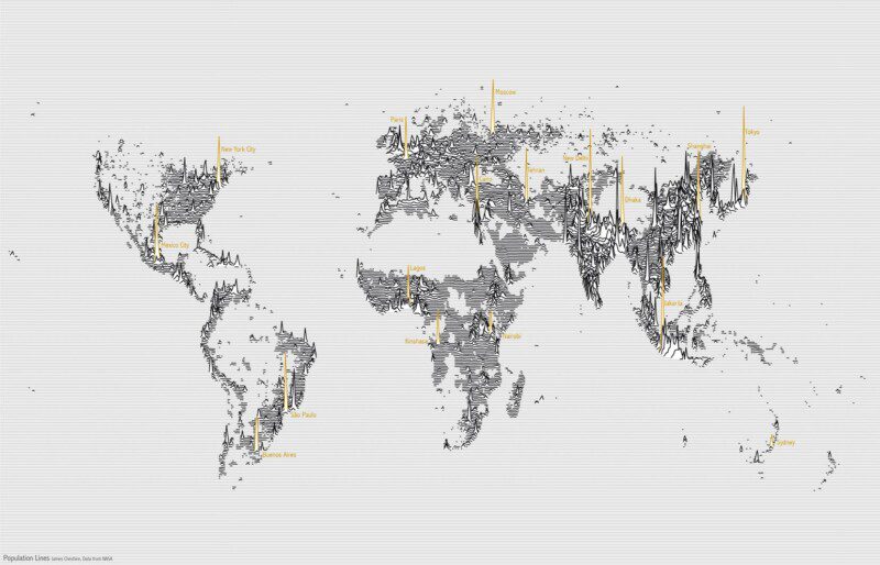
Population Lines: How and Why I Created It
Apr 27, 2017
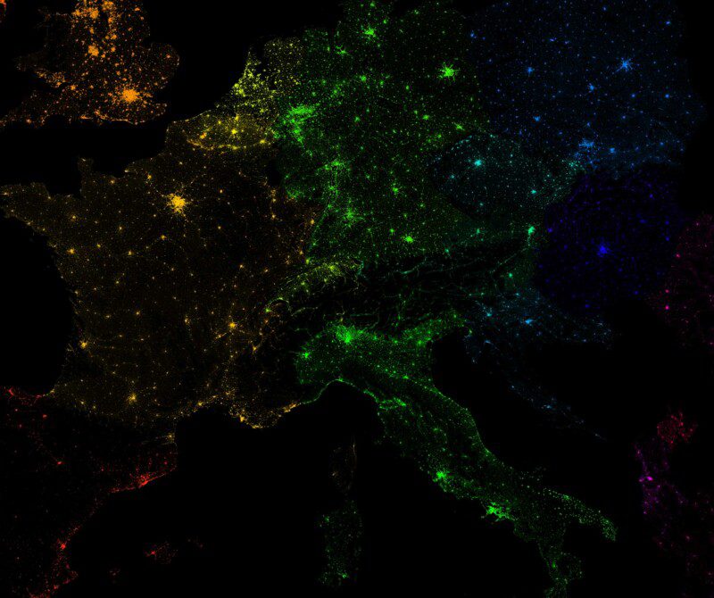
10 Million Dots: Mapping European Population
Mar 23, 2017
Useful Geographic Datasets
Oct 27, 2016
7 Deadly Sins of (Academic) Data Visualisation
Oct 11, 2016
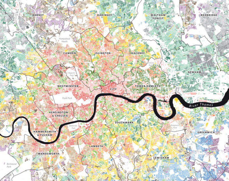
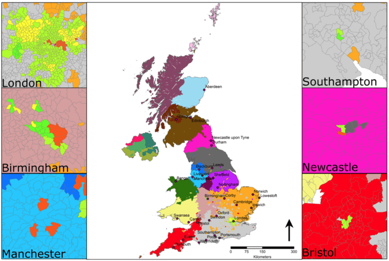
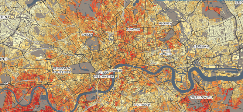
Welcome to DataShine!
Jun 17, 2014
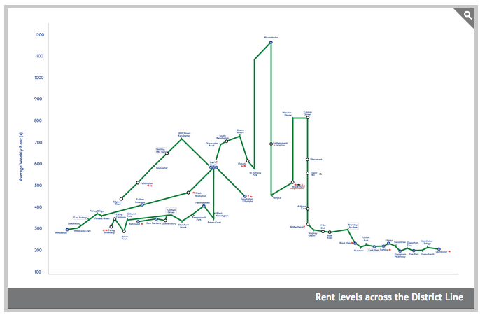
Subway Maps and Visualising Social Equality
May 15, 2013
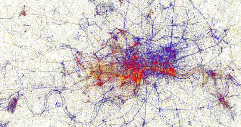
Visualising for Human Geography
May 1, 2013
Editorial: Visualisation Tools for Understanding Big Data
Jul 9, 2012
Previous Page
1
2
3
Next Page