Dot density maps are an increasingly popular way of showing population datasets. The technique has its limitations (see here for more info), but it can create some really nice visual outputs, particularly when trying to show density. I have tried to push this to the limit by using a high resolution population grid for Europe (GEOSTAT 2011) to plot a dot for every 50 people in Europe (interactive). The detailed data aren’t published for all European countries – there are modelled values for those missing but I have decided to stick to only those countries with actual counts here.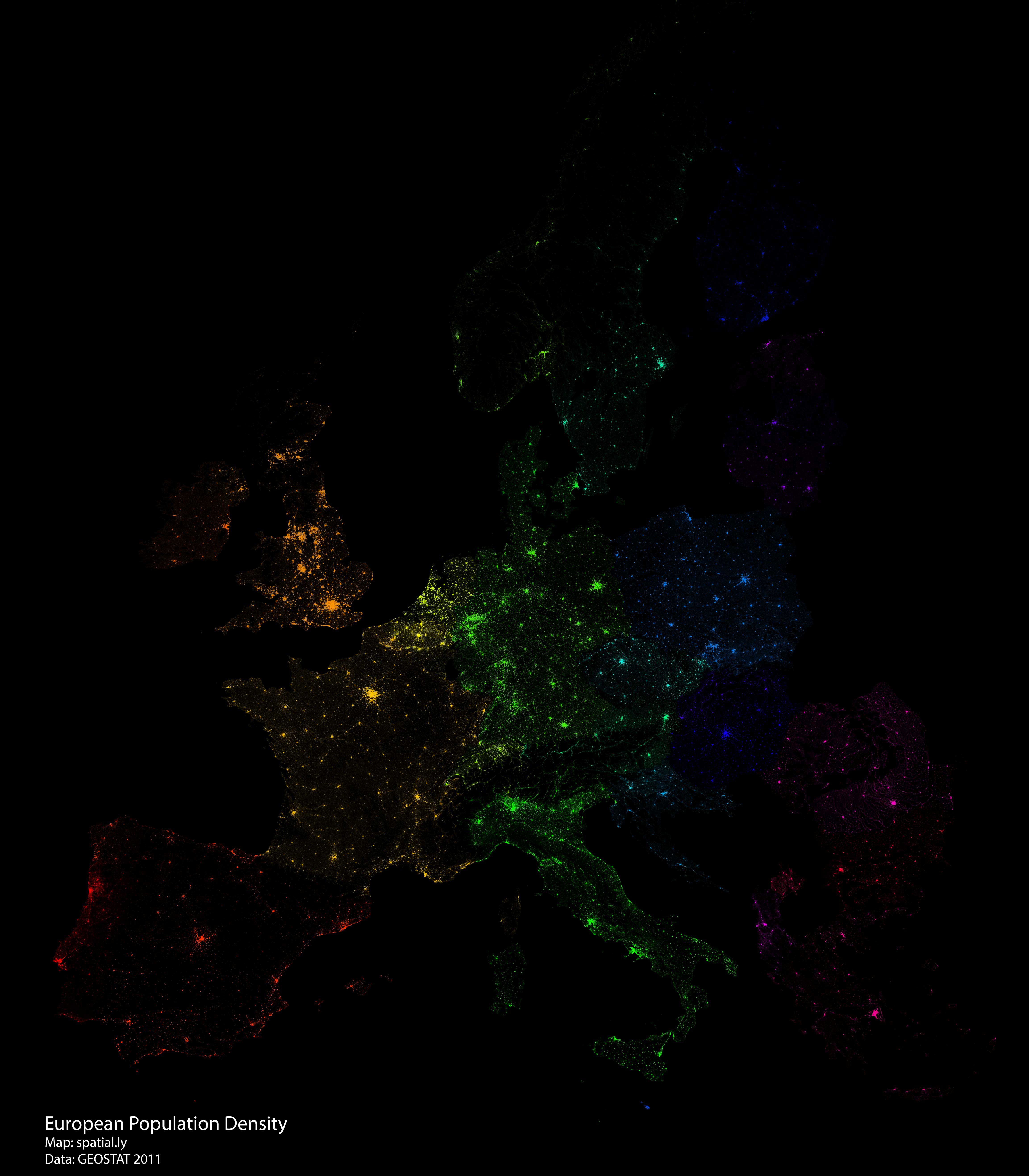
Giant dot density maps with R
I produced this map as part of an experiment to see how R could handle generating millions of dots from spatial data and then plotting them. Even though the final image is 3.8 metres by 3.8 metres – this is as big as I could make it without causing R to crash – many of the grid cells in urban areas are saturated with dots so a lot of detail is lost in those areas. The technique is effective in areas that are more sparsely populated. It would probably work better with larger spatial units that aren’t necessarily grid cells.
Generating the dots (using the spsample function) and then plotting them in one go would require way more RAM than I have access to. Instead I wrote a loop to select each grid cell of population data, generate the requisite number of points and then plot them. This created a much lighter load as my computer happily chugged away for a few hours to produce the plot. I could have plotted a dot for each person (500 million+) but this would have completely saturated the map, so instead I opted for 1 dot for every 50 people.
I have provided full code below. T&Cs on the data mean I can’t share that directly but you can download here.
Load rgdal and the spatial object required. In this case it’s the GEOSTAT 2011 population grid. In addition I am using the rainbow function to generate a rainbow palette for each of the countries.
library(rgdal)
Input<-readOGR(dsn=".", layer="SHAPEFILE")
Cols<- data.frame(Country=unique(Input$Country), Cols=rainbow(nrow(data.frame(unique(Input$Country)))))
Create the initial plot. This is empty but it enables the dots to be added interatively to the plot. I have specified 380cm by 380cm at 150 dpi PNG – this is as big as I could get it without crashing R.
png("europe_density.png",width=380, height=380, units="cm", res=150)
par(bg='black')
plot(t(bbox(Input)), asp=T, axes=F, ann=F)
Loop through each of the individual spatial units – grid cells in this case – and plot the dots for each. The number of dots are specified in spsample as the grid cell’s population value/50.
for (j in 1:nrow(Cols))
{
Subset<- Input[Input$Country==Cols[j,1],]
for (i in 1:nrow(Subset@data))
  {
  Poly<- Subset[i,]
  pts1<-spsample(Poly, n = 1+round(Poly@data$Pop/50), "random", iter=15)
  #The colours are taken from the Cols object.
  plot(pts1, pch=16, cex=0.03, add=T, col=as.vector(Cols[j,2]))
  }
}
dev.off()
