Skip to content
James Cheshire
About
Blog
Teaching
Papers
Tag:
rstats
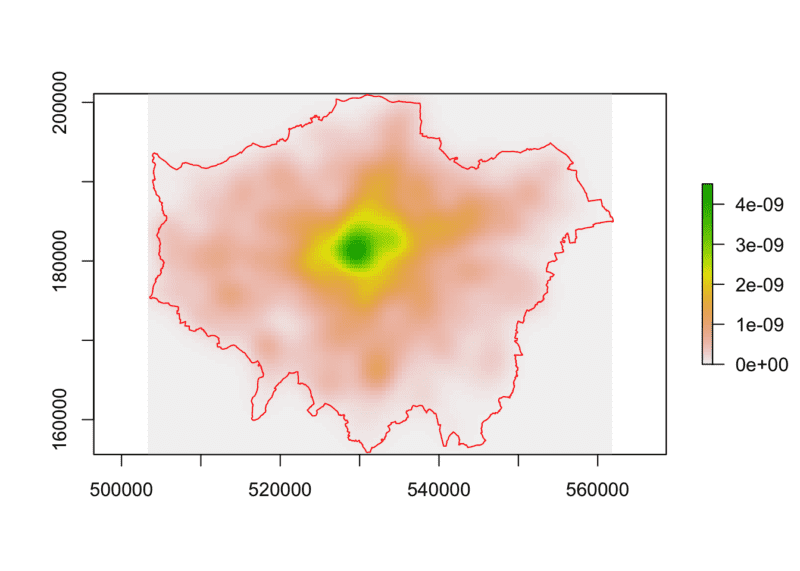
Point Pattern Analysis using Ecological Methods in R
Dec 12, 2017
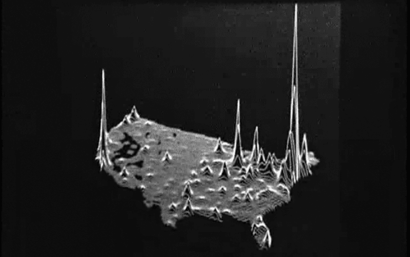
Joy Division, Population Surfaces and Pioneering Electronic Cartography
Jul 28, 2017
Spinning Globes With R
May 16, 2017
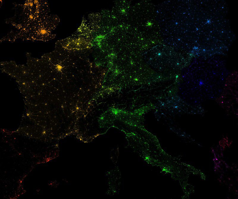
10 Million Dots: Mapping European Population
Mar 23, 2017
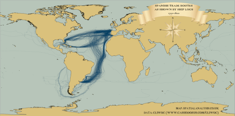
Mapping (historic) tracks in ggplot2
Oct 10, 2016
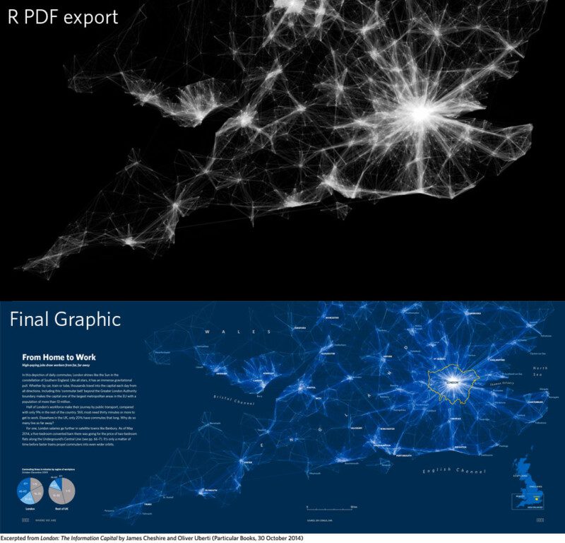
Improving R Data Visualisations Through Design
Nov 6, 2014
Mapping the World's Biggest Airlines
Jun 7, 2012
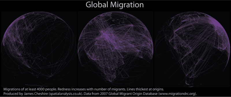
Global Migration Maps
Mar 17, 2011
Mapping London's Population Change 1801-2030
Feb 16, 2011
R interface to Google Chart Tools
Jan 10, 2011