adehabitathr package – but that are very useful for human data. Ecologists deploy point pattern analysis to establish the “home range” of a particular animal based on the known locations it has been sighted (either directly or remotely via camera traps). Essentially it is where the animal spends most of its time. In the case of human datasets the analogy can be extended to identify areas where most crimes are committed – hotspots – or to identify the activity spaces of individuals or the catchment areas of services such as schools and hospitals.This tutorial offers a rough analysis of crime data in London so the maps should not be taken as definitive – I’ve just used them as a starting point here.
Police crime data have been taken from here https://data.police.uk/data/. This tutorial London uses data from London’s Metropolitan Police (September 2017).
For the files used below click here.
#Load in the library and the csv file.
library("rgdal")
library(raster)
library(adehabitatHR)
input<- read.csv("2017-09-metropolitan-street.csv")
input<- input[,1:10] #We only need the first 10 columns
input<- input[complete.cases(input),] #This line of code removes rows with NA values in the data.
At the moment input is a basic data frame. We need to convert the data frame into a spatial object. Note we have first specified our epsg code as 4326 since the coordinates are in WGS84. We then use spTransform to reproject the data into British National Grid – so the coordinate values are in meters.
Crime.Spatial<- SpatialPointsDataFrame(input[,5:6], input, proj4string = CRS("+init=epsg:4326"))
Crime.Spatial<- spTransform(Crime.Spatial, CRS("+init=epsg:27700")) #We now project from WGS84 for to British National Grid
plot(Crime.Spatial) #Plot the data
The plot reveals that we have crimes across the UK, not just in London. So we need an outline of London to help limit the view. Here we load in a shapefile of the Greater London Authority Boundary.
London<- readOGR(".", layer="GLA_outline")Thinking ahead we may wish to compare a number of density estimates, so they need to be performed across a consistently sized grid. Here we create an empty grid in advance to feed into the kernelUD function.
Extent<- extent(London) #this is the geographic extent of the grid. It is based on the London object.
#Here we specify the size of each grid cell in metres (since those are the units our data are projected in).
resolution<- 500
#This is some magic that creates the empty grid
x <- seq(Extent[1],Extent[2],by=resolution)  # where resolution is the pixel size you desire
y <- seq(Extent[3],Extent[4],by=resolution)
xy <- expand.grid(x=x,y=y)
coordinates(xy) <- ~x+y
gridded(xy) <- TRUE
#You can see the grid here (this may appear solid black if the cells are small)
plot(xy)
plot(London, border="red", add=T)
OK now run the density estimation note we use grid= xy utlise the grid we just created. This is for all crime in London.
all <- raster(kernelUD(Crime.Spatial, h="href", grid = xy)) #Note we are running two functions here - first KernelUD then converting the result to a raster object.
#First results
plot(all)
plot(London, border="red", add=T)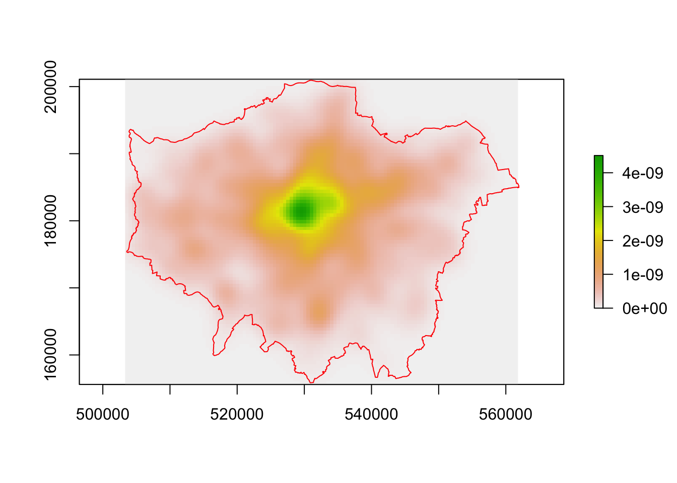
Unsurprisingly we have a hotpot over the centre of London. Are there differences for specific crime types? We may, for example, wish to look at the density of burglaries.
plot(Crime.Spatial[Crime.Spatial$Crime.type=="Burglary",]) # quick plot of burglary points
burglary<- raster(kernelUD(Crime.Spatial[Crime.Spatial$Crime.type=="Burglary",], h="href", grid = xy))
plot(burglary)
plot(London, border="red", add=T)
There’s a slight difference but still it’s tricky to see if there are areas where burglaries concentrate more compared to the distribution of all crimes. A very rough way to do this is to divide one density grid by the other.
both<-burglary/all
plot(both)
plot(London, border="red", add=T)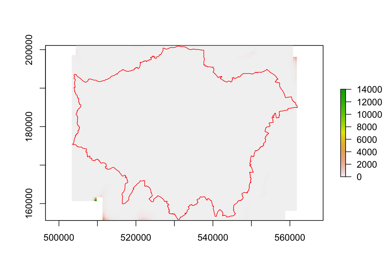
This hasn’t worked particularly well since there are edge effects on the density grid that are causing issues due to a few stray points at the edge of the grid. We can solve this by capping the values we map – in this we are only showing values of between 0 and 1. Some more interesting structures emerge with burglary occuring in more residential areas, as expected.
both2 <- both
both2[both <= 0] <- NA
both2[both >= 1] <- NA
#Now we can see the hotspots much more clearly.
plot(both2)
plot(London, add=T)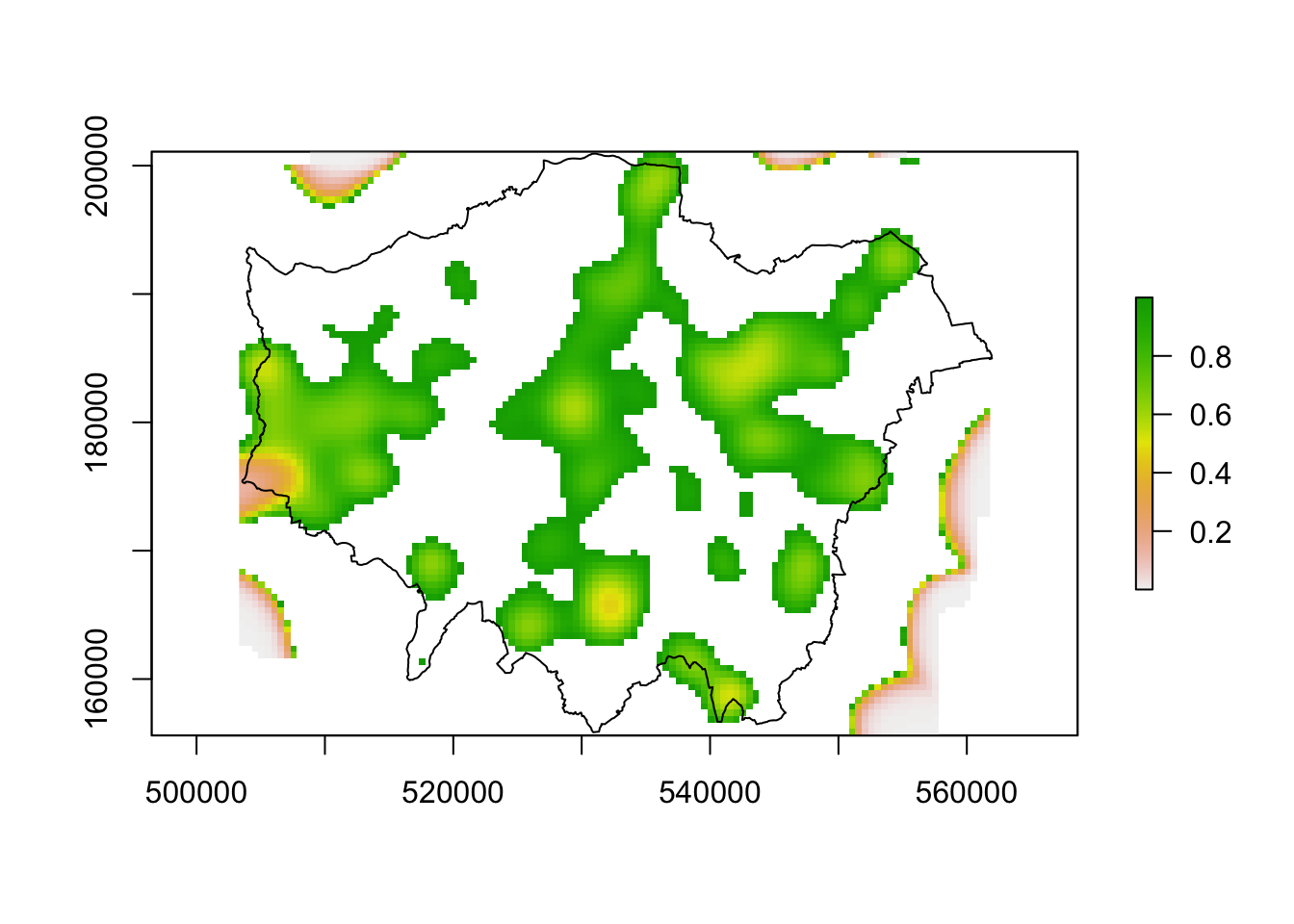
There’s many more sophisticated approaches to this kind of analysis – I’d encourgae you to look at the adehabitatHR vignette on the package page.
