It is, of course, John Snow who is credited with using maps to demonstrate that the clusters of deaths from cholera in London’s Soho during London’s 1854 outbreak were caused by contaminated water. This marked a major shift in thinking away from the disease being transmitted through dirty air: the more widely accepted theory at the time.
However, it wasn’t just Snow producing innovative maps and charts to support his cause. Snow was part of an arms race to get the best data communicated by the most compelling maps/ charts, to evidence his side of the debate against his contemporaries – people like William Farr who was also a master data visualiser.
The Wellcome Collection’s image catalogue contains many great examples of maps and charts produced around the 1850s . These images are high resolution and free to use under a CC-BY 4.0 license. Most have very little information associated with them, but I think many are worth sharing because they such amazing examples of Victorian data visualisation. I have pasted them here with the catalogue details where they have them (in no particular order). I’ve included the original links back to the high resolution image in the collection. Enjoy!
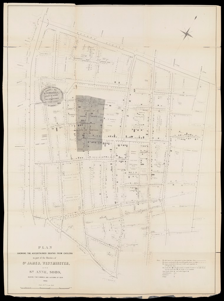
Plan Showing the Ascertained Deaths from Cholera (John Snow)
Source
Details: Plan Showing the Ascertained Deaths from Cholera in Part of the Parishes of St. James, Westminster and St. Anne, Soho, during the summer and autumn of 1854. The plan is from a report on the cholera outbreak in the Parish of St. James, Westminster, during the autumn of 1854 / presented to the vestry by the Cholera Inquiry Committee, July 1855. Report is on the cholera outbreaks in central London in 1832, 1848-9,1851,1852, 1853 and (specifically) 1854. Much reference is made to a public water pump in Broad Street. Meteorological conditions are given. Information is reported about the population, housing, sanitation, sewerage, cess pools etc. and the water supply in the Soho area.
Report on the mortality of cholera in England. Charts showing the temperature and mortality of London for every week of 11 years (1840 – 1850).

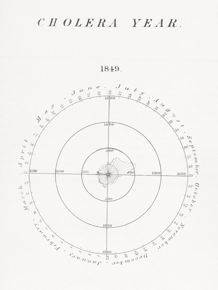
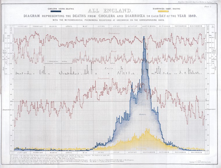
Diagram of cholera deaths in England during 1849
Source
Details: Diagram representing the deaths from cholera and diarrhoea in England on each day of the year 1849 with the meteorological phenomena registered at Greenwich on the corresponding days.
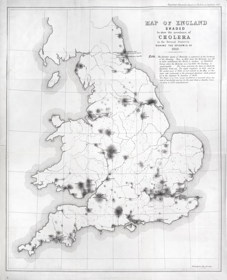
Map of England showing prevalence of cholera, 1849
Source
Details: Map of England shaded to show the prevalence of cholera in the several districts during the epidemic of 1849. The relative degree of mortality is expressed in the darkness of the shading. The dates indicate the time at which the epidemic broke out.
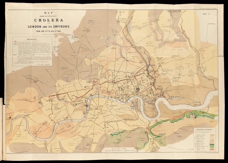
Map showing the distribution of cholera in London and its environs, from 27th June to 22st July, 1866.
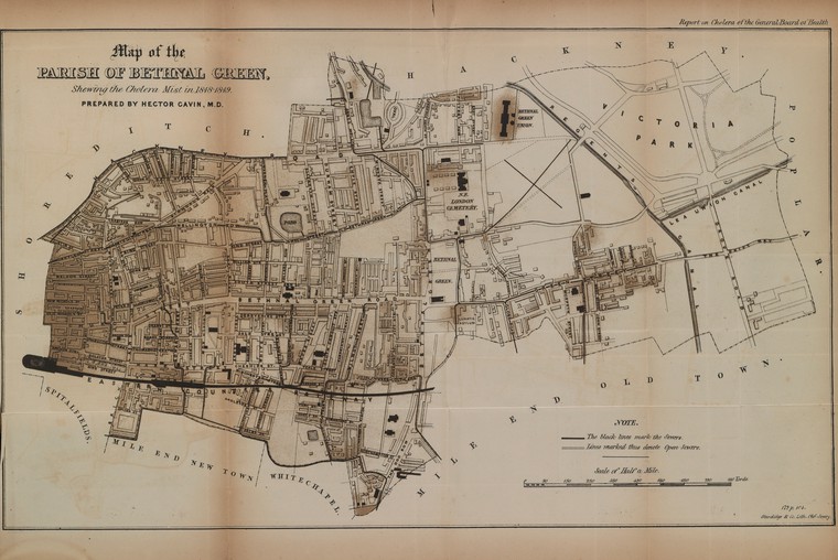
Map of the Parish of Bethnal Green, Shewing the Cholera Mist in 1848-1849
Cholera Map of the Metropolis 1849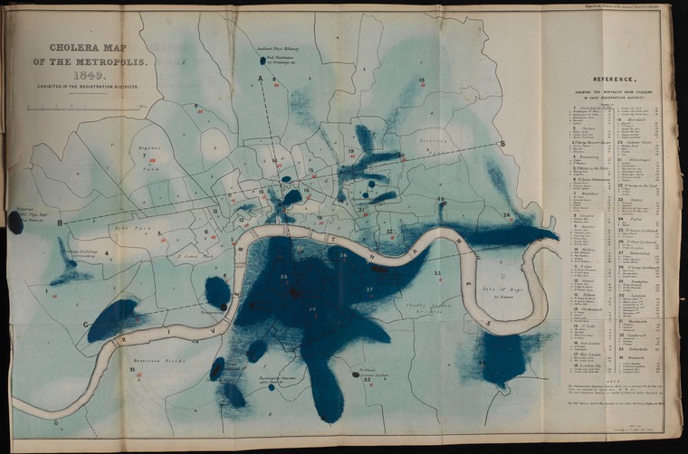
Cholera map showing intensity of cholera attack in sections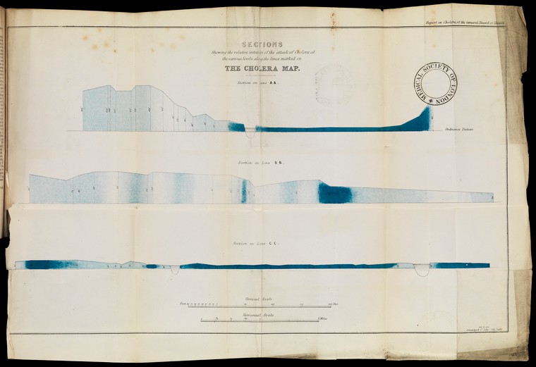
Mortality of cholera graphed against elevation 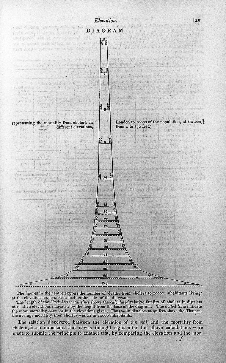
London mortality; plague years & cholera years 
Source
Details: Diagrams showing mortality in London during plague years of 1593, 1603, 1625, 1636, 1665, and the cholera year of 1849.