Skip to content
James Cheshire
About
Blog
Teaching
Papers
Tag:
maps
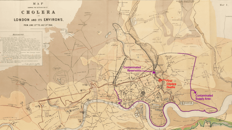
The long history of using maps to hold water companies to account
Oct 8, 2022
Anxiety and Mapping the Climate Crisis
Jan 18, 2022
Being creative is reason enough to try different data visualization
Jan 7, 2022
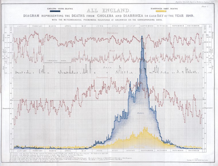
How the Victorians Mapped London’s Cholera
Mar 2, 2019
Joy Division, Population Surfaces and Pioneering Electronic Cartography
Jul 28, 2017
London: The Information Capital
Sep 30, 2014
In Maps We Trust
Aug 17, 2012
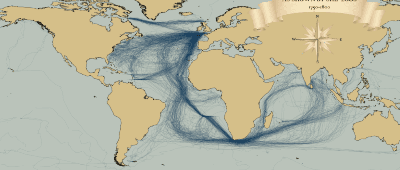
Mapped: British, Spanish and Dutch Shipping 1750-1800
Mar 30, 2012
The Power of Comparison: Just How Big Is It?
Jan 16, 2012
My Week in Maps
Jan 28, 2011