A simple line chart might be all you need to communicate the patterns in a dataset, but it might not be given a second glance. Getting the viewer to work a little harder to interpret and think about a graphic can be a very effective way of generating engagement. This is where the art meets the science of data visualisation.
There are many ways charts can misfire, but that doesn’t mean we shouldn’t try something new and it certainly doesn’t mean we should heed calls to do things the ‘right’ way if we miss a chance to change how people look at a dataset.
In the case of this ‘tapeworm of doom’ plot by NYT, it has certainly worked!
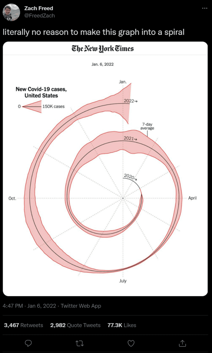
I actually rather like it and think it does it’s job well….so in it’s honor and in honor of any viral plots in the future, here’s my favorite examples of maps/ charts that you can say present data a particular way for ‘literally no reason’. Or you can say by doing something a bit differently they create much more engaging graphics – I’ll leave it to you to decide!
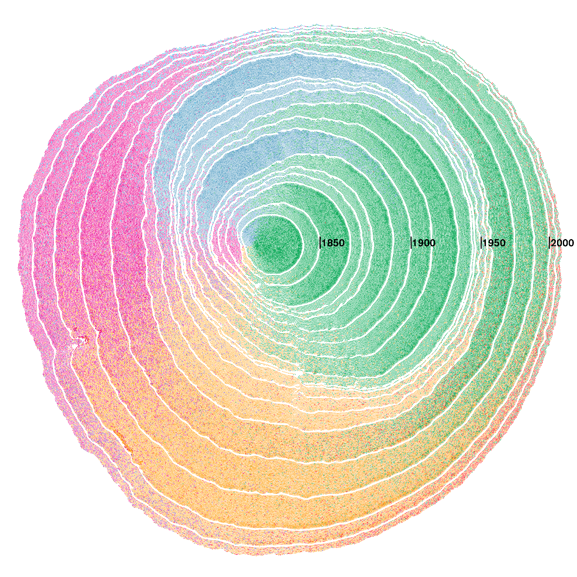
Du Bois’ Spiral
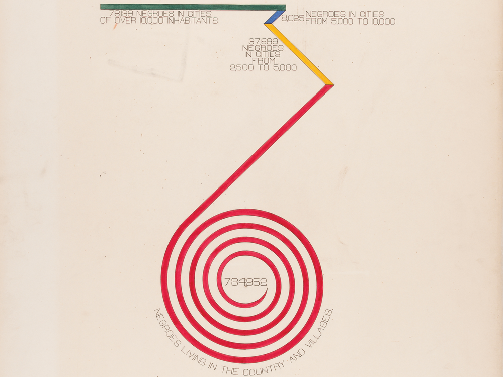
A hero of mine and pioneer of innovative visual forms, Du Bois chose a spiral over a bar chart for his ‘City and Rural Population’ graphic, and what a difference that makes. You can read more here and here, buy the book if you can.
Emma Willard
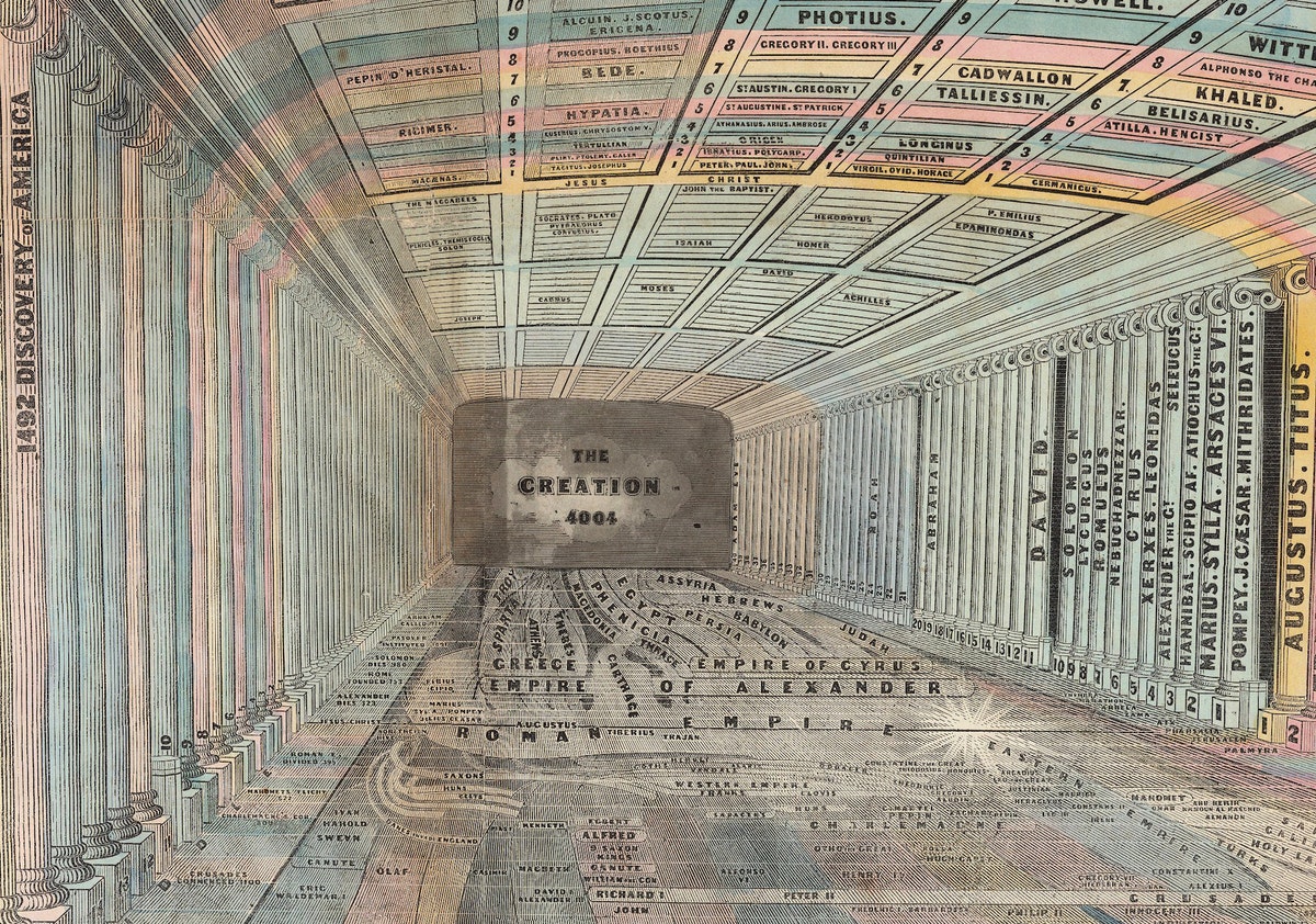
Emma Willard pioneered many maps/ graphics but the example I want to flag here is her ‘Temple of Time’. A normal timeline would have sufficed, but we wouldn’t be talking about it now.
Messing with Maps
Maps are full of distortions, but we are used to seeing them with north at the top. The sea is generally blue, the land green and all to often Europe is at the centre. You might ask why we should mess with these established norms if people are used to them – I would argue that if you can effectively disorientate the reader then you can get them to think much more deeply about the map. I’m not suggesting all maps should do this because done badly it’ll cause more harm than good, but here some examples that I think work well.
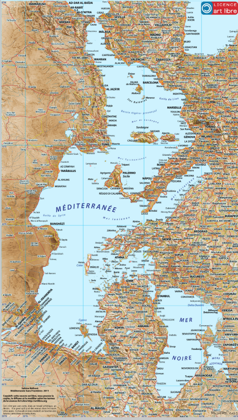
Sabine Réthoré‘s rotated Mediterranean completely threw me when I first saw it, and got me to really re-appraise my impressions of the region.

The ‘Spilhaus Projection‘ is one I really love and that we used in Atlas of the Invisible to show ‘One Stormy Sea‘. By pushing the land to the edges you get a single connected ocean view that would be hard to appreciate with a more traditional approach.
Inspired by Nature
Power in Imagery
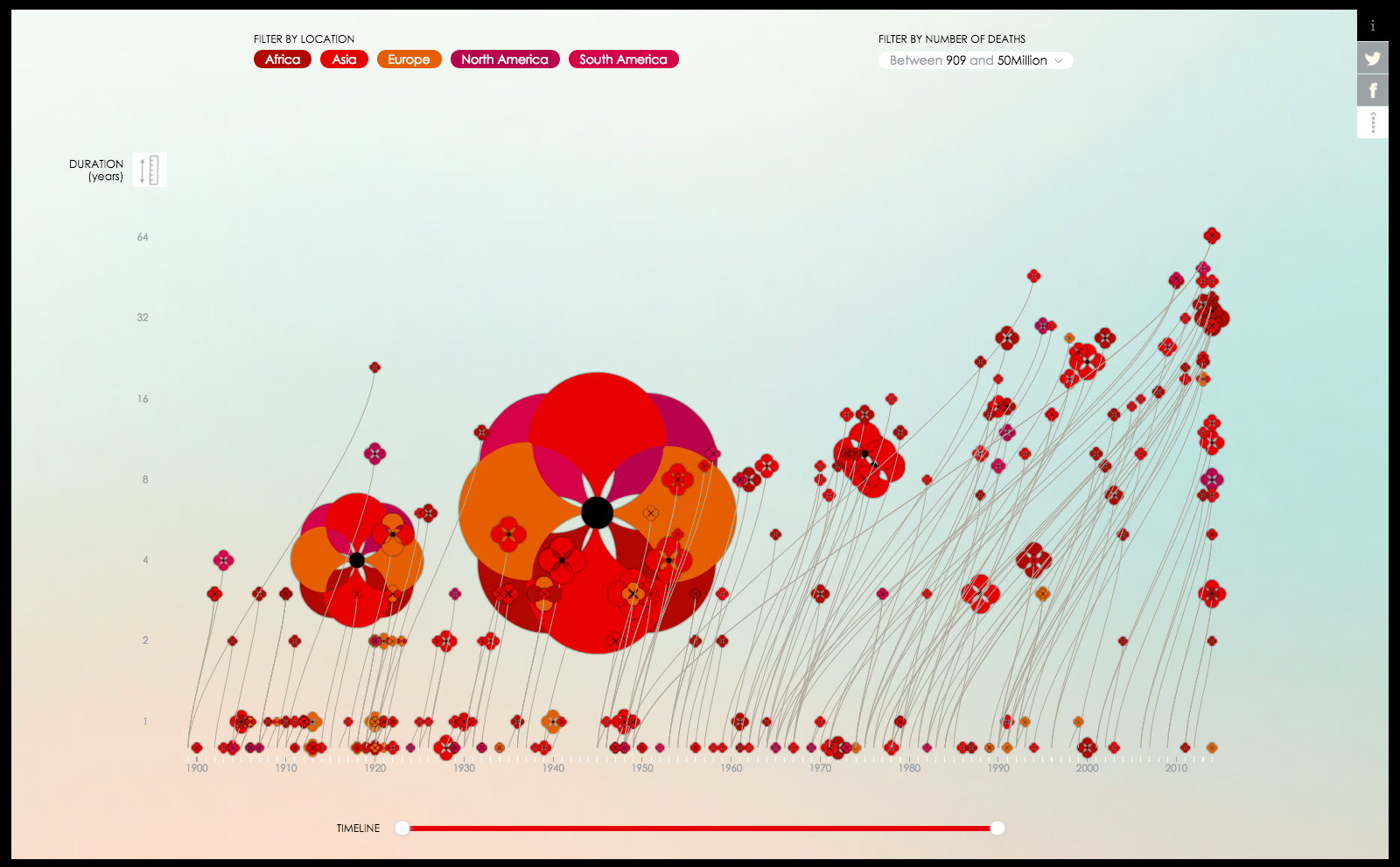
Valentina D’Efilippo’s Poppy Field chart is a multi-dimensional plot that charts the deaths during the Great War. Much of the data could be portrayed as a scatter chart with proportional symbols, but choosing the imagery of a poppy adds a powerful angle that leaves the reader in no doubt about the horrors of war.
Joy of Circles
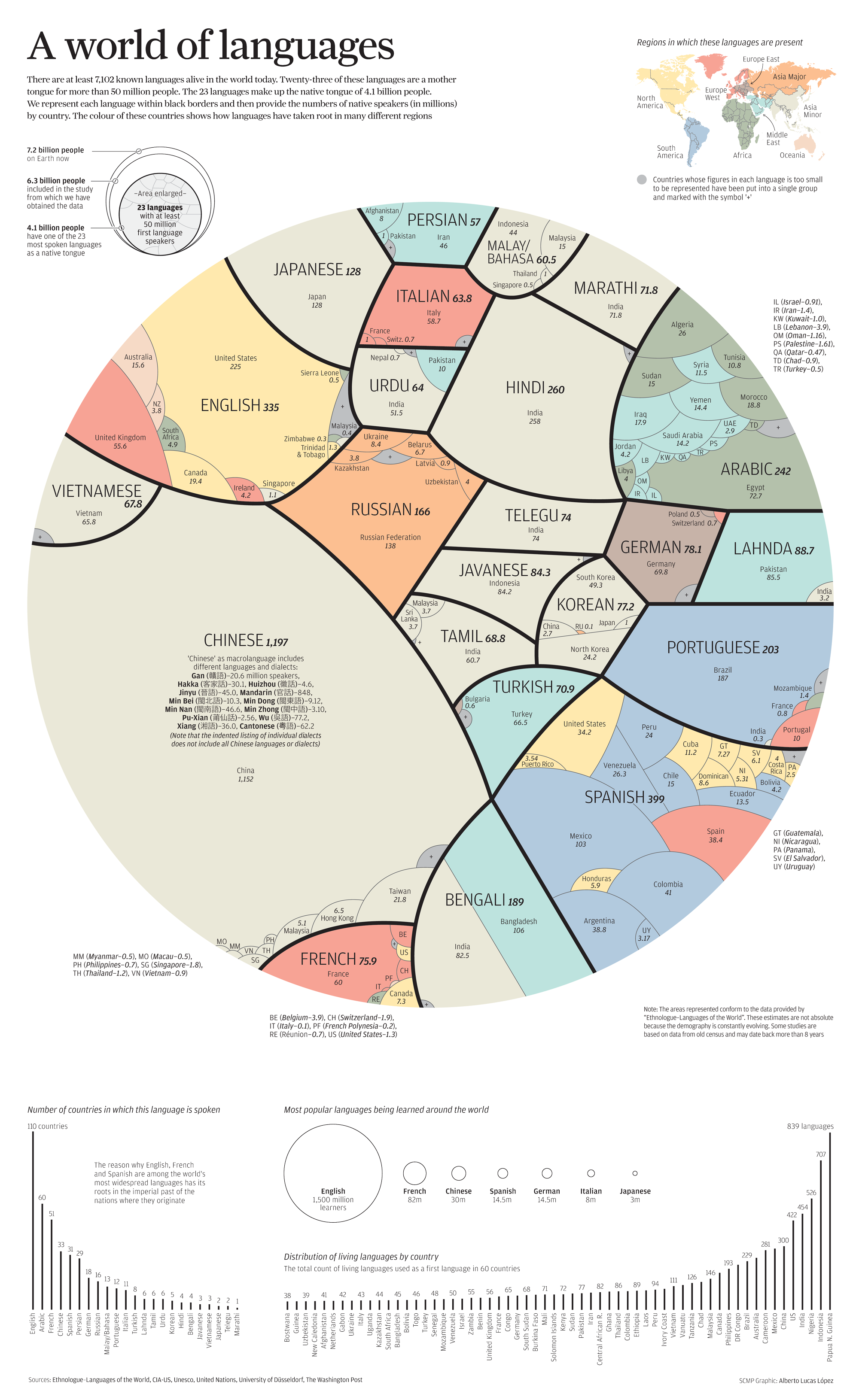
This SCMP chart of the world’s languages carves out proportions of a circle – a square treemap might have done it just as well, but visually would have lacked the appeal of this perhaps less precise approach.
Peaks and Troughs
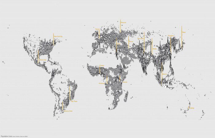
Finally, I created this map of world population nearly a decade ago to show it’s peaks and troughs. You can’t accurately establish the population of specific regions, perhaps as you might a choropleth, but that isn’t the point.
