I was recently asked to deliver a days training on scientific data visualisation. I spent a while scanning through papers to pull out what I see as the “7 deadly sins” of academic data visualisation (there are probably many more) .
These sins are rooted in a lack of time and training, an underestimation of the importance of data visualisation for conveying results and/or no real interest in producing good graphics. Frankly these reasons are perfectly understandable and I am not expecting academics to achieve excellence in design – that’s what graphic designers spend years perfecting. Instead, I am suggesting that we could all take a second look at our graphics in the light of these sins just to make sure they are easily understood and showcase the results of our hard earned analysis.
Rather than pick on anyone in particular, I have opted to feature my own published graphics here. I’m proud to say these are all a few years old now!
(1) The data dump

This is characterised by an attempt to show off the sheer volume or complexity of a dataset and manifests itself in overplotted points on graphs or enormous hairballs of interactions in network analysis. They often illicit an initial response of “oh wow that looks cool” but they are hard to understand. They make the point that the dataset is large and complex but that’s about it. The example above shows migration flows between countries in Europe. I picked it (and actually I don’t think it’s that bad) because it’s very hard to quantify interactions between countries amongst that mess of lines over France. Perhaps I could have used a chord diagram instead, or maybe small multiples for a selection of countries.
(2) 3D and (3) Duplication
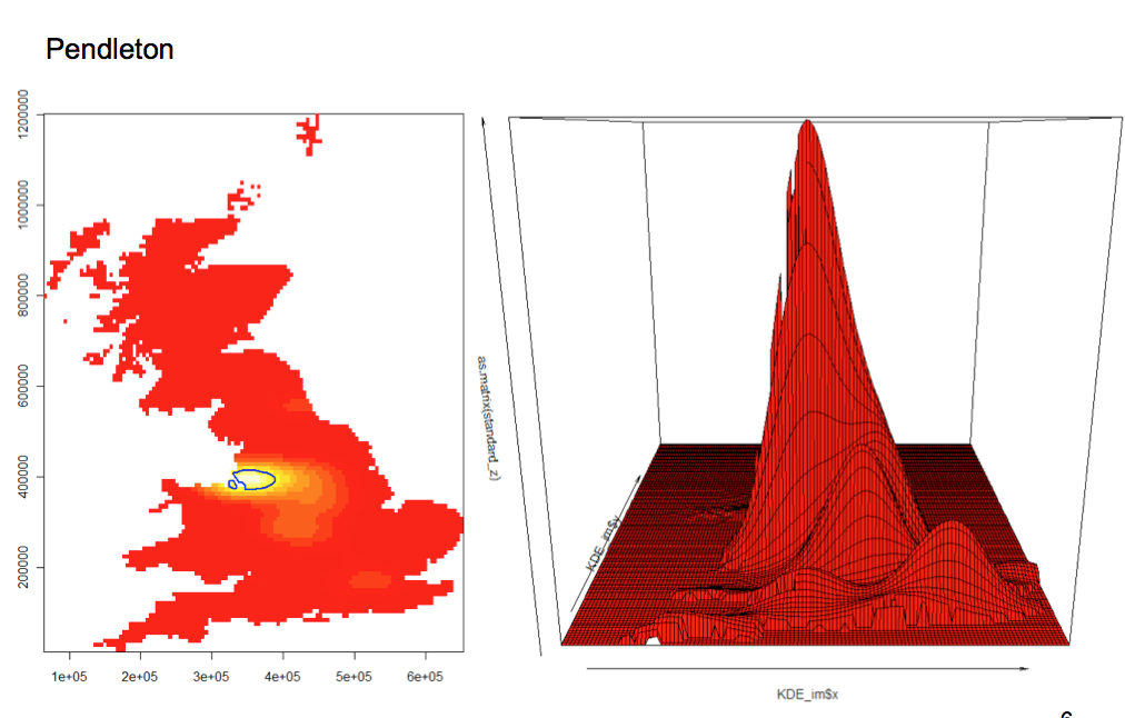
I’ve used this example – of the distribution of people with the surname “Pendleton” in Great Britain – to illustrate the sins of using 3D and duplicating information in two (or more) elements of the same figure. 3D plots take a lot of thought to work well in the static 2D environment of academic publications. You lose many of the benefits of the extra dimension since much of the data can become obscured or the sense of perspective screws up the perception of the increments along the axes. In my example you can see a series of humps over the areas of Britain where most of the Pendletons live – great! Except all the action north of the largest hump is lost.
To account for this I therefore felt obliged to commit the 3rd sin – that of duplication – in order to convey the full distribution. Both show essentially the same data and 2D does it better. With so little space for figures in articles it is important that each one is working hard for you – if there are overlaps in content/ data then seek to combine them.
(4) Poor labeling
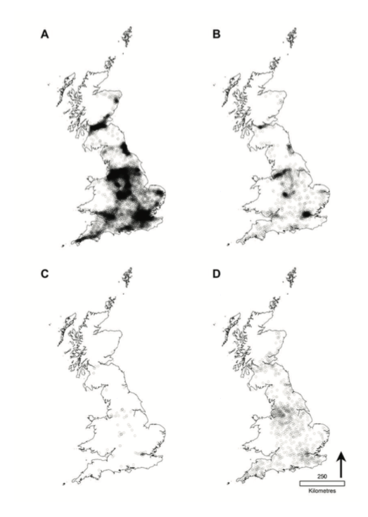
It is often the case that labels are left off graphics. Even the most basic scatter plot benefits from a label or two to highlight the most interesting data points. Well labelled plots make it much easier to explain the graphic in the caption or main text – it’s often the case that captions are filled with directions for the reader “see upper left” , “bottom right” etc etc these can often be avoided with a few well placed labels. The maps above clearly need labels – both for context (see below)- but also to help with interpretation. Map D, for example, shows toponyms so it could really benefit from me highlighting a few points by labelling the toponym they represent.
(5) Colour
I’m committing a multitude of sins with this map but I’d like to focus on colour. I think it’s still best to avoid colour where possible since black and white survives not just the printing but also the processing that journals often do to published graphics. As a rule rainbow colour palettes are pretty useless so should be avoided, as should colours that dominate (like my pink above). Certain disciplines seem to take a certain amount of pride in the number of colours they can cram on a graphic but people will struggle with more than 10. Try and keep the number of colours to a minimum, avoid clashes and take a look at websites such as Color Brewer for inspiration/ advice.
If a paper features a series of graphics it’s good to keep the same colours throughout. For example if red equates to a high value in the first graphic the reader will automatically assume the same rule applies throughout. If the colours jump around then that can cause unnecessary confusion.
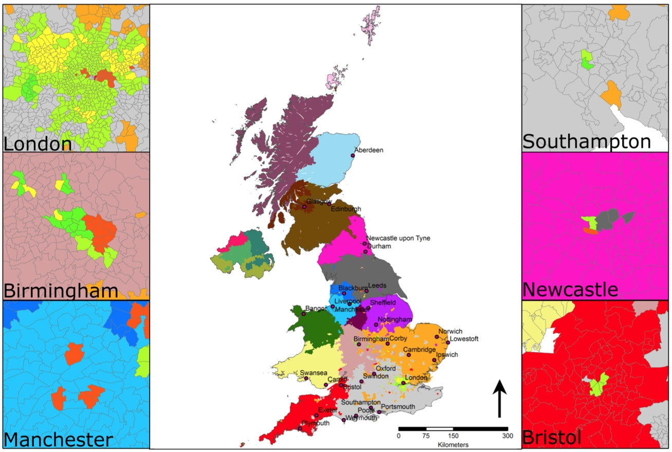
(6) Junk
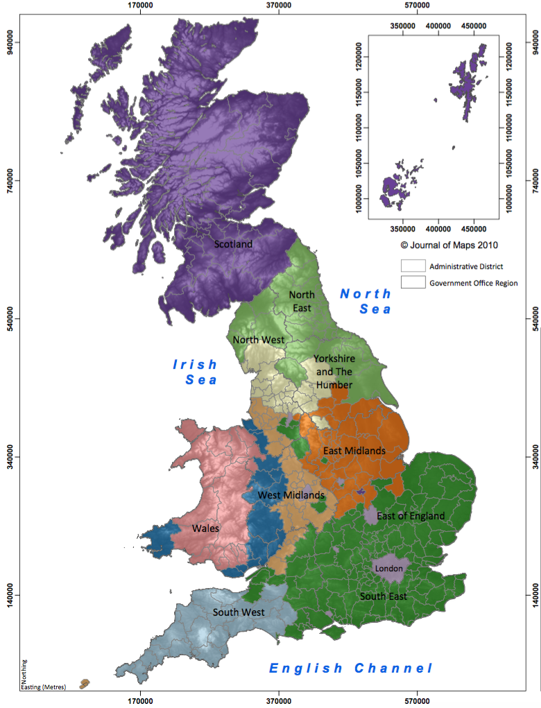
“Chart junk” comes in any forms but it can be defined as anything on the graphic that is surplus to requirements or that gets in the way of its interpretation. Every element of the graphic needs a purpose, if it doesn’t have one – beyond you thinking it looks “cool” – then it can be best avoided. The map above shows the results of a demographic regionalisation of Britain – all it needs to show is the different coloured areas. There is no real reason for adding the terrain data, which actually alters the colours of each of the regions. The journal required a graticule but I would suggest that can go and I’m not sure the labels for theatre bodies add much either. The administrative units shown as grey lines clash with the regional colours but I think they are useful here so if I did this map again I’d recolour and keep them.
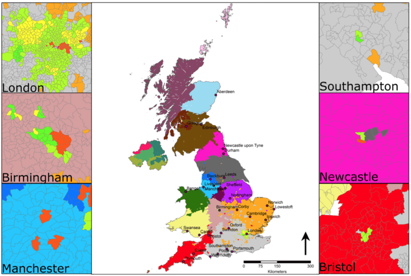
(7) Insufficient Context
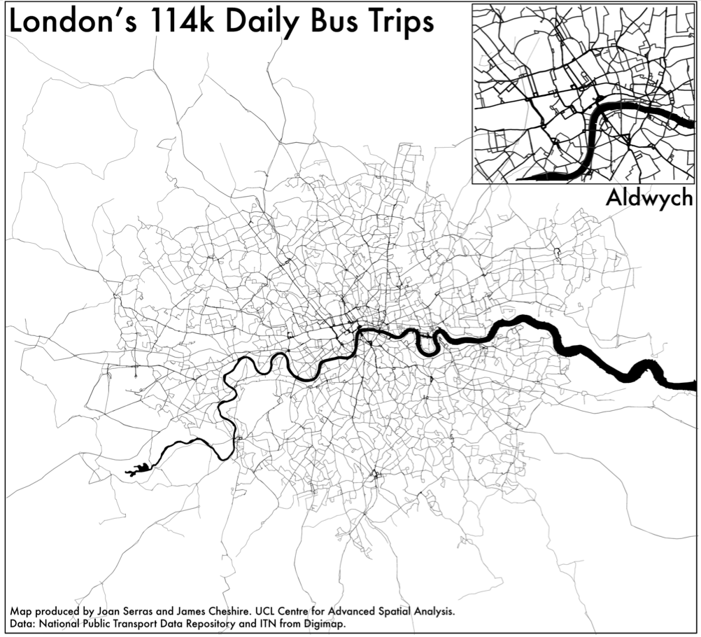
This refers to the need to orientate the reader to the part of the world you are studying (in the case of maps) and also to the orders of magnitude the data may be referring to. Labels can help a lot here as can inset maps/ graphics to show the entire data distribution or the part of a country the figure refers to. Most readers won’t know the study area as well as you do so they’ll need some help with orientation etc. The map above, for example would benefit from a box to show where Aldwych is on the main graphic to help link it to the inset and it also needs a sense of scale because the extent of the map could be 10 miles or 100 unless you are familiar with London.
7 Deadly Sins of (Academic) Data Visualisation