UPDATE: If you would like a detailed reflection on this, I have co-authored an article with Alex Kent entitled Getting to the Point? Rethinking Arrows on Maps. You can read it here.
This week I took to Twitter to offer a critique on way we might map (at the time of writing) the nearly 1 million people fleeing Ukraine.
It’s time to innovate the ways we show people fleeing war. 8 arrows for 874,026 human beings is not good enough. It’s also the same visual language we use for the invaders…It’s clear but shows just 8 (shocking) numbers: Poland: 453,982 Hungary: 116,348 Republic of Moldova: 79,315 Other European countries: 69,600 Slovakia: 67,000 Romania: 44,540 Russian Federation: 42,900 Belarus: 341
It’s had a great response so I wanted to set out some of my thinking a bit more and feature some of the responses to my critique.
The first thing to say is that I am not singling out the BBC here for particular criticism – they do great work – theirs just happened to be the map that appeared first in my timeline. Second, I think we should acknowledge that the Ukrainian crisis is not the first – and sadly won’t be the last – that requires us to map the movements of millions of people.
When we create a map or chart we should ask ourselves three questions:
- Who is it for?
- What will the map be displayed as?
- Why is it being produced?
These questions are important because they will influence the information we include, its design and how we might share it. For example you cannot use video if you are creating a map to be printed on paper, and you wouldn’t use very technical language with lots of detail for a map that might be shown for a few seconds on TV to encourage an evacuation to safety. Click here for more examples.
So lets look again at the BBC map with the above questions in mind.
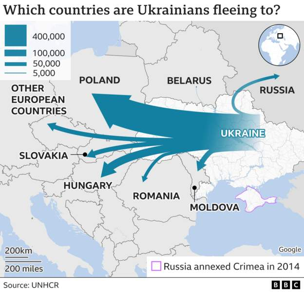
- Who: A global audience – probably one of the broadest and most global audiences there are. So the map needs to be easy to read, unambiguous and – crucially – factually correct.
- What: I think this is the biggest question that we overlook as consumers of these maps, but something that their designers have to grapple with. In this case the map needs to work as a thumbnail on social media, a slightly larger version on the BBC website and as an animation for the BBC News broadcasts. It needs to work the size of a postage stamp or a on an 86″ HD TV monitor. Nuance and detail are rarely options in this context.
- Why: To communicate the impacts of the invasion to as wide an audience as possible.
The map is effective based on these criteria – but I think it (and others like it) need to be looked at more critically to see how they might contribute to some of the more harmful narratives around migration.
Arrows
There’s an excellent piece by David Shariatmadari entitled ‘Swarms, floods and marauders: the toxic metaphors of the migration debate‘ that I thought of here – we often talk about a tide of migrants, which can be dehumanizing and a trope that the map – perhaps inadvertently – contributes to with the flow of blue cascading out of Ukraine*.
[*John Burn-Murdoch has questioned this association – for me I think its the combination of symbol + colour + language often used to describe such a map that gives this impression. On reflection the blue in and of itself is less of a concern (see The Economist’s map below, which I like. To follow discussion see here.]
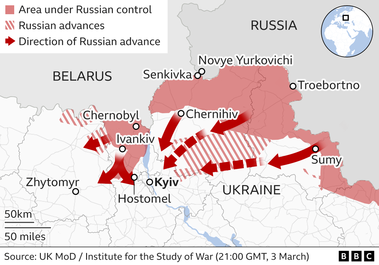
It also gives the sense of invasion – not least because the same arrows are used in the BBC’s maps of the Russian advance.
I have nothing against arrows and connecting lines, they can be extremely effective, but in these maps they over-stretch the data.
We have eight numbers – nothing more – that are simply the counts of people who moved from Ukraine to neighboring countries. If we had city to city flows – or even detail of border crossings and routes taken then arrows can help here, but we don’t. With more flows you need some sense of direction so arrows are useful or as the New York Times has done here you can use tapered lines.
The eight numbers (Poland: 453,982 , Hungary: 116,348, Republic of Moldova: 79,315, Other European countries: 69,600, Slovakia: 67,000, Romania: 44,540, Russian Federation: 42,900, Belarus: 341) are not so large they are hard to interpret, but large enough to be shocking and I think stand alone in their power. The BBC map groups them into 4 broad categories of unequal size.
The result is a loss of information combined with something that is a bit tricky to interpret – as you scrolled past on your phone, did you spot the second smallest category is 10 times larger than the smallest? This is immediately clear from the numbers.
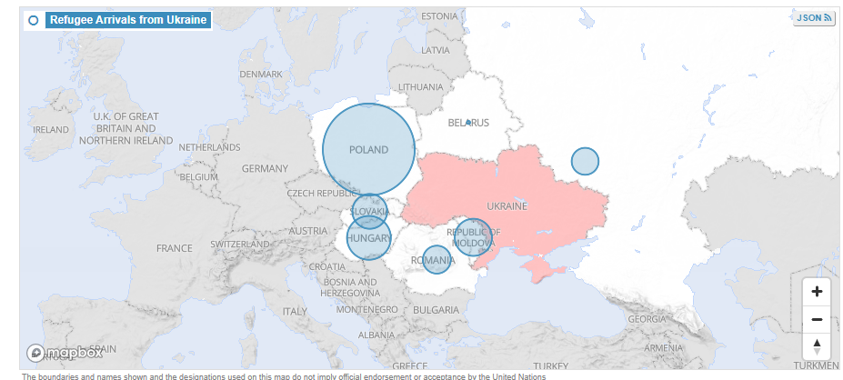
With the lack of precise origin and destination information we also have to avoid the trap that arrows can give us a sense of the journey or flow. All we know from the data is that a border was crossed somewhere between two countries. Proportional circles overlain on a basemap, the approach taken by UNHCR, avoids this issue.
What can we do?
So how might we create more human, less stereotypical maps of people fleeing war, whilst still remembering the checklist of Who? What? Why?
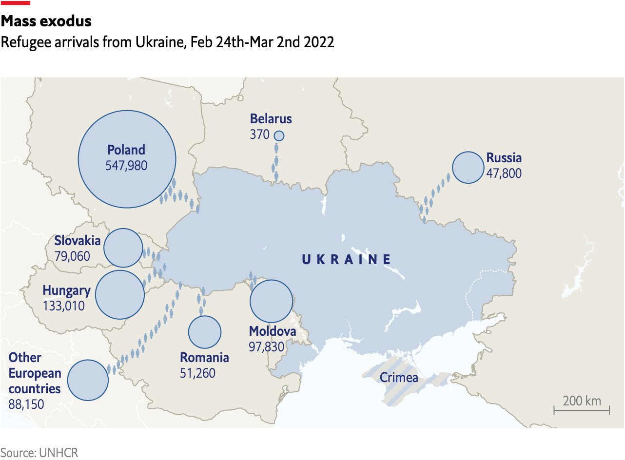
Financial Times: Precision and Flow
This from The FT is a huge improvement – it keeps the dynamism and movement but it keeps the precision we have in the data.
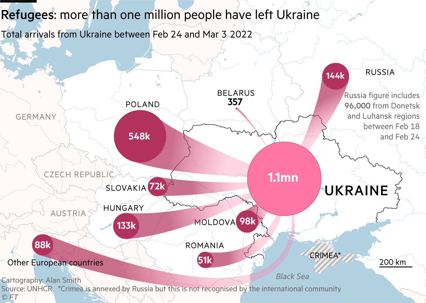
They report the actual numbers – as well as the total over Ukraine – and sit the circles over the centre of each country to make it clear we have no more precise data on where people have moved to within countries. The choice of colour keeps us well away from the water imagery (tide, flood etc) we are so used to hearing and could do without.
Greater Humanity
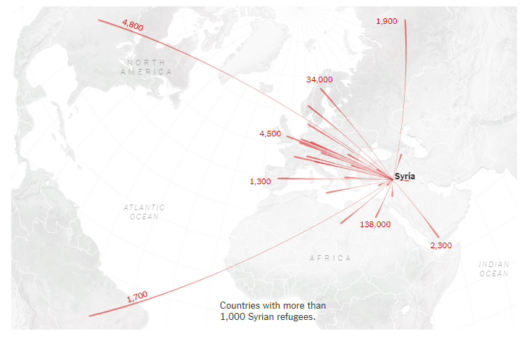
An arrow or a line on a map can never capture the depth and diversity of experiences people have had following Russia’s invasion. The fear, the cold the uncertainty are best shared through words and pictures, but we can think about giving visual reminders that the arrows represent people and not something abstract or distant. In Atlas of the Invisible these are some of the issues we grappled with when trying to show cross border movements from Syria and opted for icons and smaller arrows. I reflect on the responsibilities of creating the map in this video.
So what are the other ideas people have had?
Ken Field responded with a map that breaks the arrows into dots to each represent 100 people.
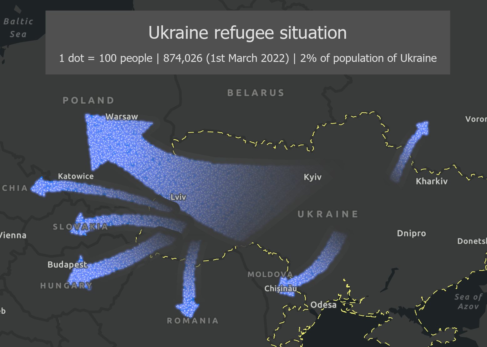
It’s more abstract than using icons and serves to soften the arrows a little. With animation, perhaps to show the numbers increasing over time, it certainly underlines the numbers involved.
Daniel Huffman suggested the use of icons – in this case isotypes – to give a sense of the numbers.
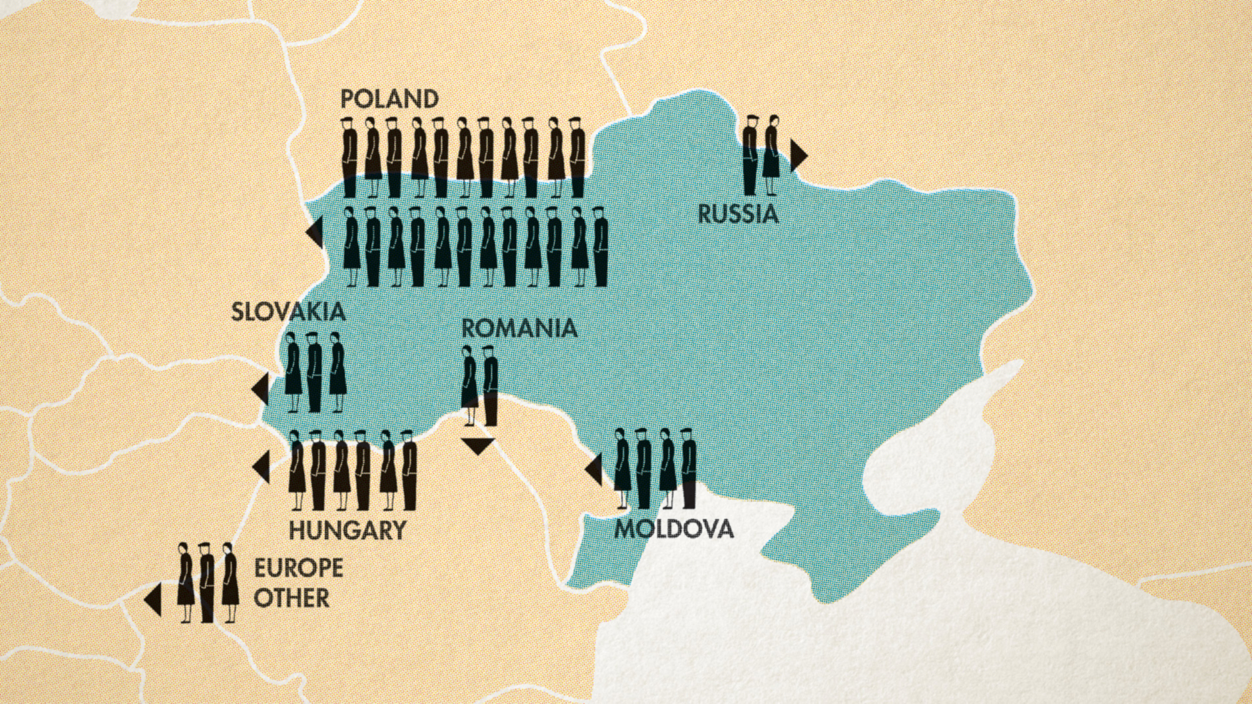
The overall impact is less dramatic than sweeping arrows (I quite like that) but it slightly risks leaving people wanting more information – how many women vs men vs children have left Ukraine, for example? Can they be shown in the icons?
The final example from The Economist combines all of the ideas above.
Small icons give the immediate sense of people on the move but are abstract enough for people not to hanker for more detailed demographics, they are moving to the centre of countries shown as proportional symbols with the exact figures and there is no sense of using arrows etc for dramatic effect – things are dramatic enough already!
Joshua Stevens has posted a great response to these points – see here.
A Couple of Final Examples
It is impossible to create maps that can truly share the full complexity – and horrors – of war and there is a place for more abstracted representations of it, especially in breaking news situations. After all the maps often supplement text, video and images that are able to offer the important personal experiences much more effectively.
That said, here are a couple of inspiring examples of maps that do add the extra layers or detail or capture the human element lost to arrows.
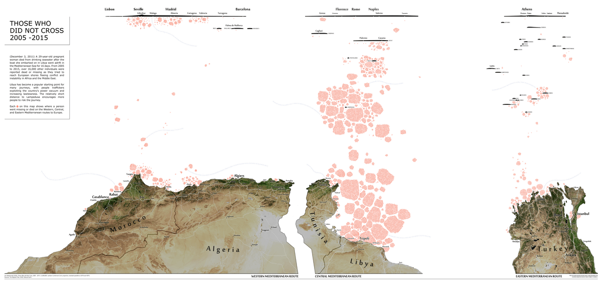
One of my favourite is Levi Westerveld’s Those Who Did Not Cross that attempts to visualise the extent of the deaths in the Mediterranean as people attempt to cross to Europe. He has made some compromises around the precise locations of shipwrecks and so on, but that doesn’t matter. What we see here is the scale of the toll.
This ESRI Story Map The Uprooted is a nice example of combining a range of media – with the maps front and centre – to help communicate the breadth and depth of the journeys taken to Europe around 2016.
Both maps however take much more time to make than the BBC one and only work in specific formats so they won’t be reproduceable in breaking news stories, but there are elements we might take forward and develop when we think more carefully about how to show human flows.
For more on Ukraine maps…
This is an interesting article from Mateusz Fafinski worth checking out.
