I often liken the process of creating data visualizations to a game of snakes and ladders – you can race up the board with a great dataset only to land on a tricky issue with software that slides you backwards. And there’s always the longest snake lurking a few turns from the end – the realization that the map or graph just isn’t working for the audience and you will need to return to square one.
When starting out it can feel like there are many more snakes than ladders and this sense of frustration can be compounded by the fact that we only really share the successes – or at least the maps and graphics that made it out the door. But behind every success will be graphics that failed.
As I scroll past the many amazing maps and graphics I see online I need to remind myself it can be rather like aspiring to the ‘perfect’ lives of Instagram influencers without zooming out to realize what’s really happening behind the camera.
In recent weeks I have had a few people ask about challenges I’ve faced or to give examples of graphics that didn’t work out, so I thought this would be a good excuse to share some outtakes from my work on Atlas of the Invisible.
What made it into the book – both the text and the graphics – really is just the tip of an iceberg created from late nights shouting at crashed software, long days staring blankly at a spreadsheet or hours spent on drafts that were later pushed aside!
As well as the examples below, Oliver and I discussed a couple more with the amazing John Grimwade for his Infographics for the People blog.
Go with the flow
When I was looking for some examples to feature in this post I happened upon this list of files – I recall they were the images I’d created of glacial flow lines after a tough day of coding.
‘BOOM’ is my file naming convention of choice when I think I have decisively solved a problem…it turns out that I needed a further 8 attempts and by looking at the time stamps another 7 hours to get to the final version!
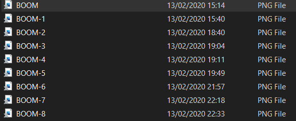
This was just the flow lines for this map, there were many hours of additional layering and design to follow.
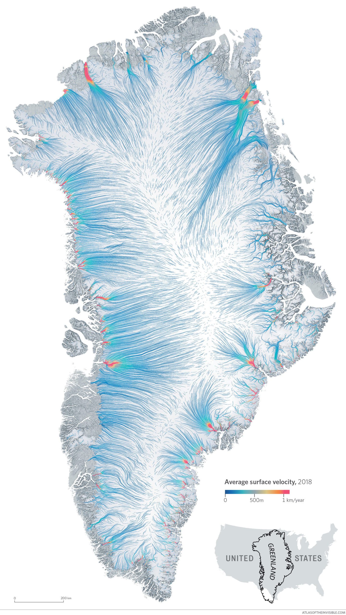
As it happens I also discovered the folder also contained probably one of the most beautiful outtakes – a map of the ice flows in Antarctica.
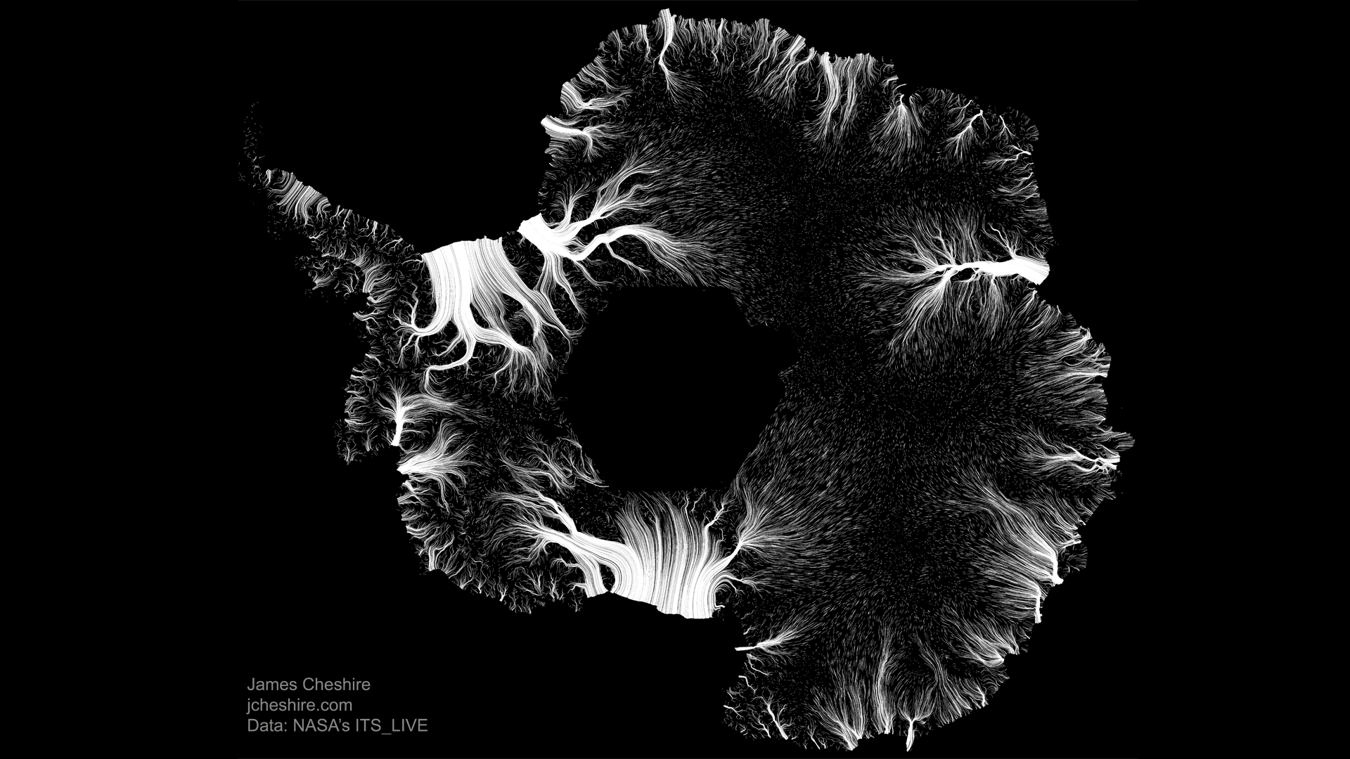
I think it works nicely as a standalone image, but it didn’t make the cut because we wanted to feature both Greenland and the Juneau Icefield as they told us the stories we were most interested in telling about accelerating ice in the face of climate change.
Too much shipping
Oftentimes you need to put significant effort into a preliminary idea to be able to decisively discard it as something that won’t work out. The image below is of shipping traffic around Denmark and it was created from an ENORMOUS dataset that took an age to download and format in order to map.

For whatever reason I just wasn’t feeling it – I didn’t know enough detail about the shipping lanes and boat behaviours to create the compelling narratives we aspire to. The data needed some cleaning up, which I wasn’t sure how best to do and we already had maps in the book that covered shipping routes, shipping’s impacts on the weather and also fishing. If I could have mastered a stronger story for this one it would have made it into the book at the expense of another on a nautical theme (we wanted a variety of topics). The draft made us question our choices again and feel firmer in our decision about what to include – and what not to.
Never a walk in the park
Of course, there are many more examples, but this final one eclipses them all as an example of when it’s sometimes best to let something go…hard though it is.
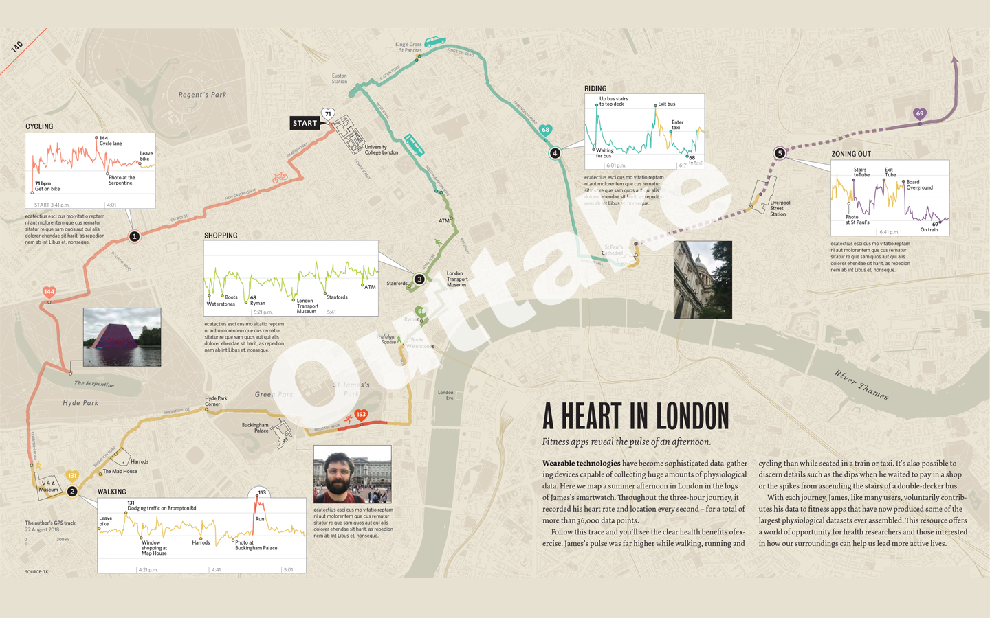
The map above is pretty much finished and it shows a long walk, short cycle, bus ride and finally train ride I did around London on a hot August day in 2018. The idea behind it was to demonstrate the various ways that fitness apps and sensors in your phone can track behaviour and be used to determine the modes of transport someone might be using. We triangulated these with images I took along the way.
So this is an afternoon puffing around London to collect the data, plus then a couple of days of processing it and creating the final map. It also felt quite personal to me and it told a bit of a story about parts of the city I enjoy visiting etc. We wanted it to be a relatable example of what our data can reveal, the privacy implications of such technology, and so on.
The initial reaction from our editor was that rather than being relatable the map was a bit random – why is my walk a story worth telling?
We then remembered that the US Military had doxed themselves with a fitness app…which even I had to admit was a much more interesting and compelling way of sharing the perils of tracking data, so my walk was cut. I consoled myself that at least it wasn’t raining that August afternoon…
