Skip to content
James Cheshire
About
Blog
Teaching
Papers
Tag:
Population
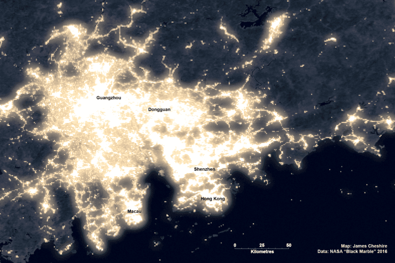
The era of the megalopolis: how the world’s cities are merging
Nov 24, 2022
How England’s complicated political geography is confusing coronavirus rules
Aug 12, 2021
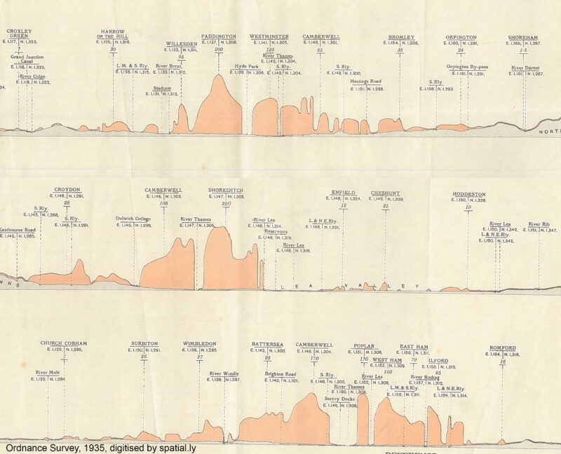
London's Population Profile in 1935
Nov 10, 2017
Joy Division, Population Surfaces and Pioneering Electronic Cartography
Jul 28, 2017
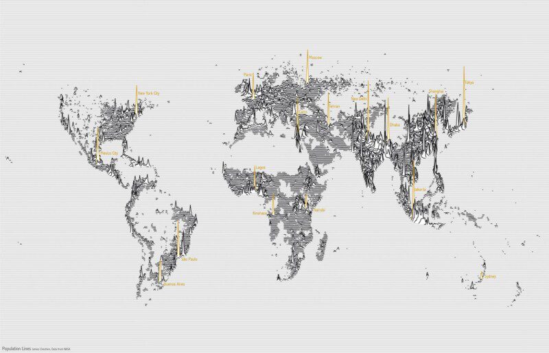
Population Lines: How and Why I Created It
Apr 27, 2017
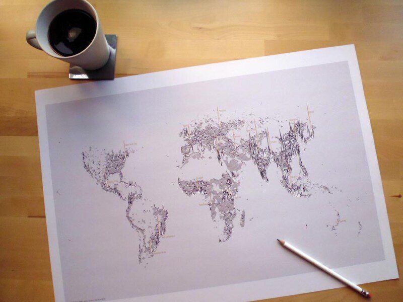
Population Lines Print
Aug 18, 2014
Sensing the City: Mapping London's Population Flows
Apr 26, 2012
Mapping London's Population Change 1801-2030
Feb 16, 2011
R interface to Google Chart Tools
Jan 10, 2011