James Cheshire, UCL and Alex Singleton, University of Liverpool
As England emerged from its second national lockdown in early December, Boris Johnson, the UK prime minister, faced an onslaught of questions from MPs on both sides of the House of Commons. Each demanded clarity on what the arrangements would be for their particular constituency under the multi-layered tiers that would impose different COVID-19 restrictions on different areas.
They saw an ad-hoc logic behind the system outlined in the bill they were being asked to vote into law. In some cases – such as in Kent – restrictions were too general. In others – such as Slough – they were too specific.
Johnson responded by saying future restrictions would be “as granular as possible … to reflect … the human geography of the epidemic”. In theory, a more localised tiered approach is exactly what is needed once national infection rates come under control. It rekindles the “whack-a-mole” strategy for the flare-ups Johnson referred to earlier in the year. In reality, however, the government – like the rest of us – is looking increasingly confused by the complicated geographical units used to govern and map the country.
It could opt for obscure statistical units that best capture local outbreaks but that few people understand, or choose from a long menu of options used by local or national government. There’s something of a pick ‘n’ mix strategy at present that betrays how the UK’s geographic units were designed by different bodies, with little coordination, for a whole range of conflicting purposes – none of which were managing a pandemic. The result is a confusion of seemingly conflicting messages across government communications.
This is not helped by the fact that maps based on the same data produce very different pictures of the crisis if you split up the country differently. Depending on the size of the population of the area, you can come out with an infection rate as low as 295 per 100,000 people or as high as 736 per 100,000.
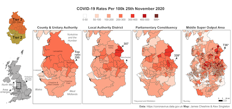
For this reason, scientists tracking the spread of the virus prefer to use units that encompass roughly the same number of people, which are geographies developed for the census (so called “output areas”). This approach has several advantages. COVID-19 hotspots can be linked to other contextual data, for example, such as on the ethnic makeup or the deprivation of an area.
But these units are not how the country is governed. For that, England is divided into constituencies and counties and “combined authorities” – to name just a few of the different units of governance. Map COVID-19 rates across these boundaries and you will get even more different infection rates, since a constituency can include a densely packed town and a sparsely populated rural area, for example. It’s an impossible problem to solve, but it can be managed through consistent policies and geography.
This is important because, as we’ve seen, local councils, MPs and metro mayors want to negotiate their own lockdown terms. Many combined authorities (city regions) are bristling at being treated as similar even if they are experiencing significantly varying disease patterns at local levels.
In London, many are questioning the rationale for treating the entire capital the same and cracks are appearing in the one-size-fits-all approach. Greenwich council, for example, entered into a heated argument with central government over its unilateral decision to close schools.
These disagreements show what happens when there is confusion about how data on infections should be interpreted. And when local, regional and national governments can’t agree, the public becomes confused too. That reduces compliance with the rules and ultimately allows the virus to spread more rapidly.
The law that England’s tiered restrictions are based upon has done little to simplify things. It previously listed the geography of counties and unitary authorities, but the public communication included the larger and more regional geography of combined authorities. The most recent legal amendments that have placed Greater London, and parts of Essex and Hertfordshire into Tier 3 are, in some cases, being set at a different geography again. The likes of Rochford District Council now make the list, for example, rather than being included in the broader Essex County Council as it was previously.
If more localised restrictions are to have a fighting chance of success, they need to do a better job of reflecting this complex and conflicting geography, even if only to give a clearer picture of how COVID-19 is spreading. The government would then be able to better communicate why particular restrictions are necessary to help control the pandemic. If people are told clearly why, and where, restrictions are being applied, they are much more likely to comply – potentially saving their own lives and the lives of others.
James Cheshire, Professor of Geographic Information and Cartography, UCL and Alex Singleton, Professor of Geographic Information Science, University of Liverpool
This article is republished from The Conversation under a Creative Commons license. Read the original article.
