Click here to access the Google Doc of these resources.
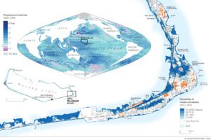
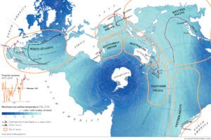
The ‘One Stormy Sea’ graphic shows the world’s oceans as a single whole – not split into individual parts such as ‘Atlantic’ or ‘Pacific’. This is important because what happens in one ocean can impact on another thanks to the currents that connect them.
Focus on the map showing sea surface temperature anomaly. The different colours show how sea surface temperatures in 2019 compared to long term averages around the world.
Grey shows seas where the surface temperatures have decreased. Give two areas of the map where sea surface temperatures have decreased slightly.
Area 1:
Area 2:
Think about the impact global warming is having on ice. How could this be linked to the decrease in sea surface temperatures in the areas you identified?
Seas that have seen the greatest increase in surface temperatures are shown in dark red. Give three areas of the map where sea surface temperatures have increased.
Area 1:
Area 2:
Area 3:
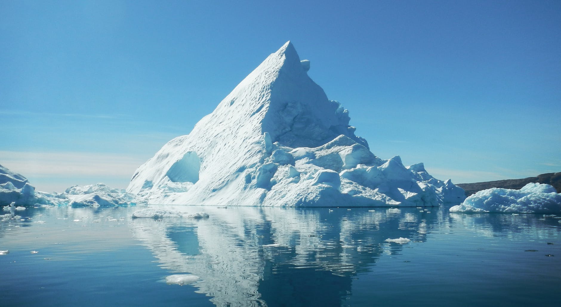
In 2019, waters in the Arctic exceeded their historical average by seven degrees Celsius. Waters around Antarctica haven’t experienced the same rapid warming. Think about the characteristics of these two places; what could explain the difference in rates of warming?
Sea ice reflects radiation, whereas open sea absorbs it. How does this lead to a positive feedback loop in terms of global warming?
The One Stormy Sea maps show the world’s oceans as an interconnected body of water rather than as separate oceans and seas. What are the advantages and disadvantages of looking at the oceans in this way?
Advantages:
Disadvantages:
Click here to explore sea temperatures further.
Guided reading
Quote 1: ‘Sit in the sun in a dark suit and you will feel the ocean’s burden‘
The albedo effect refers to the reflection or absorption of radiation by different surfaces.
In the statement, why…
… does the dark suit make you hot in the sun?
… is the ocean getting hot?
Quote 2: ‘Like heads of a hydra the effects multiply’
The hydra is a beast from mythology. When one of its heads is cut off, two more grow back.
In the statement, why are the effects of ocean warming described as being like heads of a hydra?
Quote 3: ‘Hundreds of hypoxic ‘dead zones’ have jeopardized fisheries and food chains’
Hypoxic ‘dead zones’ have low oxygen levels, so few organisms can survive. Jeopardizing something means putting it in danger.
How could these dead zones endanger…
… fisheries
… food chains?
Quote 4: ‘Storms have swelled in size, force and saturation; and these monster storms are lingering longer after landfall.‘
Why are these storms increasing the likelihood of flooding?
Tropical storms
Look at the One Stormy Sea map.
What are the names of the seven distinct regions of the oceans in which tropical storms form?
Look at the key to find out about sea temperatures around the world. What is the relationship between regions in which tropical storms form and sea temperatures?
Look at the paths of the two costliest storms on record in terms of property damage, Harvey and Katrina. What part of the world did they affect?
Look at the path of Nargis, the most deadly named storm in decades. What part of the world did this affect?
The graph shows how the number of tropical cyclones has risen dramatically this century, with many of the costliest storms occurring since 2005. How is this pattern thought to be related to the warming of the oceans?

The ocean in a square
Look at the One Storm Sea maps. They show the oceans as one body of water and are centred on Antarctica.
Different ways of presenting maps are known as map projections. This projection is based on the ‘Spilhaus projection’ which was created in 1942. You can find out more about this map projection here.
Map projections can make a big difference to the way people see the world. Different projections centre different places and exaggerate the size of different places – no map projections are perfect. You may like to explore the real size of different countries using this website.
Map projections can be a political tool – they affect the importance people attach to different locations and can be used to divide or bring people together.
Most world maps used in the UK use a projection that centres on the UK. Popular projections such as the Mercator projection stretch countries further away from the Equator, making them appear larger than they are. How may this affect people in the UK’s perception of their country?
How might the map projection used for the One Stormy Sea maps affect people’s perception of the oceans?
The global ocean conveyor belt keeps the oceans in constant motion. Thermohaline currents (driven by differences in temperature and salinity) in the depths of the ocean and surface currents driven by the wind combine to move water around the world.
This conveyor belt also transfers heat, carbon dioxide and nutrients around the oceans. Changing ocean temperatures could cause elements of this conveyor belt to break down, which could lead to changes including the UK not being warmed by the Gulf Stream and phytoplankton lacking the nutrients needed to survive.
How could the ‘Spilhaus projection’ be used to make people more aware of the global ocean conveyor belt, its importance and how it is threatened?