Mapped: Journeys to Work
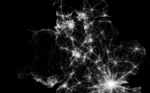
Today the Office for National Statistics released the long awaited journey to work data collected by the 2011 Census in England and Wales. Here it is in all its...
Today the Office for National Statistics released the long awaited journey to work data collected by the 2011 Census in England and Wales. Here it is in all its...
Last October I was fortunate enough to be awarded an ESRC “Future Research Leaders” grant. These run for up to 3 years and offer the opportunity for...
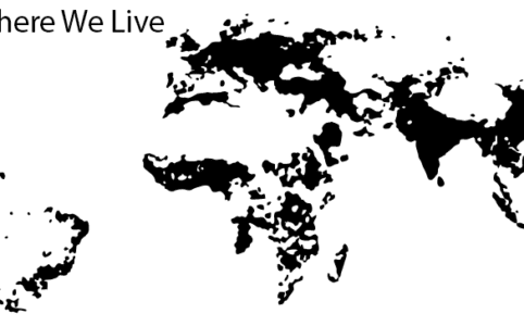
Showing where we live is, of course, one of the oldest and most useful reasons to create a map. As we bask in the “Big Data” era, the trend for mapp...
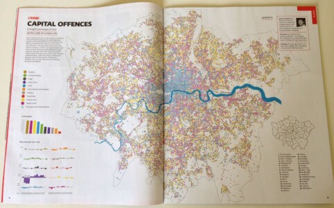
I was delighted to be asked to be part of the the Financial Times Magazine’s special graphics issue. It is a really great “celebration of visual cul...
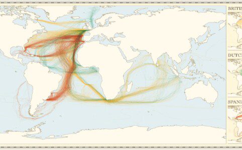
One of the most popular set of maps I produced last year showed English, Spanish and French Shipping between 1750-1800. I am pleased to say it has been revamped...

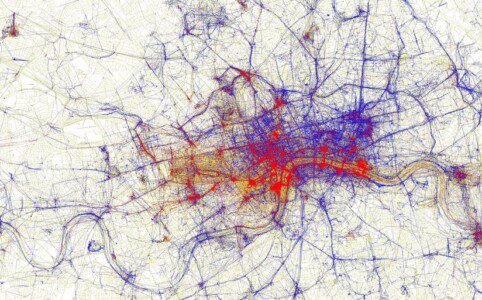
This map shows the geography of fire engine callouts across London between January and September 2011. Each of the 144,000 or so lines represents a fire engine ...
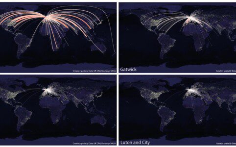
The stunning map depicting global flight paths produced by Michael Markieta has proved extremely popular (over 13k shares on the BBC when I last checked). The d...
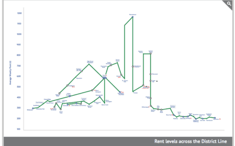
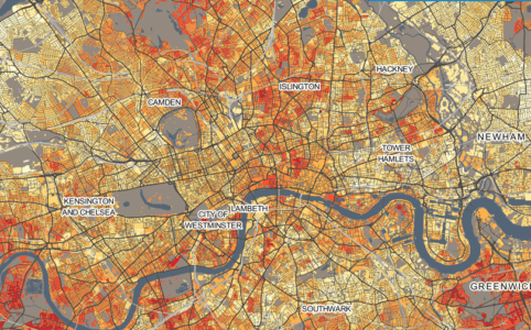
Most government statistics are mapped according to official geographical units. Whilst such units are essential for data analysis and making decisions about, fo...
The publication of the International Benchmarking Review of UK Human Geography back in March was a major event for the discipline. The report concludes that the...

Following the interest in our Twitter Tongues map for London, Ed Manley and I have teamed up with Trendsmap creator John Barratt to offer this snapshot of New Y...