Showing where we live is, of course, one of the oldest and most useful reasons to create a map. As we bask in the “Big Data” era, the trend for mapping population is increasing simply because there are more data points out there, the bulk of which are generated by people. Population distribution is important because, as xkcd wittily illustrates, if you were to map these points without accounting for it you often just get a population density map.  Or worse still, you think you are creating a map that represents the whole world, but instead you only get the parts of it where people are connected to the internet. Such maps are considered unsurprising by many (in spite of their hype) because simple maps of raw counts rarely offer surprising insights in the phenomena the map is trying to articulate. For examples of this there are some great maps (and data) of Wikipedia entries vs population density here.
For this post, however, I want to ignore the many new datasets out there to pick out some of my favourite maps that intentionally show where we live. I equate mapping population to trying to take an original picture of the Taj Mahal or the Statue of Liberty – so many people have done it before that it is very hard to produce something that offers an unseen view or perspective. The maps below have done just that (for me at least) and offer an important reminder of where the bulk of the world’s population reside – many of whom are forgotten by the representations of “Big Data” we in the “West” are now becoming accustomed to.  The first map (above) one I produced from NASA’s population grid. It shows population density by line of latitude. When I saw it plot for the first time I was amazed at how effectively it captured the key headlines of the world’s population distribution (most people live in cities, and there are lots of them in Asia). It was designed as a print for sale and also to be the front cover of this years Royal Geographical Society’s Annual Conference with the theme “Geographical Frontiers”. I felt the spikes on the map above represented the many new frontiers that exist within our growing cities – geography is no longer about exploring the natural environment.
The map below entitled Dencity was produced by Fathom Information Design and uses a similar gridded dataset to the one above. Instead of lines, they have used coloured circles of different sizes to show population density. Even though their use of the Mercator projection has expanded the northern areas where few people live and squashed the more densely populated areas nearer the equator, the map still offers a dramatic representation of world population. The use of different sized circles really adds to the “dens(c)ity” effect. 
An often quoted line from Jacques Bertin is that “great design tends towards simplicity” and this is a concept that has become fundamental to the principles of cartographic design. The map below captures this perfectly. It was produced by Derek Watkins but is an interactive recreation of “Islands of Mankind” by Bill Bunge. Its message is the same as the two above but it has only used black and white to communicate it. 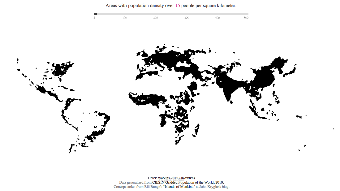
This next map is not a cartographic masterpiece by any means but it is a great example of how a map can create a powerful headline that alters our perceptions of the world (it certainly did mine).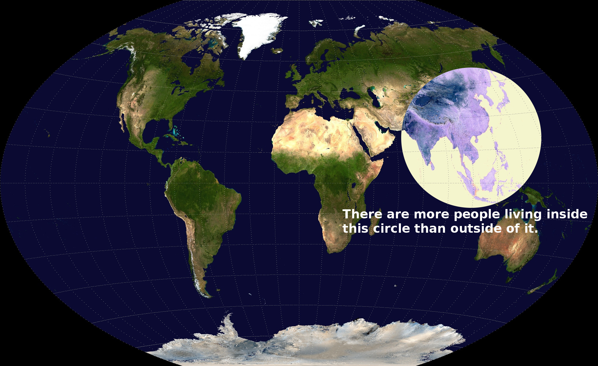
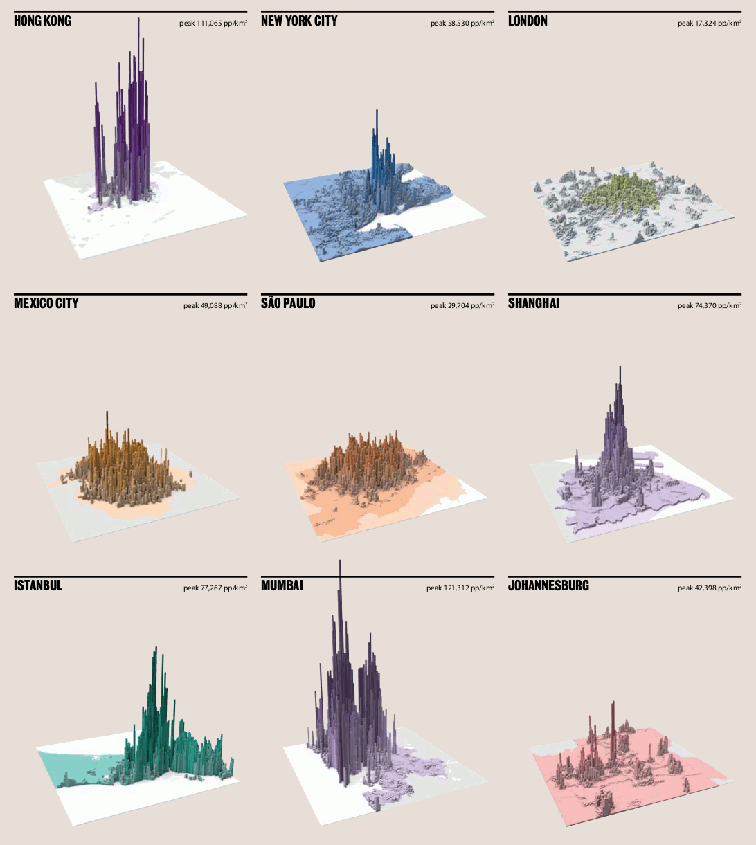
And if you wondered how so many people can fit in such a small area, take a look at these maps of “residential urban density” produced by LSECities. They clearly show that cities, such as London, have a long way to go if they are to match the likes of Shanghai and Hong Kong in terms of high density living.
Mapping Where We Live
Tags

James Cheshire is Professor of Geographic Information and Cartography in the UCL Department of Geography and the inaugural director of the UCL Social Data Institute. A world-leading map maker and geographer, his cartographic creations have been enjoyed by millions.