Skip to content
James Cheshire
About
Blog
Teaching
Papers
Tag:
UK
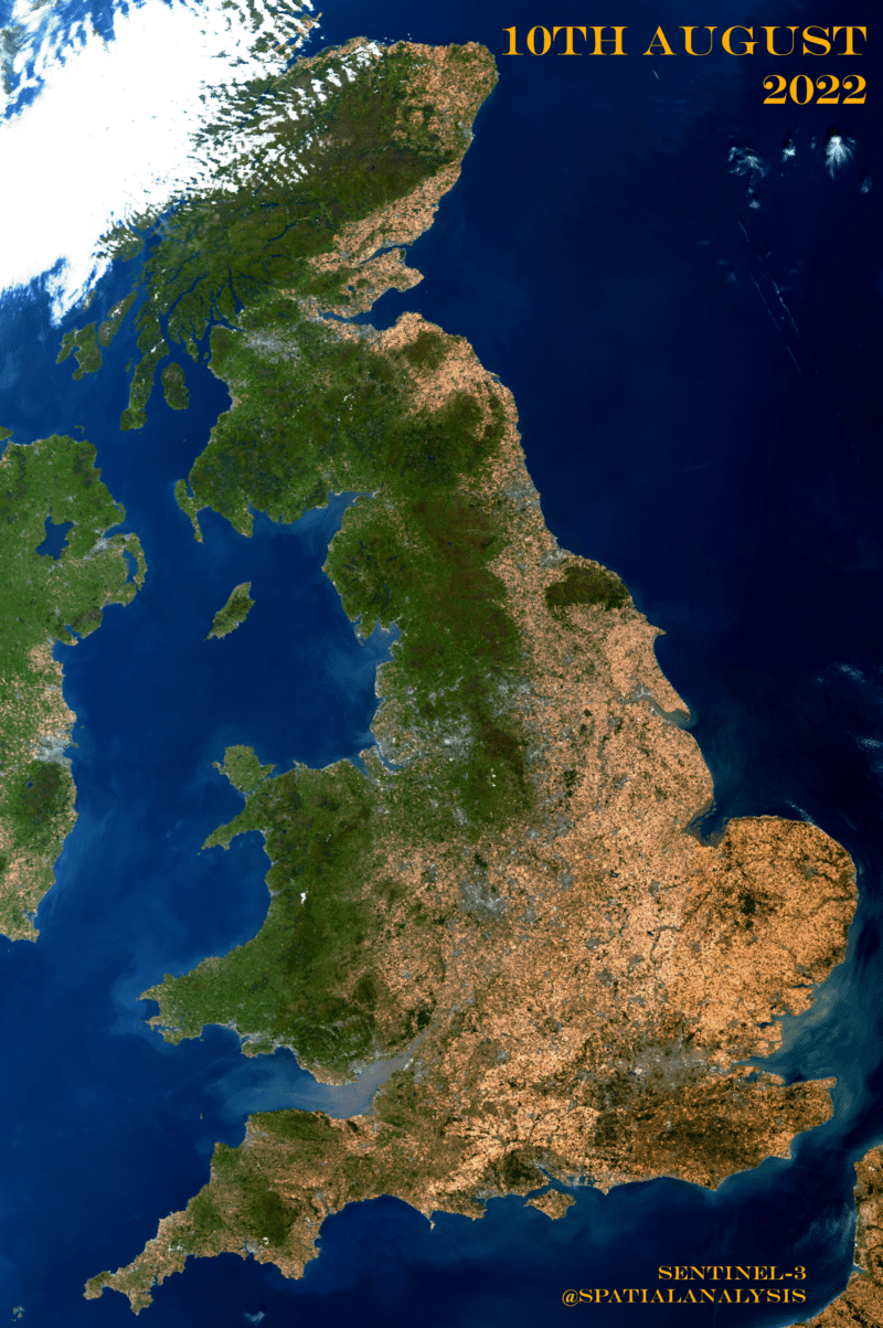
The Scarred Landscape of the Climate Crisis
Aug 10, 2022
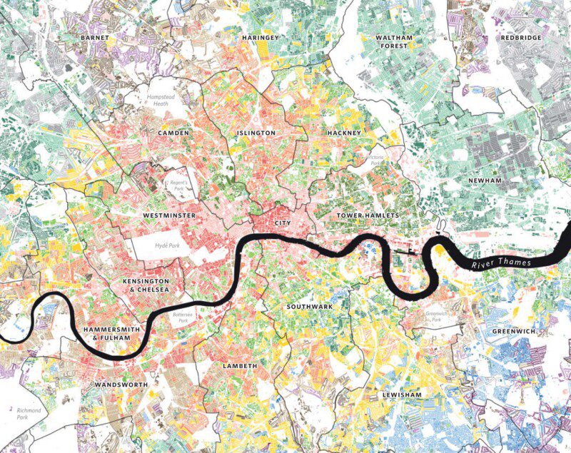
Useful Geographic Datasets
Oct 27, 2016
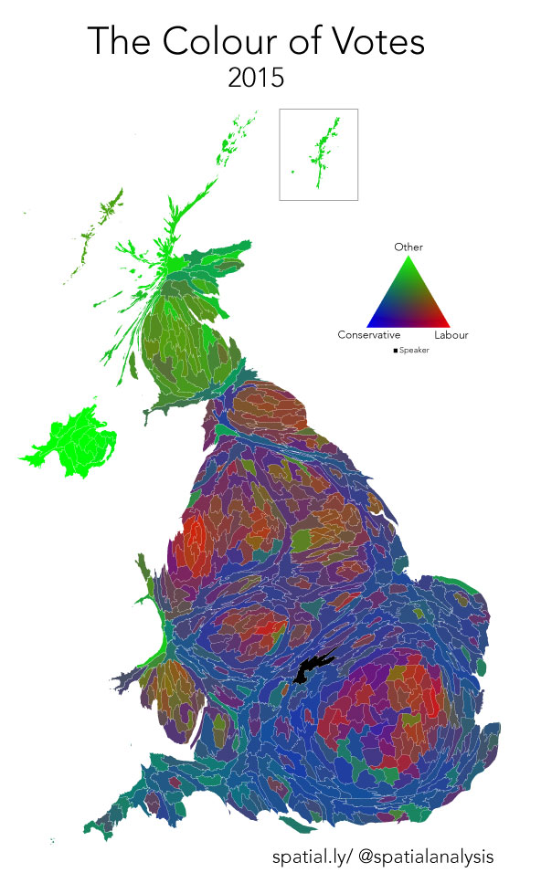
Colour of Votes: 2015 General Election
May 9, 2015
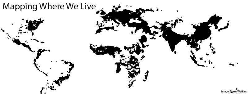
Mapping Where We Live
Oct 21, 2013