Skip to content
James Cheshire
About
Blog
Teaching
Papers
Category:
Visualisation
2010 Muslim Populations By Country
Jan 28, 2011
My Week in Maps
Jan 28, 2011
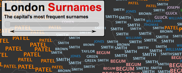
Mapping London's Surnames
Jan 24, 2011
What's in a Surname? (AKA United States of Surnames!)
Jan 21, 2011
Typographic Maps
Jan 17, 2011
R interface to Google Chart Tools
Jan 10, 2011
Boris Bikes/Barclays Cycle Hire Average Journey Times
Jan 7, 2011
Geographical Mistakes: Keeping Geographers Busy
Jan 2, 2011
Previous Page
1
…
7
8
9