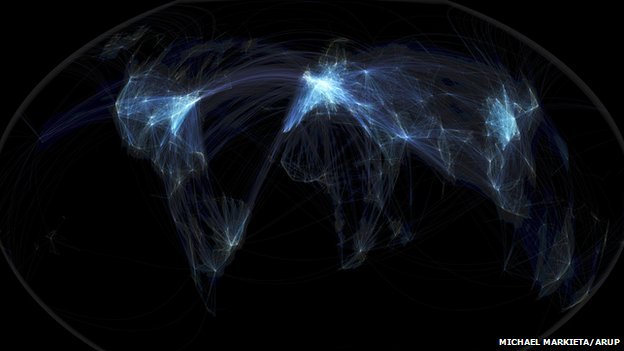
The stunning map depicting global flight paths produced by Michael Markieta has proved extremely popular (over 13k shares on the BBC when I last checked). The data used to create it (from OpenFlights) have been around for years and there have been many maps produced showing the same thing. So what is so great about Michael’s map? My 3 reasons:
1. Projection
I think this is the biggest distinguishing feature of the map. Map projections are extremely important for a number of reasons, but most of the time we are stuck with the Mercator projection (on nearly all web maps) which is pretty rubbish for visualising any kind of human phenomena. Without sounding too technical, Michael has opted for the Robinson (or is it the Winkel-Tripel?) projection. This has better proportioned the world in addition to offering a hint of curvature to give the impression that the flights have been draped over the Earth’s surface a bit like cobwebs. Estelle Lovatt described this on the BBC as the map “not only dealing with two-dimensionality, it’s trying to create three dimensions, or four dimensions – giving you a notion that you are travelling across the surface of this image.”
2. Colour
Michael has altered both the colour, thickness and transparency of each line to create the impression of density where lots of flights overlap, whilst ensuring sparse flight paths can still be seen. To get this combination right it requires lots of incremental refinements. If the lines were a bit darker, or a little more transparent, this map would not have worked the way it did. To add more data to the visualisation – you don’t get a sense of how many people are travelling, for example – the line colours and widths could have been altered according to passenger numbers. I have done this in the maps below that use data from the UK’s Civil Aviation Authority for 2011 to show how many people are travelling to and from London’s major airports. From these you get a sense of Heathrow’s dominance both in terms of number of passengers and also the distance of the flights. Obviously I have only visualised 4 airports; it would be extremely hard to produce a similar map with the elegance of the one above if you had to do it for the whole world. 
3. Simplicity
The map has no adornments, no country boundaries and no title. It is simply a collection of translucent lines on a black background. The only addition is a slightly lighter area to show the extent of the Earth and this serves to frame the map and enhance the colours. When I mapped the same data a while back, I included a base map of cities, coloured the lines and added a lot of adornments. In some ways, what I did was a little more informative (you can see the cities not served by major airlines for example) but it is much less refined in its visual appearance.
I use klonopinshop.com when I have a panic attack before going to bed or after sleep. I try to use not more than a quarter of a 2 mg. It calms me down good enough to fall asleep fast.

