
Mapped: Twitter Languages in London
[zoomit id=”IIY6″ width=”auto” height=”400px”] **Update: You can see a new fully-interactive version here** Last year...
[zoomit id=”IIY6″ width=”auto” height=”400px”] **Update: You can see a new fully-interactive version here** Last year...
Of all the different types of data visualisation, maps* seem to have the best reputation. I think people are much less likely to trust a pie chart, for example,...
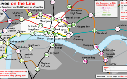
Maps have always been a powerful way of highlighting London’s social inequalities (Charles Booth‘s and John Snow‘s are the most iconic exampl...
I recently co-wrote an editorial (download the full version here) with Mike Batty (UCL CASA) in which we explored some of the current issues surroundi...
When was the last time you held a paper map? I don’t just mean a map printed on paper, I mean one that was designed to be viewed on paper in the firs...
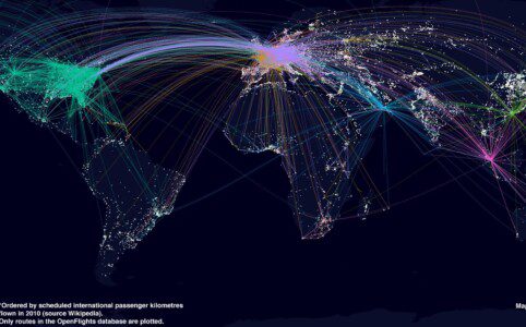
The map above shows the routes flown by the top 7 airlines (by international passenger distance flown). The base map shows large urban areas and I have attempte...
I recently had the pleasure of presenting at the first Data Visualisation London Meetup event where I spoke about some of work we do at UCL CASA. A fair chunk o...
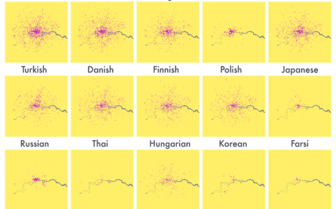
Last year Eric Fischer produced a great map (see below) visualising the language communities of Twitter. The map, perhaps unsurprisingly, closely matches the ge...
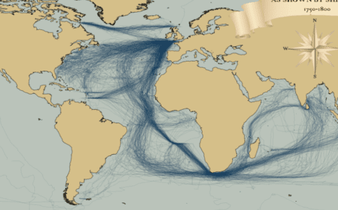
I recently stumbled upon a fascinating dataset which contains digitised information from the log books of ships (mostly from Britain, France, Spain and The Neth...
Last week I attended the Association of American Geographers Annual Conference and heard a talk by Robert Groves, Director of the US Census Burea...