[zoomit id=”IIY6″ width=”auto” height=”400px”]
**Update: You can see a new fully-interactive version here**
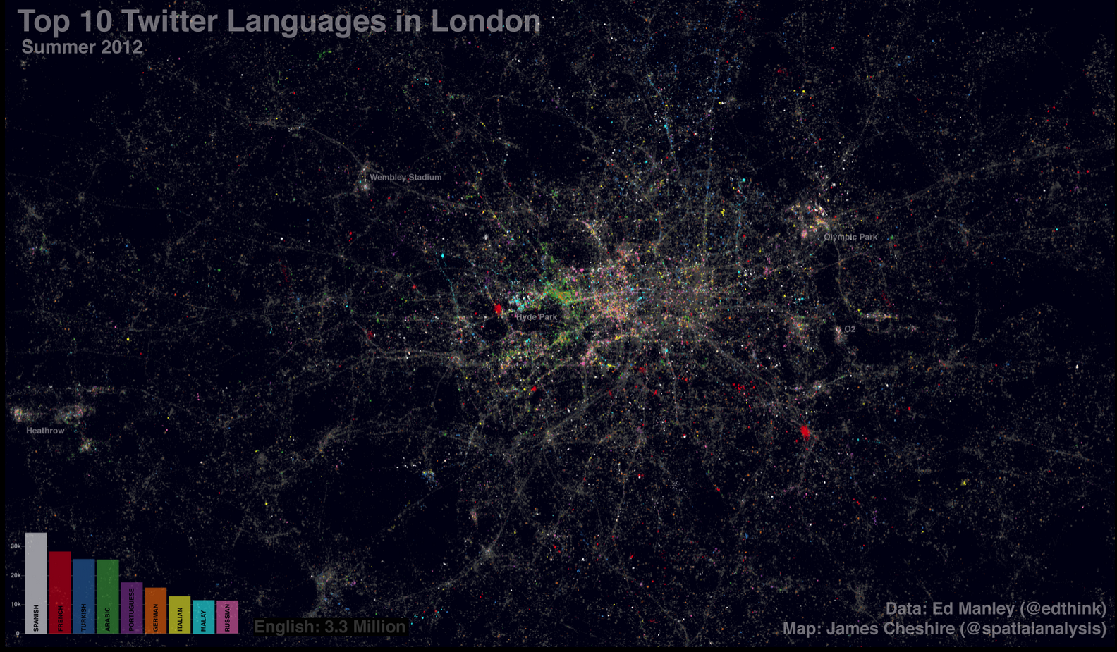
Last year Eric Fischer produced a great map (see end of post) visualising the language communities of Twitter. The map, perhaps unsurprisingly, closely matches the geographic extents of the world’s major linguistic groups. On seeing these broad patterns I wondered how well they applied London- a great international city. The graphic above shows (and here for non-zoom version) the spatial distribution of about 3.3 million geo-located tweets (based on GPS) coloured by the language detected using Google’s translation tools. Ed Manley collected the data and he goes into more detail about the data here. They cover the summer period so we can clearly see the many languages of the Olympic Park (a hotspot for tweeting). English tweets (grey) dominate (unsurprisingly) and they provide crisp outlines to roads and train lines as people tweet on the move. Towards the north, more Turkish tweets (blue) appear, Arabic tweets (green) are most common around Edgware Road and there are pockets of Russian tweets (pink) in parts of central London. The geography of the French tweets (red) is perhaps most surprising as they appear to exist in high density pockets around the centre and don’t stand out in South Kensington (an area with the Institut Francais, a French High School and the French Embassy). It may be that as a proportion of tweeters in this area they are small so they don’t stand out, or it could be that there are prolific tweeters (or bots) in the highly concentrated areas. I really like the paint-speckled effect that the multilingual tweets of London have produced and it offers a further confirmation of the international nature of London’s population.

Even though the map contains over 3 million tweets it is still a fairly selective sample of Londoners- they only include people who have a good location (through GPS) and those who are connected to the internet. I expect the latter requirement will exclude many short term visitors to London, and may explain why there aren’t so many hotspots around London’s landmarks (as is the case with Flickr where people can upload georeferenced images when they get home). There are also a couple of horizontal lines that have been caused by different levels of precision in the tweet locations. In spite of this, I think the information in these maps is useful as a basis for comparison to other cities and it helps to reveal some of the finer patterns within the broad regions mapped by Fischer.

