Skip to content
James Cheshire
About
Blog
Teaching
Papers
Author:
James Cheshire
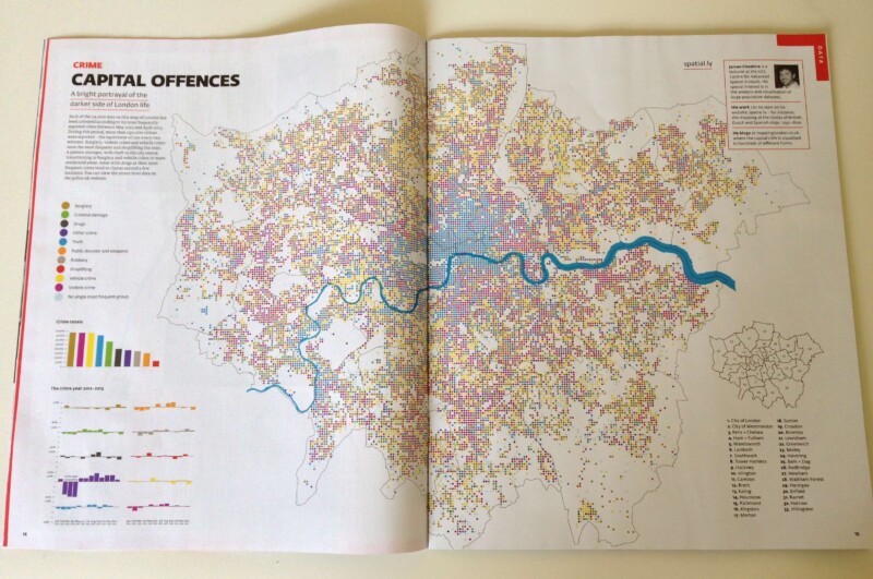
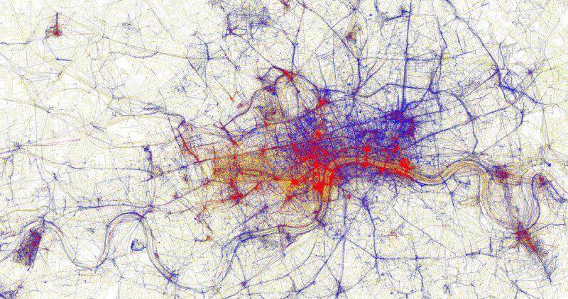
Crime Map of London
Jul 27, 2013
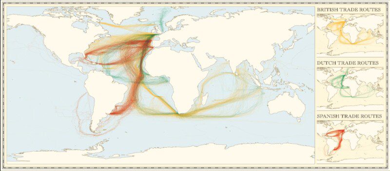
Updated: Colonial Shipping Routes
Jun 26, 2013
Mapped: London's Fire Engine Callouts
Jun 3, 2013
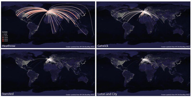
What's so Great About a World Flight Paths Map?
May 30, 2013
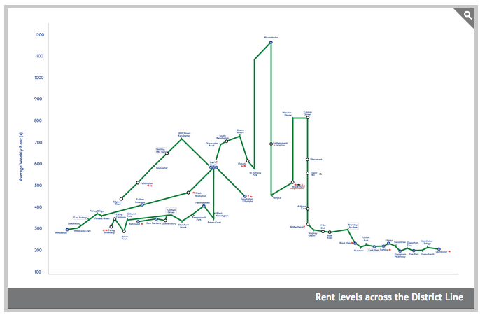
Subway Maps and Visualising Social Equality
May 15, 2013
Visualising for Human Geography
May 1, 2013
Twitter Languages in the Guardian
Apr 26, 2013
Mapped: Twitter Languages in New York
Feb 20, 2013
Mapped: Twitter Languages in London
Oct 22, 2012
In Maps We Trust
Aug 17, 2012
Previous Page
1
…
6
7
8
9
10
…
13
Next Page