Author: James Cheshire
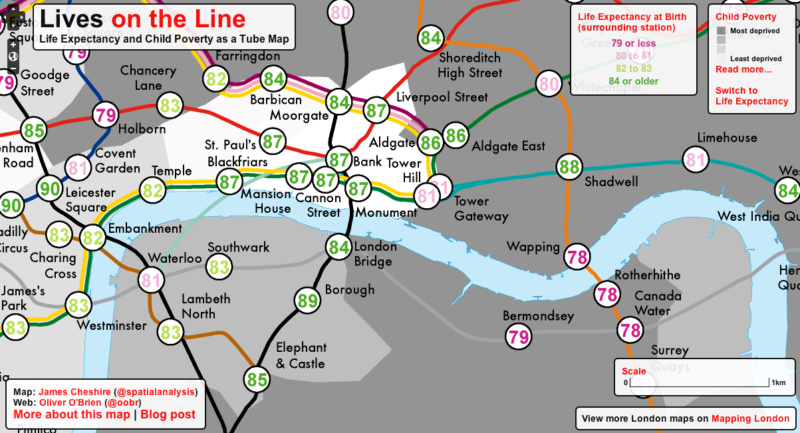
Lives on the Line: Life Expectancy and Child Poverty as a Tube Map
Maps have always been a powerful way of highlighting London’s social inequalities (Charles Booth‘s and John Snow‘s are the most iconic exampl...
Editorial: Visualisation Tools for Understanding Big Data
I recently co-wrote an editorial (download the full version here) with Mike Batty (UCL CASA) in which we explored some of the current issues surroundi...
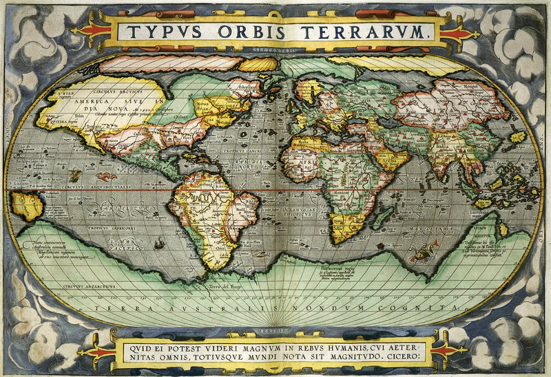
In Praise of Paper Maps
When was the last time you held a paper map? I don’t just mean a map printed on paper, I mean one that was designed to be viewed on paper in the firs...
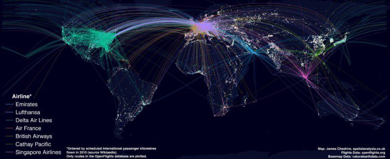
Mapping the World's Biggest Airlines
The map above shows the routes flown by the top 7 airlines (by international passenger distance flown). The base map shows large urban areas and I have attempte...
Sensing the City: Mapping London's Population Flows
I recently had the pleasure of presenting at the first Data Visualisation London Meetup event where I spoke about some of work we do at UCL CASA. A fair chunk o...
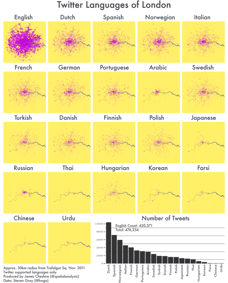
The Twitter Languages of London
Last year Eric Fischer produced a great map (see below) visualising the language communities of Twitter. The map, perhaps unsurprisingly, closely matches the ge...
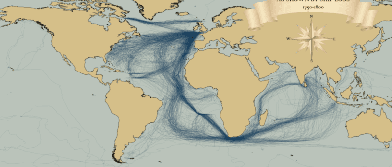
Mapped: British, Spanish and Dutch Shipping 1750-1800
I recently stumbled upon a fascinating dataset which contains digitised information from the log books of ships (mostly from Britain, France, Spain and The Neth...
Fast Thinking and Slow Thinking Visualisation
Last week I attended the Association of American Geographers Annual Conference and heard a talk by Robert Groves, Director of the US Census Burea...
Deceptive in their Beauty?
Finding ways to effectively map population data is a big issue in spatial data visualization. The standard practice uses choropleth maps that simply col...