Activities
Social data, mapping, writing
James’ books have achieved global success, being translated into tens of languages and receiving widespread critical acclaim.
He is an elected fellow of the Academy of Social Sciences and has been recognised with awards from the likes of the Royal Geographical Society, the Royal Scottish Geographical Society and the British Cartographic Society.
📖
Books
Atlas of Finance; Atlas of the Invisible.
📊
UCL Social Data Institute
Led by the UCL Faculty of Social and Historical Sciences (SHS), the Social Data Institute amplifies UCL’s advanced research and teaching in social data and methods.
🎓
UCL Department of Geography
The UCL Department of Geography is a world-renowned centre for education, research, and public engagement.
📍
Geographic Data Service
Maximising the value of diverse and nationally significant Smart Data through geographic integration, enrichment and validation.
Focus
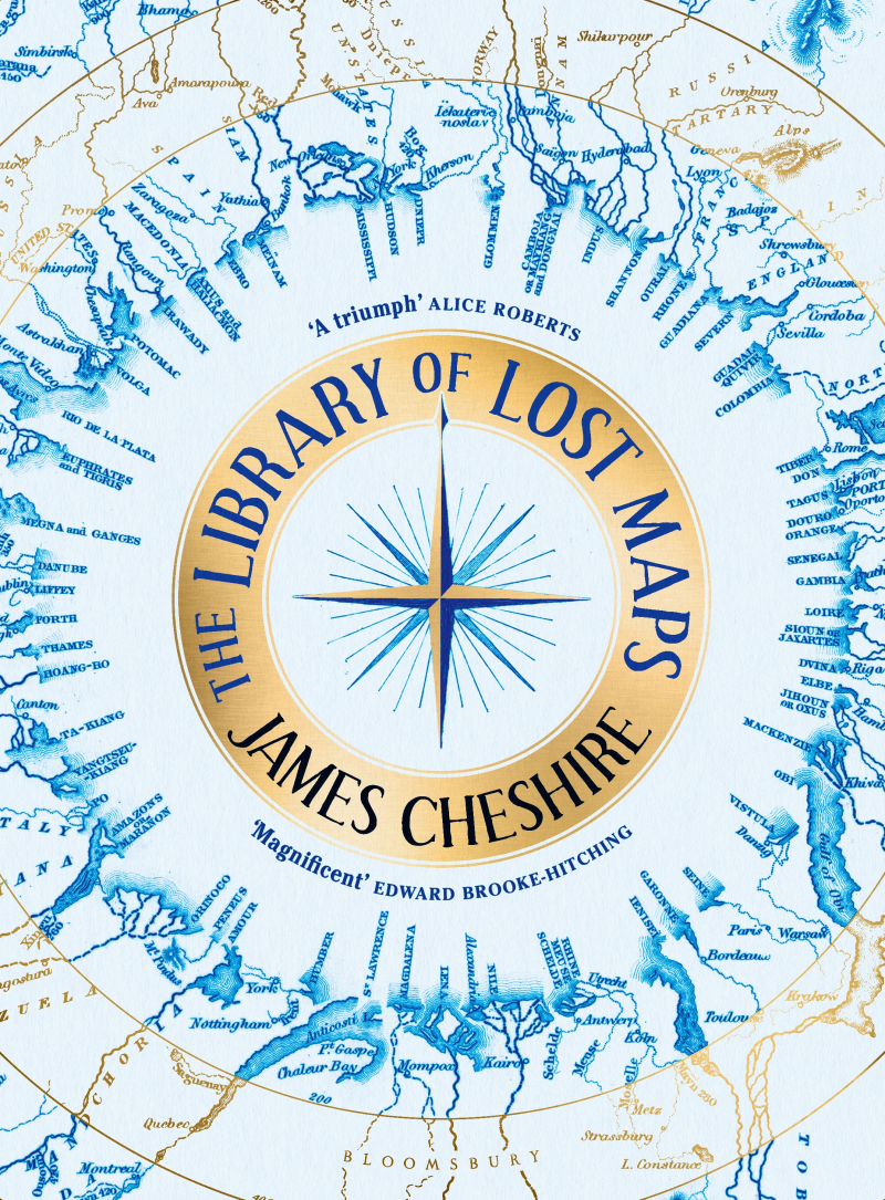
The Library of Lost Maps
The Library of Lost Maps details the remarkable story of an overlooked map archive that reveals how maps have helped inspire some of the greatest scientific discoveries, but also led to terrible atrocities.

Writing
Recent articles from James.
Online Materials
Teaching

Free Resources
When it comes to teaching maps, graphics and data skills you can never have too many good examples to inspire the next generation of geographers, cartographers and data scientists – we need them more than ever to help make sense of our increasingly complex and challenging world.
I’ve developed some free to use resources about maps and mapping based on my work.

For UCL Students
If you are a student enrolled on one of my classes at UCL I post most of my teaching materials to this website.
Details would have been sent to you through the module’s Moodle pages, and you can find the full list of classes on the link below.