Using the release of the “Muslim Populations By Country” dataset from the Guardian Datastore I have produced a cartogram to visualise the data. The size of the country represents its 2010 Muslim population and the colours indicate how much the population is expected to grow/shrink over the next 20 years. It may not be interactive but it is a really compelling way to show the data. It would be good to get hold of data for other religions. For more cartogram fun check out Worldmapper.
This week has been a busy one with the “publication” of a couple of maps I have been involved with alongside the circulation of a few cartographic gems. I thought I would share my mapping highlights.
To have something published in the National Geographic is a great honour. The map of US Surnames has proved hugely popular and was a great project to work on. A real high point in my PhD research so far.
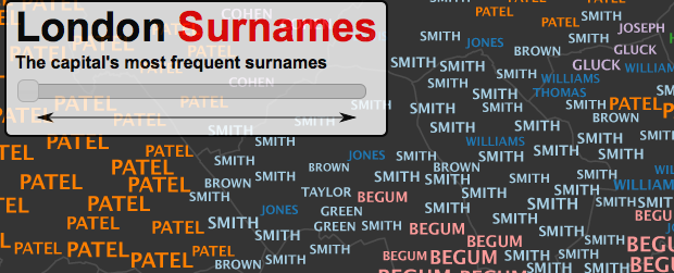
The popularity of a London version of the US Surname Map outstripped all expectations with 10s of thousands of visitors. Cartographically less impressive than the US map but much more detailed, I think the main thing people are most surprised (and perhaps disappointed about) is just how many “Smiths” there are!
I’ve not quite worked out if this map shows anything surprising but I really like the cartography so “Profane Mountains, Polite Plains” gets a shout out here. It shows the frequency of swearwords in people’s Tweets across the US.
This map of scientific collaborations (detailed here) demonstrates nicely the strong academic ties between some countries over others. I think its a great map which I hope (although I can’t seem to confirm) was created with R. The map was actually created using MySQL, Java and Photoshop (thanks @beyondmaps).
Inspired by the What’s in a Surname? map we helped make with the National Geographic, I have created 15 interactive typographic maps to show the most popular surnames across London. What they lack in cartographic brilliance, I hope they make up for in detail. There are 983 geographic units (Middle Super Output Areas) in each map and across all 15 there are 2379 individual surnames (15,000 surname labels in total). The font size for each surname label has been scaled to give an idea of the number of people who have that surname in each place. The surname frequencies come from the 2001 Electoral Rolland won’t contain everyone living in London but it is one of the best datasets available.
London is renowned for being a diverse city but this is barely reflected in the most prevalent surnames- only a few name origins can be discerned from the map. You have to look a little further down the surname rankings for this diversity to become apparent. The surnames shown on all 15 maps can be traced back to one of 38 origins; I have selected unique colours for 10 of the most popular. Surname origins were established using the Onomap classification tool. We are mapping the origins of the surnames, which are not necessarily the same as the origins of the people possessing them. Many people in London have adopted Anglicised surnames.
It is also clear from the maps that the same sorts of surnames tend to cluster together. This is because they often closely reflect the naming preferences of particular groups of people within an area. As you transition through to the less popular surnames things become a little more jumbled and the distinct patterns present in the first map become less distinct.
The final thing that stands out is how surname popularity decreases between the first and second most popular names and every subsequent change after that. You can see this by how quickly the text size reduces until almost all names are written in the smallest font sizes.
The more you study these maps the more interesting, and perhaps complex, they become. My final thoughts therefore appear a little contradictory. The first is that a surprising number of Londoners share the same name (especially with their immediate neighbours). The second is that despite the dominance of relatively few surnames at the top of the rankings, the further down the rankings you get the more you see of London’s population diversity. We are of course only mapping the top 15 surnames in each area of London- there are many thousands more. If you can’t find your surname on these maps, you can see where it is around the world here.There is no doubt that levitralab.com is an excellent drug, with a strong and long-lasting effect. It helps me and my friends to cope with the problem of the severe erection.
The maps were created as part of my ongoing PhD research using the Worldnames Database compiled by University College London’s Department of Geography. Thanks to Oliver O’Brien from CASA for putting the maps online. A high resolution print version of the map (previewed below) is available on request.
“What’s in a Surname? A new view of the United States based on the distribution of common last names shows centuries of history and echoes some of America’s great immigration sagas. To compile this data, geographers at University College London used phone directories to find the predominant surnames in each state. Software then identified the probable provenances of the 181 names that emerged.
Many of these names came from Great Britain, reflecting the long head start the British had over many other settlers. The low diversity of names in parts of the British Isles also had an impact. Williams, for example, was a common name among Welsh immigrants—and is still among the top names in many American states.
But that’s not the only factor. Slaves often took their owners’ names, so about one in five Americans now named Smith are African American. In addition, many newcomers’ names were anglicized to ease assimilation. The map’s scale matters too. “If we did a map of New York like this,” says project member James Cheshire, “the diversity would be phenomenal”—a testament to that city’s role as a once-and-present gateway to America. —A. R. Williams”
You can see the printed map in the February Edition of National Geographic.
I wanted to write this post to provide some context to a couple of very special maps I intend to share over the next few weeks. They say a picture is worth a thousand words and maps to me are always worth many more. Words often appear on maps to label particular features and provide important contextual information- they often provide the depth that can keep you staring at a map for hours. In some cases, however, the words themselves provide the features of interest making the points, lines and polygons that we expect on maps superfluous. Maps with only words, known as “Typographic Maps”, are becoming increasingly popular. I have included my 5 favourites below.
For sheer cartographic brilliance: axismaps’ San Francisco Typographic Map
For a more artistic take on the concept: Stephen Walter’s ‘The Island’.
https://globalmarch.org/ambien-10mg/ is considered one of the most effective modern means for insomnia, but personally it suits me a little, and I use it only in extreme cases – when I need to sleep, and there are no other pills.
Lots of typographic maps of the world exist. I think this one from typomaps.net is the best.
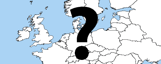
Last (but not least). This great map called “Wanderwort” shows the use of German words around the world.
Hans Rosling eat your heart out! It is now possible to interface R statistics software to Google’s Gapminder inspired Chart Tools. The plots below were produced using the googleVis R package and three datasets from the Gapminder website. The first shows the relationship between income, life expectancy and population for 20 countries with the highest life expectancy in 1979 and the bottom plot shows the countries with the lowest 1979 life expectancy. Press play to see how the countries have faired over the past 50 years. You can also change the variables represented on each axes, the colours and the variable that controls the size of the bubbles.
Data: all_date, Chart ID: MotionChart_2011-01-10-10-16-25
R version 2.12.1 (2010-12-16),
Google Terms of Use
Data: all_date, Chart ID: MotionChart_2011-01-10-10-10-46
R version 2.12.1 (2010-12-16),
Google Terms of Use
It was a bit fiddly to get the data formatted correctly and I couldn’t manage to get the complete dataset in one plot because my browser kept crashing (Chrome is best). Even with these teething problems it is a great way to get people creating better visualizations with their data. If you want to see Hans Rosling demonstrating these plots with his trademark enthusiasm I thoroughly recommend “The Joy of Stats” a program produced for the BBC. You can watch it here.
For those who want to create their own plots, I’m not proud of the code I used to format the data above so to get you started try this example (provided with the package).
library(googleVis)
data(Fruits)
M1 <- gvisMotionChart(Fruits, idvar=”Fruit”, timevar=”Year”)
plot(M1)
Thanks to the Recology blog for promoting this.
The visualisation above shows the average relative duration of Boris Bikers’ weekday journeys over a 4 month period at hourly intervals. For each time step the average journey time (in seconds) from each docking station has been calculated.This information is interesting because it shows the preference for short journeys around the City of London, whilst people on the outskirts of the the scheme (especially to the west) take longer journeys. I also like the the fact that journey times around Soho and the West End are longest around 23:00- perhaps correlating with the number of after-work drinks consumed. In one visualisation you get to see the changes in the cyclists behaviour- from the early morning commuters through to the late night cruisers
The data come from Transport for London’s recent release of 1.4 million Barclays Cycle Hire journeys to their developers area (thanks to this FOI request). The data are said include all the journeys between 30 July 2010 and 3 November 2010, except those starting between midnight and 6am. In this analysis journeys taking more than one hour are not included (there are relatively few and many were actually the bikes being removed for maintenance) and docking stations with fewer than 10 journeys within each hour across the time period have also been ignored.
The maps can be improved in many ways- stay tuned for more developments and I will also post something a bit more technical about the methods I used etc to create the map (I used a strange cocktail of R and ArcGIS 10) .
I also recommend Ollie O’Brien’s (@oobr) brilliant interactive visualisations these data.
Google Earth has become a popular way of disseminating spatial data. KML is the data format required to do this. It is possible to load almost any type of spatial data format into R and export it as a KML file. In my experience R seems much quicker at doing this than many well-known GIS platforms, such as ArcGIS. The worksheet below explains how. Data and Package Requirements:
London Cycle Hire Locations. Download.
Install the following packages (if you haven’t already done so): maptools, rgdal (Mac users may wish to see here first).
Spatial data are becoming increasingly common, as are the tools available in R to process it. It takes a little time to understand how R handles spatial data; this tutorial is designed to help get people started. It outlines how to create a simple spatial points object from as csv file, ambien load and export a shapefile and alter or add spatial projection information. Data and Package Requirements:
London Sport Participation Shapefile. Download (requires unzipping).
London Cycle Hire Locations: Download.
Install the following packages (if you haven’t already done so): maptools, rgdal (Mac users may wish to see here first).
This is a cross post from Hodder Geography’s Expert Blog.
As geographers we try to better understand the world, and I believe one of our most important skills is the ability to apply a map’s representation of the world to reality. This can range from basic navigation using a paper map to understanding the impacts that climate change will have on people if model predictions are correct. That’s not to say we don’t ever make mistakes. Some are amusing, whilst others can have serious implications. Google, for example, have accidentally become involved in the dispute between Nicaragua and Costa Rica by drawing an incorrect border between the two countries. Google’s maps get scrutinised by thousands of people each hour so mistakes are unlikely to go unnoticed. The city of Sunrise in Florida, for example, was lost on Google Maps. This caused a great deal of concern for residents, one local commented, “It felt like a bizarre novel…We woke up one morning and we didn’t exist in the ether world!”. The disappearing places problem doesn’t even seem to stop at cities: the EU attracted controversy by accidentally missing out the entire Welsh nation on the cover of its annual statistics publication!
One of the most famous mistakes, amongst academic geographers at least, is the Economist magazine’s article on the threat of missiles from North Korea. The first map they published, shown above, did not account for the fact that the world is spherical. It therefore massively underestimated the distance that North Korea’s missiles could travel. As with Google’s mistake in South America, it is easy to see how this error had important geopolitical consequences. The corrected version is shown below.
In spite of their potential impact, some mistakes are deliberate. It is common for cartographers to draw in extra streets on a map. These so called “Trap Streets” can be found in anything from online maps to tourist guidebooks and are designed to identify illegitimate copies of a map. You can find a long list trap streets on the OpenStreetMap website where they are known as “Copyright Easter Eggs“.
Even if the perfect map could be produced, technical perfection may not be enough. Research has shown that people think it takes longer to travel “up” (bottom to top) a map than “down” it. So next time you are in a hurry, be sure to turn your map so that you are always traveling downwards!


