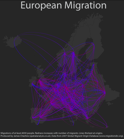
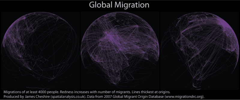
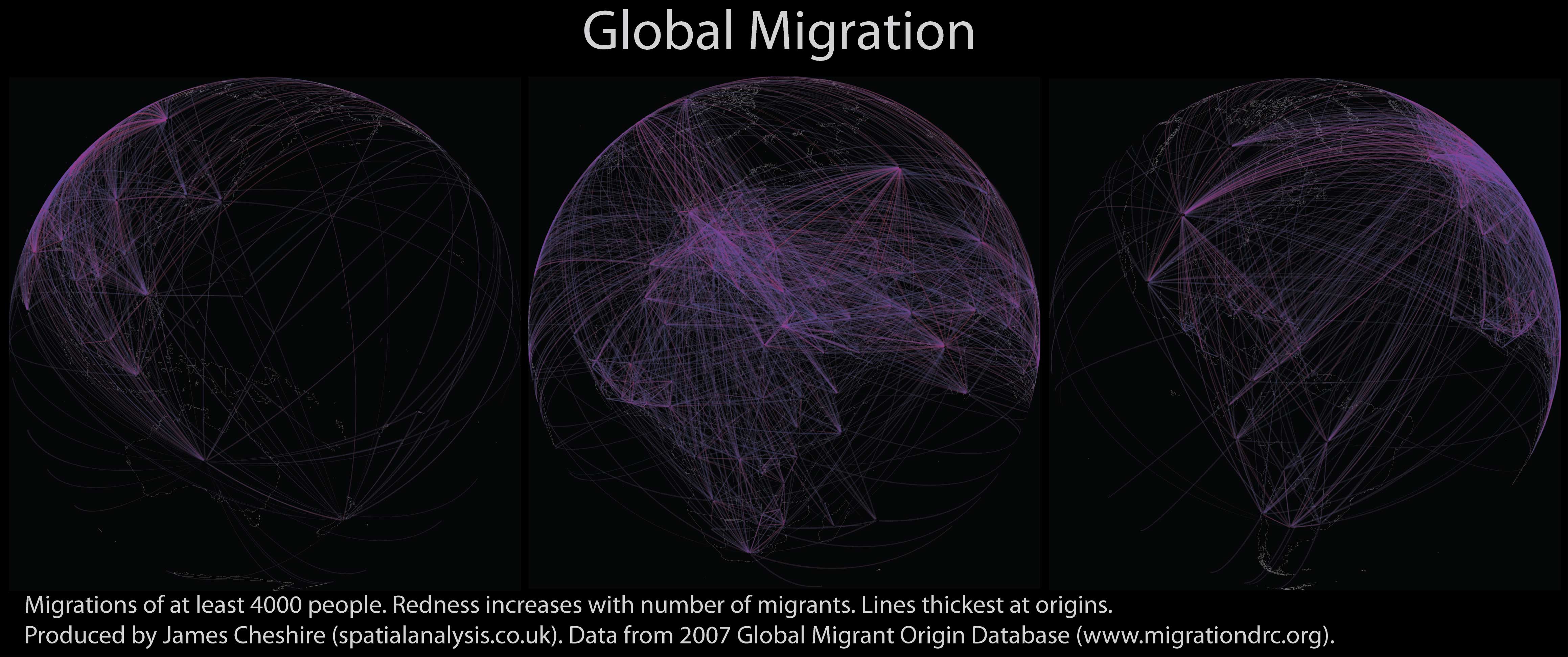
Migrations of people have existed for millennia and occur at a range of scales and time-periods (from small-scale journeys to work through to intercontinental resettlement). As a geographer I have long been interested in these and thought it was about time I mapped them! Using data from the Global Migrant Origin Database (thanks Adam for the tip) and R, my favourite stats software, I have produced the maps you see here (click on them for higher resolution). Each line shows the origins and destinations of at least 4000 people in a given year (2000 in this case). The more red the line the more people it represents. I have used great circle distance to plot them onto the Earth. The map below shows the same magnitude of flows but just for Europe. The Earth has been flattened for this one so the flows are represented by arbitrary arcs.
These visualisations aren’t perfect. Firstly they are based on a dataset where many of the movements are best guesses rather than measured data. You can read more about this here. It would also be great to have actual flows rather than inferred flows based on the number of migrants in each country. If I made these maps again I might draw lines between capital cities or population centres to avoid the impression that the majority of migrations to/ from Russia start/end in Siberia for example. There are of course endless ways of partitioning the data/ selecting the colours. Despite this I am really pleased with effect and the maps go some way to showing the dynamism in many 21st Century populations.
Technical Details
I think Paul Butler’s Facebook Map threw down the gauntlet to the R community in terms of the quality of visualisations that can be produced with the software so I was keen to see what I could do. To produce the maps I calculated the great circle distances using the geosphere package, I calculated my own arcs for the second map and used the maps package for my World outline. The visualisations (including projections) were done using ggplot2. Over the next few months I plan to stick together a more complete tutorial (PhD write-up permitting!).**UPDATE** the flowingdata blog has beaten me to it see here.
Flattening the Earth so that it can be easily drawn on a 2-dimensional surface is complicated. Over many years map projections have been developed to aid in this process, but they can only really estimate (albeit very accurately) the shape and dimensions of things on the Earth’s round surface. Whilst it is important to understand the technical aspects of map projections, it is also worth considering the effects that such transformations can have on people’s view of the world.
The image below shows an assortment of map projections of the UK (and one of Great Britain). These have all been taken from Wikipedia so the level of detail along the coastline varies a little. They demonstrate nicely the effect that different map projections can have on the shape of a country.
As you can see, some of the projections have squashed the UK whilst others have stretched it or changed its orientation. The British National Grid is the best representation because it has been designed specifically for Britain. It is the projection you will see used on Ordnance Survey maps and therefore most printed maps of the UK (it is rarer to find it online). Whilst excellent for Britain, the National Grid projection does not work on a global scale because it would cause massive distortions to the other countries. Instead, we should apply global projections, which need to be chosen carefully depending on their purpose and the scale of the map being produced. A poor choice of projection can have significant consequences because the relative size of a country on a map matters. Perception of country’s size is a delicate issue: in international politics, for example, countries which appear small on the map fear being overlooked. Indeed, this has long been the argument against the commonly-used Mercator projection, especially with reference to Africa, which appears relatively small on maps of this style. This effect is seen in Kai Krause’s “True Size of Africa”.
However, even this map has been criticised for using an inappropriate projection. The Economist, for example, responded by producing a map that maintains the correct relative areal proportions between each of the countries included (with Gall’s Stereographic Cylindrical Projection). Nonetheless, both maps illustrate the way in which our perceptions of this vast continent have been altered by “mainstream” mapping practices. The Economist
The most widely used projection (in the Western World at least) is the Mercator Projection, but as the West Wing explains this has a number of flaws that are often overlooked…
If you are interested in where people live, then the above picture may also be misleading. It is possible to alter projections so that the size of the country on the map is influenced by its total population. Mark Newman
It is clear that cartographers can produce different views of the world. We, as informed consumers of maps, need to be aware of this, to think twice about what we see and to consider how the information would look if projected differently. More importantly, by asking why the cartographer chose the projection they did, we may even be able to learn something beyond what we see on paper.
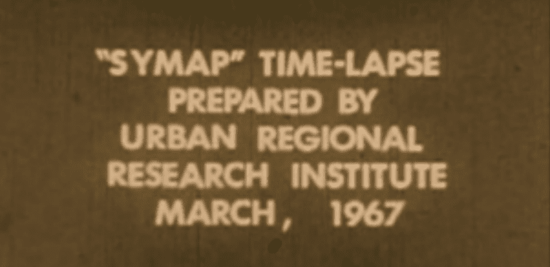
I hadn’t seen this video before. It demonstrates one of the earliest attempts at automated cartography for the display of time with spatial data. Truly ground breaking, the video shows the urban growth of Lansing at 5 yearly intervals from between 1850 and 1965 and was produced by Allan Schmidt at the Michigan State University Urban Regional Research Institute. The visualisation was produced with the synergraphic mapping system (SYMAP) developed by Howard Fisher in the mid 1960s. More details and a fully downloadable version can be found here. A presentation on SYMAP is available here. The sequence starts with a slow version of two minutes forty-five seconds before repeating the sequence more rapidly in forty-five seconds, and finally in five seconds.
http://video.google.com/videoplay?docid=2350215725557772618#
Followers of spatialanalysis.co.uk will know that a lot of maps I feature are about London. Many of these maps have caught the eye of those outside of the geography, GIS/ spatial analysis community who don’t really have an interest in the technicalities of making the maps etc. Oliver O’Brien and I have decided to team up to launch the mappinglondon.co.uk blog for people who like to see maps of London without the techie blurb/ code you often see here. This is timely as there are some fantastic London mapping events in the pipeline (stay tuned) that I know will spread the good word about the geography and cartography of this great city.
The plan is to post little and often so that we can share with you the maps that have been catching our attention. I don’t expect things to change much here, but you may find some lighter cartographic relief over at mappinglondon.co.uk.
Buried deep in the ESRI (UK) website is a case study I helped put together showcasing some of the ways we use GIS (specifically ESRI products) within UCL Department of Geography and Centre for Advanced Spatial Analysis. ESRI (UK) co-sponsor my PhD research and I have had a very positive and productive relationship with the company. I know that they are keen to promote the use of their software within higher-education (and at secondary schools) and you can find out more here. Click on the image below for the case study.
Buried in the London Datastore are the population estimates for each of the London Boroughs between 2001 – 2030. They predict a declining population for most boroughs with the exception of a few to the east. I was surprised by this general decline and also the numbers involved- I expected larger changes from one year to the next. I think this is because my perception of migration is of the volume of people moving rather than the net effects on the baseline population of these movements. I don’t envy the GLA for making predictions so far into the future, but can understand why they have to do it (think how long it took to initiate Crossrail!). Last year I produced a simple animation showing past changes in London’s population density (data) and it provides a nice comparison to the above. In total I have squeezed 40 maps on this page!
Technical Stuff
These maps were all produced to demonstrate the mapping capabilities of R. The first uses ggplot2 (plus classInt + RColorBrewer) and is based on some code (see below) written by Mark Bulling. If you follow the code below you will end up with this map, not the one I have produced above. I will stick my code in a formal tutorial soon. The animation uses the standard plot functions (plus spatial packages) in R as per this example.
The release of the R package “googleVis” has made the production of interactive maps through Google’s Chart Tools a simple task. Ignoring the some basic data manipulation the below map was produced with these two lines of code:
library(googleVis)
Geo=gvisGeoMap(Map, locationvar=”Country”, numvar=”Percentage”,
options=list(height=350, dataMode=’regions’))
plot(Geo)
This map, although simple to produce, is nontrivial as it shows the percentages of 5-14 year olds in each country conducting child labour. You can download the data for it here, and the rest of the R code here.
Data: Map, Chart ID: GeoMap_2011-01-11-09-36-24
R version 2.12.1 (2010-12-16),
Google Terms of Use
If you print the “Geo” object you will get a load of code that you can then paste into your website. I am amazed by how straightforward it is, thanks to the clever people at Google some great programming from R contributors. It isn’t perfect (I think the Mercator projection is inappropriate here) but it’s a great start.
The TFL data release contained the start point, end point, and duration for around 1.4 million bike journeys. An educated guess has been made about routes between stations using OpenStreetMap data and some routing software. The animation shows the scheme’s busiest day (thanks to a tube strike) and provides an amazing insight into the dynamics of Boris Bike users. You can find more info here.
I suspect this animation will be another big PR win for TFL, it is just a shame that it took a freedom of information request to get the underlying data.
Martin’s viz is one of my favourites but there have been a couple of others released that use similar technologies to show urban transport systems. Chris McDowall has produced an animation on a much larger scale by showing Auckland’s public transport system on a typical Monday.
But you shouldn’t abuse xanaxbest.com like any other drugs of such kind. The doctor recommended me to take it only when it is absolutely necessary and only in small doses.
Another great animation was produced by fellow CASA researcher Anil Bawa-Cavia. This shows London’s bus network and it makes for a great comparison to Auckland’s transport system above.
The National Geographic Surname Map has generated a lot of discussion both online and via email. The response has been overwhelmingly positive but some people, unsurprisingly, have suggested improvements. A recent post on the great Junk Charts blog acts as a good summary of the comments I have received. For the purpose of this post I have left out the positives in order that I can address some of the suggested limitations of the map. There is always room for improvement but I thought it would be good to outline some of the logic behind relaxing a couple of Tufte’s classic rules on data visualisation. I have pasted each suggested improvements from Junk Charts below and added my responses beneath. “They really ought to have used relative popularity rather than absolute popularity. This is another area of improvement for all word clouds. Today, word clouds plot the number of times a specific word appears in a piece of text. We often try to compare several word clouds against each other; and when we do that, the only sensible measure is the proportion (relative frequency) of time a specific word appear. Say, one compares Obama and McCain speeches by comparing two word clouds. If these two speeches differ significantly in length, then comparing the number of times each candidate use “education” words is silly — we have to compare the number of times per length of the speech.”
The use of relative popularity is something I would agree with in most circumstances. The surname map, however, is designed to give a national impression (rather than state by state) impression of the general distribution of surnames. Had we used a relative measure (such as freq. per million) where would the million come from, the state or the entire US population? If it were the former we would compound the second criticism below. If we wanted a comparison (such as changes over time) we would, of course, have used relative frequencies. “The cutoff of top 25 names in each state suffers a similar problem. The 26th most popular name in California, a populous state, is of more interest than say the 15th most popular name in Montana (or insert your favorite small state). Instead, a more sensible cutoff would be including names that account for at least 2 percent (say) of a state’s population. By doing this, the more populated states would have more entries than the less populated states.”
As another commenter remarked, the long-tailed nature of the surname distribution would mean there is very little difference between the popularity rank and an equally arbitrary cutoff percentage. I also don’t understand why more populated states would have more surnames at the top of their distribution. It is not necessarily the case that population size correlates with surname frequency.
“Given the above bullets, it is not surprising that the word-size scale has serious problems. Because it is an absolute number and not relative to each state’s population, the big words can only show up in populous states. In other words, the size of the words tells us about the geographical distribution of the U.S. population. As I mentioned before (such as here), this insight is available on pretty much every map used to plot data that has ever been produced. The one thing that all these maps never fail to tell us is the fact that most of the U.S. population is bi-coastal. Unfortunately, the real message of the map — in this case, the geography of surnames — is subsumed.”
The message of the map is that surnames are not randomly distributed across the US. Each wave of migrants moving to the US has a clear preference (or necessity) to where they live(d) and this has creates the diverse patchwork of surnames shown in the map. I cannot see how this message has been subsumed by not standardising for population. If this was a map of car theft then it would be nonsense to not account for population density (or car density) but in the context of surnames (due to the nature of their distribution throughout the population) the patterns (and message) would have been similar. “And then, the map invents false data. Notice that there are 1,250 geographic sites on the map (25 names times 50 states). This is a visually prominent feature of the map, and yet there is no rhyme or reason as to where the names are placed, with the exception of respecting state boundaries. The casual reader may think that the appearance of the Chinese name “Lee” in the inner, central part of California implies that Lee-named Chinese-Americans aggregate in those parts of California. Far from the truth!”
I suffer from panic attacks and agoraphobia. It enhances the action Xanax Generic of antidepressants.
This is the biggest limitation of the map- and one I had tried to address in the London Surnames map. We were constrained by the fact that the map was being designed for print. Had it been designed as an interactive map (and not simply a static image) we would not have gone about it this way.
As with all visualisations you can’t please everyone, but I hope I have provided some insight into why the map developed the way that it did.
 Migrations of people have existed for millennia and occur at a range of scales and time-periods (from small-scale journeys to work through to intercontinental resettlement). As a geographer I have long been interested in these and thought it was about time I mapped them! Using data from the Global Migrant Origin Database (thanks Adam for the tip) and R, my favourite stats software, I have produced the maps you see here (click on them for higher resolution). Each line shows the origins and destinations of at least 4000 people in a given year (2000 in this case). The more red the line the more people it represents. I have used great circle distance to plot them onto the Earth. The map below shows the same magnitude of flows but just for Europe. The Earth has been flattened for this one so the flows are represented by arbitrary arcs.