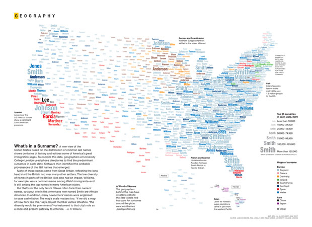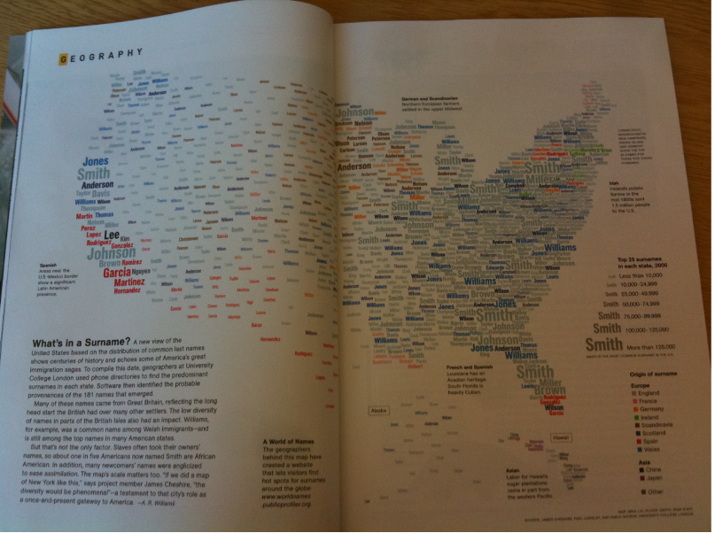
The National Geographic Surname Map has generated a lot of discussion both online and via email. The response has been overwhelmingly positive but some people, unsurprisingly, have suggested improvements. A recent post on the great Junk Charts blog acts as a good summary of the comments I have received. For the purpose of this post I have left out the positives in order that I can address some of the suggested limitations of the map. There is always room for improvement but I thought it would be good to outline some of the logic behind relaxing a couple of Tufte’s classic rules on data visualisation. I have pasted each suggested improvements from Junk Charts below and added my responses beneath.
“They really ought to have used relative popularity rather than absolute popularity. This is another area of improvement for all word clouds. Today, word clouds plot the number of times a specific word appears in a piece of text. We often try to compare several word clouds against each other; and when we do that, the only sensible measure is the proportion (relative frequency) of time a specific word appear. Say, one compares Obama and McCain speeches by comparing two word clouds. If these two speeches differ significantly in length, then comparing the number of times each candidate use “education” words is silly — we have to compare the number of times per length of the speech.”
The use of relative popularity is something I would agree with in most circumstances. The surname map, however, is designed to give a national impression (rather than state by state) impression of the general distribution of surnames. Had we used a relative measure (such as freq. per million) where would the million come from, the state or the entire US population? If it were the former we would compound the second criticism below. If we wanted a comparison (such as changes over time) we would, of course, have used relative frequencies.
“The cutoff of top 25 names in each state suffers a similar problem. The 26th most popular name in California, a populous state, is of more interest than say the 15th most popular name in Montana (or insert your favorite small state). Instead, a more sensible cutoff would be including names that account for at least 2 percent (say) of a state’s population. By doing this, the more populated states would have more entries than the less populated states.”
As another commenter remarked, the long-tailed nature of the surname distribution would mean there is very little difference between the popularity rank and an equally arbitrary cutoff percentage. I also don’t understand why more populated states would have more surnames at the top of their distribution. It is not necessarily the case that population size correlates with surname frequency.
“Given the above bullets, it is not surprising that the word-size scale has serious problems. Because it is an absolute number and not relative to each state’s population, the big words can only show up in populous states. In other words, the size of the words tells us about the geographical distribution of the U.S. population. As I mentioned before (such as here), this insight is available on pretty much every map used to plot data that has ever been produced. The one thing that all these maps never fail to tell us is the fact that most of the U.S. population is bi-coastal. Unfortunately, the real message of the map — in this case, the geography of surnames — is subsumed.”
The message of the map is that surnames are not randomly distributed across the US. Each wave of migrants moving to the US has a clear preference (or necessity) to where they live(d) and this has creates the diverse patchwork of surnames shown in the map. I cannot see how this message has been subsumed by not standardising for population. If this was a map of car theft then it would be nonsense to not account for population density (or car density) but in the context of surnames (due to the nature of their distribution throughout the population) the patterns (and message) would have been similar.
“And then, the map invents false data. Notice that there are 1,250 geographic sites on the map (25 names times 50 states). This is a visually prominent feature of the map, and yet there is no rhyme or reason as to where the names are placed, with the exception of respecting state boundaries. The casual reader may think that the appearance of the Chinese name “Lee” in the inner, central part of California implies that Lee-named Chinese-Americans aggregate in those parts of California. Far from the truth!”
I suffer from panic attacks and agoraphobia. It enhances the action Xanax Generic of antidepressants.
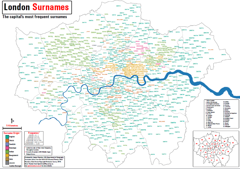
This is the biggest limitation of the map- and one I had tried to address in the London Surnames map. We were constrained by the fact that the map was being designed for print. Had it been designed as an interactive map (and not simply a static image) we would not have gone about it this way.
As with all visualisations you can’t please everyone, but I hope I have provided some insight into why the map developed the way that it did.


