
Transport for London have just released their performance data (link here) for the London Underground network. It is in the form of a really detailed file that contains, amongst other things, the “Peak Operated Kilometres” and “Peak Passenger Journeys” for the past 6 years or so. If you total the distances covered by the Tube rolling stock at peak times, this map shows how far they travel each day. The Central Line wins with over 13,000km – the equivalent of almost reaching Australia! In humble last place is the Waterloo and City Line that just passes Dublin with a little over 500km travelled. There are many more cool things to be done with the data, but I thought this is a neat way of showing the gargantuan task of shifting London commuters!
OpenStreetMap: 5 Years of Mapping London
This week I am giving a talk on some of the London maps that we produce in CASA. The hours of work I put in to such maps is minuscule compared to the amount of effort and time that the OpenStreetMap community have invested in producing a truly open (and often more accurate) map of London (and the rest of the world). To give an idea of just how far the project has come over the past five years or so, ITO World have produced a great visualisation (above).
As a bonus ITO World have also produced a similar visualisation for Berlin, Germany.
Thanks to Patrick Webber for the tip off about these.
Why do we need a census?

Last week I attended a “Beyond 2011” Census event organised by the Prof. Dave Martin and the Office for National Statistics (ONS). The attendees came from central and local government, private companies that utlise census data, and a few universities. The majority there (based on an approximate straw poll) believed that there would not be a census “in its current form” in 2021. This is because census data collection is a very costly exercise and its results are becoming more out of date more quickly as the pace of societal change (through migration, for example) increases.
So, we need to find an alternative but from where? Census data collection has been taking place for centuries and has, until relatively recently, been our only source of “Big Data” concerning the population characteristics of the UK. Why then, when we have finally achieved the computational and analytical capabilities to efficiently analyse it are we prepared to throw it all away? The reason relates to the fact that we have hundreds of big data sources available now and, if used properly, we can potentially generate the same levels of insight (and more!) as those provided by a traditional census form.

For example the 2011 Census only accurately recorded where people live, not where they work. What good is this for emergency planning in central London? Why not use Oyster Card trip data, or mobile phone usage instead to give daily updates on population movement? Another issue is the fact that we have a more mobile population and we miss a lot of change by only taking decennial snapshots. Other government datasets are updated more often, such as the NHS Patient Register or the Electoral Roll, and can provide an indication of where we are living this year, rather than where we lived 5-10 years ago (I moved house 4 times between censuses). We also, and perhaps controversially, hand over loads of personal data every-time we use a store-card or credit card, log into Facebook, use our mobile phone or surf the web. This has contributed, perhaps for the first time, to many private companies having a much better idea about aspects of the population of the UK than the government. The question is do we want companies to share it for the greater good (or evil depending on what you think of the “big brother” state), or should we let them keep the data and have the government spend more to source it itself? We also have to be sure to count those who don’t feature on private company databases (put crudely, often because they aren’t worth anything to that company) and it is these groups, often the most vulnerable in society, that we are most likely to miss with a non-census solution.
I think there is more than enough data to go around without having to fill in lengthy census forms, the issue is we haven’t worked out how to join it all together yet. Once we solve that problem we then need to work out who we have missed and that is much harder to do without a compulsory census!
If you want to contribute to this debate please fill in the consultation documents.
The Times Atlas of London

*This post has been cross-posted from the Mapping London blog.*
A few months back I had the honour of being asked to approve the use of a couple of excerpts from my London Surname Map in The Times Atlas of London. The wait was finally over last week when I received my copy in the post. It is a great book and an essential guide to the city. The Atlas begins with the first mapped representation of London in 1250 and covers a detailed history of London mapping that provides interesting context to both the development of the city and its mapping culture.

The Atlas includes detailed information on each of the London boroughs interspersed with great photos and fascinating insights into London life covering everything from its inhabitants (below) to football,

and public transport (below) through to London’s World Heritage Sites.

As you would expect from an atlas there are may detailed maps (see below) to break up the extensive commentary associated with the topics I mentioned above. I think the Atlas is brilliant book (not just because I’m in it!) and should make a great addition to the coffee table of fellow London map addicts.

Mapping Academic Tweets
Another day, another Twitter map- this time showing the global distribution of tweets that link to academic journal articles. I am always a bit skeptical of Twitter data (especially with location information) but as an academic seeking to publish in many of the journals that feature in people’s tweets I was prepared to make an exception when producing these maps. The data come from a cool service called Altmetric.
I think mapping Twitter’s engagement with the academic literature is important as it echos the map below and provides another example of the dominance of researchers (both in terms of access and production) from a few countries in the academic literature.

You can see how the “hotspots” of collaboration allign with the hotspots of tweets below.

One thing academics strive for is “impact”. This can mean many things, but one often applied criterion is the number of people outside of your immediate academic community that read your work. Twitter is becoming increasingly cited as an example of impact (for example how many followers an academic has), but as these maps demonstrate, much of the engaged audience is already where work is relatively easily accessible.
About the data from Altmetric:
“This dataset lists the ~ 58k tweets that mentioned a scientific article (broadly speaking anything with a DOI, PMID or arxiv ID) between the 1st and 31st of July 2011.
Recall isn’t 100%: my best estimate is that it’s missing another ~ 6k tweets where the article couldn’t be identified, the link was malformed or the journal involved is new or gets very low traffic.
Twitter’s TOS prohibit re-distribution of the tweets themselves but the dataset contains the extracted links, the tweet ID and some information about the tweeter (screen name, country & lat/lng derived from their location using Yahoo! Placemaker).“
Interview for the Global Lab Podcast

This week I feature on the 4th Episode of the Global Lab podcast. The podcast is a great new initiative led by Martin and Steve from CASA where they talk about cities, global connectivity and the impact of technology on people’s lives. Episode four features some horrendous physics jokes, Einstein’s Garden at the Green Man festival and a few minutes of me sounding a little underwhelmed about my research. You can listen here.
Naming Rivers and Places
A map doing the rounds at the moment (thanks to a plug from flowingdata) is Derek Watkin’s brilliant map of “generic” terms for rivers in the United States (below).The map shows how different cultural and linguistic factors have influenced the naming of geographic features in the US. For example French settlers named the streams they encountered “bayous”.

The number of rivers in the US, combined with Derek’s brilliant design, make this a really compelling map. Inspired by this work I have quickly (with much less cartographic flair) extracted the major rivers and streams in Great Britain from the Ordnance Survey’s Strategi dataset and coloured them according to whether they are a “river”, “canal” (not sure if this really counts in terms of naming), “water”, “afon” (Welsh for river) and “brook”. You can see that a clear geography exists. I was not surprised by all the “afons” being in Wales but I was surprised to see so many “waters” in Scotland.

On the topic of naming, settlement names also have a clear geography as they, like rivers in the US, reflect the different settlers (or invaders!) of the British Isles over millennia. The map below (taken from my thesis) shows the different naming influences on settlements in Britain. The most striking aspect is the abrupt end to the Viking settlement names along what is called the Danelaw Line. So if you live north of this line you will be using more Viking words on a daily basis than those to the south. There are loads of people studying and recording the different place naming conventions in Britain- I would recommend you check out the “Institute for Name Studies” if you want more information.

Improved Tree Maps with R
“Treemaps display hierarchical (tree-structured) data as a set of nested rectangles. Each branch of the tree is given a rectangle, which is then tiled with smaller rectangles representing sub-branches. A leaf node’s rectangle has an area proportional to a specified dimension on the data. Often the leaf nodes are colored to show a separate dimension of the data.
When the color and size dimensions are correlated in some way with the tree structure, one can often easily see patterns that would be difficult to spot in other ways, for example, if a certain color is particularly relevant. A second advantage of treemaps is that, by construction, they make efficient use of space. As a result, they can legibly display thousands of items on the screen simultaneously.” (source: Wikipedia)
I think treemaps are becoming an increasingly popular method of visualising multidimensional datasets and there are many ways to create them. This tutorial is going to focus on the use of R and builds on the one published on flowingdata.
Open R and install the following packages
 install.packages("portfolio")

install.packages("RColorBrewer")
now load them.
library(RColorBrewer)
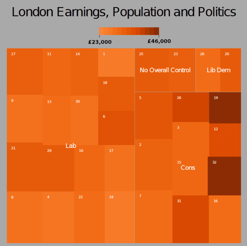
library(portfolio)
The next step is to load in the data file we are using. This is an edited version of the London Borough Profiles csv taken from the London Datastore. There are five columns of data. The three we are interested in are “pop”, “earnings” and “party”.
input<-read.csv("https://jcheshire.com/wp-content/uploads/2011/08/tree_eg_data.csv")

attach(input)
A treemap generally requires 4 pieces of information:
the item- in this case the London Borough’s or “id”- each will be assigned a rectangle,
a value to scale the size of the rectangle by- in this case the population or “pop”,
a value for assigning the colour- in this case the average earnings per person or “earnings”,
and a broader group to which the item belongs- in this case the ruling political party or “party”.
Armed with this we can simply used the map.market function from the portfolio package (installed earlier) to produce a treemap.
map.market(id, pop, party, earnings, lab = c(TRUE, TRUE), main="London Earnings, Population and Politics")

The output looks OK but I don’t really like the colours. I have therefore edited the code so that a selection of colours can be used using the ColorBrewer palettes. You can either download the code or load it straight away with
source("http://dl.dropbox.com/u/10640416/treemapbrewer.r")
you have now loaded in a new function called “treemap” that does a very similar job to the one above but has a few other options that you can see used below
treemap(id, pop, party, earnings, lab = c(TRUE, TRUE), main="London Earnings, Population and Politics", pal="Oranges", linecol= "dark gray", textcol="white")

The plot above used the “Oranges” palette but there are many more such as “Blues”, “BuPu” and “Reds”. Try for example
treemap(id, pop, party, earnings, lab = c(TRUE, TRUE), main="London Earnings, Population and Politics", pal="Blues", linecol= "white", textcol="black")
When you are happy with the results save the plot as a pdf
pdf("my_tree_map2.pdf")

treemap(id, pop, party, earnings, lab = c(TRUE, TRUE), main="London Earnings, Population and Politics", pal="Oranges", linecol= "dark gray")

dev.off()
or PNG
png("my_tree_map2.png")

treemap(id, pop, party, earnings, lab = c(TRUE, TRUE), main="London Earnings, Population and Politics", pal="Oranges", linecol= "dark gray")

dev.off()
and then you can edit it using image/ vector editing software such as GIMP or Inkscape to get the following result:

I hope that the options to change colours makes for a more interesting treemaps than the standard red/green ones we are used to seeing. If anyone knows how to alter the scale bar so that it does not show values beyond the range of the data it would be great to see how it is done!
Mapping GCSE Scores
In the UK, August is exam results month for 16-18 year olds. Every year, photos of leaping teenagers clutching their results are accompanied by reports of record attainment rates, debates around how challenging modern exams are and, more so recently than ever, concerns for the number of sixth form and university places. Back in March the full list of the 2010 GCSE results (exams taken by UK 16 year olds [except in Scotland]) were released and I mapped them but never got round to sharing them with anyone. Now seems a good time to do this so here goes…
The map below uses the increasingly popular cartogram method to show the success of students in each Local Authority (LA) across England. The non cartogram version is also shown alongside.

This is quite a coarse map as England is only split into the 152 LAs and we know there is much greater variation between schools at a local level and even sometimes within individual schools. Moreover, schools on authority borders often serve communities from the areas on either side, limiting the application of LA data to their populations only. Independent (fee-charging) schools are also included in these broad LA results, which is significant when we take into account the predictably higher results of fee-paying pupils and the fact that these schools have not been established with regard for even distribution across the country. The size of the LA (in school-age population terms) does not seem to have a strong link to the results of its pupils. There must be other factors at play. Concerning known evidence indicates that a pupil’s level of deprivation has a stark impact on his/her attainment. This is supported by the plot for London below that shows the relationship between a borough’s mean national deprivation rank (known as the index of multiple deprivation or IMD).

Another way to show represent this information is by mapping the 2010 GCSE scores for each of the London Boroughs and resizing the borough so that it represents the levels of child poverty (measured by number of under 16s receiving means-tested benefits).

Again, the map above is not perfect as it is still quite generalised and shows only one of the many measures of child poverty that are used. Both maps also show only one measure of attainment the “GCSE or Equivalent” score. The “or Equivalent” bit is important here as it covers a wide range of more vocational qualifications (called NVQs) that are often perceived as less academically challenging and can be a way for students to get the equivalent of 5 A* to C grades including English and maths (a key educational benchmark) without having to be proficient in these core subjects. This is important as schools in England are often ranked by the proportion of their students achieving this benchmark resulting in a possible bias towards the schools offering more vocational subjects and against those offering more challenging ones such as modern languages. It is interesting to consider whether the nature of equivalent qualifications makes them more likely to be used by certain types of school and to explore this further I have produced the plots below. The codes are as follows: AC= Academy, CTC= City Tech. College, CY= Community School, CYS= Community Special School, FD= Foundation School, FDS= Foundation Special School, IND= Registered Independent School, INDSS= Independent Special School, NMSS=Non-Maintained Special School, VA= Voluntary Aided School, VC= Voluntary Controlled School (if you are as baffled about these as I was see here or here).
The plot shows 9 regions of England. Each point represents a school in that region and is coloured by its type. On the x-axis is the inverse (higher= better) regional ranking of the school based on its GCSE scores only and on the y-axis is the regional ranking if “equivalents” are included. If the inclusion/ exclusion of equivalents made no difference to the rankings then the points would follow the grey lines perfectly. In reality we get schools falling either side of this line with those under it benefitting if equivalents are counted and those above benefitting if they are excluded. For example, broadly speaking independent schools (light blue) look worse when GCSE equivalents are used in the ranking criteria and therefore would benefit if such qualifications were excluded. This also seems to be the case for the voluntary controlled schools in pink. Academy Schools (orange) however do much better with the inclusion of equivalent qualifications perhaps reflecting a more vocational emphasis to their curriculum. There are also some interesting regional distinctions with independent schools, for example, in the South West and South East appearing to do well whatever the ranking criteria whilst the East/ West Midlands and the North East present a more mixed picture. I think a lot more can be said about these plots so I would welcome comments!
England Riots: Offences Committed and Offenders Age
The Guardian have been keeping track of the magistrate cases and convictions resulting from the recent rioting in England. Using this data I have produced the “tree map” below. For each magistrate I have grouped each offence committed and represented it as a square. The size of the square represents the number of people who have committed the offence and its colour is the mean age of the offenders. I have highlighted some of the most frequent/ serious offences in each area.
[styled_image_spec w=”577″ h=”614″ link=”https://jcheshire.com/wp-content/uploads/2011/08/riots_tree.png” lightbox=”yes” alt=”England Riots Tree Map”]https://jcheshire.com/wp-content/uploads/2011/08/riots_tree_sm.png[/styled_image_spec]
I was struck by the seriousness of the offences and the age of the perpetrators represented above. As time goes on many more squares will need to be added, but I think the plot provides a useful generalisation of the nature of the riots across England.