London As You've Never Seen it Before…

*Cross-posted from London: The Information Capital’s website*
As London: The Information Capital enters its second year in print, we think its maps and graphics continue to show London at its best. Here are 12 of our favourites…

12. Photogenic Features

A sleepy tiger, a blue whale, the Queen’s Guards and the arc of the London Eye. To get these shots, leave your guidebook at home and head to spots on this map. Researchers Alexander Kachkaev and Jo Wood at City University London plotted more than 1.5 million pictures taken by 45,000 Flickr users. Like camera flashes in a dark arena, these lines and clusters expose patterns of human activity.
Photogenic Features

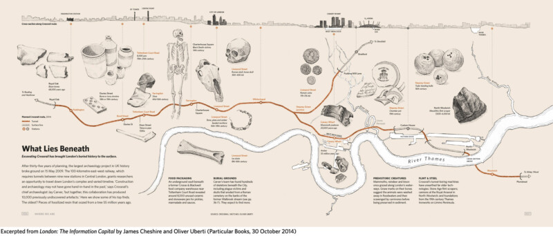
11. What Lies Beneath

After thirty-five years of planning, the largest archaeology project in UK history broke ground on 15 May 2009. Crossrail, the 100-kilometre east-west railway that requires tunnels between nine new stations in Central London, grants researchers an opportunity to travel down London’s complex and varied timeline.
Excerpted from London: The Information Capital by James Cheshire and Oliver Uberti (Particular Books/Penguin)

10. Passports, Please

For the first time, the 2011 Census asked, ‘What passports do you hold?’ 5.8 million Londoners ticked ‘United Kingdom’; 1.7 million named another country. In these maps, we show where British passport holders were born (left) and the number of foreign passport holders from each country (right).
Passports_spread

9. The Tube Challenge

The Guinness Book of Records credits R. J. Lewis and D. R. Longley with completing the first Tube Challenge on 13 June 1959. Since then, the game has evolved with the Tube map. Yet the essential rule remains: visit every station. Here we show you how.
The Tube Challenge

8. Increasingly Eastern

With this chart, we show the changing numbers of migrants from 98 countries between the last two censuses and rank them by percent change. For example, in 2001 there were fewer than 3,000 Lithuanians living in London: by 2011, that figure had increased sixteen-fold.
IncreasinglyEastern_spread

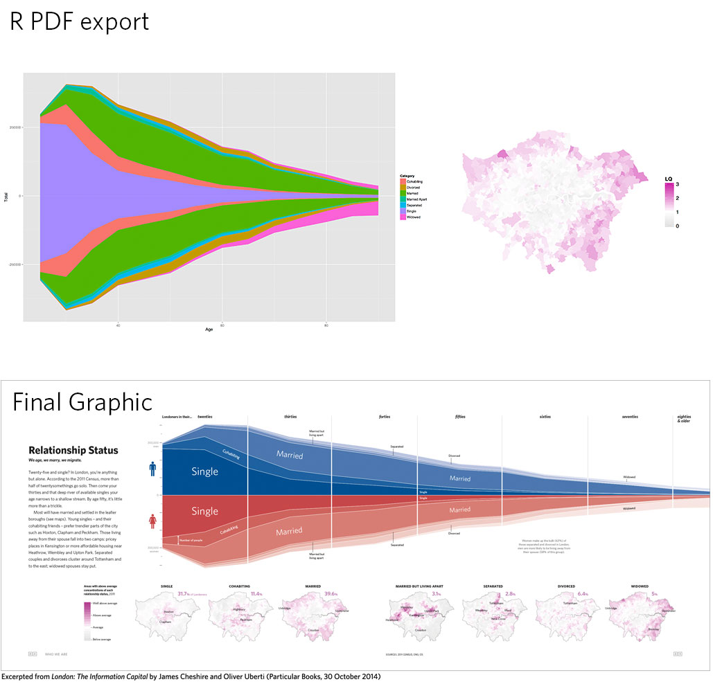
7. Relationship Status

Twenty-five and single? In London, you’re anything but alone. According to the 2011 Census, more than half of twentysomethings go solo. In this graphic, we show how the rest of Londoners are pairing or splitting and where they live.
Relationship Status spread

6. Greetings from London

London boasts over 300 different spoken languages — more than any other city in the world. The capital’s lingua franca, of course, remains English: 78% of Londoners cited it as their ‘main’ language in the 2011 Census. The other 22% speak in different tongues, including Urdu, Somali and Tagalog. We celebrate the city’s linguistic diversity by mapping how you’d say ‘hello’ in the most-frequently-spoken languages aside from English.
GreetingsfromLondon_spread

5. Islington Has Issues

Since 2011, the Office for National Statistics (ONS) has asked UK residents to rate their feelings of life satisfaction, purpose, happiness and anxiety on a scale of zero to ten. In these faces, we have linked each of those four questions to a different facial attribute.
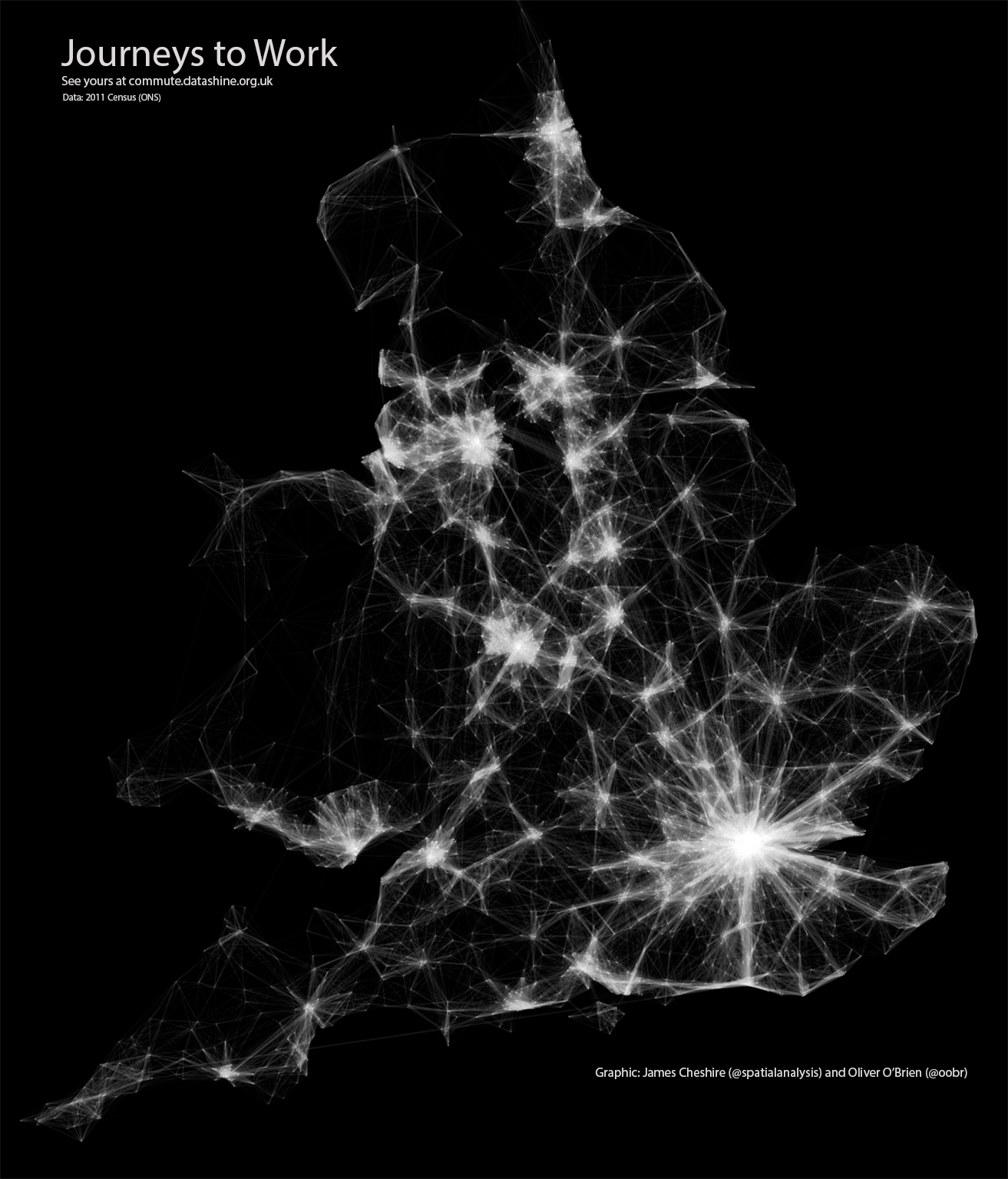
Life Satisfaction spread

4. Getting to Work

The Underground may be the best-known way to get around London, but it is not an option for everyone…
Excerpted from London: The Information Capital by James Cheshire and Oliver Uberti (Particular Books/Penguin)

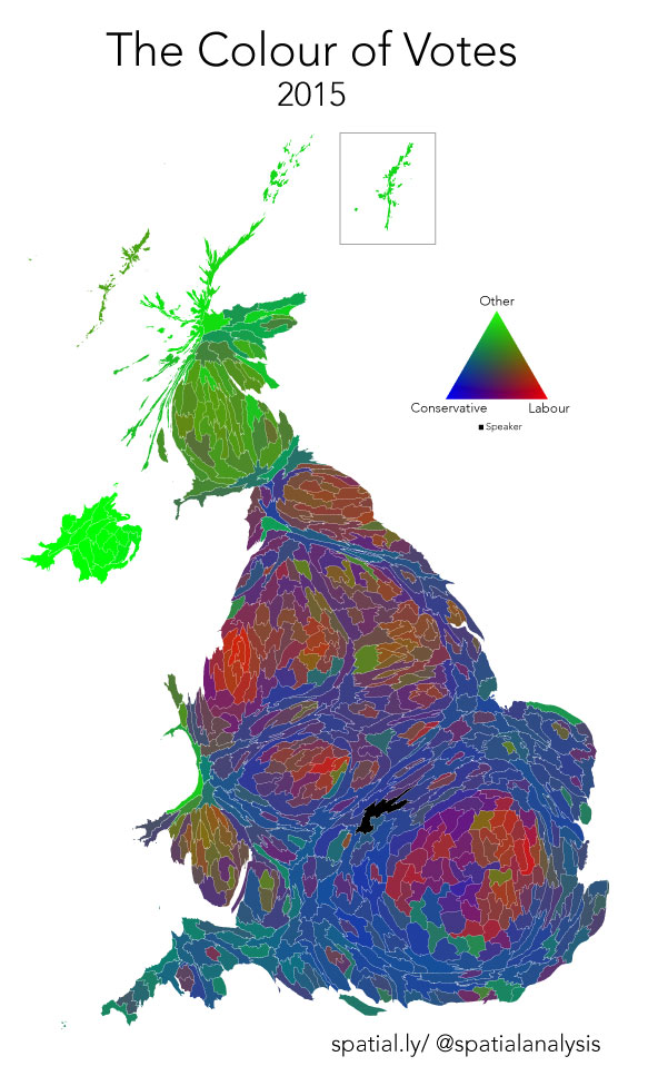
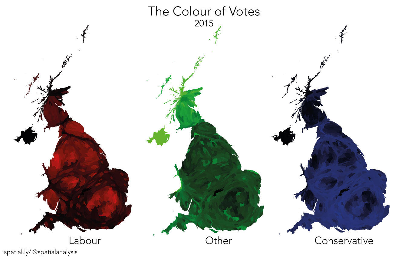
3. The Football Tribes

There are thirteen professional football clubs in London. To produce this mosaic of football loyalties, we divided the city into 500-by-500-metre squares, each coloured by the club with the most tweeted hashtag in that area.
The Football Tribes spread

2. A True Zoo

After an afternoon of sketching at the London Zoo in February 2014, Oliver decided to celebrate some lesser-known creatures tallied during the zoo’s annual inventory.
A True Zoo spread

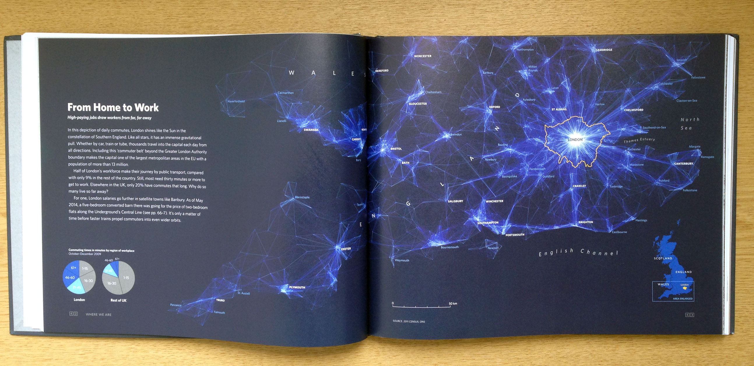
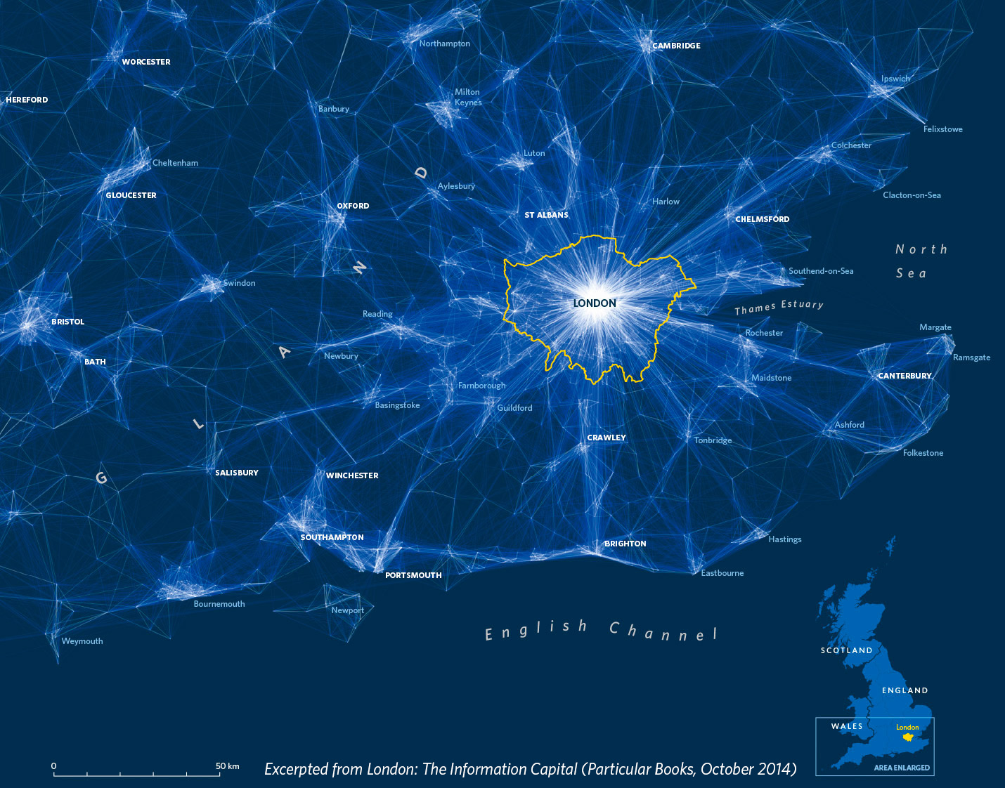
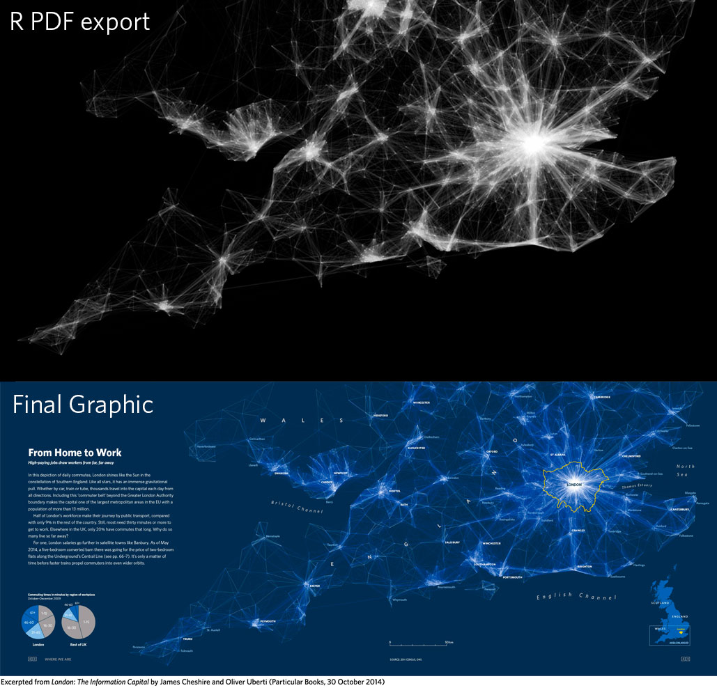
1. From Home to Work

In this depiction of daily commutes, London shines like the Sun in the constellations of Southern England. Like all stars, it has an immense gravitational pull. Whether by car, train or tube, thousands travel into the capital each day from all directions.
Home to Work spread
Purchase London: The Information Capital from Amazon, Waterstones, or Foyles.

#15MinuteMap: Tropical Cyclone Tracks 1842-2014

More and more I stumble across really cool datasets online that are crying out to be mapped, but I never seem to have the time to do anything fun with them. I had a spare 15 minutes yesterday and challenged myself to map something.
I wanted to map tropical cyclones – you can see the result below. I think my map is a good start, but it was never going to be perfect in 15 minutes. For example, it would benefit from a few more tweaks and a little more time spent adding labels, picking out interesting storm tracks and so on.
That said, I surprised myself that I was able to do anything in 15 minutes – it felt a bit like the cartographic equivalent of arriving home hungry and throwing a quick meal together from what’s left in the fridge.
It would be great to see what others can do – use the hashtag #15MinuteMap to share on Twitter!
hurricanes
How I did my map:
Data formatting is time consuming so the trick is to find some nice clean data – in my case it was a shapefile of historic hurricane tracks from here. These could be loaded easily into a GIS (ArcGIS in this case). I then downloaded “black marble” from NASA (as a GeoTiff) and loaded that into the GIS too. I then reprojected both to the Winkel Tripel projection and made the storm track lines pink and a little transparent. Hey presto!

Colour of Votes: 2015 General Election

colour_votes_jcheshire
There have been many great interactive maps and graphics produced for the 2015 General Election. A map I haven’t seen though is one that attempts to show the relative strength of support for each party in each constituency. This is what the map above seeks to achieve. The principle is simple – you have 3 buckets of paint – one red, one green, one blue – and you mix them together based on the vote share of each party. So a strong Conservative win gets lots of blue paint and relatively little from the other two, whilst split in support across parties will result in a more muddy colour as all three paints get mixed together in similar amounts. As an extra step I also rescaled the size of each area by the number of people who voted there to help show cities, especially London, more clearly.
Of course, this map falls a little short of revealing the most interesting results of the election since they mostly occurred in the green areas. A swing from Lib Dem to SNP, for example, would still warrant mostly green paint since both parties fall in the “Other” category. Instead, I see it as a useful way of showing where support for the Conservatives and Labour was strongest as well as those areas where the results underlying the outcome of the election were far from definitive.
I’ve included individual maps below showing how each of the colours are combined to produce the final map.
colour_votes_parties_jcheshire
Thanks to Oliver O’Brien for the constituency boundaries and to @ianpatterson99 for pointing me to the results.

Mapping Flows in R

journey_to_work_web
Last year I published the above graphic, which then got converted into the below for the book London: The Information Capital. I have had many requests for the code I used to create the plot so here it is!
The data shown is the Office for National Statistics flow data. See here for the latest version. The file I used for the above can be downloaded here (it is >109 mb uncompressed so you need a decent computer to load/plot it all at once in R). You will also need this file of area (MSOA) codes and their co-ordinates. The code used is pasted below with comments above each segment. Good luck!

library(plyr)
library(ggplot2)
library(maptools)

Load the flow data required – origin and destination points are needed.

input<-read.table("~/Dropbox/London_visualized_working/commute_flows/wu03ew_v1.csv", sep=",", header=T)

We only need the first 3 columns of the above

input<- input[,1:3]
names(input)<- c("origin", "destination","total")

The UK Census file above didn’t have coordinates just area codes. Here is a lookup that provides those.

centroids<- read.csv("~/Dropbox/London_visualized_working/commute_flows/msoa_popweightedcentroids.csv")
#Lots of joining to get the xy coordinates joined to the origin and then the destination points.
or.xy<- merge(input, centroids, by.x="origin", by.y="Code")
names(or.xy)<- c("origin", "destination", "trips", "o_name", "oX", "oY")
dest.xy<-  merge(or.xy, centroids, by.x="destination", by.y="Code")
names(dest.xy)<- c("origin", "destination", "trips", "o_name", "oX", "oY","d_name", "dX", "dY")

Now for plotting with ggplot2.This first step removes the axes in the resulting plot.

xquiet<- scale_x_continuous("", breaks=NULL)
yquiet<-scale_y_continuous("", breaks=NULL)
quiet<-list(xquiet, yquiet)

Let’s build the plot. First we specify the dataframe we need, with a filter excluding flows of <10

ggplot(dest.xy[which(dest.xy$trips>10),], aes(oX, oY))+
#The next line tells ggplot that we wish to plot line segments. The "alpha=" is line transparency and used below
geom_segment(aes(x=oX, y=oY,xend=dX, yend=dY, alpha=trips), col="white")+
#Here is the magic bit that sets line transparency - essential to make the plot readable
scale_alpha_continuous(range = c(0.03, 0.3))+
#Set black background, ditch axes and fix aspect ratio
theme(panel.background = element_rect(fill='black',colour='black'))+quiet+coord_equal()

home_work_print

London: The Open Data Capital

This has been cross-posted from a guest blog post I wrote on the London Datastore.
Throughout London’s history, its data have inspired innovative maps and visualisations from the likes of John Snow, William Farr, Charles Booth and Florence Nightingale, all of whom were truly pioneering in their communication of complex datasets throughout the 19th Century. A more recent and less well-known contribution to their legacy is the “Atlas of London and the London Region”, which takes pride of place in my office. Published in 1968 by Emrys Jones and Daniel Sinclair, it is a box containing 70 maps – each nearly a metre wide – that depict everything from London’s topography to the growth of the city and its overcrowded households. The atlas was six years in the making and the work required to produce it without widespread digital mapping tools must have been enormous.

Map 7 from the “Atlas of London and London Region” showing the growth of London since 1800.

Inspired by London’s visualisation pioneers London: The Information Capital is a new book that I produced with designer Oliver Uberti. Although it is more modest in terms of its physical dimensions, its 20 million data points are a reflection of a wealth of data that simply did not exist in Jones and Sinclair’s day. The variety of topics that Oliver and I were able to explore – from commuter flows to Londoners’ binge drinking habits – is the result of the volume of freely available data covering all aspects of London life. For example, we had easy access to everything from the UK’s 2011 Census to Transport for London performance data and Ambulance call-outs. London: The Information Capital benefitted not just from their existence but also from the easy-to-analyse format in which they are shared.
Open data initiatives now exist in other cities, but London continues to be a pioneer in the creation and dissemination of its data, to the advantage of those who live here. Indeed, the volume of data made freely available, supplemented by the likes of social media and those obtainable through Freedom of Information requests (FOIs), inspired the book’s title. By saying that London is the Information Capital we are challenging other cities to match the great work conducted by the likes of the London Datastore.

Commuter flows into London, taken from the 2011 Census.

We are not suggesting London has done all it can to improve access to data. Many more datasets could be made open, while others could be made easier to find among the lists of files.
Moreover, datasets in their raw form require high-level skills to turn them into usable information: in this sense, increasing data provision is by no means the same as increasing data access. That said, moves to increased accessibility are already being made, with the likes of “dashboards” offering accessible snapshots to key trends in the data behind them and interactive maps that can show patterns without the need for number crunching. By offering a series of new data portraits, we hope that London: The Information Capital adds to these developments and offers some new perspectives on an old city.

Improving R Data Visualisations Through Design

When I start an R class, one of my opening lines is nearly always that the software is now used by the likes of the New York Times graphics department or Facebook to manipulate their data and produce great visualisations. After saying this, however, I have always struggled to give tangible examples of how an R output blossoms into a stunning and informative graphic. That is until now…
I spent the past year working hard with an amazing designer – Oliver Uberti – to create a book of 100+ maps and graphics about London. The majority of graphics we produced for London: The Information Capital required R code in some shape or form. This was used to do anything from simplifying millions of GPS tracks, to creating bubble charts or simply drawing a load of straight lines. We had to produce a graphic every three days to hit the publication deadline so without the efficiencies of copying and pasting old R code, or the flexibility to do almost any kind of plot, the book would not have been possible.  So for those of you out there interested in the process of creating great graphics with R, here are 5 graphics shown from the moment they came out of R to the moment they were printed.
commute_flows_before_after
This graphic shows the origin-destination flows of commuters in Southern England. In R I used the geom_segment() command from the brilliant ggplot2 package to draw slightly transparent white lines between the centroids of the origins and destinations. I thought my R export looked pretty good on black, but we then imported it into Adobe Illustrator and Oliver applied a series of additional transparency effects to the lines to make them glow against the dark blue background (a colour we use throughout the book).
day_night_before_after
This is a crop from a graphic we produced to show the differences between the daytime and nighttime population of London (we are showing nighttime here). It copies the code I used to produce my Population Lines print, but Oliver went to the effort of manually cleaning the edges of the plot (I couldn’t work out how to automatically clip the lines in ggplot2!) by following the red-line I over-plotted. Colours were tweaked and labels added, all in Illustrator.
treasures_before_after
One of my favourite graphics in the book shows the number if pieces of work by each artist in the Tate galleries.  We can only show a small section here, but full-sized it looks spectacular as it features a Turner painting at its centre. The graphic started life as a treemap that simply scaled the squares by the number of artists. R has a very easy to use treemap() function in the treemap package. Oliver then painstakingly broke the exported graphic to bits, converted the squares to picture frames and arranged them on “the wall”.
cycle_before_after
This map, showing cyclists in London by time of day, was created from code similar to this graphic. It is an example where very little needed to be done to plot once exported – we only really needed to add the River Thames (this could have been done in R), some labels and then optimise the colours for printing. Hundreds of thousands of line segments are plotted here and the graphic is an excellent illustration of R’s power to plot large volumes of data.
relationship_status_before_after
The graphic above (full size here) has been the most popular from the book so far. It takes 2011 Census data and maps people by marital status as well as showing the absolute numbers as a streamgraph. ggplot2 was used to create both the maps and the plot. We stuck to the exported colours for the maps and then manually edited the streamgraph colours. The streamgraph was created with the geom_ribbon() function in ggplot2.
london_inspired_before_after
All the graphics shown so far started life as databases containing, as a minimum, several thousand rows of data. In this final example we show a “small data” example – the lives of 100 Londoners who have earned a blue plaque on one of London’s buildings. The data were manually compiled with each person having 3 attributes against their name: the age they lived to, the age when they created their most significant work, the period of their life they lived in London. Thanks to ggplot2 I was able to use the code below to generate the coarse looking plot above. Oliver could then take this and flip it before restyling and adding labels in Illustrator. They key thing here was that a couple of lines of code in R saved a day of manually drawing lines.
#We order by age of when the person started living in London, this is the order field.
ggplot(Data,aes(order,origin))+geom_segment(aes(xend=order, yend=Age))+geom_segment(aes(x=order,y=st_age, xend=order, yend=end_age), col="red")+geom_segment(aes(x=order,y=st_age2, xend=order, yend=end_age2), col="yellow")+ coord_polar()
 
Purchase London: The Information Capital.

DataShine Update

Back in June Oliver O’Brien and I launched an interactive census map called DataShine. It has been hugely successful with a core of regular users in addition to many visitors passing who want to learn more about their area or a specific dataset. As we said back in June, the website is a work in progress so we are always looking to add new features. Two of these – local area rescaling of the colour key and data download – were launched recently at the UK Data Service‘s Census Research User Conference hosted by the Royal Statistical Society. Both are in response to people’s need to zoom in and look at particular patterns for their area without worrying about other parts of the country. Census data can also be tricky to find if you don’t know all the codes or table structures so we hope that offering simple access via the map will help users a lot. So next time you use DataShine look out for the buttons highlighted below…
datashine_new_features
To learn more about these features, in particular the local area rescaling see our blog post here.

London: The Information Capital

printed_book
I am pleased announce that London: The Information Capital will be published on the 30th October. It is a book bursting with maps and graphics about the world’s greatest city and the result of a year of intense work with designer Oliver Uberti. Inspired by London’s design, mapping and visualisation pioneers (think Booth, Snow, Beck) we have sought to paint a contemporary portrait of the city through its abundance of open data. We asked ourselves questions such as

Which borough of London is the happiest? 

Where are the city’s tweeting hot spots?  

How many animals does the fire brigade save each year? 

Which London residents have left their mark on history?

Where are London’s most haunted houses (and pubs)?

What makes London the information capital?

and sought to answer them through data visualisation. The book contains over 100 full-colour spreads alongside some brief essays to introduce each of the 5 broad themes – Where we are, Who we are, Where we go, How we’re doing and What we like.

We worked closely with our publisher Particular Books (part of Penguin) to create a book that was a beautiful as it could be. Inside you’ll find some graphics with transparent overlays for before/ after comparisons, binding that minimises the impact of the centre fold and page dimensions tailored to the shape of London. All this showcases everything from watercolours of London’s protected vistas, 24 hours of shipping in the Thames Estuary and London’s data DNA. You can find out more here or pick up a copy on Amazon.

home_work_print

Population Lines Print

population_lines_sml

Unfortunately the print is no longer available

I recently produced a map entitled “Population Lines”, which shows population density by latitude. The aim was to achieve a simple and fresh perspective on these well-known data. I have labelled a few key cities for orientation purposes but I’ve left off most of the conventional cartographical adornments. I am really pleased with the end result not least because it resembles Joy Division’s iconic Unknown Pleasures album cover, which in itself is a great example of data visualisation as art.

map_coffee_sml

The data, from NASA SEDAC, have been mapped many times before and in many beautiful ways but none seem to me quite as compelling as the simple approach here of using only black and grey lines across the page. What amazes me about this map (from where I sit in London) is just how jagged the lines become throughout India, East China, Indonesia and Japan in comparison to “the West” – evidence that we are definitely in the “Asian Century”.
asia
Following quite a lot of interest in the map, I’ve had some A2 prints produced for those who’d like to own a copy. Each print is produced with vegetable-based inks on 170 gsm 100% recycled Cyclus Offset paper. This is slightly off-white and does a great job of producing crisp lines and giving the print a quality feel. I have signed and numbered each print for this first print run. If you would like to own a copy please click below.

framed_sml
Frame not included

Small print: Print is unframed. Orders from outside of the EU may be subject to local taxes.
europe_smlindia_sml
For those interested Ryan Brideau has produced a version of the code for how to do this here.