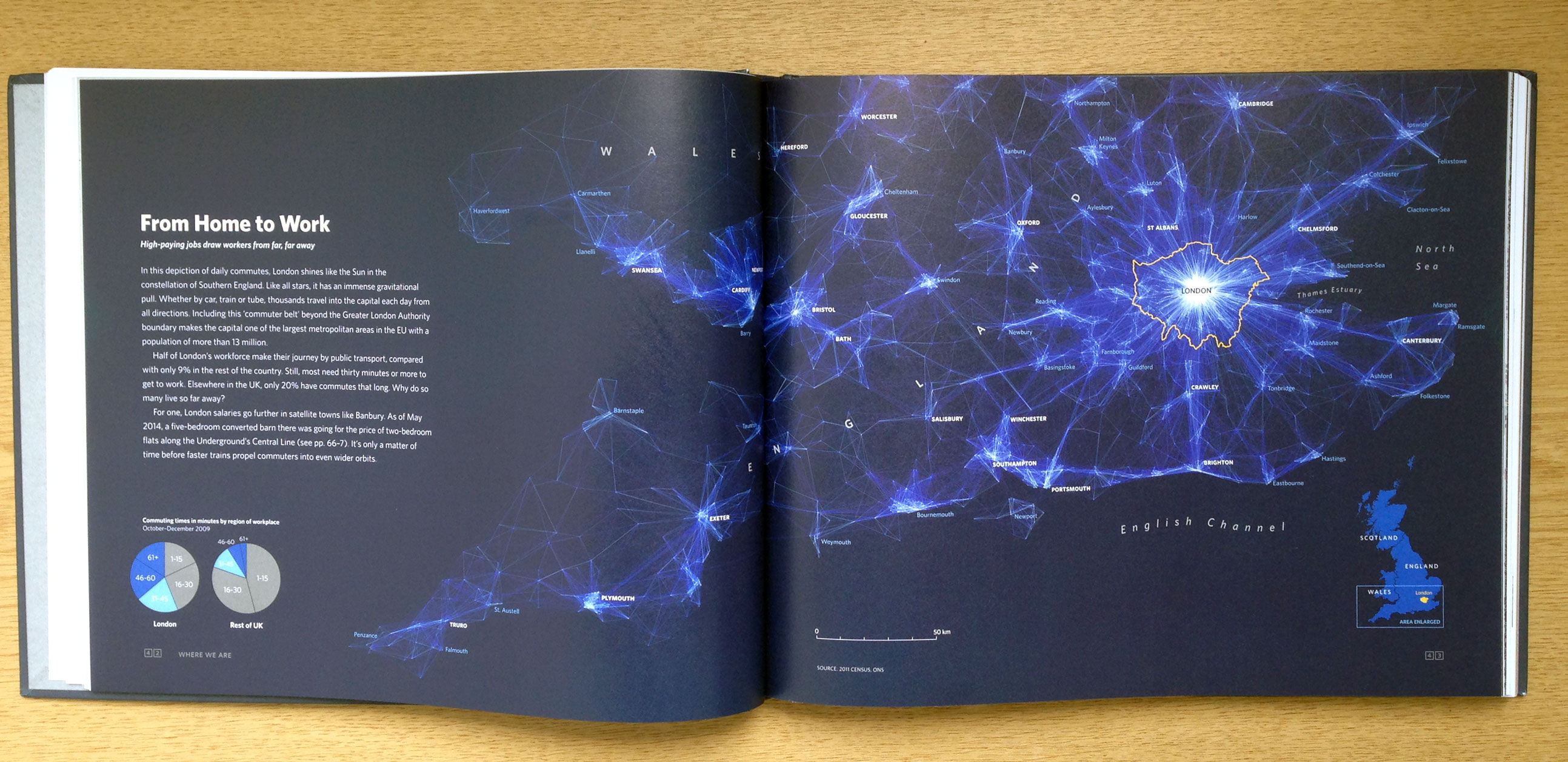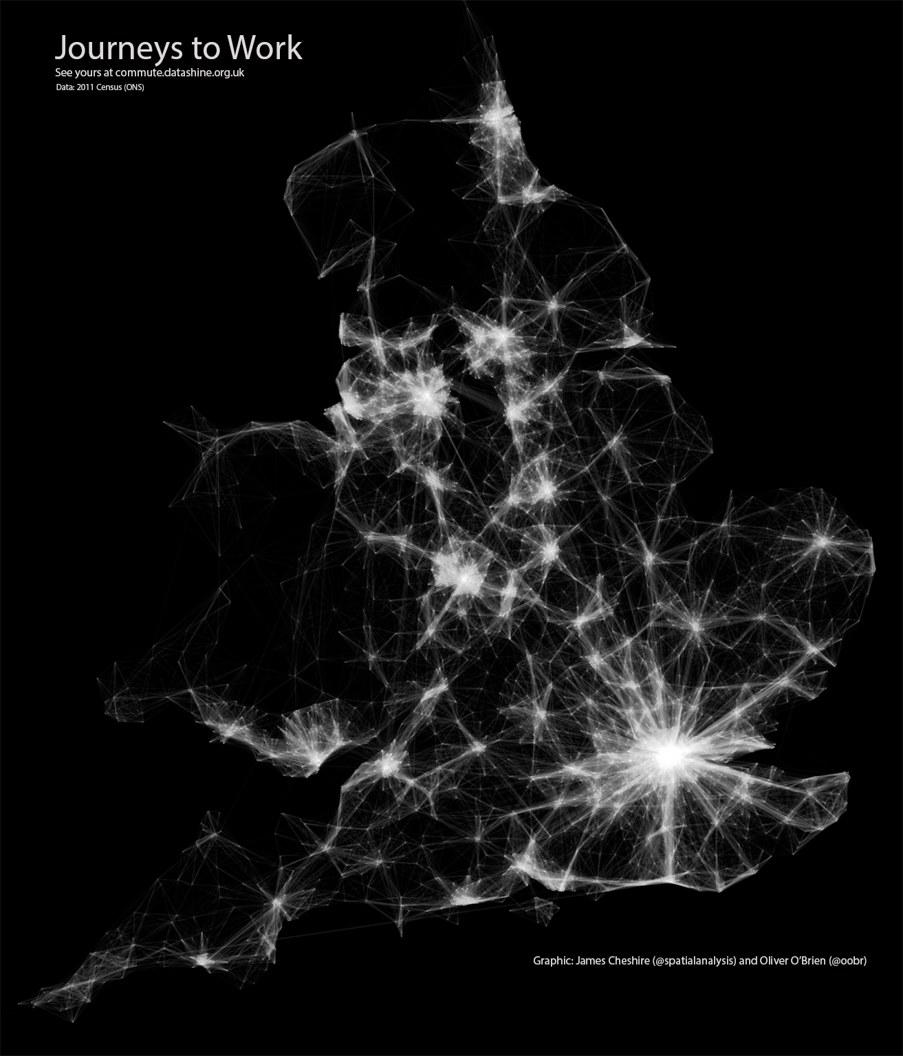
Last year I published the above graphic, which then got converted into the below for the book London: The Information Capital. I have had many requests for the code I used to create the plot so here it is!
The data shown is the Office for National Statistics flow data. See here for the latest version. The file I used for the above can be downloaded here (it is >109 mb uncompressed so you need a decent computer to load/plot it all at once in R). You will also need this file of area (MSOA) codes and their co-ordinates. The code used is pasted below with comments above each segment. Good luck!
library(plyr)
library(ggplot2)library(maptools)Load the flow data required – origin and destination points are needed.
input<-read.table("~/Dropbox/London_visualized_working/commute_flows/wu03ew_v1.csv", sep=",", header=T)We only need the first 3 columns of the above
input<- input[,1:3]
names(input)<- c("origin", "destination","total")
The UK Census file above didn’t have coordinates just area codes. Here is a lookup that provides those.
centroids<- read.csv("~/Dropbox/London_visualized_working/commute_flows/msoa_popweightedcentroids.csv")
#Lots of joining to get the xy coordinates joined to the origin and then the destination points.
or.xy<- merge(input, centroids, by.x="origin", by.y="Code")
names(or.xy)<- c("origin", "destination", "trips", "o_name", "oX", "oY")
dest.xy<-  merge(or.xy, centroids, by.x="destination", by.y="Code")
names(dest.xy)<- c("origin", "destination", "trips", "o_name", "oX", "oY","d_name", "dX", "dY")
Now for plotting with ggplot2.This first step removes the axes in the resulting plot.
xquiet<- scale_x_continuous("", breaks=NULL)
yquiet<-scale_y_continuous("", breaks=NULL)
quiet<-list(xquiet, yquiet)
Let’s build the plot. First we specify the dataframe we need, with a filter excluding flows of <10
ggplot(dest.xy[which(dest.xy$trips>10),], aes(oX, oY))+
#The next line tells ggplot that we wish to plot line segments. The "alpha=" is line transparency and used below
geom_segment(aes(x=oX, y=oY,xend=dX, yend=dY, alpha=trips), col="white")+
#Here is the magic bit that sets line transparency - essential to make the plot readable
scale_alpha_continuous(range = c(0.03, 0.3))+
#Set black background, ditch axes and fix aspect ratio
theme(panel.background = element_rect(fill='black',colour='black'))+quiet+coord_equal()