DataShine Update
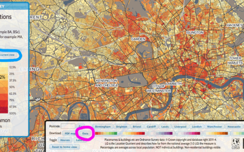
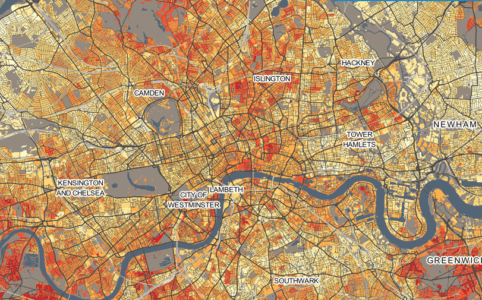
Back in June Oliver O’Brien and I launched an interactive census map called DataShine. It has been hugely successful with a core of regular users in addit...
Back in June Oliver O’Brien and I launched an interactive census map called DataShine. It has been hugely successful with a core of regular users in addit...
Last October I was fortunate enough to be awarded an ESRC “Future Research Leaders” grant. These run for up to 3 years and offer the opportunity for...
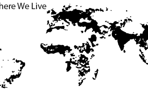
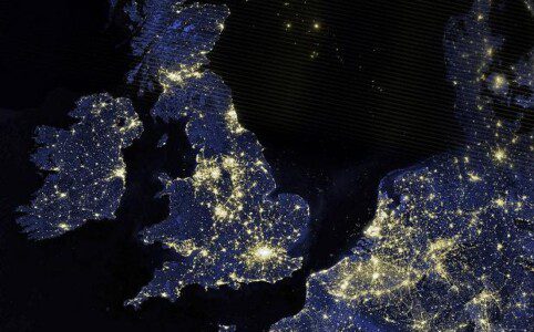
Showing where we live is, of course, one of the oldest and most useful reasons to create a map. As we bask in the “Big Data” era, the trend for mapp...
I have just been awarded and ESRC Future Research Leaders grant entitled “Big Open Data: Mining and Synthesis” (BODMAS). The project is an exciting ...
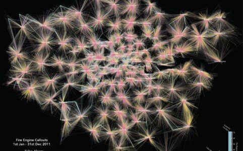
This map shows the geography of fire engine callouts across London between January and September 2011. Each of the 144,000 or so lines represents a fire engine ...
The publication of the International Benchmarking Review of UK Human Geography back in March was a major event for the discipline. The report concludes that the...
[zoomit id=”IIY6″ width=”auto” height=”400px”] **Update: You can see a new fully-interactive version here** Last year...
Of all the different types of data visualisation, maps* seem to have the best reputation. I think people are much less likely to trust a pie chart, for example,...
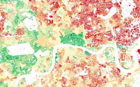
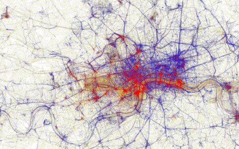
Maps have always been a powerful way of highlighting London’s social inequalities (Charles Booth‘s and John Snow‘s are the most iconic exampl...
I recently co-wrote an editorial (download the full version here) with Mike Batty (UCL CASA) in which we explored some of the current issues surroundi...