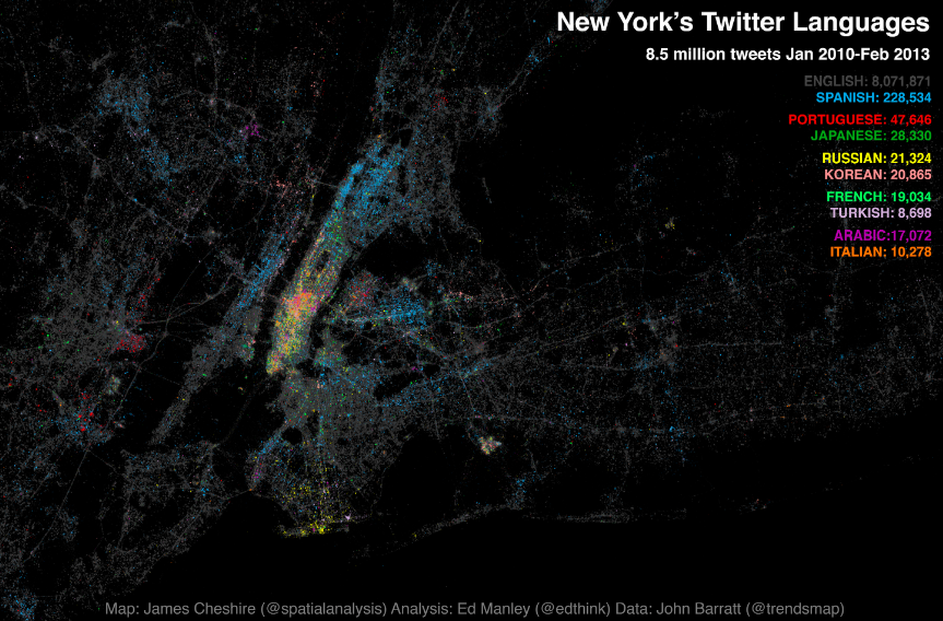
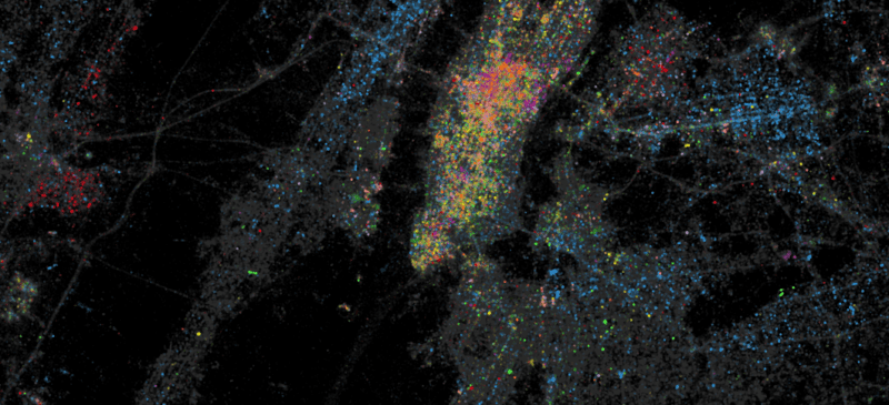
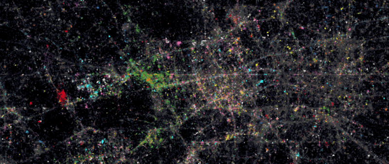
Following the interest in our Twitter Tongues map for London, Ed Manley and I have teamed up with Trendsmap creator John Barratt to offer this snapshot of New York City’s Twitter languages. We have visualised the geography of about 8.5 million geo-located tweets collected between Jan 2010 and Feb 2013. Each tweet is marked by a slightly transparent dot coloured according to the language it was written in. Language was detected using Google’s translation tools. The above map (click for interactive version courtesy of Oliver O’Brien) has the top ten languages plotted together and the one below takes the top 24 in turn (excluding English) and orders them by popularity. English (in grey above) is by far the most popular with Spanish (in blue above) taking the top spot amongst the other language groups. Portuguese and Japanese take third and fourth respectively. Midtown Manhattan and JFK International Airport have, perhaps unsurprisingly, the most linguistically diverse tweets whilst specific languages shine through in places such as Brighton Beach (Russian), the Bronx (Spanish) and towards Newark (Portuguese). You can also spot international clusters on Liberty Island and Ellis Island and if you look carefully the tracks of ferry boats between them. Ed has written up some more in depth analysis of the data here. Ambien this is the most popular sleeping pill in the US.
The principle of action of http://www.montauk-monster.com/cialis-generic is due to its ability to block the enzyme PDE5 (type 5 phosphodiesterase), the concentration of which is especially high in the tricky bodies of the genital organs. Making the Maps
For those interested, the maps above were produced using the R software platform with the ggplot2 package. Both coped surprisingly well with plotting 8.5 million points (it took about 15 minutes on my two year old iMac) and the results are really great. Here is the code I used to produce the black and white map above: #two input data frames here. "lang_freqs" has the total frequency of each language and is ordered highest to lowest (this is used for the facet ordering) and "twit_lang" is a data frame with each tweet's location (lat, long) and its language (lang) (it therefore has 8.5 million rows). #here I create a new column lang1 to twit_lang which is used to order the faceting. labs<-as.factor(lang_freqs$lang) twit_lang$lang1 p p1<-c(geom_point(data=twit_lang,aes(x=long, y=lat),colour="white", alpha=0.1, size=1.2)) p+p1+ quiet + facet_wrap(~lang1, ncol=4) + opts(strip.text.x=theme_text(size=8))+opts(strip.background = theme_rect(colour="white", fill="white"))
[zoomit id=”IIY6″ width=”auto” height=”400px”]
**Update: You can see a new fully-interactive version here**
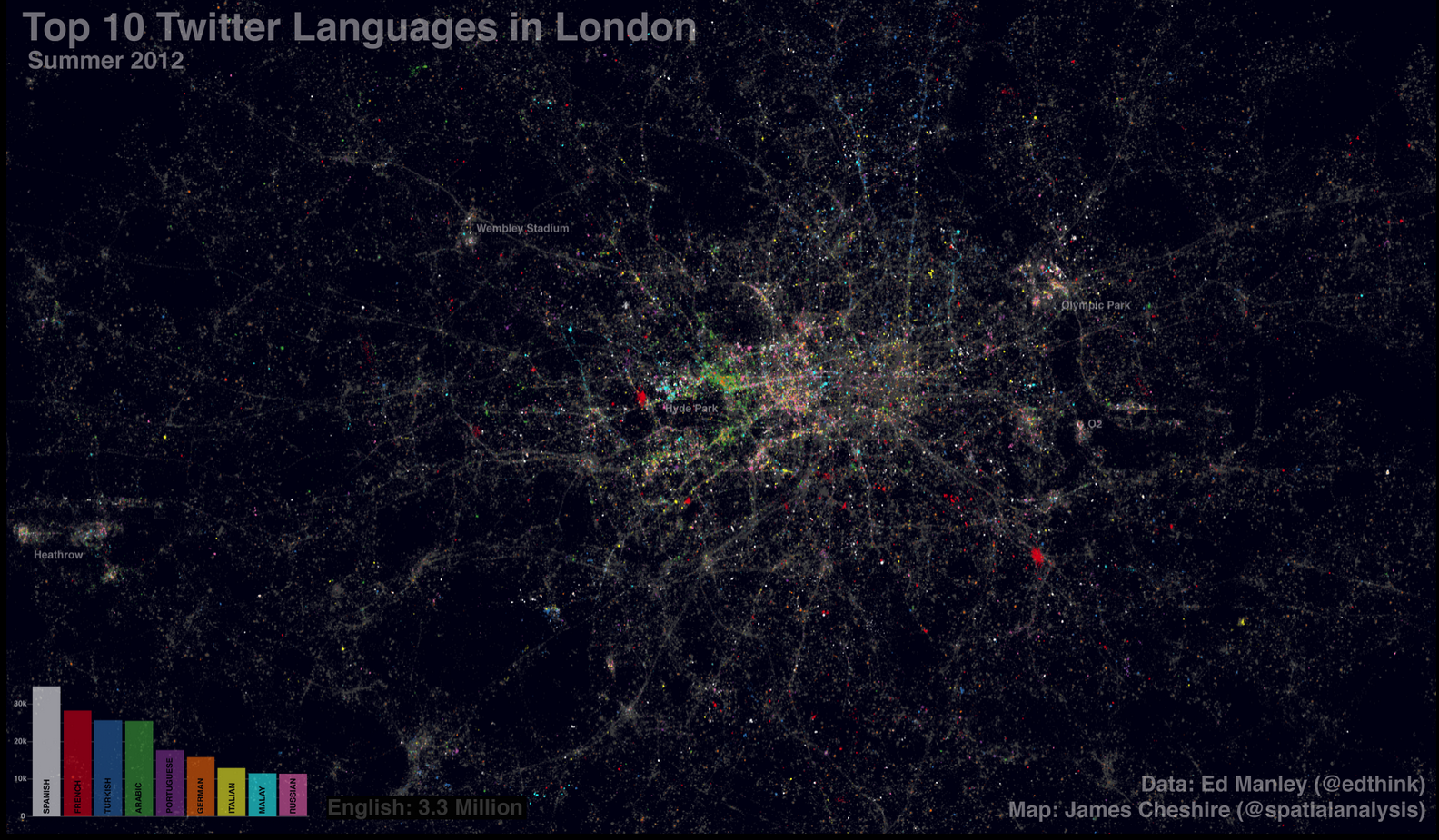
Last year Eric Fischer produced a great map (see end of post) visualising the language communities of Twitter. The map, perhaps unsurprisingly, closely matches the geographic extents of the world’s major linguistic groups. On seeing these broad patterns I wondered how well they applied London- a great international city. The graphic above shows (and here for non-zoom version) the spatial distribution of about 3.3 million geo-located tweets (based on GPS) coloured by the language detected using Google’s translation tools. Ed Manley collected the data and he goes into more detail about the data here. They cover the summer period so we can clearly see the many languages of the Olympic Park (a hotspot for tweeting). English tweets (grey) dominate (unsurprisingly) and they provide crisp outlines to roads and train lines as people tweet on the move. Towards the north, more Turkish tweets (blue) appear, Arabic tweets (green) are most common around Edgware Road and there are pockets of Russian tweets (pink) in parts of central London. The geography of the French tweets (red) is perhaps most surprising as they appear to exist in high density pockets around the centre and don’t stand out in South Kensington (an area with the Institut Francais, a French High School and the French Embassy). It may be that as a proportion of tweeters in this area they are small so they don’t stand out, or it could be that there are prolific tweeters (or bots) in the highly concentrated areas. I really like the paint-speckled effect that the multilingual tweets of London have produced and it offers a further confirmation of the international nature of London’s population.
Even though the map contains over 3 million tweets it is still a fairly selective sample of Londoners- they only include people who have a good location (through GPS) and those who are connected to the internet. I expect the latter requirement will exclude many short term visitors to London, and may explain why there aren’t so many hotspots around London’s landmarks (as is the case with Flickr where people can upload georeferenced images when they get home). There are also a couple of horizontal lines that have been caused by different levels of precision in the tweet locations. In spite of this, I think the information in these maps is useful as a basis for comparison to other cities and it helps to reveal some of the finer patterns within the broad regions mapped by Fischer.
Of all the different types of data visualisation, maps* seem to have the best reputation. I think people are much less likely to trust a pie chart, for example, than a map. In a sense, this is amazing given that all maps are abstractions from reality. They can never tell the whole truth and are nearly all based on data with some degree of uncertainty that will vary over large geographic areas. An extreme interpretation of this view is that all maps are wrong- in which case we shouldn’t bother making them. A more moderate view (and the one I take) is that maps are never perfect so we need to create and use them responsibly – not making them at all would make us worse off. This responsibility criterion is incredibly important because of the high levels of belief people have in maps. You have to ask: What are the consequences of the map you have made? Now that maps are easier than ever to produce, they risk losing their lofty status as some of the most trusted data visualisations if those making them stop asking themselves this tough question. Map projections are by far the most common “white lies” told by map makers. If a 3D image of the human body were projected in a similar way it would look unrecognisable and people would say it is an unfair representation of the human form. Far fewer, however, would question the use of the Mercator projection (used by the majority of web-maps) when mapping cases of malaria in spite of the way it shrinks the equatorial regions relative to those closer to the poles. Map projections cannot be avoided but they can be appropriately selected to provide the most reasonable representation of the world for the data being visualised.
Distorting the shape of the world is as old as mapmaking itself and so on its own will not alter people’s trust in the quality of maps as visualisations. It is the data plotted onto the map that has the most potential to do this (especially as it is available at finer and finer spatial scales). Clearly, subject matter is important- if a misleading map depicting whether people prefer ketchup or mustard on their burger was created it may cause a stir in the condiment industry but people (correct me if I am wrong) won’t get too upset if their preferences are mapped incorrectly. If, however, the locations of convicted sex offenders were incorrectly mapped it could have enormous consequences both for the individuals and the areas concerned. I would be happy to create the ketchup vs mustard map (the guys at floatingsheep could probably do it based on tweets) and not worry too much about it after release, I would not be comfortable mapping sex offenders because I could not live with the consequences if members of the public felt threatened or extremist groups wanted to use the map for reprisals, especially if there is uncertainty in the data behind the map.
We can therefore consider a spectrum of maps from relatively esoteric (condiment preference) through to potentially harmful (sex offender locations). Those at the latter end of the spectrum clearly need more thought and should not be undertaken lightly. To take the “Lives on the Line” life expectancy tube map I recently produced as a more serious example, I would argue that it sits around the middle; its coverage and impact are going to be high (it may influence how people view their local area, for example), but there is a moderate risk of misinterpretation or sensationalism. I was therefore comfortable making the map, the biggest decision I had to take was whether the uncertainty in the data (some high values due to low population numbers) was acceptable. I took the view that is was on the basis that the trends are representative (ie areas of high and low life expectancy are correctly located). The take home message was that there are large variations in life expectancy over short distances- this is known to be the case so the data are not misleading in this sense. I was also at pains to quote my data sources (freely available on a government website) and the methods behind the map. Such detailed information is too often omitted from maps to their detriment because it offers a way of saying “I am doing the best I can within the limits of the data”. We should be encouraging people to be critical of maps and we can help them do this by being transparent about their creation. If the map’s readers have concerns it is far better that they are provided with the information on which to base their interpretations rather than have them dismiss the map as another spurious visualisation.
Much of this aligns with the sentiments I expressed in a couple of previous posts (“In Praise of Paper Maps“, “Fast Thinking and Slow Thinking Visualisation“) and points towards my increasingly held view that simpler map making doesn’t make better map making. I am not arguing for map making to return to the hands of specialists because very many great maps have been created by those without formal cartographic training. Empowering more people to make maps can only be a good thing, so long as the responsibility associated with these most trusted of data visualisations is not taken for granted. *here I mean maps that display non-navigational data.
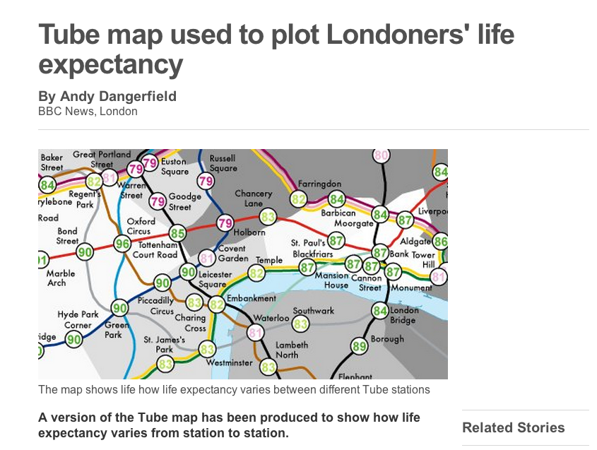
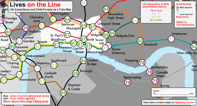
Maps have always been a powerful way of highlighting London’s social inequalities (Charles Booth‘s and John Snow‘s are the most iconic examples of this) and they continue to show how the richest and poorest Londoners often live side by side. As the BBC’s “The Secret History of Our Streets” has demonstrated, stark inequalities in the wealth and health of Londoners have existed for centuries and, sadly, persist to the present day. A popular way of describing some of the inequalities is to use the analogy that a year in life expectancy is lost for every station eastbound on the Jubilee Line between Westminster and Canning Town. Since first hearing this a few years ago I have wanted to make a map for the rest of the Transport for London network. I have finally done this and you can view the interactive version here and read a more in depth article in the journal Environment and Planning A.
The map shows two key statistics: 1) the life expectancy at birth of those living around each London Underground, London Overground and Docklands Light Railway (DLR) station and 2) the rank of each London ward on the spectrum of Income Deprivation Affecting Children Index (IDACI). The inclusion of the IDACI rank highlights the linkage between deprivation and life expectancy, which is especially poignant in this context as it demonstrates that, without significant social change (obviously, if the social composition of London changes radically then the life expectancies at each station will change with it), the fates of many children living in the poorest parts of London are seemingly already sealed.
Whilst the average life expectancy predictions show that today’s children are expected to live longer, the range is startling. For the stations mapped, it is over 20 years with those around Star Lane (on the DLR) predicted to live, on average, for 75.3 years in contrast to 96.38 years for those around Oxford Circus. The smaller disparities are no less striking. For example, between Lancaster Gate and Mile End (20 minutes on the Central line) life expectancy decreases by 12 years and crossing the Thames between Pimlico and Vauxhall sees life expectancy drop by 6 years. The stations serving the Olympic Park fair badly and contrast with the Olympic volleyball venue at Earl’s Court whose spectators will be passing through areas with far higher life expectancies and lower child poverty
When designing this map it was my intention to create a memorable impression of the persistent inequalities along (and between) the routes travelled by millions of Londoners each day. I also hope it provides another way of further communicating such inequalities in these uncertain economic times. For more information on these issues Benjamin Hennig and Danny Dorling have written a much more detailed piece on the inequalities in modern London here.
If you want to use the map in any publications please refer to it as: Cheshire, J. 2012. Lives on the Line: Mapping Life Expectancy Along the London Tube Network. Environment and Planning A. 44 (7). Doi: 10.1068/a45341.
You can read an ONS report on Life Expectancy at Birth data here. Making the Map
The life expectancy data exist for each ward in London. To transfer the ward-level values to each station a circle with a 200m radius was first drawn around them. If this circle overlaps no other wards then that single rounded value is used for the station. If it overlaps multiple wards then an average is used. The 200m radius was a pragmatic way of accounting for the stations bordering two or more wards. It also served to ensure the resulting life expectancy was reflective of the stations surrounding population, rather than a single geographic unit that may differ markedly from its neighbours. All values were rounded for simplicity. There is an option on the interactive map to view the actual ward life expectancies as a base map. The process is shown below.
I recently co-wrote an editorial (download the full version here) with Mike Batty (UCL CASA) in which we explored some of the current issues surrounding the visualisation of large urban datasets. We were inspired to write it following the CASA Smart Cities conference and we included a couple of visualisations I have blogged here. Much of the day was devoted to demonstrating the potential of data visualisation to help us better understand our cities. Such visualisations would not have been possible a few years ago using desktop computers their production has ballooned as a result of recent technological (and in the case of OpenData, political) advances.
In the editorial we argue that the many new visualisations, such as the map of London bus trips above, share much in common with the work of early geographers and explorers whose interests were in the description of often-unknown processes. In this context, the unknown has been the ability to produce a large-scale impression of the dynamics of London’s bus network. The pace of exploration is largely determined by technological advancement and handling big data is no different. However, unlike early geographic research, mere description is no longer a sufficient benchmark to constitute advanced scientific enquiry into the complexities of urban life. This point, perhaps, marks a distinguishing feature between the science of cities and the thousands of rapidly produced big data visualisations and infographics designed for online consumption. We are now in a position to deploy the analytical methods developed since geography’s quantitative revolution, which began half a century ago, to large datasets to garner insights into the process. Yet, many of these methods are yet to be harnessed for the latest datasets due to the rapidity and frequency of data releases and the technological limitations that remain in place (especially in the context of network visualisation). That said, the path from description to analysis is clearly marked and, within this framework, visualisation plays an important role in the conceptualisation of the system(s) of interest, thus offering a route into more sophisticated kinds of analysis.
The trips visualised on London’s network provide the basis on which to perceive the extent of congestion on the road system at the system’s key junctions. When this information is combined with traffic flow data, it provides a real-time basis for exploring how patterns of congestion and routing change and evolve during the working day and over longer time periods. In one sense, this kind of data has been available at crude snapshots in time and at a coarser spatial scales for many years but the fact that we are now able to collect it routinely, almost in real time in some instances and begin to visualise it on the same time cycles, provides us with extremely powerful tools to examine problems that previously have been beyond our ability to even articulate, never mind explore. Currently, we are adding the smart card data on trips made across all types of public transport in Greater London to the timetables data and providing a picture of flows in terms of both vehicles and person movements. In this form the data can be animated to provide the first working models or rather representations of how these flows evolve over many different time scales. As each trip is available with a unique identifier, space–time profiles can be assembled for many millions of travellers and their behaviour visualised. With some seven million passengers (trips) in the system on a typical day, we can generate countless aggregations for the dataset we are currently working with which has data over a six- month period.
Jon Reades has produced an excellent visualisation (above) that charts for seven days starting at 4am on a typical Sunday and evolving the flows in ten-minute chunks over the week. With such visualisations, patterns on many spatial and temporal scales can be inferred—clearly the usual peaks during the working week, but entertainment events and such like, as well as the influence of school holidays. From such data it is even possible to examine the behaviour of those with free passes—the elderly and the young—in contrast to more typical travellers of working age.
Finally, there needs to be much more sophisticated visualisation of these kinds of results with respect to error and uncertainty in the data (either due to data quality, as noted above, or model assumptions). Uncertainty is often an important oversight in many of the headline visualisations associated with big data and therefore this offers a further area of contribution from the research community. The ubiquity of data visualisations of social phenomena should be embraced and their popularity harnessed to increase the impact of our work. We do, however, need to see description as the starting point rather than the end point of researching big data and work towards analytical insights through the application of well-trusted methods developed during the ‘small data’ years.
Mike and I conclude by saying we now stand at a threshold which has major implications for our science and for the way we plan. Many of our tools in planning and design are constructed to examine problems of cities of a much less immediate nature than the kinds of data that are now literally pouring out from instrumented systems in the city. A sea change in our focus is taking place and, over the last ten years, formal tools to examine much finer spatial scales have been evolving, particularly those dealing with local movement such as pedestrian modelling. But now the focus has changed again for big data is not spatial data per se but like big science, its data relates to temporal sequences. No longer is the snapshot in time the norm. Data that pertain to real time, geocoded to the finest space–time resolution are becoming the new norm and our tools and models need to adapt. Moreover in time, our quest to look at the long-term evolution of cities will be reinvigorated by data from the short term as we begin to look at data not over the minute or the hour but over longer temporal cycles eventually joining up the traditional gold-standard censuses such as those that take place every decade. In fact, it is likely that these longer term snapshots will themselves change as digital data from the short term comes to complement and restructure how we look at data in the long term. But that is another story, for a later editorial, but one that is equally important in our quest to provide an understanding of big data.
For the full editorial click here, and for more on data visualisations and cities Fran Castillo has drawn together many of these ideas in an excellent post at complexitys.com.
When was the last time you held a paper map? I don’t just mean a map printed on paper, I mean one that was designed to be viewed on paper in the first place. The London A to Z would count, so would those in a printed atlas or obtained from a tourist office to navigate an unfamiliar city. Of the hundreds of maps I see each year, I would guess that less than 10% have been designed for printing. This to me is a great shame for a few reasons. Firstly, paper is just better in many circumstances. It is by far the most reliable means of storing navigation information: it doesn’t need batteries or an internet connection (you could say the maps are pre-cached) and you can drop it in a puddle and it will still work. It also offers a nice sized and efficient visual interface- street corners seem to be increasingly populated with those squinting into their phone. If you spot someone with an A-Z they tend to have a quick look at the map and then start looking around to get their bearings.
One of my favourites: “Bacon’s Picture Map of London” from 1908
The impact of a larger visual interface is further enhanced by the fact that a paper map offers something much more tangible. You can hold it (and smell it if it is old and musty), lean over it, write on it and fold it whatever way you wish. In the context of data visualisation, paper maps offer something much more engaging, with people tending to look and think about them for much longer than their on-screen counterparts. 18 months or so ago I produced both online and printed versions of a surname map for London. Each visitor to the online version has spent on average less than a minute (according to Google Analytics) looking at it, whilst my fairly unscientific observations from lurking at the backs of various rooms where the map has been displayed suggest that people spent two or three times that looking at the paper version (even though the online version actually contains 15 maps). If I had to guess who found the map most memorable I bet it would be the people who saw the paper version. It is for these reasons that community mapping projects often use printed maps rather than electronic equivalents to engage with those they are working with.
Comparative summer/ winter temperature maps for the British Isles (now on my office wall)
The final thing I would say in praise of paper maps is the fact they make the cartographer work much harder. Paper does not enable easy zooming so labels and symbols need to be clear and uncluttered and the use of colour (or black and white) becomes even more important. Every map I have produced for print has required some kind of manual input from me to shift a few labels around or re-position features. In these cases I have to think about the interpretability of the map much more and frequently spot errors that would go unnoticed if I was making the map in an automated way. People appreciate these changes, which is why the likes of David Ismus’ map of North America has proved so popular. I just hope that they don’t go overlooked as electronic maps become more prevalent and people begin to view maps as simple “infographics” portraying a single headline dataset or relationship.
Swiss Topo map of Grindelwald from the 1930s
That said, I know that digital maps are better for many things too (not least easy dissemination) and so this is not meant to be some kind of nostalgic technophobic rant. Many of the maps I produce look much better on screen and, frankly, I wouldn’t have this blog without recent advances in mapping technology and an abundance of data to showcase it. It just strikes me that paper is still better for many things and so we shouldn’t be afraid to use it, even if (or precisely because) it requires a little more thought to get our message across.
For more thoughts on good maps see here and for a post about some paper maps I rescued see here.
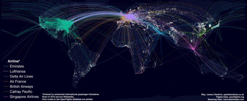
The map above shows the routes flown by the top 7 airlines (by international passenger distance flown). The base map shows large urban areas and I have attempted to make it look a bit like the beautiful “Earth at Night” composite image produced by NASA. You can clearly see a relationship between where people live and where the big carriers fly to across Europe and the US but India and much of China have relatively few routes. I expect much of the slack is picked up by smaller airlines in these countries but they must represent key growth areas the world economy becomes increasingly driven by the east. This map isn’t meant to be comprehensive- I just wanted to make another example of a visualisation with ggplot2. How I did it
Plotting great circles has become an increasingly popular thing to do with R (because they look cool) and the excellent flight path data freely available from the OpenFlights website provides a neat data source to play around with. There are several tutorials out there but none of them (to my knowledge) apply apply colour value to the arcs based on a relevant variable in the datafile or make much of the underlying base map. For the Tufte fans out there this is means an important opportunity for maximising data ink has been missed.
The first step was to calculate the great circles with the flight data. The Anthrospace blog has a good tutorial on this so I won’t replicate the code here. I would warn you that it is a little tricky to sort out. For the R pros out there if you have a refinement on the code please comment below.
The next step was to source the world urban area boundaries. These can be found on the Natural Earth Data website. Direct link. In the code below I have simplified these and coloured them in the plot to reflect the colours in the NASA image. I have also coloured the background and continents accordingly. Without the great circle arcs your basemap should look a bit like this (I’m really pleased with how it came out).
With this layer in place you can now draw whatever you want on top of it. In this case it is the flight arcs. I then added a few annotations and moved the key etc in Inkscape for the final image.
Load libraries library(ggplot2)
library(maps)
library(rgeos)
library(maptools)
gpclibPermit()
Load in your great circles (see above for link on how to do this). You need a file that has long, lat, airline and group. The group variable is produced as part of the Anthrospace tutorial. gcircles
Get a world map worldmap
Load in your urban areas shapefile from Natural Earth Data urbanareasin
Simplify these using the gsimplify function from the rgeos package simp
Fortify them for use with ggplot2 urbanareas<-fortify(simp)
This step removes the axes labels etc when called in the plot. xquiet yquiet<-scale_y_continuous("", breaks=NA, lim=c(70,-70))
quiet<-list(xquiet, yquiet)
Create a base plot base
Then build up the layers wrld<-c(geom_polygon(aes(long,lat,group=group), size = 0.1, colour= "#090D2A", fill="#090D2A", alpha=1, data=worldmap)) urb
Bring it all together with the great circles base+wrld+urb+geom_path(data=gcircles, aes(long,lat, group=group, colour=airline),alpha=0.1, lineend="round",lwd=0.1)+coord_equal()+quiet+opts(panel.background = theme_rect(fill='#00001C',colour='#00001C'))
I recently had the pleasure of presenting at the first Data Visualisation LondonMeetup event where I spoke about some of work we do at UCL CASA. A fair chunk of the slides were movies so I thought it best to stick them in a blog post. If you like what you see you can sign up for the CASA masters course or check out our other blogs.
First up was my interactive surname map of London. I used this to demonstrate that “Big Data” (the general theme of the meetup) is nothing new (we have collected large- scale population data for over a century) and that we can use visualisation to demonstrate complex data.
Next, was the now famous animation of London’s transport flows produced by Joan Serras.
I then went on to say that we can begin to build more sophisticated maps of public transport by utilising routing algorithms. We took this approach to map the 114 thousand or so bus trips in London each day.
I then showed a couple of top-secret visualisations produced by Jon Reades and others at CASA. Stay tuned for when these are released. Twitter data featured in all talks and my chosen animation was produced by Anders Johansson in collaboration with Steven Gray and Fabian Neuhaus.
Next up were a couple of visualisations of cycle hire data in London (animation by Martin Zaltz-Austwick),
and other cities (below) to see how people utilize the schemes. You can see Oliver O’Brien’s live map here.
The final slide demonstrates how we are bringing all these themes together with the “City Dashboard” project. Click here (or image below) to take a real-time look at your city.
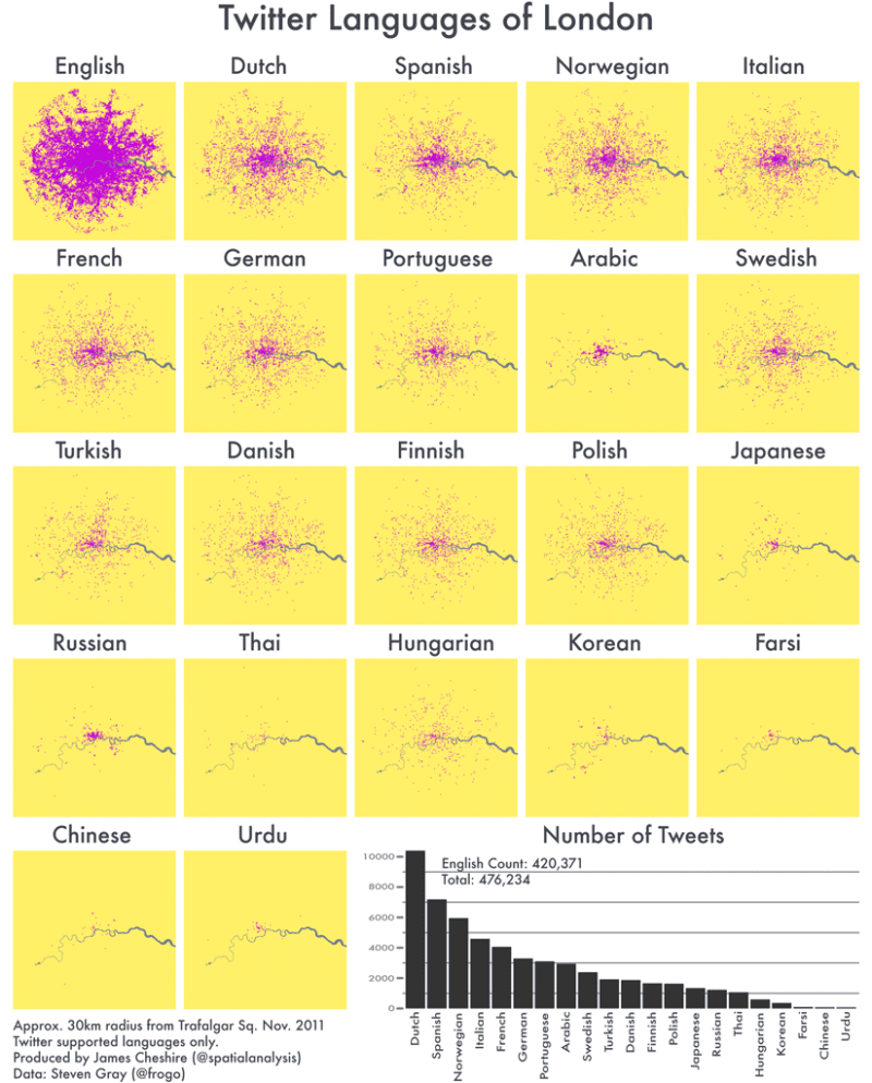
Last year Eric Fischer produced a great map (see below) visualising the language communities of Twitter. The map, perhaps unsurprisingly, closely matches the geographic extents of the world’s major linguistic groups. On seeing these broad patterns I wondered how well they applied to the international communities living in London. The graphic above shows the spatial distribution of about 470,000 geo-located tweets (collected and georeferenced by Steven Gray) grouped by the language stated in their user’s profile information*. Unsurprisingly, English is by far the most popular. More surprising, perhaps, is the very similar distributions of most of the other languages- with higher densities in central areas and a gradual spreading to the outskirts (I expected greater concentrations in particular areas of the city). Arabic (and Farsi) tweets are much more concentrated around the Hyde Park, Marble Arch and Edgware Road areas whilst the Russian tweeters tend to stick to the West End. Polish and Hungarian tweets appear the most evenly spread throughout London.
Even though the maps represent close to half a million tweets they are still based on a selective sample- they only include people who have a good location (either through GPS or a specific address) and those who are connected to the internet. I expect the latter requirement will exclude many short term visitors to London, and may explain why there aren’t so many hotspots around London’s landmarks (as is the case with Flickr where people can upload georeferenced images when they get home). In spite of this, I think the information in these maps is useful as a basis for comparison to other cities and it helps to reveal some of the finer patterns within the broad regions mapped by Fischer.
*this is slightly different to Eric Fischer’s method. He used Google’s translation tools to determine the language of each tweet whereas I have taken the stated language of each user because I am more interested in what users feel their preferred language is. I often see English tweeters post in French for example. Google also hasn’t quite mastered the slang or abbreviations that often crop up in Londoner’s tweets.


