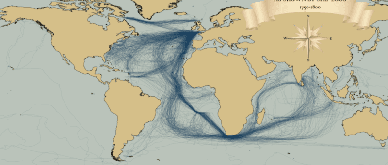
I recently stumbled upon a fascinating dataset which contains digitised information from the log books of ships (mostly from Britain, France, Spain and The Netherlands) sailing between 1750 and 1850. The creation of this dataset was completed as part of the Climatological Database for the World’s Oceans 1750-1850 (CLIWOC) project. The routes are plotted from the lat/long positions derived from the ships’ logs. I have played around with the original data a little to clean it up (I removed routes where there was a gap of over 1000km between known points, and only mapped to the year 1800). As you can see the British (above) and Spanish and Dutch (below) had very different trading priorities over this period. What fascinates me most about these maps is the thousands (if not millions) of man hours required to create them. Today we churn out digital spatial information all the time without thinking, but for each set of coordinates contained in these maps a ship and her crew had to sail there and someone had to work out a location without GPS or reliable charts.
These maps were produced with the latest version of R‘s ggplot2, maptools, geosphere and png packages. Formatting the data took the most work (it was a very large MS Access database). I used ggplot’s annotation_raster() to add the compass rose and title.
Update: For some nice animations and a much better critical analysis of the data see Ben Schmidts blog.
Last week I attended the Association of American Geographers Annual Conference and heard a talk by Robert Groves, Director of the US Census Bureau. Aside the impressiveness of the bureau’s work I was struck by how Groves conceived of visualisations as requiring either fast thinking or slow thinking. Fast thinking data visualisations offer a clear message without the need for the viewer to spend more than a few seconds exploring them. These tend to be much simpler in appearance, such as my map of the distance that London Underground trains travel during rush hour.
The explicit message of this map is that surprisingly large distances are covered across the network and that the Central Line rolling stock travels furthest. It is up to the reader to work out why this may be the case. Slow thinking maps require the viewer to think a little harder. These can range from more complex or unfamiliar ways of projecting the world as demonstrated by this gridded population cartogram of Africa from Benjamin Hennig’s PhD thesis
or the seemingly impenetrable (from a distance at least), but wonderfully intricate hand drawn work of Steven Walter (click image for interactive version).
I have seen bad examples of both slow thinking and fast thinking maps but there is undoubtedly more rubbish in the latter category. I blame the rise of infographics in addition to the increasing ease with which data can be mapped (I note, this latter point has also facilitated many great maps). It’s not all bad though, much like tabloid newspaper headlines I think clever fast thinking visualisations have required a lot of slow thinking by their creators and are good for portraying simple but important messages. My concern, however, is that slow thinking data visualisations are on the decline, especially online, because they do not grab the attention of potential viewers quickly enough or a similar impact (in terms of internet traffic) can be achieved with less data processing or, in the case of geography, cartographic flair. In addition there is a (perhaps legitimate) fear that producing complicated visualisations will intimidate or confuse readers. This latter point is important in the context of the media and is a problem the New York Times Graphics Department (also at the AAG conference) seem to have grappled with. Their approach is to introduce the unfamiliar or complex alongside graphics people are used to. This was done to excellent effect with their 2008 election coverage- look out for the cartogram towards the bottom.
So do the renowned folks at the NY Times Graphics Dept. prefer fast or slow thinking visualisations? I asked them what they think makes a successful map. Archie Tse said what I hoped he would: the best maps readable, or interpretable, at a number of levels. They grab interest from across the room and offer the headlines before drawing the viewer ever closer to reveal intricate detail. I think of these as rare visualisations for fast and slow thinking. The impact of such excellent maps is manifest by the popularity of atlases and why they inspire so many to become cartographers and/or travel the world. The work of David Ismus offers a classic example.
From a distance (above) the road network reveals major population centres, the shading mountains and the colours the depths of water surrounding/ within the US. You want to know more and each time you look something new catches your eye.
In addition Ismus offers something else- he has painstakingly visited (cartographically rather than physically) every part of the map through manual labelling. Most of the maps we see are the product of automated cartography and can therefore make sense computationally but are less intuitive to use. This relates to the final commonality in the most interesting visualisation talks I went to at the AAG – all great maps, fast or slow, “feel right” to those who created them. There is a gut instinct at work that, perhaps, cannot be taught or acted on quickly. So next time you see a map, give it the time it deserves. Is it fast, slow, or the best of both?
Finding ways to effectively map population data is a big issue in spatial data visualization. The standard practice uses choropleth maps that simply colour administrative units based on the combined characteristics of the people that live there (see below).
These maps are popular with cartographers for a couple of reasons. You get a clear sense that the map is depicting some form of aggregation (or grouping) so readers of the map are (hopefully) less tempted to think that everything or everyone in that particular unit are the same. Mapping in this way is often the simplest option as names of the administrative units often come with the data you are interested in so they can be easily linked. Ultimately the underlying data are at household level and choropleth’s colour areas (such as parks etc) where nobody lives. For example the River Thames is running through the map above. Oliver O’Brien has sought to remedy some if these drawbacks by clipping the standard choropleth to building outlines (see first map and below).
I think this has resulted in a great visual improvements to the standard maps, and they closely resemble the iconic maps of Charles Booth. The question is, has Ollie gone too far? The reason the maps look better is because they have massively increased the implied precision of the data. This is what makes the increasingly popular dot density maps so eye-catching (but potentially very misleading). You are more likely to think that the inhabitants of each building (if, indeed there are any) are exactly as the colour suggests, but we know that the final colour is based on a number of the surrounding households (approx. 125 in this case). The obvious solution is to map household level data but this clearly isn’t possible for reasons of confidentiality in addition to the fact that grouping households makes statistical sense in many applications. The counter to this argument is that if people are encouraged to look for their own house it will be abundantly clear (to them at least) that the implied category is unrepresentative and they view the map more critically. This implied precision, called the ecological fallacy, affects our lives daily with anything from insurance premiums, to public services and marketing but we don’t notice it because it isn’t mapped. By revealing it in such a visually appealing way, do these maps compound the problem or educate us about it? Click here for Ollie’s explanation of the maps.
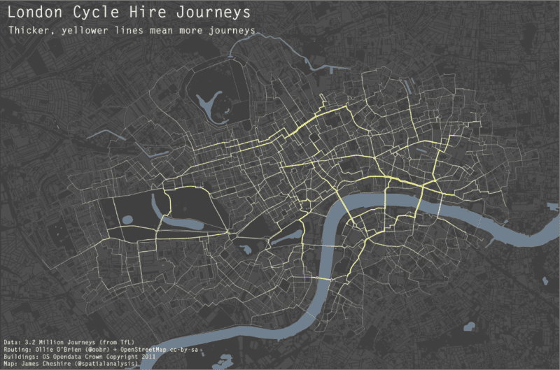
As a cyclist in London you can do your best to avoid left turning buses and dozy pedestrians. One thing you can’t really avoid though is pollution (although I accept cyclists probably aren’t much worse off than pedestrians and drivers in this respect). To illustrate this I have taken data for 3.2 million journeys from the Barclays Cycle Hire scheme and combined it with GLA pollution data for particulate matter. Unsurprisingly, pollution is worse at junctions and where there is lots of static traffic, with the popular cycling routes around Waterloo Bridge and the Strand particularly affected. Most of the journeys are subject to relatively low (by London standards) levels because cyclists try and avoid the busiest routes, such as Euston Road. The loop around Hyde Park is really popular with Boris Bikers and fortunately one of the least polluted but clearly more could be done to sort out the pollution hotspots around the west end.
The routes have been guessed using routing algorithms and OpenStreetMap data and optimised for cyclists (ie we assumed that people would prefer cycle lanes over roads etc). Thanks to Ollie O’Brien for this analysis. You can see more of his work here. I produced this map using the R software package and blog about how I did it here.
The above map (and this one) was produced using R and ggplot2 and serve to demonstrate just how sophisticated R visualisations can be. We are used to seeing similar maps produced with conventional GIS platforms or software such as Processing but I hadn’t yet seen one from the R community (feel free to suggest some in the comments). The map contains three layers: buildings, water and the journey segments. The most challenging aspect was to change the standard line ends in geom_segment from “butt” to “round” in order that the lines appeared continuous and not with “cracks” in, see below.
I am grateful to Hadley and the rest of the ggplot2 Google Group for the solution. You can see it here. From this point I layered the plots using the geom_polygon() command for the buildings and water bodies and my new function geom_segment2() for the journey segments- these were simply the start and end latitudes and longitudes for each node in the road network and the number of times a cyclist passed between them. I have included the code below
#Code supplied by james cheshire Feb 2012

#load packages and enter development mode

library('devtools')

dev_mode()

library(ggplot2)

library(proto)
#if your map data is a shapefile use maptools
library(maptools)
gpclibPermit()
#create GeomSegment2 function
GeomSegment2 objname <- “geom_segment2″
draw if (is.linear(coordinates)) {
return(with(coord_transform(coordinates, data, scales),
segmentsGrob(x, y, xend, yend, default.units=”native”,
gp = gpar(col=alpha(colour, alpha), lwd=size * .pt,
lty=linetype, lineend = “round”),
arrow = arrow)
))
}
}})
geom_segment2 “identity”, position = “identity”, arrow = NULL, …) {
GeomSegment2$new(mapping = mapping, data = data, stat = stat,
position = position, arrow = arrow, …)
}
#load data stlat/stlong are the start points elat/elong are the end points of the lines
lon names(lon)<-c(“stlat”, “stlon”, “elat”, “elong”, “count”)
#load spatial data. You need to fortify if loaded as a shapefile
water built
#This step removes the axes labels etc when called in the plot.
xquiet yquiet<-scale_y_continuous(“”, breaks=NA)
quiet<-list(xquiet, yquiet)
#create base plot
plon1
#ready the plot layers
pbuilt<-c(geom_polygon(data=built, aes(x=long, y=lat, group=group), colour= “#4B4B4B”, fill=”#4F4F4F”, lwd=0.2))
pwater<-c(geom_polygon(data=water, aes(x=long, y=lat, group=group), colour= “#708090″, fill=”#708090”))
#create plot
plon2
#done
plon2
If I said a country was 1594719800 metres squared it would mean a lot less to you than if I said it was about the size of Greater London (so long as you know about how big Greater London is). For this reason the media tend to report the extent of a flood in relation to the size of the Isle of Wight or Icebergs in relation to the size of Wales (or Luxembourg) so that we can imagine the extent and scale of a disaster or news story. Despite plenty of comment on how ridiculous such comparisons are, and a great website that will convert standard measurements into the fractions or multiples of the size of Wales, I am yet to see a mapped representation of our increasingly standard units of area. The one I produced above is not meant to be definitive, just a starting point to what I hope will be a new system to replace the metric measures we are used to*.
A much more effective alternative to simply stating an area in terms of its relative size to another area is of course to produce a map. Geographically correct maps contain most of this information in the first place but they aren’t much good if you want to compare two things at either ends of the World or even the Solar System. With loads of mapping data online it is now easy to start shifting things around and laying them on top of each other in the same way the BBC’s How Big Really? website does.
This is fine if you want to compare a couple of things, but the map gets messy if you want to do more than that. For more complex comparisons you need to start with a fresh map (be careful of the projection) and shifting everything around to fit on a single page. Doing this can have a big impact as Kai Krause did with his “True Size of Africa” map.
Such maps can be particularly effective when comparing the size and shape of cities to each other…
…sparsely populated areas (UK Cities on top of the Highland region of Scotland by Alasdair Rae)…
…and their transport systems such as subways (by Neil Freeman)
and cycle hire schemes (by Oliver O’Brien).
I think they offer a new perspective on the world and use maps as more abstract forms of information visualisation, so lets hope we see them more often to accompany the usual descriptive “relative to Wales” statements.
*I don’t seriously mean this.
I have been using R (a free statistics and graphics software package) now for the past four years or so and I have seen it become an increasingly powerful method of both analysing and visualising spatial data. Crucially, more and more people are writing accessible tutorials (see here) for beginners and intermediate users and the development of packages such as ggplot2 have made it simpler than ever to produce fantastic graphics. You don’t get the interactivity you would with conventional GIS software such as ArcGIS when you produce the visualisation but you are much more flexible in terms of the combinations of plot types and the ease with which they can be combined. It is, for example, time consuming to produce multivariate symbols (such as those varying in size and colour) in ArcGIS but with R it is as simple* as one line of code. I have, for example, been able to add subtle transitions in the lines of the migration map above. Unless you have massive files, plotting happens quickly and can be easily saved to vector formats for tweaking in a graphics package.
R’s utilisation has been tempered by its relatively sparse documentation and challenging usability. The R community is increasingly aware of this with packages such as DeducerSpatial providing a graphical user interface to some of R’s spatial data functionality. More and more tutorials are appearing and people have been inspired by some high profile maps made with R (see here) so I am confident that it will be increasingly seen as the engine for slightly glossier analysis and visualisation packages.
R can’t do everything- I find handling map projections a bit tricky and its not possible to pan and zoom the maps as they are being created. In some circumstances I can’t do without these functions so I opt for a traditional GIS. Also, for the programmers out there used to the likes of Python and Java, R can have quite a few quirks in its syntax so be patient. Despite it’s flaws, if you have a large data processing and visualisation task R is a great option. It offers a high degree of flexibility in terms of input data formats and with packages such as twitteR, RCurl, and XML it is easier than ever to import online data sources from social media sites and data feeds. Aside from traditional export formats for the visualisations it has become incredibly simple to export interactive and animated graphics using the googleVIS package or igraph for network visualisations. Such flexibility is invaluable if you are seeking to create a variety of different graphics from a single datasource without having to format it for multiple software packages. The great thing with R is the sense that it still has masses of unrealised potential for future spatial data visualizations. If you know of any good visualisations or tutorials please leave a comment!
I should also say that if you would like to learn how to do these sorts of visualisations (and more!) come and do our masters course! *simple might be a slightly optimistic way of thinking about it if you haven’t used R before, but with a bit of practice you will ge there!
It would be a shame to end the year without a festive map! Jack Harrison (@jacksfeed) is studying for a research masters in “Advanced Spatial Analysis and Visualisation” at UCL. I teach on the course and it obviously hasn’t worked Jack hard enough this term as he has had time to slack off and produce this great map of Christmas festivities based on information from Wikipedia. As with all good maps, it speaks for itself and I think it is a great way of showing the difference in celebrations, especially as the Anglo-American view of Christmas is (unsurprisingly) so dominant. It also serves as a splendid last post on the blog for this year. Merry Christmas, and see you in 2012!
I have spent the last few years investigating the geography of family names (also called surnames). I work with the team who assembled the UCL Department of Geography Worldnames Database that contains the names and geographic locations of over 300 million people in nearly 30 countries (a few of these are yet to be added to the website). My research has focussed on the 152 million or so people we have data for in Europe and they all come from publicly available telephone directories or electoral rolls. I also had access to a historical dataset for Great Britain in the form of the 1881 census. I have tried to answer two questions:
1. Is it possible to approximately establish the origin of a surname based on its modern day geographic distribution?
2. Are particular surnames more likely to be found together and if so do they form distinct geographic regions?
In the past surname research has involved lot of manual work to create a detailed history of a particular name. With so many surnames in the database I had to think of some automated ways to do this computationally. The patterns I produce are much more generalised than the manual work- I find broad patterns rather than specific genealogical facts- but they provide useful context for population genetics, migration, historical geography and demography. If you want to find out more about this research here are titles for the papers I have had published in academic journals: The Surname Regions of Great Britain. Creating a Regional Geography of Great Britain Through the Spatial Analysis of Surnames. Identifying Spatial Concentrations of Surnames. People of the British Isles: A Preliminary Analysis of Genotypes and Surnames in a UK Control Population. Delineating Europe’s Cultural Regions: Population Structure and Surname Clustering.
For a full list see my UCL academic profile. The left map at the top of the post is from the last paper I listed and shows how the surname regions vary across Europe. The map on the right shows how confident I am of the regions based on the number of times they emerge in the cluster analysis.
As 2011 draws to a close it is worth reflecting on what, I think, has been a defining year for mapping and spatial analysis. Geographic data have become open, big, and widely available, leading to the production of new and interesting maps on an almost daily basis. The increasing utilisation of technology such as Google Fusion Tables has made it easier than ever to map data. Sadly the number of bad maps is on the increase as a result (largely thanks to the web’s preference for the Mercator projection and push-pins) and I hope things will improve (over to you Google!) next year. To inspire another year of mapping, and in no particular order, here is the spatialanalysis “Best of 2011”. The maps here have been popular, engaged users, innovated, and raised the bar for cartographic standards. I bet I have missed some so feel free to link to your best map in the comments section. Paul Butler’s Facebook Connections Map
This just sneaks in as it was produced in December 2010. The map is important for what it doesn’t show (most of Africa for example) rather than what it does. It has served as an inspiration for many others, and raised the bar in terms of the detail and extent of social media mapping. National Geographic Surnames Map
I think the National Geographic Surnames Map is one of an increasing number of brilliant typographic maps that have been produced in the past year. Typographic maps can show many variables (using colour, font size etc) and are often instantly engaging. This one was especially popular alongside its “sister” map of London Surnames. Galaxy Survey Fly Through
I really like this video as it serves to demonstrate just how vast the universe is. I spend my life mapping a few things over relatively small geographic areas and there is plenty for me to do. We have barely even started mapping the universe and I think this video captures the immensity of the undertaking. iPhone Tracker
This map is not featured for its cartographic brilliance but for its unveiling of the volume of data our electronic devices, in this case iPhones, are capable of collecting. It served as a wake up call for many that data about our locations are collected all the time and it is easy to track where you have been.
Fedex Cartograms
Cartograms are becoming an increasingly popular way of mapping population data. I don’t have a problem with advertising so long as it is informative as well. I think these maps tick the box as they provide the best animations I have seen of cartograms morphing from one dataset to the other so I’m happy to give fedex a plug for this one. Naming Rivers The “Naming Rivers” map shows how different cultural and linguistic factors have influenced the naming of geographic features in the US. We talk about how we live in a “world without borders” but this plainly isn’t true as things we encounter on a daily basis are still influenced by the uneven movements of various populations over time. Scientific Collaboration
This map, inspired by the Facebook connections map (above), demonstrates the dominance of a few countries within the scientific literature and the limited collaborations between a few countries. This pattern is seen in many datasets and is another illustration that “global” is often only a minority of countries. Eric Fischer’s Twitter Language Map
I really liked these maps both for their cartography but also for their demonstration that linguistic and national borders can be seen online as well. There has also been a tendency for fine scale mapping of Twitter data so it is nice to get a global perspective. ITO 10 Years of Road Casualties UK (and US)
As I was writing this, the BBC have launched their own visualisations with this depressing data. It is often said that in the context of modern health and safety standards the car would never have been allowed. With maps such as the above it is easy to see why. ITO World have tried to be more intelligent with their use of icons- they have moved beyond the simple “pins on maps” we often see. It doesn’t work so well at the regional level, but as you zoom in clear accident hotspots unfortunately emerge. NOAA Japanese Tsunami Wave Height
This year saw a devastating earthquake and subsequent tsunami hit Japan. NOAA produced a series of excellent maps and visualisations to help chart and explain the events. The map shows likely tsunami wave heights. I found it interesting as it shows both the extent of the waves and the way in which they appear as tentacles circling Earth. BBC Brief History of Time Zones
Good maps help to educate and I found the above interactive globe from the BBC a really great way to learn about time zones. The BBC are becoming increasingly ambitious with their maps and I think they have excelled themselves with this one. xkcd’s What Your Favourite Map Projection Says About You
This captures the different opinions on some of the many map projections perfectly. You may have gathered from the opening lines of this post that projections are really important and often considered too complicated to bother with. I’m all for the Winkel-Tripel although I can’t claim to have been a fan before the National Geographic adopted it, as I would have been too young to care at the time.