Skip to content
James Cheshire
About
Blog
Teaching
Papers
Category:
Visualisation
Failure is part of the visualization process
Nov 4, 2021
Atlas of the Invisible
Aug 5, 2021
Next slide please: what’s wrong with the UK government’s coronavirus charts
Jan 12, 2021
Why eye-catching graphics are vital for getting to grips with climate change
Jan 12, 2021
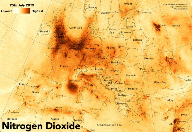
Mapping Nitrogen Dioxide Across Europe
Aug 24, 2020
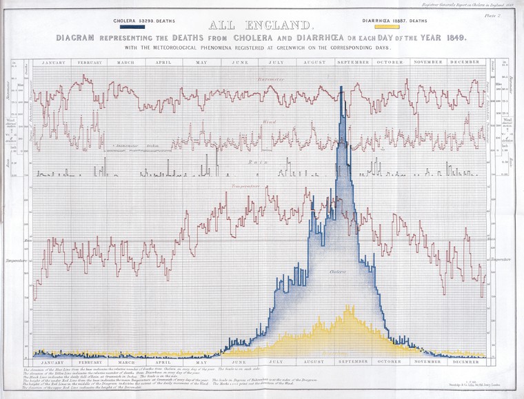
How the Victorians Mapped London’s Cholera
Mar 2, 2019
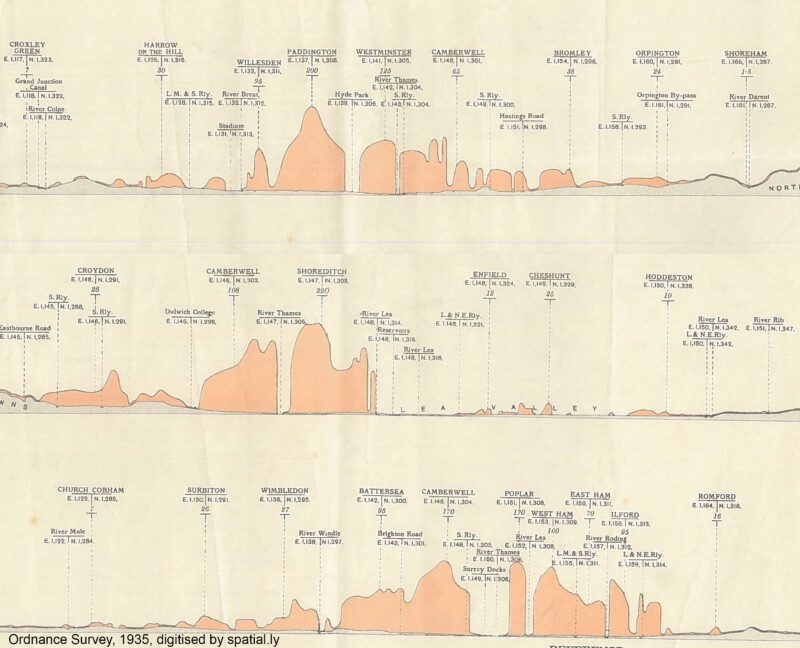
London's Population Profile in 1935
Nov 10, 2017
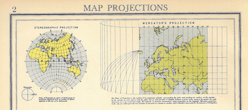
Map Projections
Oct 30, 2017
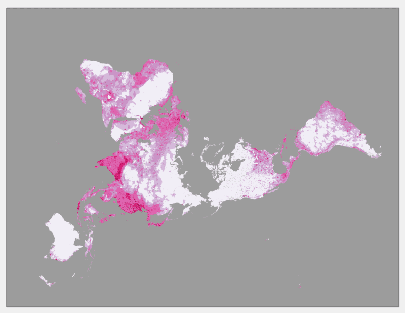
World Population Density 1970-2000
Oct 25, 2017
Less is More: Data Visualisations for Big Data
Aug 10, 2017
Previous Page
1
2
3
4
…
9
Next Page