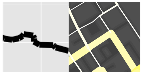
The above map (and this one) was produced using R and ggplot2 and serve to demonstrate just how sophisticated R visualisations can be. We are used to seeing similar maps produced with conventional GIS platforms or software such as Processing but I hadn’t yet seen one from the R community (feel free to suggest some in the comments). The map contains three layers: buildings, water and the journey segments. The most challenging aspect was to change the standard line ends in geom_segment from “butt” to “round” in order that the lines appeared continuous and not with “cracks” in, see below.

I am grateful to Hadley and the rest of the ggplot2 Google Group for the solution. You can see it here. From this point I layered the plots using the geom_polygon() command for the buildings and water bodies and my new function geom_segment2() for the journey segments- these were simply the start and end latitudes and longitudes for each node in the road network and the number of times a cyclist passed between them. I have included the code below
#Code supplied by james cheshire Feb 2012

#load packages and enter development mode

library('devtools')

dev_mode()

library(ggplot2)

library(proto)
#if your map data is a shapefile use maptools
library(maptools)
gpclibPermit()
#create GeomSegment2 function
GeomSegment2 objname <- “geom_segment2″
draw if (is.linear(coordinates)) {
return(with(coord_transform(coordinates, data, scales),
segmentsGrob(x, y, xend, yend, default.units=”native”,
gp = gpar(col=alpha(colour, alpha), lwd=size * .pt,
lty=linetype, lineend = “round”),
arrow = arrow)
))
}
}})
geom_segment2 “identity”, position = “identity”, arrow = NULL, …) {
GeomSegment2$new(mapping = mapping, data = data, stat = stat,
position = position, arrow = arrow, …)
}
#load data stlat/stlong are the start points elat/elong are the end points of the lines
lon names(lon)<-c(“stlat”, “stlon”, “elat”, “elong”, “count”)
#load spatial data. You need to fortify if loaded as a shapefile
water built
#This step removes the axes labels etc when called in the plot.
xquiet yquiet<-scale_y_continuous(“”, breaks=NA)
quiet<-list(xquiet, yquiet)
#create base plot
plon1
#ready the plot layers
pbuilt<-c(geom_polygon(data=built, aes(x=long, y=lat, group=group), colour= “#4B4B4B”, fill=”#4F4F4F”, lwd=0.2))
pwater<-c(geom_polygon(data=water, aes(x=long, y=lat, group=group), colour= “#708090″, fill=”#708090”))
#create plot
plon2
#done
plon2
Great Maps with ggplot2

James Cheshire is Professor of Geographic Information and Cartography in the UCL Department of Geography and the inaugural director of the UCL Social Data Institute. A world-leading map maker and geographer, his cartographic creations have been enjoyed by millions.