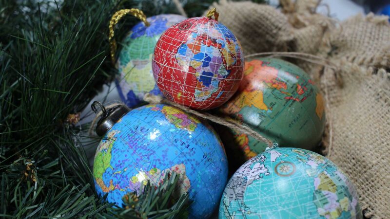
Every Christmas I love being reunited with my growing collection of globe-themed baubles. Each has its own cartographic style – from the glittery to the antique – and I take a moment each year to admire them. As I hung the final one on the tree this year, I spotted something that offered a fascinating insight into how geopolitics can play out in the unlikeliest of places: my box of decorations.
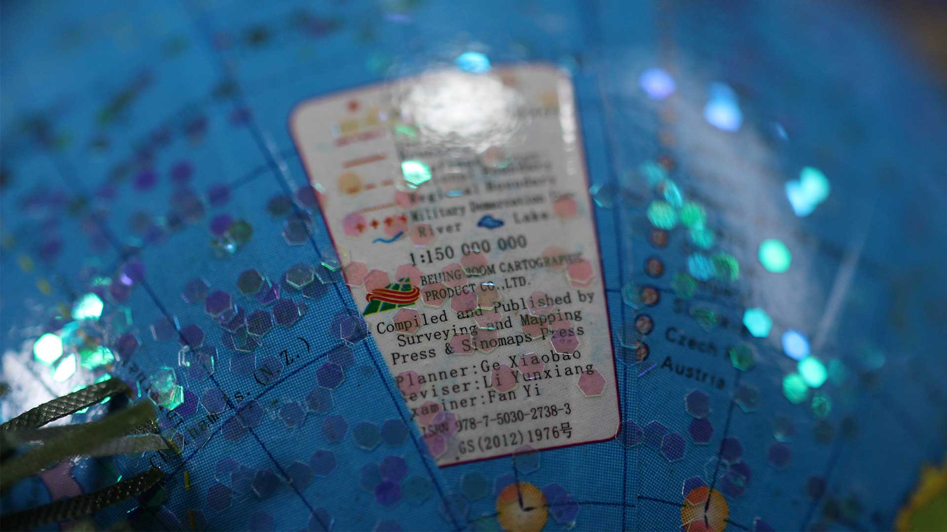
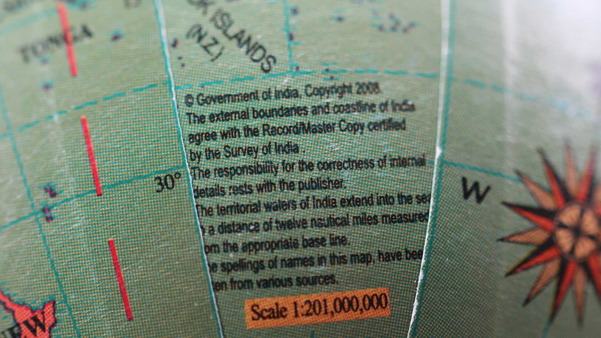
I spotted an attribution on one of the globes to ‘Beijing Boom Cartographic’ and ‘Sinomaps Press’. I then looked at the others and found – in tiny writing – ‘Copy certified by the Survey of India’.
All maps mark a moment in time so borders are always subject to change- especially if the globes were made in different years – but both China and India have tight controls on how borders can be drawn. Even something as innocuous as a Christmas decoration will need to have the ‘correct’ state-sanctioned map, which will differ from international conventions. And sure enough I have spotted some important differences in how the world is shown on my Christmas tree…
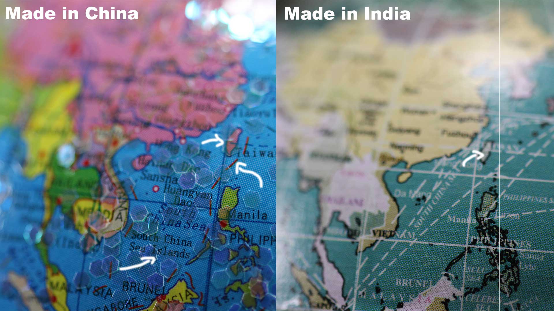
South China Sea
The South China Sea is a contested area of ocean where China has made several claims. On the Chinese made globe I’ve pointed to the ‘nine-dash line‘ marked in red that marks the extent of the Chinese claim. It is also one of the most heavily labelled parts of that globe including labels for the ‘South China Sea Islands’. Compare that to the Indian made globe, none of these labels exist and Taiwan is given it’s own colour to differentiate it from mainlined China. On the Chinese globe they are they same.
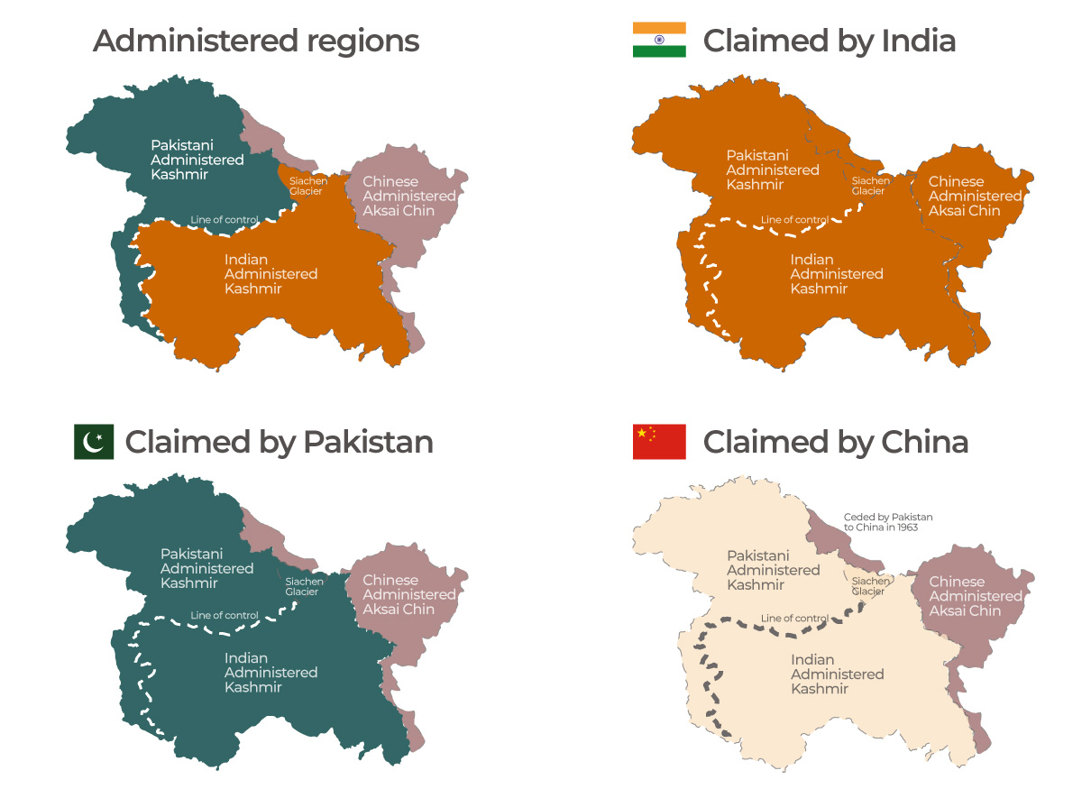
Disputed Borders
India, Pakistan and China are involved in a border dispute over the region of Kashmir and this too plays out on the Christmas baubles. You can see on the Indian made decoration the Indian border kinks into China and prevents Pakistan from touching China. On the Chinese bauble we see Pakistan extending to China and the kink is gone.
The dispute is really nicely explained here and by the maps below.
Of course these differences will go unnoticed for the vast majority of the globes hanging from tree each year (I had to use a macro lens to photograph them), but if I were to take the Indian globe to China and I’ll be reprimanded by the authorities. The first forbidden items listed on Indian customs declaration forms are ‘Maps and literature where Indian boundaries have been shown incorrectly’ so if I were to pack a Chinese decoration in my suitcase I might be refused entry.
The stockists of these globe decorations look to India and China to manufacture them cheaply perhaps without realising they are subject to these geopolitical disputes that are now being played out on my Christmas tree. Fortunately I live where maps – however contentious – can be safely displayed so I’ll keep hanging the globes, but I’ll certainly never look at my collection of baubles the same way again.
I’m a geographer who’s produced many maps depicting human effects on the environment – and demanded we create more of them. A question I am increasingly asked is: how do you not feel powerless in the face of such depressing data?
With climate anxiety now affecting young people’s mental health, and widespread doubt about whether limiting global warming to 1.5℃ is possible, it can be tricky to answer. What I’ve found is that we can use a surprisingly commonplace tool to communicate danger and to bring about positive change: the map.
Throughout history, it has generally been society’s elites who have used maps to exploit, not help, the planet and its people. They’ve used them to pinpoint oil reserves, carve up continents and justify wars. But maps can also be used to empower and defend those who face seemingly insurmountable obstacles.
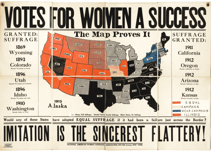
Over a century ago, the women’s suffrage movement developed one of the largest ever map-based campaigns, spanning decades and continents, as part of its drive to give women the vote. We need to use their principles if we are to persuade leaders not just to deliver but to improve upon the promises made at the recent UN climate conference COP26.
What the Suffragists did
Suffragists used maps to celebrate jurisdictions across the world that had given women the vote – and to shame those that had not. They reasoned that the action of some policymakers would highlight the inaction of others, betraying the most misogynist politicians and their supporters.
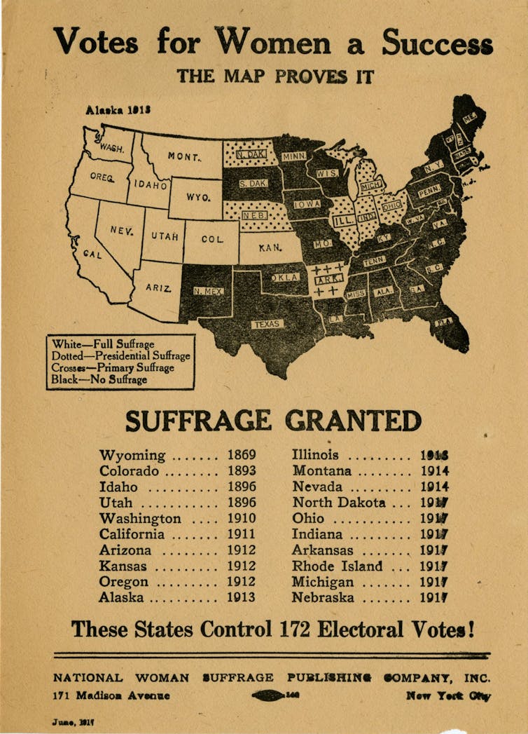
American suffrage maps with the headline “Votes for Women a Success” showed the US states that had granted women the right to vote. To challenge those with backward views, some versions of the map were also adorned with provocative statements such as “How long will the republic of the United States lag behind the monarchy of Canada?”
In 1930s Europe, where France was still withholding votes for women, suffrage campaigns published maps showing the country’s outdated approach to democracy in contrast to its neighbours such as Belgium, under the banner “French women can’t vote! French women want to vote!”
Suffrage maps were plastered on walls, hung across streets, paraded on sandwich boards, printed in newspapers and even used to petition the US Congress.
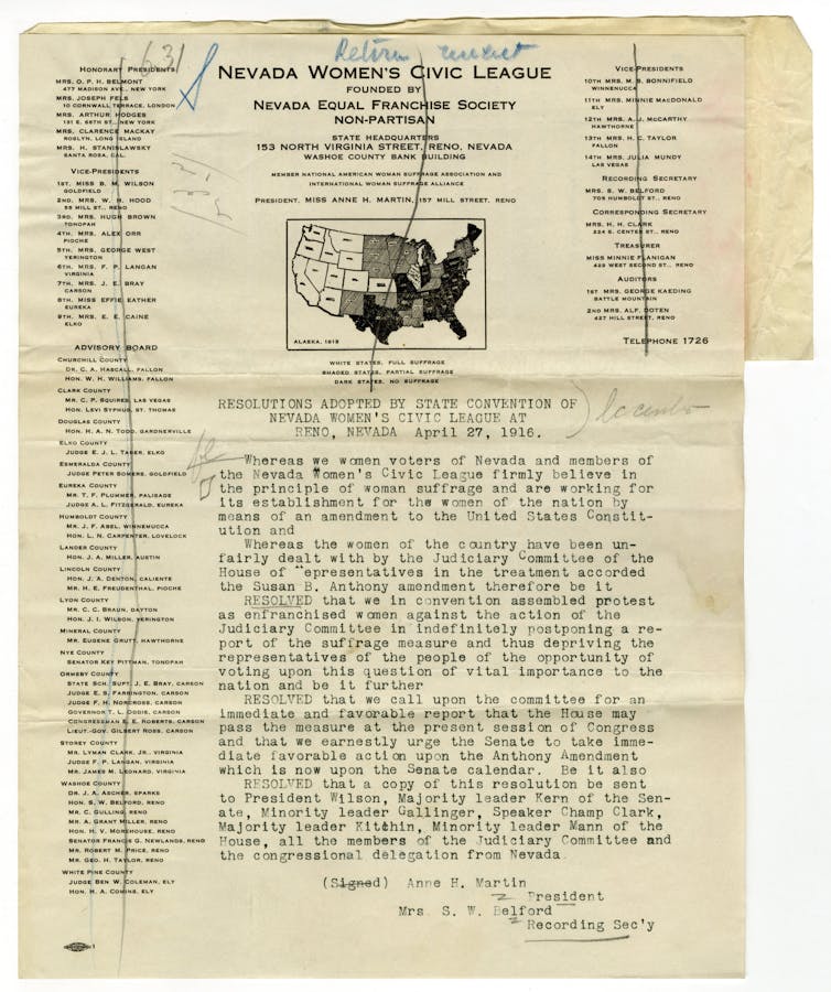
Geographer Christina E. Dando has pointed out how American suffragists’ work was not just focused on creating maps, but changing them. For example, the map below was submitted by the Nevada Women’s Civic League to the US judiciary committee, which was resisting granting women the right to vote nationwide. As the catalogue entry for the map tells us, “this petition shows that women were not just lobbying Congress in general, but strategically pressuring committees to act”.
In the US, the 19th amendment guaranteeing all women the right to vote was ratified in August 1920. But the fight for equal access to the ballot box was far from over.
Racist voter suppression policies were enacted in many states against women of colour, who were themselves creating maps to campaign against the horrors of lynching. It was only after the Voting Rights Act was passed nearly 50 years later, on August 6 1965, that such policies were outlawed. Even today, maps remain a weapon in the continuing fight to achieve fair racial representation in some US states.
Modern maps
In the past, creating maps to counter the status quo – or indeed creating pretty much any map at all – would have required significant design expertise, a lot of manual effort and the financial means to print and promote it.
Today, these challenges can be overcome more easily. The majority of sites and social media platforms are free, do not conform to national borders, and are out of government reach. That means that images that hold those in power to account can spread more freely. So it’s time to use maps to challenge the greatest social and political crisis of our time: the destruction of our planet’s environment.
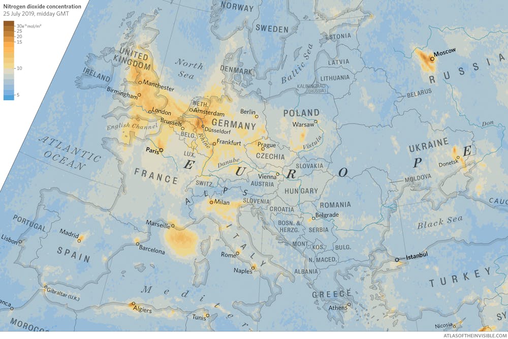
Take a look at this map of nitrogen dioxide – a gas released into the atmosphere by burning fossil fuels – from a hot July day across Europe in 2019 (click to make it bigger). High levels can damage health, create acid rain and contribute to the greenhouse effect. Although the map shows gas moving around, it’s clearly concentrated in certain areas. There’s a big cloud caused by shipping in Marseille and spots marking industrial plants around Dusseldorf.
Map of nitrogen dioxide concentration
High nitrogen dioxide concentration is shown in yellow and red colours. Atlas Of The Invisible, Author provided
Rather than view this as purely an image of scientific interest, we should see it as a call to action. Living beneath the swirls of nitrogen dioxide are policymakers who can design tougher legislation, such as introducing low emission zones, to erase the yellow marks from this map.
The battle for women’s equality is clearly not over, but the idea that at least half the adult population should be legally deprived of a vote is now unconscionable in all but the most extreme jurisdictions. Maps created for women, by women, helped make this so. Now, let’s unleash the political power of maps to ensure that a failure to act on the environment becomes unconscionable too.
Filmed in Copenhagen October 2021. I talk about the power of maps to reveal the invisible, drawing examples from history as well as my co-authored books: Atlas of the Invisible, Where the Animals Go and London: The Information Capital.
I often liken the process of creating data visualizations to a game of snakes and ladders – you can race up the board with a great dataset only to land on a tricky issue with software that slides you backwards. And there’s always the longest snake lurking a few turns from the end – the realization that the map or graph just isn’t working for the audience and you will need to return to square one.
When starting out it can feel like there are many more snakes than ladders and this sense of frustration can be compounded by the fact that we only really share the successes – or at least the maps and graphics that made it out the door. But behind every success will be graphics that failed.
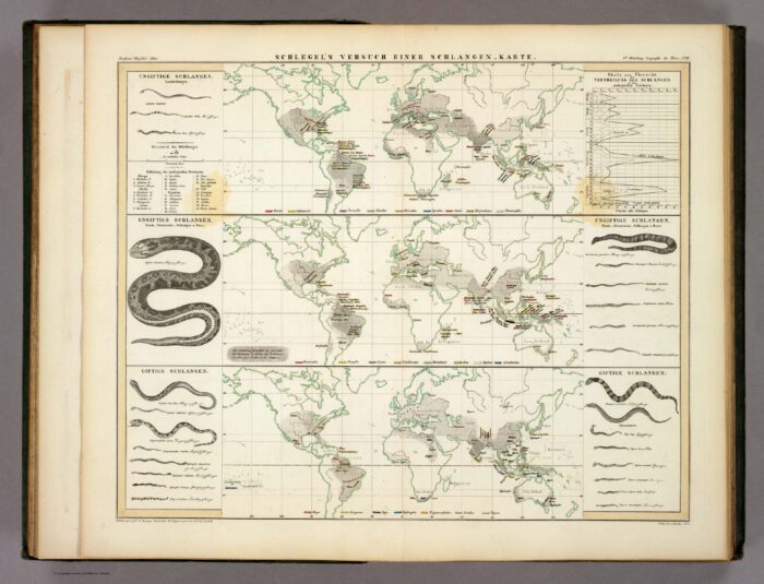
Real snakes: Heinrich Berghaus (1845) – Three maps of the world showing snake distributions.
As I scroll past the many amazing maps and graphics I see online I need to remind myself it can be rather like aspiring to the ‘perfect’ lives of Instagram influencers without zooming out to realize what’s really happening behind the camera.
In recent weeks I have had a few people ask about challenges I’ve faced or to give examples of graphics that didn’t work out, so I thought this would be a good excuse to share some outtakes from my work on Atlas of the Invisible.
What made it into the book – both the text and the graphics – really is just the tip of an iceberg created from late nights shouting at crashed software, long days staring blankly at a spreadsheet or hours spent on drafts that were later pushed aside!
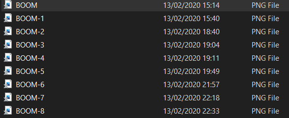
When I was looking for some examples to feature in this post I happened upon this list of files – I recall they were the images I’d created of glacial flow lines after a tough day of coding.
‘BOOM’ is my file naming convention of choice when I think I have decisively solved a problem…it turns out that I needed a further 8 attempts and by looking at the time stamps another 7 hours to get to the final version!
This was just the flow lines for this map, there were many hours of additional layering and design to follow.
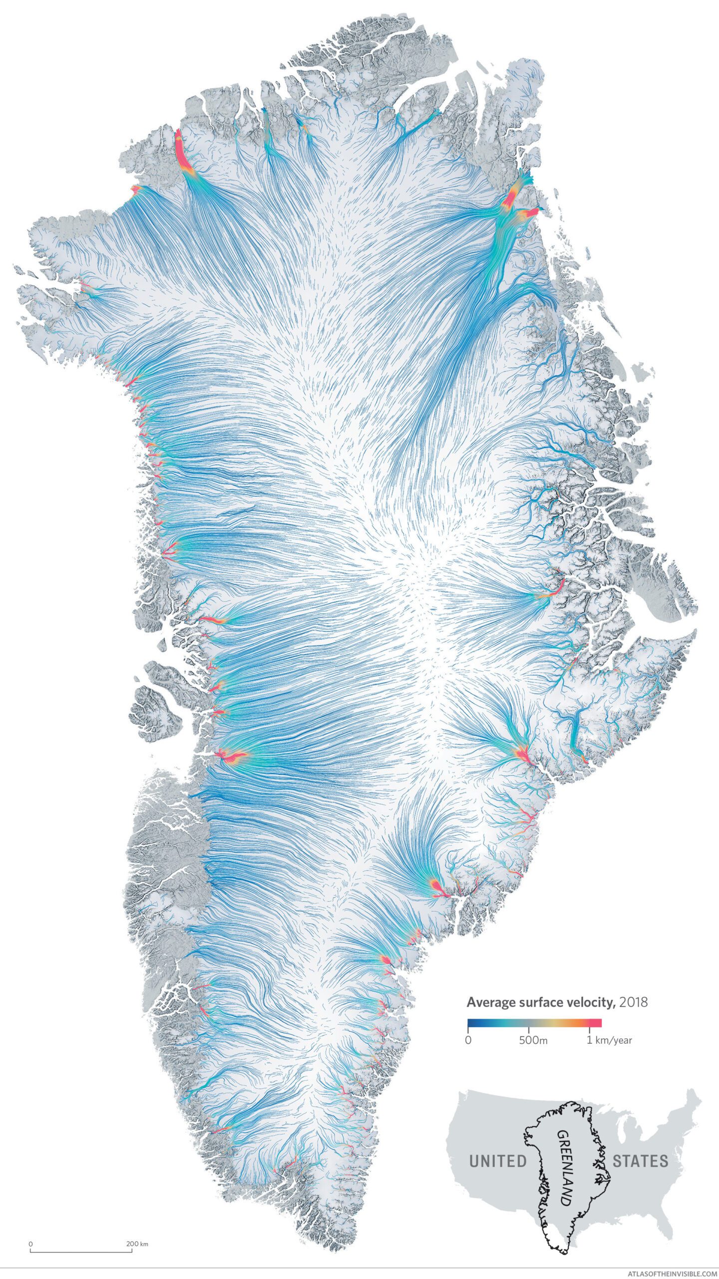
As it happens I also discovered the folder also contained probably one of the most beautiful outtakes – a map of the ice flows in Antarctica.
I think it works nicely as a standalone image, but it didn’t make the cut because we wanted to feature both Greenland and the Juneau Icefield as they told us the stories we were most interested in telling about accelerating ice in the face of climate change.
Too much shipping
Oftentimes you need to put significant effort into a preliminary idea to be able to decisively discard it as something that won’t work out. The image below is of shipping traffic around Denmark and it was created from an ENORMOUS dataset that took an age to download and format in order to map.
For whatever reason I just wasn’t feeling it – I didn’t know enough detail about the shipping lanes and boat behaviours to create the compelling narratives we aspire to. The data needed some cleaning up, which I wasn’t sure how best to do and we already had maps in the book that covered shipping routes, shipping’s impacts on the weather and also fishing. If I could have mastered a stronger story for this one it would have made it into the book at the expense of another on a nautical theme (we wanted a variety of topics). The draft made us question our choices again and feel firmer in our decision about what to include – and what not to.
Never a walk in the park
Of course, there are many more examples, but this final one eclipses them all as an example of when it’s sometimes best to let something go…hard though it is.
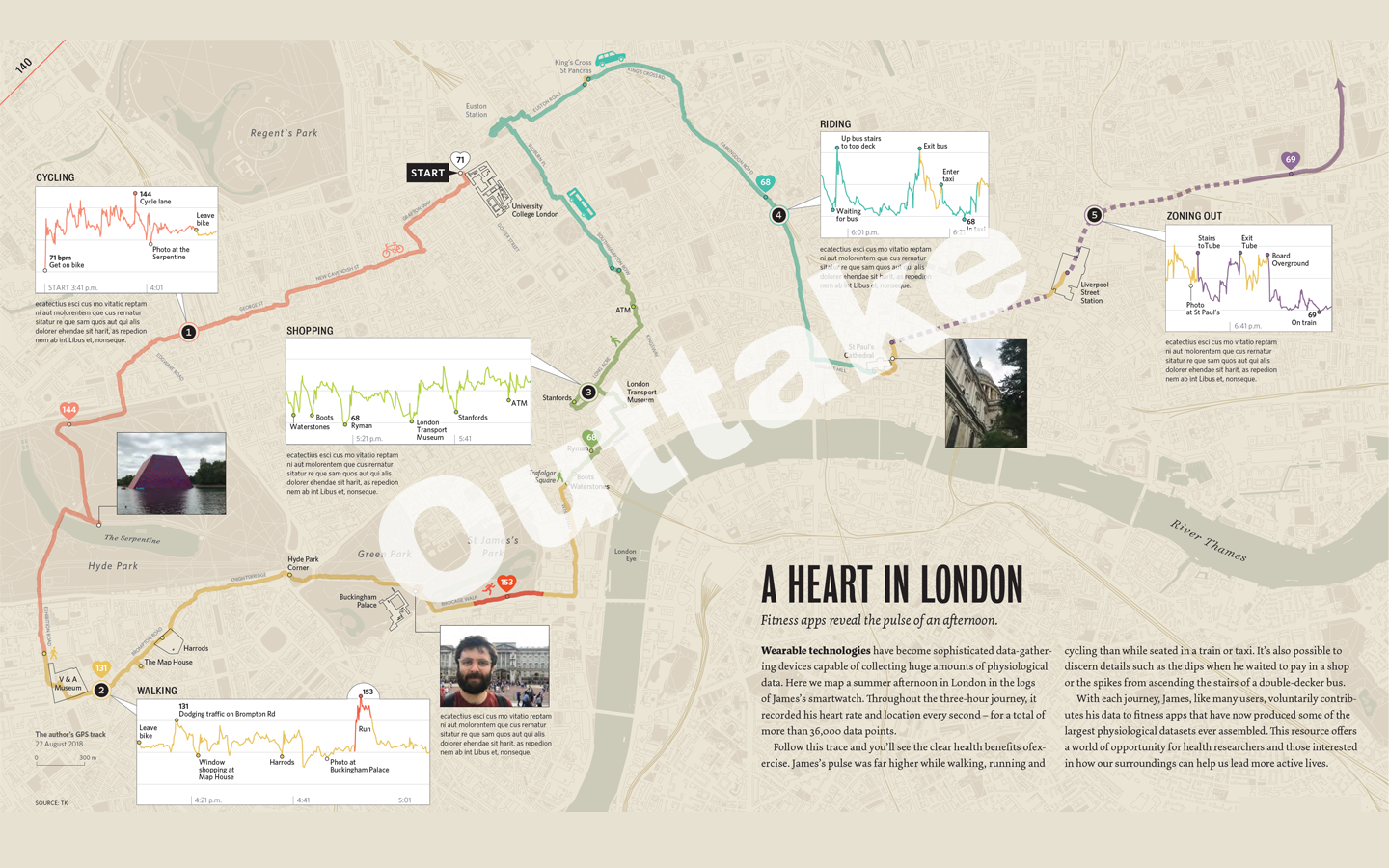
The map above is pretty much finished and it shows a long walk, short cycle, bus ride and finally train ride I did around London on a hot August day in 2018. The idea behind it was to demonstrate the various ways that fitness apps and sensors in your phone can track behaviour and be used to determine the modes of transport someone might be using. We triangulated these with images I took along the way.
So this is an afternoon puffing around London to collect the data, plus then a couple of days of processing it and creating the final map. It also felt quite personal to me and it told a bit of a story about parts of the city I enjoy visiting etc. We wanted it to be a relatable example of what our data can reveal, the privacy implications of such technology, and so on.
The initial reaction from our editor was that rather than being relatable the map was a bit random – why is my walk a story worth telling?
We then remembered that the US Military had doxed themselves with a fitness app…which even I had to admit was a much more interesting and compelling way of sharing the perils of tracking data, so my walk was cut. I consoled myself that at least it wasn’t raining that August afternoon…
As England emerged from its second national lockdown in early December, Boris Johnson, the UK prime minister, faced an onslaught of questions from MPs on both sides of the House of Commons. Each demanded clarity on what the arrangements would be for their particular constituency under the multi-layered tiers that would impose different COVID-19 restrictions on different areas.
They saw an ad-hoc logic behind the system outlined in the bill they were being asked to vote into law. In some cases – such as in Kent – restrictions were too general. In others – such as Slough – they were too specific.
Johnson responded by saying future restrictions would be “as granular as possible … to reflect … the human geography of the epidemic”. In theory, a more localised tiered approach is exactly what is needed once national infection rates come under control. It rekindles the “whack-a-mole” strategy for the flare-ups Johnson referred to earlier in the year. In reality, however, the government – like the rest of us – is looking increasingly confused by the complicated geographical units used to govern and map the country.
It could opt for obscure statistical units that best capture local outbreaks but that few people understand, or choose from a long menu of options used by local or national government. There’s something of a pick ‘n’ mix strategy at present that betrays how the UK’s geographic units were designed by different bodies, with little coordination, for a whole range of conflicting purposes – none of which were managing a pandemic. The result is a confusion of seemingly conflicting messages across government communications.
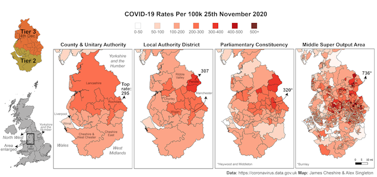
This is not helped by the fact that maps based on the same data produce very different pictures of the crisis if you split up the country differently. Depending on the size of the population of the area, you can come out with an infection rate as low as 295 per 100,000 people or as high as 736 per 100,000.
How is the infection spreading? Depends on how you count.
For this reason, scientists tracking the spread of the virus prefer to use units that encompass roughly the same number of people, which are geographies developed for the census (so called “output areas”). This approach has several advantages. COVID-19 hotspots can be linked to other contextual data, for example, such as on the ethnic makeup or the deprivation of an area.
But these units are not how the country is governed. For that, England is divided into constituencies and counties and “combined authorities” – to name just a few of the different units of governance. Map COVID-19 rates across these boundaries and you will get even more different infection rates, since a constituency can include a densely packed town and a sparsely populated rural area, for example. It’s an impossible problem to solve, but it can be managed through consistent policies and geography.
This is important because, as we’ve seen, local councils, MPs and metro mayors want to negotiate their own lockdown terms. Many combined authorities (city regions) are bristling at being treated as similar even if they are experiencing significantly varying disease patterns at local levels.
In London, many are questioning the rationale for treating the entire capital the same and cracks are appearing in the one-size-fits-all approach. Greenwich council, for example, entered into a heated argument with central government over its unilateral decision to close schools.
These disagreements show what happens when there is confusion about how data on infections should be interpreted. And when local, regional and national governments can’t agree, the public becomes confused too. That reduces compliance with the rules and ultimately allows the virus to spread more rapidly.
The law that England’s tiered restrictions are based upon has done little to simplify things. It previously listed the geography of counties and unitary authorities, but the public communication included the larger and more regional geography of combined authorities. The most recent legal amendments that have placed Greater London, and parts of Essex and Hertfordshire into Tier 3 are, in some cases, being set at a different geography again. The likes of Rochford District Council now make the list, for example, rather than being included in the broader Essex County Council as it was previously.
If more localised restrictions are to have a fighting chance of success, they need to do a better job of reflecting this complex and conflicting geography, even if only to give a clearer picture of how COVID-19 is spreading. The government would then be able to better communicate why particular restrictions are necessary to help control the pandemic. If people are told clearly why, and where, restrictions are being applied, they are much more likely to comply – potentially saving their own lives and the lives of others.
Really excited to announce that Atlas of the Invisible, the third book I have co-authored with Oliver Uberti will be in bookshops soon! You can pre-order it here!
“If you can’t convince them, confuse them.” If you watched the UK government’s COVID-19 briefing to announce and England-wide lockdown, you might have been reminded of this quote by Harry S Truman. Following slide after slide of maps and charts, there was growingfrustration about the way nationally important statistics were being presented to the public.
Getting these things right is important. We’ve seen previously and in this pandemic that trust in government influences whether people follow public health guidelines. And in a UK survey earlier this year, those who had low levels of trust in the government’s ability to handle the outbreak were twice as likely to think its response had been confused and inconsistent. While a set of confusing slides won’t alone dictate how people behave, these things add up.
We don’t need high production values, or even much polish – it’s nice to feel like we’re seeing the latest data rather than something endlessly adjusted – but being comprehensible and looking professional will help support the message. At the moment, these slide decks are reminiscent of rushed conference presentations pieced together while the previous presenter was speaking. Here’s how to fix that.
Explain your working
Perhaps the biggest betrayal to an audience eager to understand is the phrase “as you can see”. It’s repeated many times at these briefings, and it’s too quickly followed by “next slide please”. The information shown is complex and takes a moment to digest. The presenters – the UK government’s chief medical adviser Chris Whitty and its chief scientific adviser Sir Patrick Vallance – need to slow down.
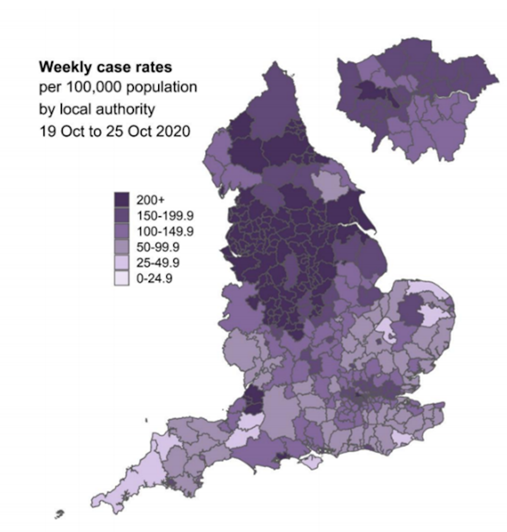
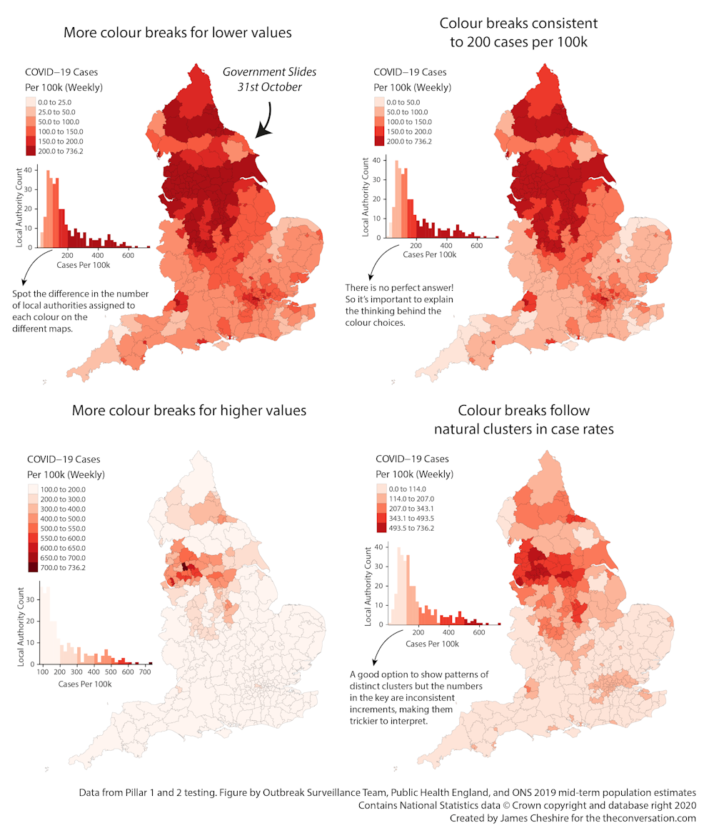
On the map below from briefing in question, how many of us noticed that the weekly case rates per 100,000 people didn’t increase by the same amount each time in the key? We had intervals of 25 for the first two categories, but then jumps of 50 until 200+. The map’s design also failed to show that the rate far exceeded 200 cases per 100,000 people in some areas. Wigan, for example, had 622 cases per 100,000 people.
One goal of a map maker is to reveal patterns that may exist in the data, and colouring is key to this – they have to decide when to move from one colour to another. In some cases it’s preferable to split up a narrow part of the distribution into lots of colours and then assign the rest to a few. Or you might assign each part of the distribution equally. Either is fine, but it needs to be explained, or else it’s a nuance that will get missed or misinterpreted.
The choice made for this map overemphasises small leaps in small numbers at the expense of big leaps in large numbers. Unless the values up to 25 and those between 25 and 50 had significance in policy, they could have been lumped into 0-50. Likewise, the map suggests anything greater than 200 doesn’t really matter – that a rate of 201 deserves the same colour as a rate of 601. This doesn’t seem right to me. But the point is, this system needs to be explained, because choosing different intervals can create a very different impression.
Consider the following graphs. The top left is the same as the government’s purple one above, whereas the others present exactly the same data, just with different sized intervals.
Author provided
On this point as well, the presenters made their lives hard by using national maps when most of the action is in cities. These are hard to see at this scale. The maps pulled out London, but should have done the same for other urban areas.
Presentation matters too
On this map, we were supposed to focus on the dark brown areas – these are bad news. But instead our eyes can’t resist the greens. Whitty had to tell us that the brown areas were what we should be looking at.
Many people online also complained that the slides didn’t fit the screen. This was an error seen on the BBC only, which had set them up wrong, and wasn’t the government’s fault. However, it does suggest the government isn’t considering what devices people will use to view the press conferences. They appear to be designing for the 50-inch television they are viewing and not for the many people streaming or catching up on their phones.
It’s always a risky strategy to push content right to the edge of slides, as things can get cut off. The layout also failed to account for the chyrons that appear at the bottom of news broadcasts, which could easily have been anticipated and designed for.
Try and keep it simple
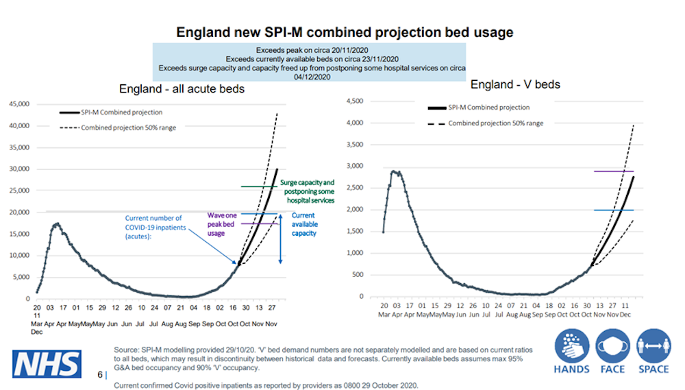
“This is a complicated slide,” said Sir Patrick Vallance as he drew things to a close, forgiving us for not fully understanding it. But this slide was crucial. It was the climax to the case for lockdown. The 16 maps and graphics that came before were just preamble. The two graphs on this slide told us that the NHS would likely run out of capacity to treat the sickest patients in only a few weeks if we didn’t act. It was all he needed to show.
Unfortunately, the dates were misaligned on both graphs (the one on the right takes us to the end of the year, the left mid-December). It’s splitting hairs perhaps, but it demonstrates again that no one took a breather to dot the Is and cross the Ts.
The abundance of acronyms and specialist language is also symptomatic of trying to throw too much at a general audience to build credibility through complexity. This approach risks alienating the audience – when actually there was one key message on Saturday: without lockdown we’ll run out of hospital beds within a few weeks and people we could otherwise save will die.
I want to be clear that I have tremendous respect for the teams of people involved in creating these maps and graphics. I also have sympathy with the scientific advisers themselves, who are treading the increasingly strained tightrope between science and politics. The fact that they are showing such a rich array of data in some quite interesting ways is a really good thing, and we need more of it.
But data visualisation and communication is different to epidemiological modelling. It’s hard to do well, even harder under pressure, though it is possible. Unfortunately, if the government briefings are anything to go by, it remains an overlooked and undervalued skill.
James Cheshire, Professor of Geographic Information and Cartography, UCL
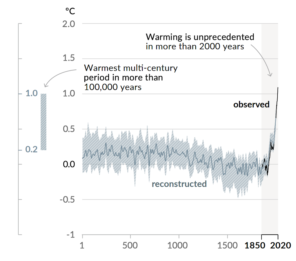
Like many people, the first graph I ever saw explaining climate change was in a school geography textbook. It showed the “hockey stick” curve of the Earth’s surface temperature over time, which has become one of the world’s most recognisable line graphs.
Despite relatively minor fluctuations, the line on the graph depicting global surface temperature remains almost horizontal across centuries, before suddenly inclining to an almost vertical trajectory over the past 50 years. Since 1970 the rate of global temperature increase has hit an unprecedented 1.7°C per century.
One challenge of understanding the information contained in this hockey stick graph – and this is a gift to climate-change deniers – is the inclusion of the grey fuzz of “uncertainty data”: outlying data points that can be cherry-picked to raise doubts about the mass of evidence supporting a general warming trend.
Global surface warming: the hockey stick
Changes in global surface temperature as reconstructed (between 1-2000) and observed (between 1850-2020). IPCC 2021
Uncertainty is a complex thing to communicate in a single chart. In 2018 the UK-based climate scientist Ed Hawkins chose to omit it altogether when he presented his “warming stripes” graphic to help clearly visualise key trends in climate data. Hawkins explained that the warming stripes were designed to remove all superfluous information, leaving behind only the undeniable scientific evidence of a steadily warming world.
If getting to grips with all the data and complexity in the hockey stick required a long read, Hawkins’ climate stripes give us the headline. The stripes are now a global phenomenon, having appeared on the lapels of US senators, the ties of TV weather presenters and on the front cover of The Economist.
As calls for change grow louder in light of the latest IPCC (Intergovernmental Panel on Climate Change) report and in the run up to COP26 conference in Glasgow this November, it’s time to focus on how data visualisation can help people grasp the challenges that lie ahead.
The power of maps
One misconception about the climate crisis is that warming will be uniform across the world. Deniers cite cold fronts or blizzards as evidence that warming is exaggerated, or hark back to past heatwaves – such as that experienced by the UK in 1976 when temperatures exceeded 35°C – as proof that the scientists have got it wrong.
Apart from this misleading conflation of weather (daily conditions) and climate (long-term conditions), this kind of argument misses the complex patchwork of effects that interact to create what gets reported in the headline figures.
Maps can be an invaluable weapon against this misunderstanding. For the first time, the IPCC has released an “interactive atlas” with its latest report, allowing audiences to pan and zoom through the data themselves. But if you give the IPCC’s atlas a try, you can see how it’s hard to capture complexity for a specialist audience while retaining simplicity for a global audience.
Most users are unlikely to closely engage with towering datasets named ‘CMIP5’ or ‘APHRODITE’, or with the mass of code that constitutes the IPCC-WG1 repository on Github. Although it’s a step in the right direction, what is needed are more universally accessible visualisations that are able to show where we’re heading in no uncertain terms.
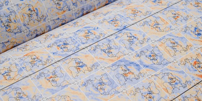
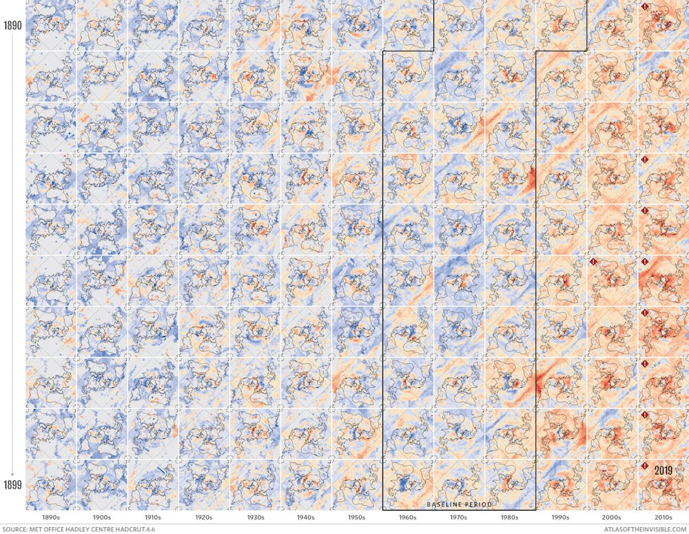
With that in mind, when I set out to map global warming for a new book entitled Atlas of the Invisible, my co-author Oliver Uberti and I chose to combine the most important lessons from the warming stripes with the intricacies of geographical context.
This intriguingly named “Peirce quincuncial” projection, which you can see below, is a type of 2D map that flattens the Earth into a grid of 130 mini maps called tiles. Like all projections, it’s not a perfect representation of the 3D Earth, since some areas are stretched more than others. But it lets us create a series of tiles representing the planet in each year from 1890 to 2019, coloured by how and where temperatures deviated from a reliable baseline measured between 1961 and 1990. Blue areas represent temperature anomalies between -2°C and 0°C, while red areas represent anomalies between 0°C and 3°C and grey represents insufficient data.
Heat gradient map
This data visualisation depicts the trend towards warming across the world, from the upcoming book Atlas of the Invisible. Author provided
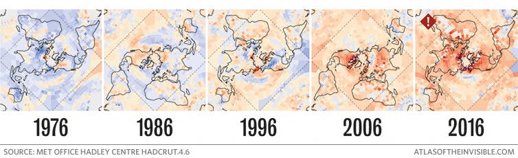
Reading the images from left to right reveals that while heatwaves and cold spells speckle the grid, tiles representing the current century are increasingly filled with warm tones. For example, compare the few pink splotches in 1976 when the UK experienced its famous heatwave to years later in 2006 and 2016 when ruddy hues spanned the globe. In fact, the ten hottest years on record have occurred since 2005.
Heat gradient map: specific years
A visualisation of increasing global temperatures from 1976-2016. MET Office Hadley Centre Hadcrut 4.6
Time to think local
When mitigation targets aim to keep the overall global temperature increase at an average of below 1.5 or 2°C, we need data visualisations to remind us that there can still be large local variations even when such targets are achieved, with the warming creating drastic and often devastating conditions for those living in affected areas.
Generalised warming will inevitably affect some places far worse than others, causing knock-on effects like sea-level rises and storms in different areas. For proof, look to the 2021 summer heatwave experienced by many parts of Europe yet escaped by the UK, the “heat dome” that scorched British Columbia in June, or the Arctic, where temperatures are rising at twice the global rate.
Even within cities, conditions can vary from neighbourhood to neighbourhood. Across the US, global warming is compounding the legacy of racist housing policies enacted through a process known as redlining. This rated the “investment risk” of urban areas, condemning many black neighbourhoods to a “hazardous” rating and thus to reduced infrastructure and increased poverty.
As the New York Times has expertly mapped, such areas saw a lack of investment in – amongst other things – green spaces and street trees. This has resulted in some historically redlined neighbourhoods suffering summers that are up to 7°C warmer compared to their non-redlined counterparts.
Maps reveal these social injustices in the UK, too. Local authorities are under pressure to turn a blind eye to flood-risk maps in order to permit thousands of “affordable” homes to be built for those priced out of higher ground.
The power of maps lies in their ability to show us simultaneously that as global average temperatures rise, local conditions threaten to become ever more extreme. We now need to better harness that power to inspire action.
James Cheshire, Professor of Geographic Information and Cartography, UCL
The maps above were created for an article in The Conversation entitled Next slide please: data visualisation expert on what’s wrong with the UK government’s coronavirus charts. In it I argue that there needs to be better data visualisations in government briefings. I give a particular example about how maps can appear differently depending on the choice of colours – in this case case rates of COVID-19 in the week up to the 30th October. The maps were designed to be created in R and I have posted the code below.
The case data comes from here, and the boundary data here. It’s a bit messy to join them so I have done this already, data url is in the code.
#Packages
library(tmap)
library(rgdal)
library(sp)
library(spatialEco)

# load in file

input<- readOGR(dsn="http://www2.geog.ucl.ac.uk/~ucfa012/COVID_Oct30_Rate.GeoJSON", layer="COVID_Oct30_Rate")

# Remove the Nas (this is Scotland and Wales and a function from the SpatialEco package)
input<- sp.na.omit(input, col.name="LA_Cln")

#Government choice - extra colours for low values
opt1<-tm_shape(input) +
  tm_fill("Rate_num", palette = "Reds", legend.hist = T, breaks=c(0,25,50,100,150,200,736.2), title="COVID-19 Cases\nPer 100k (Weekly)") +
  tm_borders(col="black", lwd=0.1)


#Suggestion 2 - same colour breaks up until 200+ plus cases
opt2<-tm_shape(input) +
  tm_fill("Rate_num", palette = "Reds", legend.hist = T, breaks=c(0,50,100,150,200,736.2),title="COVID-19 Cases\nPer 100k (Weekly)") +
  tm_borders(col="black", lwd=0.1)

#Suggestion 3 - consistent breaks up to 500+ cases
opt3<-tm_shape(input) +
  tm_fill("Rate_num", palette = "Reds", legend.hist = T, breaks=c(0,100,200,300, 400, 500,736.2),title="COVID-19 Cases\nPer 100k (Weekly)") +
  tm_borders(col="black", lwd=0.1)


#Suggestion 4 - natural breaks in the distribution using the Jenks algorithm
opt4<-tm_shape(input) +
  tm_fill("Rate_num", palette = "Reds", legend.hist = T, style="jenks",title="COVID-19 Cases\nPer 100k (Weekly)") +
  tm_borders(col="black", lwd=0.1)


#Suggestion 5 - equal numbers of local authorities in each colour band
opt5<-tm_shape(input) +
  tm_fill("Rate_num", palette = "Reds", legend.hist = T, style="quantile",title="COVID-19 Cases\nPer 100k (Weekly)") +
  tm_borders(col="black", lwd=0.1)

#Suggestion 6 - extra colours for higher values
opt6<-tm_shape(input) +
  tm_fill("Rate_num", palette = "Reds", legend.hist = T, breaks=c(100,200,300,400,500,550,600,650,700,736.2),title="COVID-19 Cases\nPer 100k (Weekly)") +
  tm_borders(col="black", lwd=0.1)

#uncomment below if you want to save as PDF. I have only selected 4 of the above options.
#pdf("map.pdf",width=20, height=5)
tmap_arrange(opt1,opt2,opt6,opt4, ncol=2)
#dev.off()

#Voila!


_-_Climate_Lab_Book_(Ed_Hawkins).png)