I’m a geographer who’s produced many maps depicting human effects on the environment – and demanded we create more of them. A question I am increasingly asked is: how do you not feel powerless in the face of such depressing data?
With climate anxiety now affecting young people’s mental health, and widespread doubt about whether limiting global warming to 1.5℃ is possible, it can be tricky to answer. What I’ve found is that we can use a surprisingly commonplace tool to communicate danger and to bring about positive change: the map.
Throughout history, it has generally been society’s elites who have used maps to exploit, not help, the planet and its people. They’ve used them to pinpoint oil reserves, carve up continents and justify wars. But maps can also be used to empower and defend those who face seemingly insurmountable obstacles.
Over a century ago, the women’s suffrage movement developed one of the largest ever map-based campaigns, spanning decades and continents, as part of its drive to give women the vote. We need to use their principles if we are to persuade leaders not just to deliver but to improve upon the promises made at the recent UN climate conference COP26.
What the Suffragists did
Suffragists used maps to celebrate jurisdictions across the world that had given women the vote – and to shame those that had not. They reasoned that the action of some policymakers would highlight the inaction of others, betraying the most misogynist politicians and their supporters.
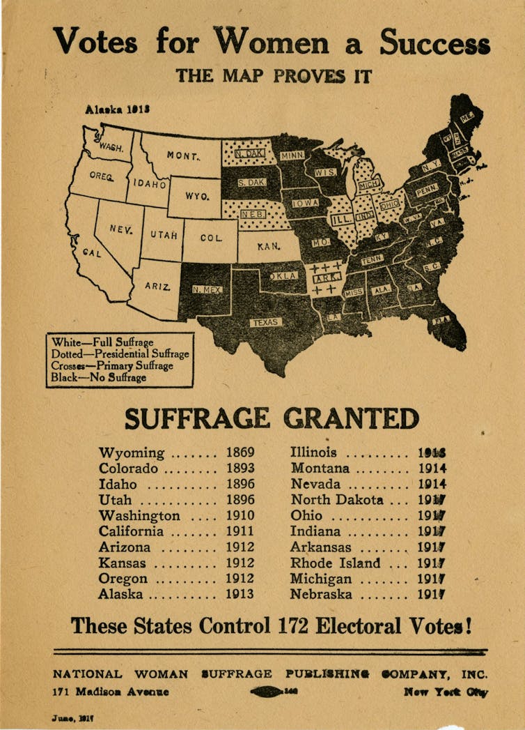
American suffrage maps with the headline “Votes for Women a Success” showed the US states that had granted women the right to vote. To challenge those with backward views, some versions of the map were also adorned with provocative statements such as “How long will the republic of the United States lag behind the monarchy of Canada?”
In 1930s Europe, where France was still withholding votes for women, suffrage campaigns published maps showing the country’s outdated approach to democracy in contrast to its neighbours such as Belgium, under the banner “French women can’t vote! French women want to vote!”
Suffrage maps were plastered on walls, hung across streets, paraded on sandwich boards, printed in newspapers and even used to petition the US Congress.
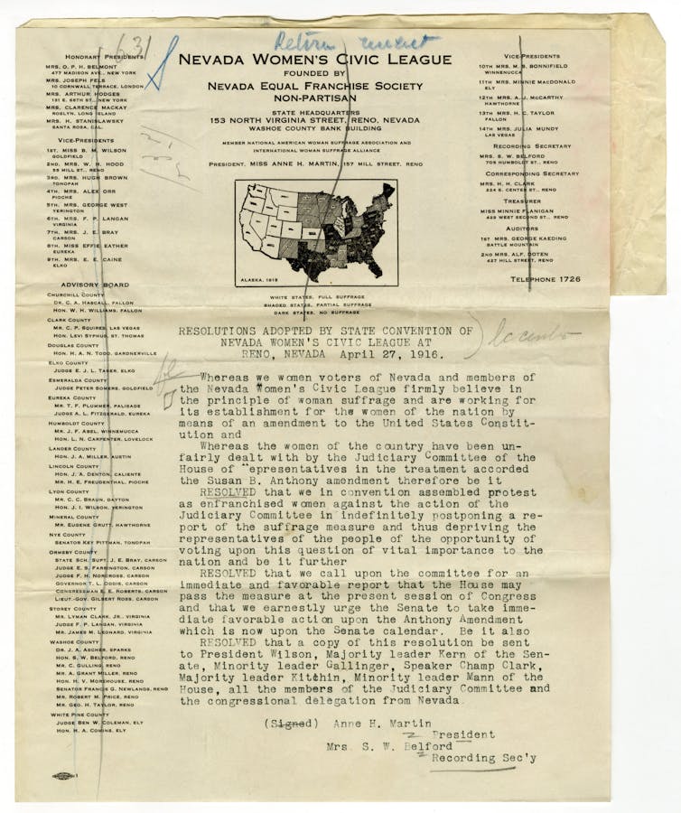
Geographer Christina E. Dando has pointed out how American suffragists’ work was not just focused on creating maps, but changing them. For example, the map below was submitted by the Nevada Women’s Civic League to the US judiciary committee, which was resisting granting women the right to vote nationwide. As the catalogue entry for the map tells us, “this petition shows that women were not just lobbying Congress in general, but strategically pressuring committees to act”.
In the US, the 19th amendment guaranteeing all women the right to vote was ratified in August 1920. But the fight for equal access to the ballot box was far from over.
Racist voter suppression policies were enacted in many states against women of colour, who were themselves creating maps to campaign against the horrors of lynching. It was only after the Voting Rights Act was passed nearly 50 years later, on August 6 1965, that such policies were outlawed. Even today, maps remain a weapon in the continuing fight to achieve fair racial representation in some US states.
Modern maps
In the past, creating maps to counter the status quo – or indeed creating pretty much any map at all – would have required significant design expertise, a lot of manual effort and the financial means to print and promote it.
Today, these challenges can be overcome more easily. The majority of sites and social media platforms are free, do not conform to national borders, and are out of government reach. That means that images that hold those in power to account can spread more freely. So it’s time to use maps to challenge the greatest social and political crisis of our time: the destruction of our planet’s environment.
Take a look at this map of nitrogen dioxide – a gas released into the atmosphere by burning fossil fuels – from a hot July day across Europe in 2019 (click to make it bigger). High levels can damage health, create acid rain and contribute to the greenhouse effect. Although the map shows gas moving around, it’s clearly concentrated in certain areas. There’s a big cloud caused by shipping in Marseille and spots marking industrial plants around Dusseldorf.
Map of nitrogen dioxide concentration
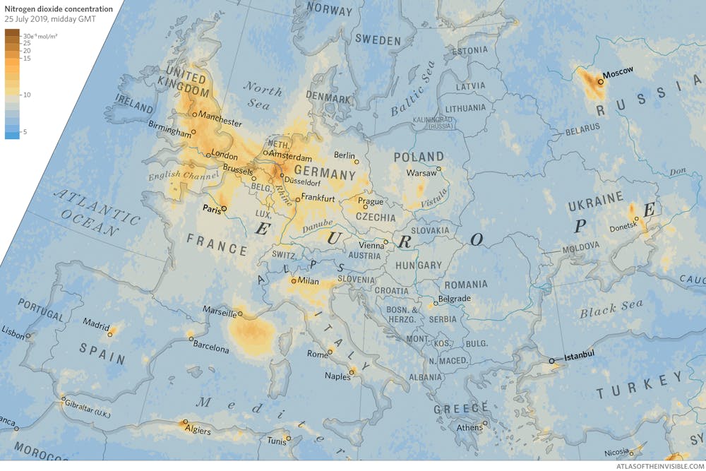
Rather than view this as purely an image of scientific interest, we should see it as a call to action. Living beneath the swirls of nitrogen dioxide are policymakers who can design tougher legislation, such as introducing low emission zones, to erase the yellow marks from this map.
The battle for women’s equality is clearly not over, but the idea that at least half the adult population should be legally deprived of a vote is now unconscionable in all but the most extreme jurisdictions. Maps created for women, by women, helped make this so. Now, let’s unleash the political power of maps to ensure that a failure to act on the environment becomes unconscionable too.
This article is republished from The Conversation under a Creative Commons license. Read the original article.
