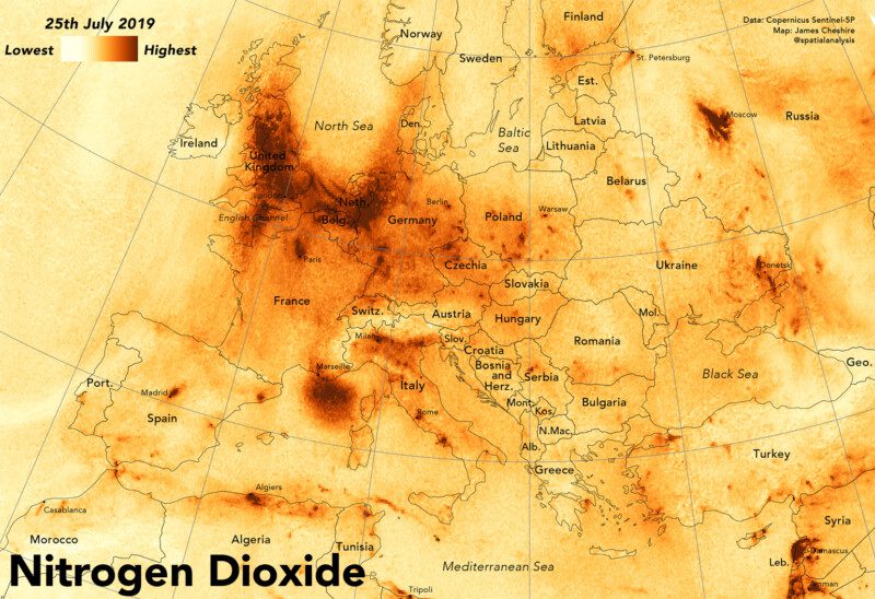
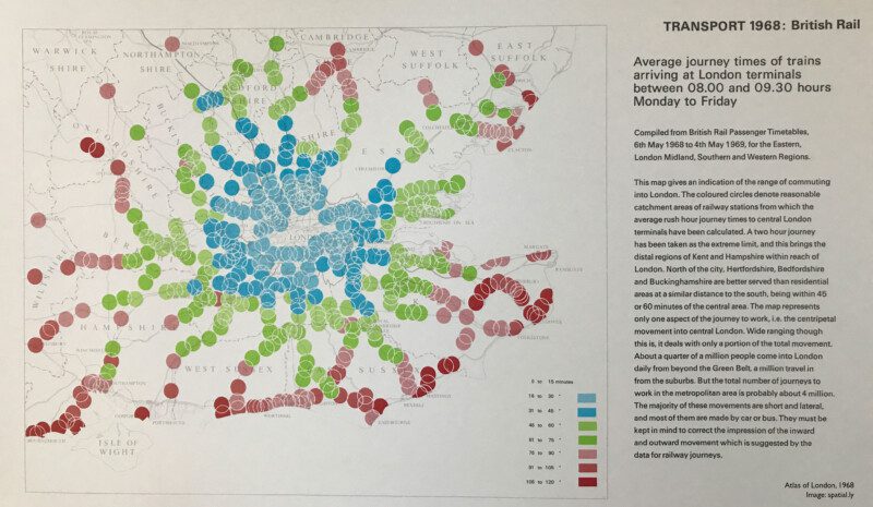
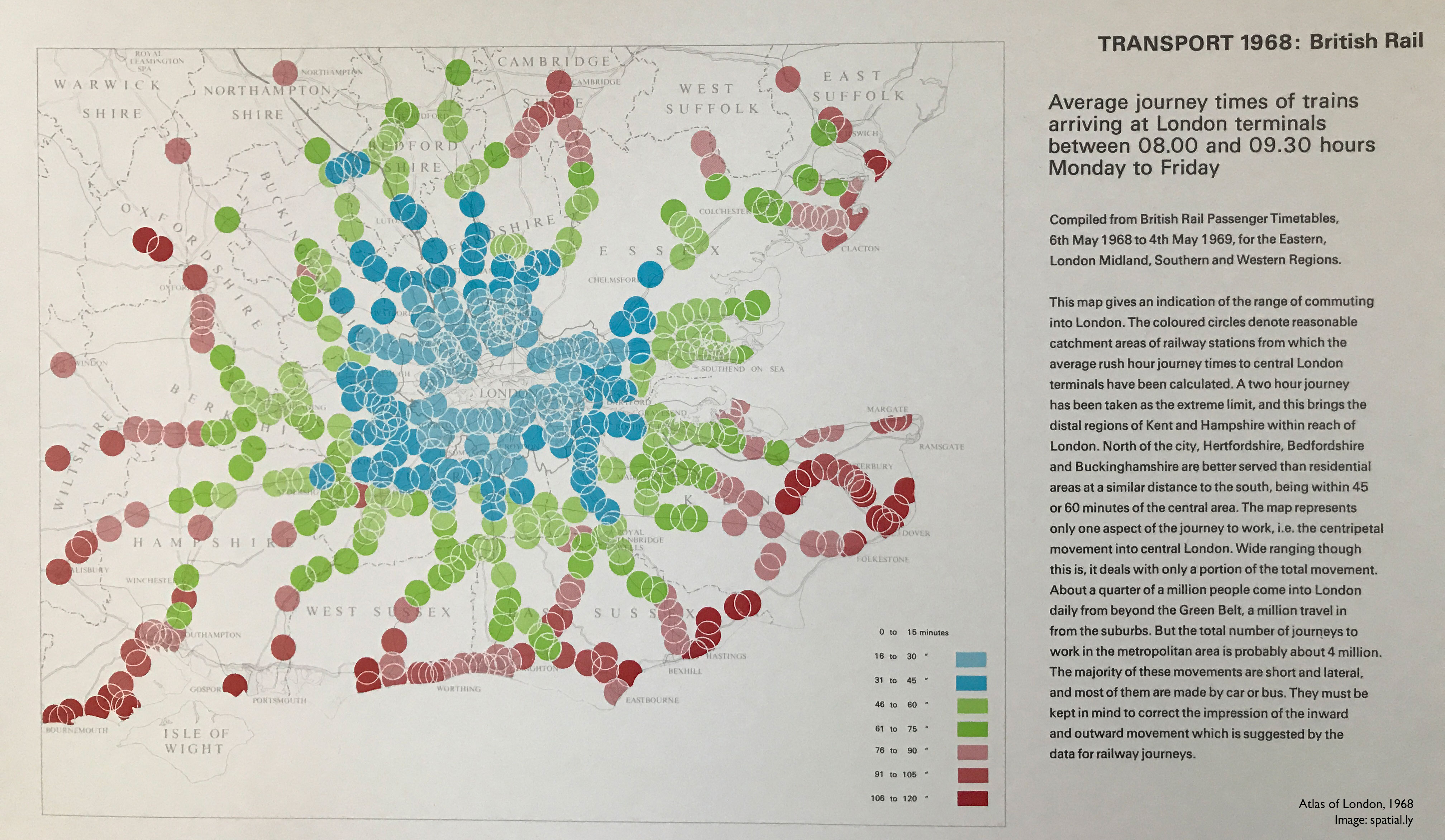
Here is a short video I did for the Royal Geographical Society to show how new satellite data can reveal the daily changes to nitrogen dioxide (and other pollutants) in the atmosphere in unprecedented detail. For a longer version of the video and further explanation see here.
It is, of course, John Snow who is credited with using maps to demonstrate that the clusters of deaths from cholera in London’s Soho during London’s 1854 outbreak were caused by contaminated water. This marked a major shift in thinking away from the disease being transmitted through dirty air: the more widely accepted theory at the time.
However, it wasn’t just Snow producing innovative maps and charts to support his cause. Snow was part of an arms race to get the best data communicated by the most compelling maps/ charts, to evidence his side of the debate against his contemporaries – people like William Farr who was also a master data visualiser.
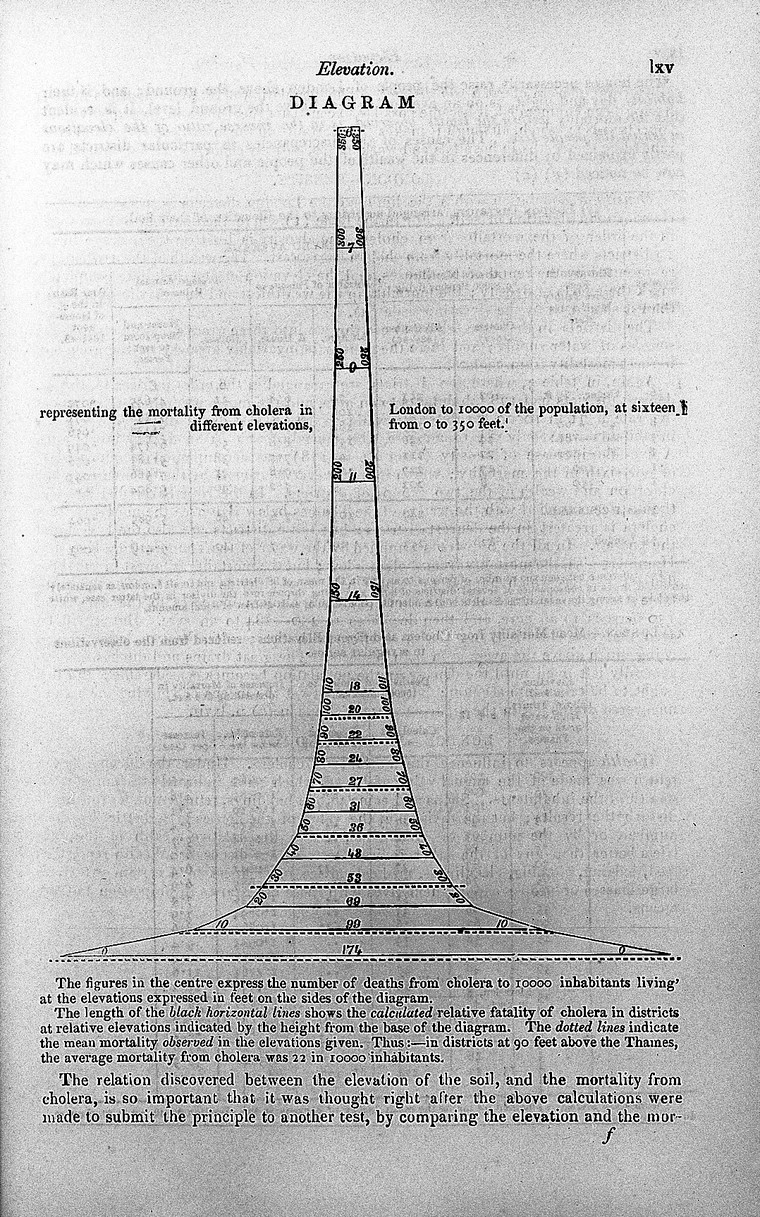
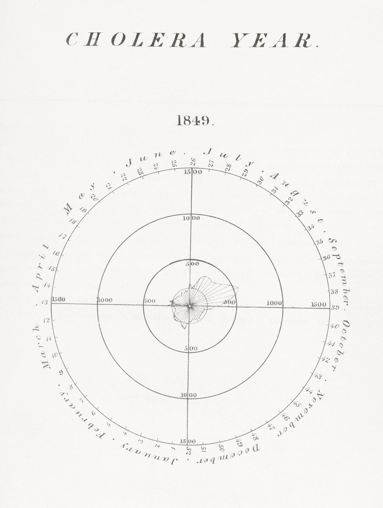
The Wellcome Collection’s image catalogue contains many great examples of maps and charts produced around the 1850s . These images are high resolution and free to use under a CC-BY 4.0 license. Most have very little information associated with them, but I think many are worth sharing because they such amazing examples of Victorian data visualisation. I have pasted them here with the catalogue details where they have them (in no particular order). I’ve included the original links back to the high resolution image in the collection. Enjoy!
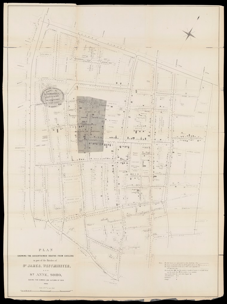
Plan Showing the Ascertained Deaths from Cholera (John Snow)
Source
Details: Plan Showing the Ascertained Deaths from Cholera in Part of the Parishes of St. James, Westminster and St. Anne, Soho, during the summer and autumn of 1854. The plan is from a report on the cholera outbreak in the Parish of St. James, Westminster, during the autumn of 1854 / presented to the vestry by the Cholera Inquiry Committee, July 1855. Report is on the cholera outbreaks in central London in 1832, 1848-9,1851,1852, 1853 and (specifically) 1854. Much reference is made to a public water pump in Broad Street. Meteorological conditions are given. Information is reported about the population, housing, sanitation, sewerage, cess pools etc. and the water supply in the Soho area.
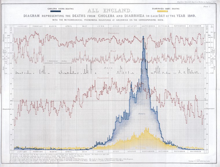
Report on the mortality of cholera in England. Charts showing the temperature and mortality of London for every week of 11 years (1840 – 1850).
Source
Details: Diagram representing the deaths from cholera and diarrhoea in England on each day of the year 1849 with the meteorological phenomena registered at Greenwich on the corresponding days.
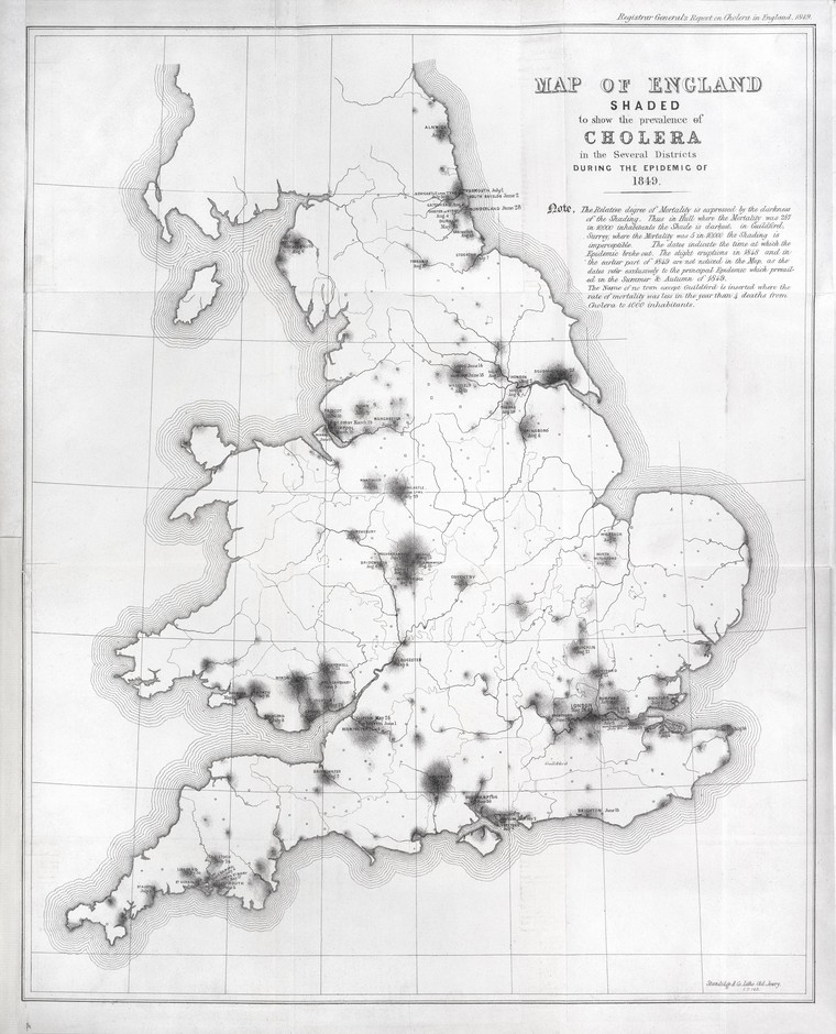
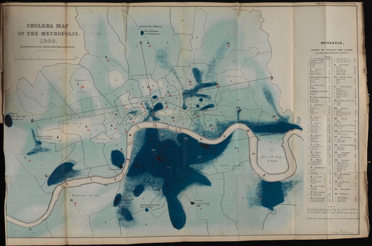
Map of England showing prevalence of cholera, 1849
Source
Details: Map of England shaded to show the prevalence of cholera in the several districts during the epidemic of 1849. The relative degree of mortality is expressed in the darkness of the shading. The dates indicate the time at which the epidemic broke out.
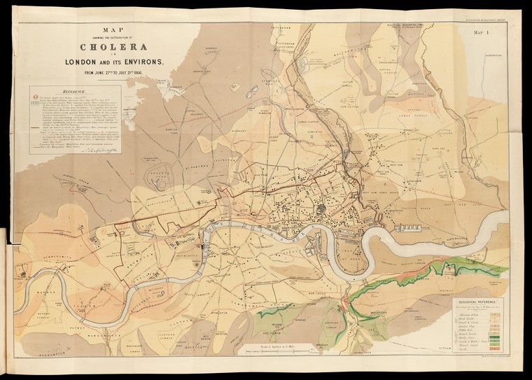
Map showing the distribution of cholera in London and its environs, from 27th June to 22st July, 1866.
Here is a quick example for how to get started with some of the more sophisticated point pattern analysis tools that have been developed for ecologists – principally the adehabitathr package – but that are very useful for human data. Ecologists deploy point pattern analysis to establish the “home range” of a particular animal based on the known locations it has been sighted (either directly or remotely via camera traps). Essentially it is where the animal spends most of its time. In the case of human datasets the analogy can be extended to identify areas where most crimes are committed – hotspots – or to identify the activity spaces of individuals or the catchment areas of services such as schools and hospitals.
This tutorial offers a rough analysis of crime data in London so the maps should not be taken as definitive – I’ve just used them as a starting point here.
Police crime data have been taken from here https://data.police.uk/data/. This tutorial London uses data from London’s Metropolitan Police (September 2017).
For the files used below click here.
#Load in the library and the csv file.
library("rgdal")
library(raster)
library(adehabitatHR)
input<- read.csv("2017-09-metropolitan-street.csv")
input<- input[,1:10] #We only need the first 10 columns
input<- input[complete.cases(input),] #This line of code removes rows with NA values in the data.
At the moment input is a basic data frame. We need to convert the data frame into a spatial object. Note we have first specified our epsg code as 4326 since the coordinates are in WGS84. We then use spTransform to reproject the data into British National Grid – so the coordinate values are in meters.
Crime.Spatial<- SpatialPointsDataFrame(input[,5:6], input, proj4string = CRS("+init=epsg:4326"))
Crime.Spatial<- spTransform(Crime.Spatial, CRS("+init=epsg:27700")) #We now project from WGS84 for to British National Grid
plot(Crime.Spatial) #Plot the data
The plot reveals that we have crimes across the UK, not just in London. So we need an outline of London to help limit the view. Here we load in a shapefile of the Greater London Authority Boundary.
London<- readOGR(".", layer="GLA_outline")
Thinking ahead we may wish to compare a number of density estimates, so they need to be performed across a consistently sized grid. Here we create an empty grid in advance to feed into the kernelUD function.
Extent<- extent(London) #this is the geographic extent of the grid. It is based on the London object.
#Here we specify the size of each grid cell in metres (since those are the units our data are projected in).
resolution<- 500
#This is some magic that creates the empty grid
x <- seq(Extent[1],Extent[2],by=resolution)  # where resolution is the pixel size you desire
y <- seq(Extent[3],Extent[4],by=resolution)
xy <- expand.grid(x=x,y=y)
coordinates(xy) <- ~x+y
gridded(xy) <- TRUE
#You can see the grid here (this may appear solid black if the cells are small)
plot(xy)
plot(London, border="red", add=T)
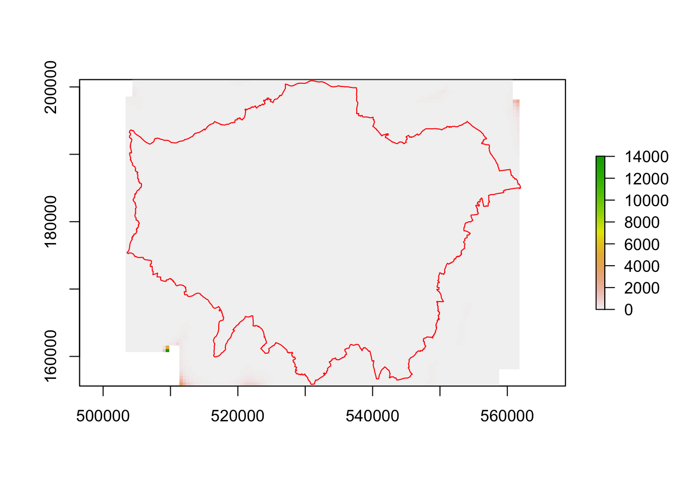
OK now run the density estimation note we use grid= xy utlise the grid we just created. This is for all crime in London.
all <- raster(kernelUD(Crime.Spatial, h="href", grid = xy)) #Note we are running two functions here - first KernelUD then converting the result to a raster object.
#First results
plot(all)
plot(London, border="red", add=T)
Unsurprisingly we have a hotpot over the centre of London. Are there differences for specific crime types? We may, for example, wish to look at the density of burglaries.
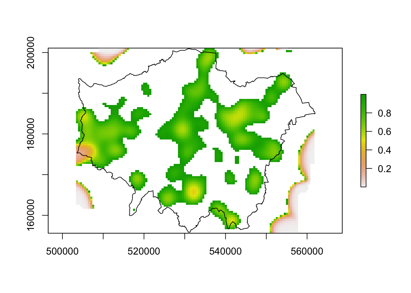
There’s a slight difference but still it’s tricky to see if there are areas where burglaries concentrate more compared to the distribution of all crimes. A very rough way to do this is to divide one density grid by the other.
This hasn’t worked particularly well since there are edge effects on the density grid that are causing issues due to a few stray points at the edge of the grid. We can solve this by capping the values we map – in this we are only showing values of between 0 and 1. Some more interesting structures emerge with burglary occuring in more residential areas, as expected.
both2 <- both
both2[both <= 0] <- NA
both2[both >= 1] <- NA
#Now we can see the hotspots much more clearly.
plot(both2)
plot(London, add=T)
There’s many more sophisticated approaches to this kind of analysis – I’d encourgae you to look at the adehabitatHR vignette on the package page.
Here’s my 2017/2018 Ultimate Gift List for Map Lovers! All the recommendations are for products I own – or have seen – and can genuinely endorse. I’ve listed them under broad categories of people you might want to buy them for. Hopefully they cater for a range of map-related interests and budgets. Enjoy!
For those who like a good coffee table book
(Amazon UK; Amazon US)
Okay, I may be a little biased putting Where the Animals Go on here, but is has received significant critical acclaim and won a number of awards so I know others have enjoyed it! Not many people are creating original map books from scratch these days so we put a huge amount of effort into getting the cartography right for this – there’s lots of innovations in approach that we’re really proud of. Its not just for animal lovers – there’s data & technology to think about as well. We’ve been amazed at the age range of people coming to our talks from kids to grandparents and all in between – each enjoying the book for different reasons so it seems a safe bet if you want something for the whole family. It also comes as Die Wege Der Tiere and Atlas De La Vie Sauvage.
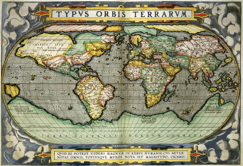
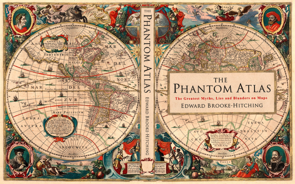
As I said above, there aren’t many people making books of original map content, instead there’s an increasing number of books containing compilations or edited selections of maps. In this crowded market I’m becoming increasingly discerning about what books are genuine contributions rather than a rehash of other people’s work. That said, there are a few lovely examples of map compendiums that contain great commentary and some nice surprises. The Phantom Atlas (US link) is one of those. It is also beautifully produced with some nice design touches and high print quality. I got it for Christmas last year and it remains a favourite.
You would have seen Maps (US link) in a bookshop before now. It’s designed for kids but the illustrations are brilliant and it’s really immersive…just make sure the person you’re giving it to has tall bookshelves since it’s a big book!
For those in search of a good poster
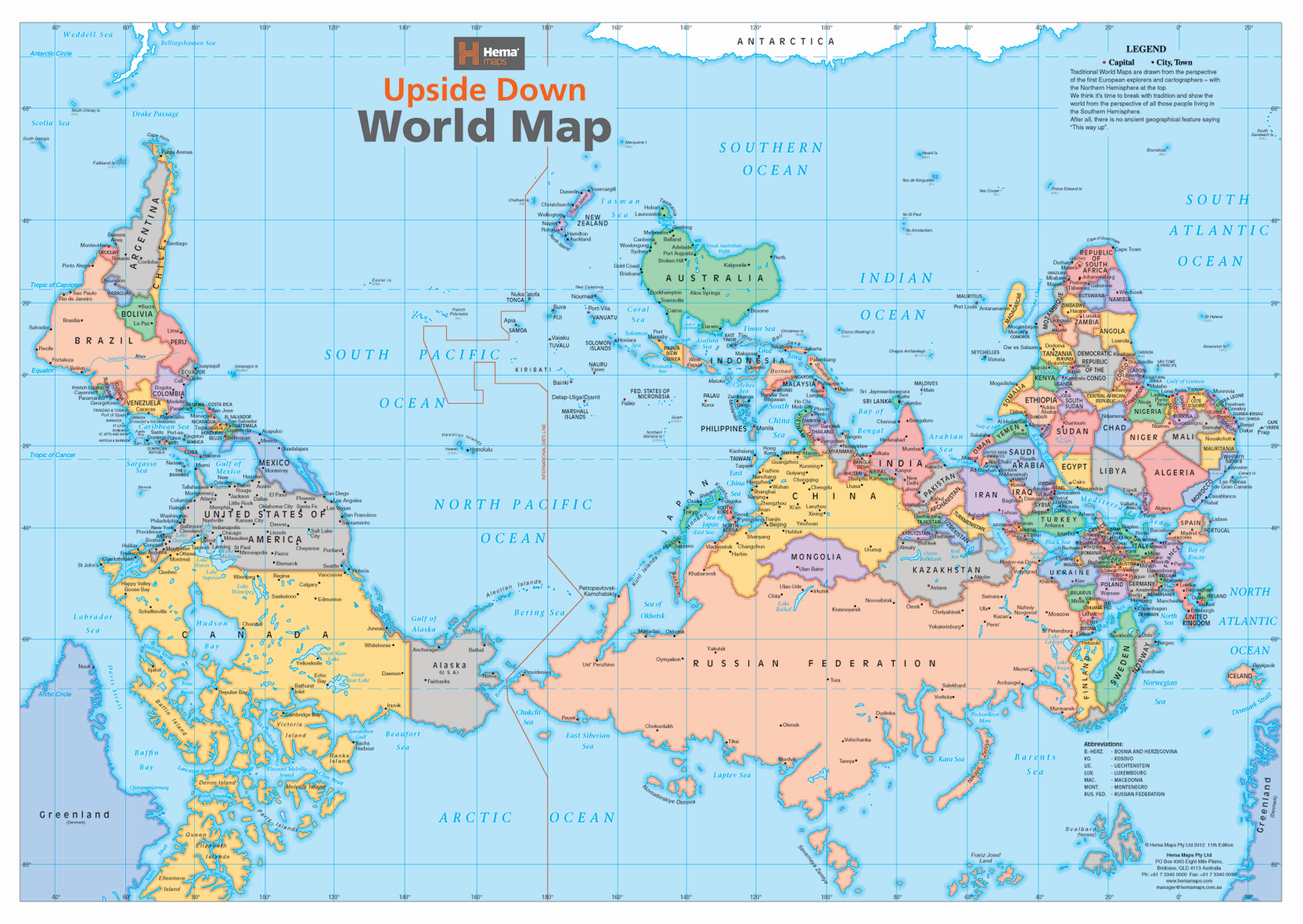
I have this Upside Down World Map (US Link) up on the wall of my office and almost anyone who comes in does a double-take when they see it. It’s a great conversation starter and nicely makes the point that the maps can be used to make us see the world differently! (Note that it comes folded rather than rolled).
The British library has an extensive map collection and it’s possible to purchase prints of some of them. There’s a variety of formats on offer and lots to choose from. Click here for more.
For the armchair geographer
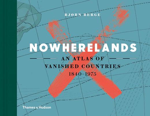
Nowherelands (US Link) is a wonderfully produced book detailing countries that once existed but have since disappeared. It has nice touches like the countries’ stamps alongside a small map of their location. Maps are a relatively small part of the book, but it is packed with geopolitical history.
For the fashion-conscious
Threadless has loads of map themed t-shirts, most of which I think I own/ have owned in recent years.
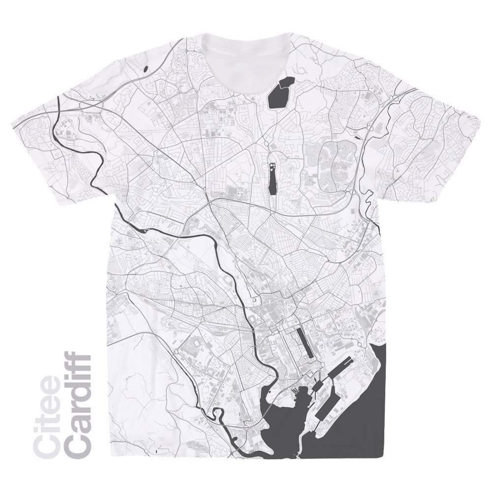
I don’t own a t-shirt from Citee, but I’ve seen a sample and also they are cropping up more and more at conferences I attend. You can get a map for practically any city you can think of. They come in either white or black.
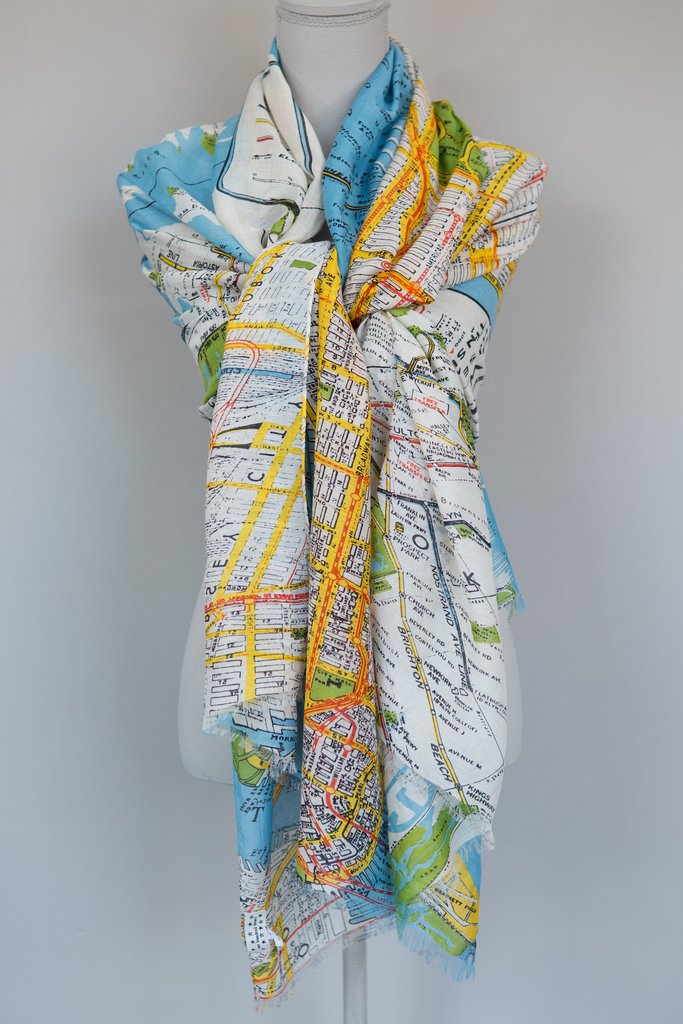
One Hundred Stars does a whole range of map-based clothing. I purchased one of they scarves and have been really impressed with it. More here.
For the map enthusiast
The Red Atlas (US link) has recently been published and it showcases the extraordinarily detailed maps the Soviet Union were able to create in a time before widespread satellite surveillance etc. It’s probably more suited for someone you know who really likes maps/ mapping since it can get a bit technical in places – I really enjoyed it.
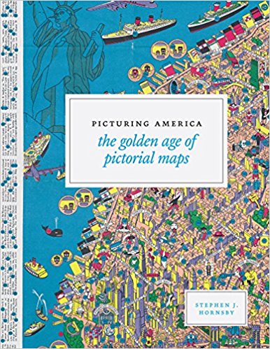
Pictorial maps have brought a lot of fun to cartography. This book includes over 150 of them across six thematic sections such as “Maps to Amuse” and “Maps for War”. All examples are taken from the US (as the title suggests), but it’s very nicely produced and full of interesting/ insightful commentary from Stephen Hornsby. UK link. US link.
If you’re still searching – click here for a gift list from a few years ago.
The graphic below shows the population of London across a number of transects overlain on the city’s underlying terrain. It was produced by Ordnance Survey in 1935 and is one of the few early examples I’ve seen of the organisation producing “data visualisations” alongside their famous maps (they do a lot more of this now – see here). For what it’s worth I really like the way that this approach shows how London is built in a basin and how the population is dissected by rivers and parkland etc (this pattern hasn’t changed much since 1935). But it is a tricky graphic to read if you want to extract more precise info. I’m missing the companion map that would help with orientation, but I’m struggling with extracting values from the graphs since they are essentially adding terrain and population values together in a kind of streamgraph. The axes at either side of the plot therefore don’t really work, although I do like their caveat that “no greater precision must be expected of the curve of population density”. Here is the full version (I had to scan in 4 sections so it’s a little distorted I’m afraid).
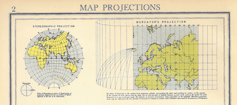
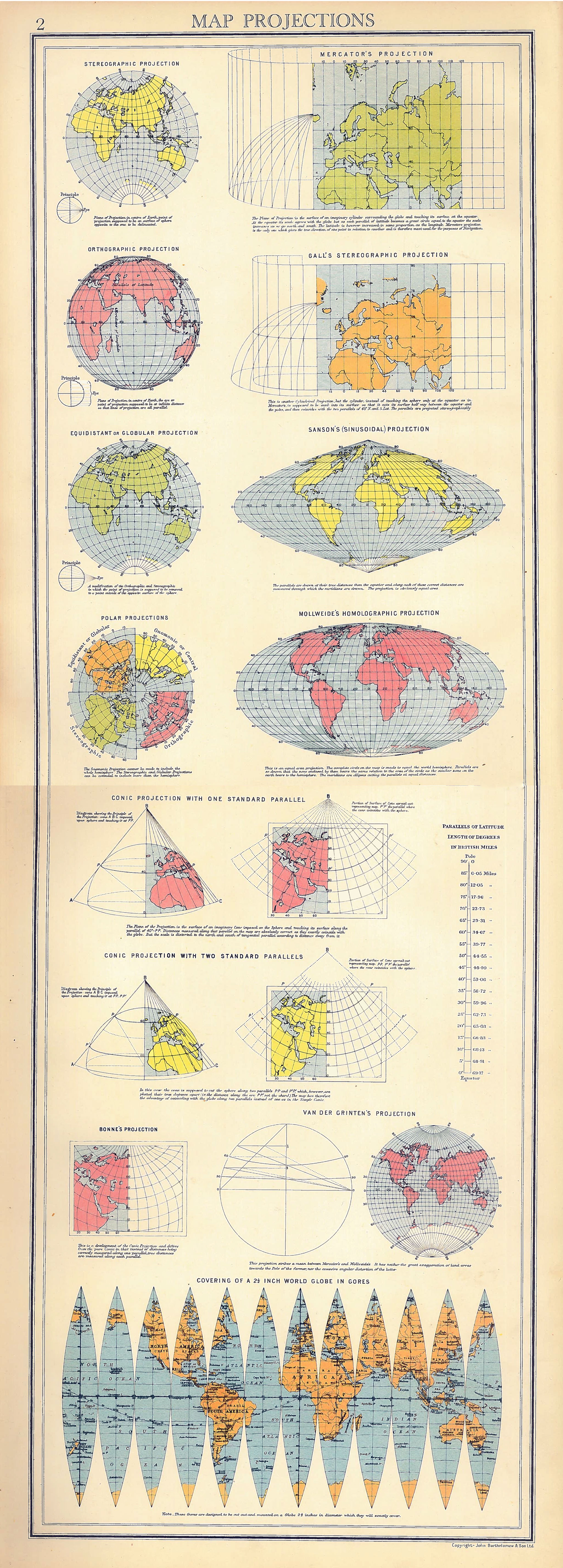
I’ve just discovered this really lovely graphic detailing a number of different map projections. It’s taken from the opening pages of the “Oxford Advanced Atlas” (Bartholomew, 1936) and features well-known projections such as the Mercator and Mollweide, through to the more obscure Van der Grinten, and the heart shaped Bonne. It even features the gores required to make your own globe! I’ve scanned and combined the pages to make them scrollable.
I wish I’d seen this before I did something similar (but much less informative) a few weeks ago…!