Week 6: Geographic Data and Methods
Session Outline
In this session we will cover the following:
- What is spatial representation?
- Discrete objects vs continuous fields.
- Raster vs vector data formats.
- The importance of map projections.
- The Modifiable Areal Unit Problem (MAUP) and the ecological fallacy.
You will also be introduced to the fundamentals of working with spatial data in R.
Slides for this week can be downloaded here.
Spatial Representation
A note about Geographic Information Systems (GIS)
Before we go too much further it is worth giving a brief introduction to Geographic Information Systems (GIS). These are software packages designed for specific use for spatial datasets and they have been around longer than R. If you research the topics covered in the coming sessions you will likely encounter reference to them. The academic research area that contributes to the methodological and conceptual developments in GIS is referred to as “GIScience” and there is a lot of literature from this domain that we will cover. So whilst we use R with spatial data we can think of it as a GIS, and the analysis we do with the tools is GIScience. I have extracted some introductory material from Longley and Cheshire (2019) here:
Geographic information (GI) systems are computer-based systems for storing and processing geographic information about sets of locations. We can think of each atom of geographic information as comprising three (x, y, z) elements – a coordinate (x, y) pair and a location attribute (z). GI systems are a collection of tools that improve the efficiency and effectiveness of handling information about geographic objects and events. They can be used to carry out many useful tasks including storing vast amounts of geographic information in databases, conducting analytical operations in a fraction of the time it would take to do it by hand, and automating the process of making useful maps. GI systems process information, but there are limits to the kinds of procedures and practices that can be automated when turning data into information. However, it is important to understand whether this selectivity and preparation for purpose actually adds any value, or whether the results are of sufficient value in geographic applications. Such issues are the realm of GI science, a rapidly developing field concerned with the scientific underpinnings of GI systems. GI science thus provides a framework for learning from the accumulated experience of using GI systems.
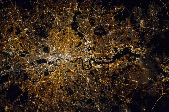
GI systems can thus be thought of as providing the technology for problem solving. Longley et al. (2015) discuss how the label “GIS” is used to describe many things, including: a collection of software tools (sometimes bought from a commercial company) to carry out certain well-defined functions; digital representations of various aspects of the geographic world, in the form of datasets; a community of people who use and perhaps advocate the use of these tools for various purposes; and the activity of using a GI system to solve problems or advance science.
Geographic Data in R & Map Projections
Follow along with the video & code below. The code has been adapted from this really helpful tutorial.
library(sf)
library(spData)

# load in the world map data from the spData package
worldmap<- world

# make a map!
plot(worldmap)

# subset the spatial data a variety of ways
plot(worldmap["lifeExp"])

summary(worldmap["lifeExp"])

plot(worldmap[3:6])

Asia<- worldmap[worldmap$continent=="Asia",]

plot(Asia)

class(worldmap)

# Projections and coordinate reference systems.
st_crs(worldmap)<-4326

worldmap_merc<-st_transform(worldmap,3395)

plot(worldmap_merc["lifeExp"])

GB<- worldmap[worldmap$iso_a2=="GB",]

plot(GB)

st_crs(GB)

GB_BNG<- st_transform(GB, 27700)

plot(GB_BNG)

World_BNG<- st_transform(worldmap, 27700)
Mapping in R
In this section we will:
- Load spatial data files into R
- Join spatial data files to a regular data frame
- Create a simple choropleth map from the data
- Customise choropleth maps with the tmap package
R was conceived – and is still primarily known – for its capabilities as a “statistical programming language” (Bivand and Gebhardt 2000). Statistical analysis functions remain core to the package but there is a broadening of functionality to reflect a growing user base across disciplines. R has become “an integrated suite of software facilities for data manipulation, calculation and graphical display” (Venables et al. 2013). Spatial data analysis and visualisation is an important growth area within this increased functionality. In recent years R has really made its mark as a data visualisation tool. The map of Facebook friendships produced by Paul Butler is iconic in this regard, and reached a global audience. He mapped the linkages between friends by calculating the great circle arcs between them (using the geosphere package) and plotted the result, displayed in below. The secret to the success of this map was the time taken to select the appropriate colour palette, line widths and transparency for the plot.

The impact of the graphic was to inspire the R community to produce more ambitious graphics; a process fueled by the increased demand for data visualisation and the development of sophisticated packages, such as ggplot2, that augment the basic plot functions of R. It is now the case that R has become a key analysis and visualisation tool used for spatial data.
Finally, it is worth noting that while there are dedicated programs handle spatial data by default and display the results in a single way, there are various options in R that must be decided by the user, for example whether to use R’s base graphics or a dedicated graphics package such as ggplot2. On the other hand, the main benefits of R for spatial data visualisation lie in the reproducibility of its outputs, a feature that we make use of in these tutorials since they are written in R Markdown and can therefore be executed as R code. We will introduce this later in the module.
First we must set the working directory and load the practical data. Go to RStudio and upload the zipfile of data you downloaded from the link above. You can set this as your working directory. Now we can load the data.
# Remember to set the working directory as usual

# Load the data. You may need to alter the file directory
census_data <-read.csv("worksheet_data/eng_wales_practical_data.csv")
Loading Shapefiles into R
A shapefile is a file format for storing the location, shape, and attributes of geographic features. In other words, it contains the information we create a map and analyse it as either points, lines or polygons. First we need to load some packages. Remember to install them first if you have not used them before or to check the tick boxes if you are using RStudio Server. A reminder that the “Packages” tab on the server is alongside the Plots tab, tick the boxes of the ones you need and they auto-load.

If you are using your own laptop, to install go to Tools > Install packages. in RStudio and enter the name of the package or use the install.packages() function.
We are using the ‘sf’ package which is specially designed to work with spatial data.
#Load Package

library(sf)
Next we need to load the output area shapefile into R.
We refer to ‘a shapefile’ as if were a single file but actually it is a collection of files and all are needed for it to work. If you look in the data folder you will see the following collection:
OA_2021_EW_BGC_V2.dbf
OA_2021_EW_BGC_V2.prj
OA_2021_EW_BGC_V2.shp
OA_2021_EW_BGC_V2.shx
The .dbf file contains our data attributes (it is a bit like a csv but designed to specifically work as part of a shapefile), the .prj file contains the projection information we need (more on this soon), the .shp supplies the geometry information and the .shx file is a kind of index that links them all together. All these files can be moved to your working directory. If you have problems loading the data into R there is a good chance one of the files is missing so be careful to copy them all.
#Load the output area shapefile using the st_read function (be patient). Note we only need to specify the .shp file extension.

Output.Areas <- st_read("worksheet_data/OA_2021_EW_BGC_V2.shp")
If you click on the Output.Areas object in the Environment tab you will see a table appears with various columns in it. The good news is that there is a “OA21CD” column that appears to have values in it that are the same format as our “OA” column in the ‘census_data’ object created above. So on this basis we can join them. But before we proceed we are going to subset the data to only contain the rows for the Borough of Camden.
This is going to take a bit of lateral thinking because there is no column that simply has the borough names in it. So take a look at the ‘LSOA21NM’ column and you will see that there are names of places in their. This is the column showing the names if the Lower Super Output Areas (the groups of OAs introduced in the diagram above). So could probably do the subset by searching for the word ‘Camden’ in this column. Lets give it a go…
OA.Camden<- Output.Areas[grepl('Camden', Output.Areas$LSOA21NM),]If you look at the OA.Camden Object you will see 751 obs and that LSOA21NM column is full of “Camden”. Magic! So what just happened. Here’s the code again, but broken into two steps.
# The key bit here is the "grepl" function which is an oddly named function that searches for text. Consult the help files for more.

grepl('Camden', Output.Areas$LSOA21NM)

# This returns a list of TRUE/ FALSE if the word Camden appears in the rows within the LSOA21NM column. These then are used in the subset, which only returns the rows marked TRUE.

OA.Camden<- Output.Areas[grepl('Camden', Output.Areas$LSOA21NM),]
So now we can see what the OA.Camden is all about.
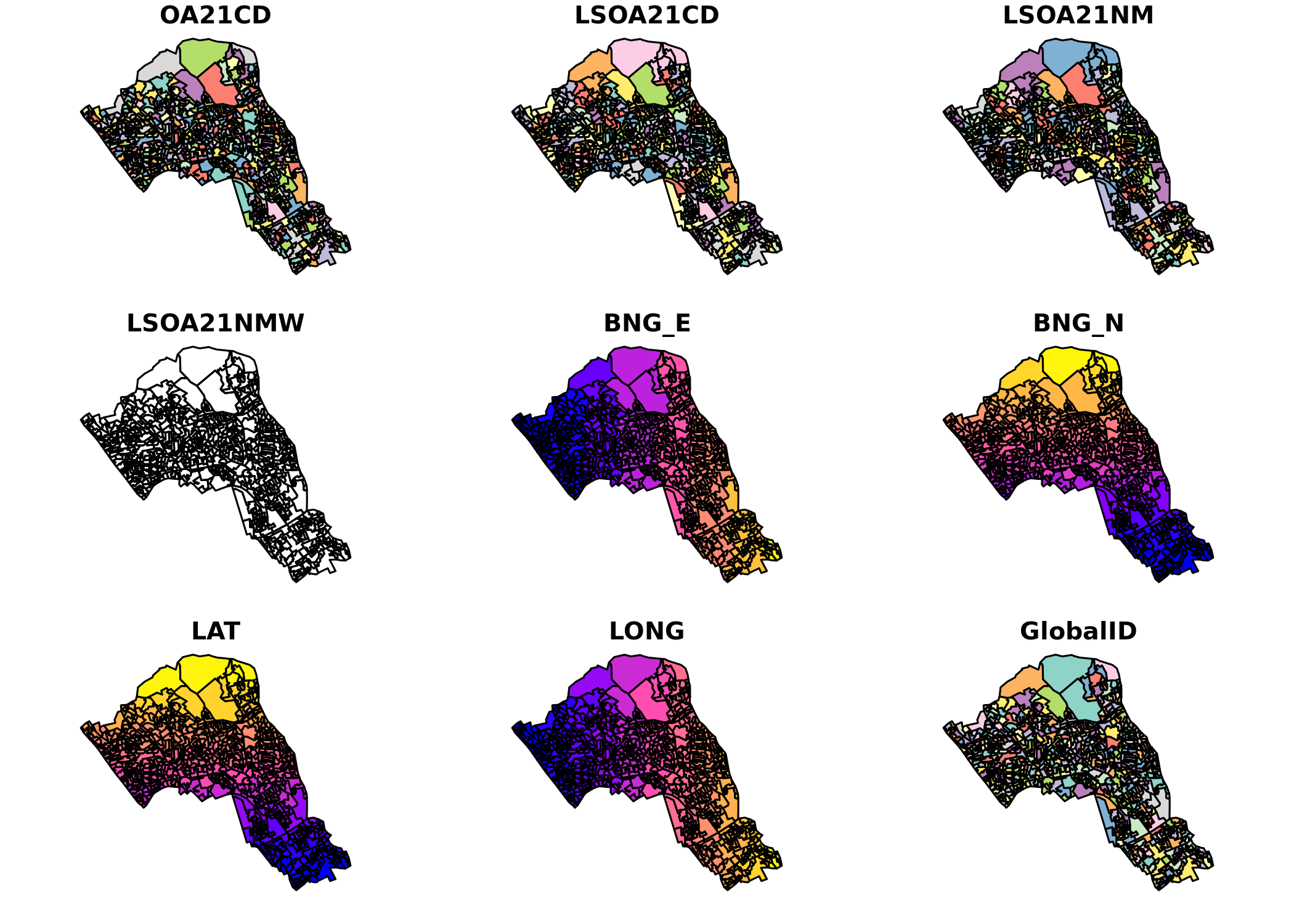
plot(OA.Camden)Its a spatial object, known as ‘simple features’ or ‘sf’ for short. And the plot function has returned a map for each of the columns in the attribute table. In this case we have the following (and none are terribly useful when mapped):
To make more useful maps we need to join the census data we created about ethnicity, unemployment etc. At the moment the Output.Areas object is missing the census data we wish to map and analyse so we now need to join our Census.Data to the shapefile so the census attributes can be mapped. As our census data contains the unique names of each of the output areas, this can be used a key to merge the data to our Output.Areas object (which also contains unique names of each output area). We will use the merge() function to join the data.
Notice that this time the column headers for our output area names are not identical, despite the fact they contain the same data. We therefore have to use by.x and by.y so the merge function uses the correct columns to join the data.
OA.Census<- merge(OA.Camden, census_data, by.x="OA21CD", by.y="OA")You can now see those columns in the OA.Census file, and they can be mapped (here by specifying the column numbers)
plot(OA.Census[10:13])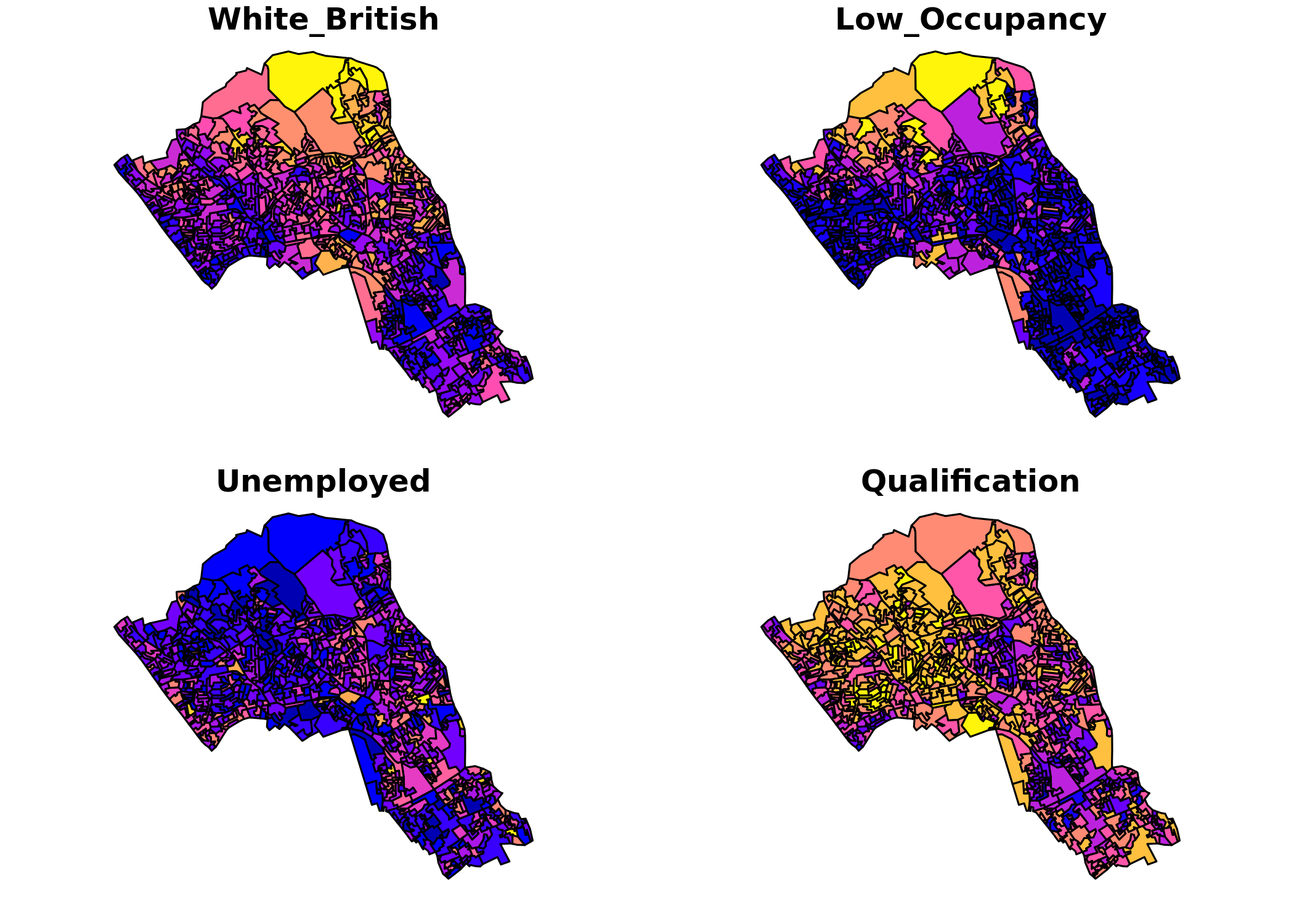
Making Maps
Whilst the plot function is pretty limited in its basic form. Several packages allow us to create maps relatively easily. They also provide a number of functions to allow us to tailor and alter the appearance of the map. Probably the easiest to use are the functions within the tmap library and it works in a similar way to ggplot by building up layers.
As always the packages needed should be installed or check boxed if using for the first time. Rather than use the library(tmap) syntax, its more reliable if you are using the RStudio Server to tick the package on in the “Packages” pane on the right (but I have left the code here for reference)
#Load packages
library(tmap)
Creating a Quick Map
If you just want to create a map with a legend quickly you can use the qtm() function.
# this will produce a quick map of our qualification variable
qtm(OA.Census, fill = "Qualification")
It’s as easy as that!
Creating More Advanced Maps with tmap
The qtm function is a good start but the power of tmap comes by binding together several functions that comprise different aspects of the map.
For instance: spatial object + symbology options + borders + layout
So we specify the spatial data objects (currently the Oa.Census object) followed by a command to set their symbologies – these are how we would like to colour the map for example. These objects can then be layered such that the object first listed lies at the bottom and subsequent objects are layered on top.
Creating a Simple Map
Here we load in the spatial object with the tm_shape() function then add in the tm_fill() function, which is where we can decide how the polygons are filled in. All we need to do in the tm_shape() function is call the spatial object (OA.Census). We then add (+) a separate new function (tm_fill()) to enter the parameters which will determine how the polygons are filled in the graphic. By default, we only need to include a variable name within the parameters.
You can explore all of the available functions and how they can be customised by visiting webpage for tmap, or by entering ?function into R (i.e. ?tm_fill). Below we will go through some of the basic steps of mapping with tmap.
# Creates a simple choropleth map of coloured qualification variable
tm_shape(OA.Census) + tm_fill("Qualification")
You will notice that the map is very similar to the quick map produced from using the qtm() function. However, the advantage of using the advanced functions from tmap is that they provide a wide range of customisation options. The following steps will demonstrate this.
Setting the Colour Palette
tmap allows you to use colours either defined by the user or we can choose from a set of predefined colour ramps that are part of the RColorBrewer() package. These have been developed by Cynthia Brewer to ensure that they are colour blind safe and also don’t over emphasize one colour over another. You can see more about them here: https://colorbrewer2.org/
To explore the predefined colour ramps in ColorBrewer enter the following code:
library(RColorBrewer)
display.brewer.all()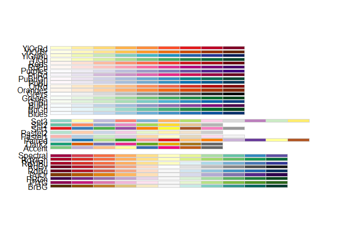
This presents a range of previously defined colour ramps. The continuous ramps at the top are all appropriate. If you enter a minus sign before the name of the ramp within the brackets (i.e. -Greens), you will invert the order of the colour ramp.
# setting a colour palette
tm_shape(OA.Census) + tm_fill("Qualification", palette = "-Greens")
Setting the Colour Intervals
We have a range of different interval options in the style option. This is what we use to specify the colour assigned to the values. Each of them will greatly impact how your data is visualised. To do this you enter style = followed by one of the options below:
- equal – divides the range of the variable into n parts.
- pretty – chooses a number of breaks to fit a sequence of equally spaced ‘round’ values. So the keys for these intervals are always tidy and memorable.
- quantile – equal number of cases in each group
- jenks – looks for natural breaks in the data
- Cat – if the variable is categorical (i.e. not continuous data)
Try a couple of different interval styles to observe how they visualise the data differently. The example below uses the quantile interval scheme
# changing the intervals
tm_shape(OA.Census) + tm_fill("Qualification", style = "quantile", palette = "Reds")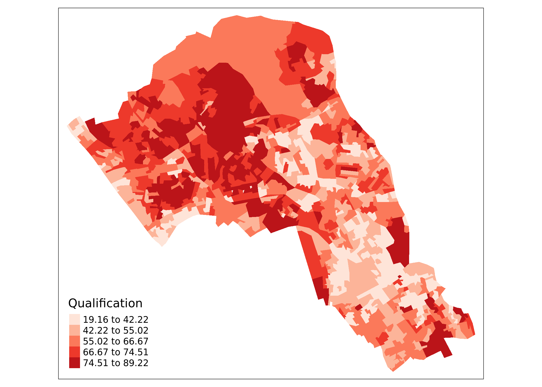
We can also change the number of intervals in the colour scheme and how the intervals are spaced. Changing the number of intervals is straightforward, just n= n (note that the default interval setting may still round the number). Here we have 7 shades instead of the default 5.
# number of levels
tm_shape(OA.Census) + tm_fill("Qualification", style = "quantile", n = 7, palette = "Reds")
You can also create a histogram within the legend, simply add legend.hist = TRUE within tm_fill. The histogram can be quite informative of how the intervals are defined. Try running the maps with a histogram to observe how different intervals are univariately distributed across our data.
# includes a histogram in the legend
tm_shape(OA.Census) +
 tm_fill("Qualification", style = "quantile", n = 5, palette = "Reds", legend.hist = TRUE)
Adding Borders
You can edit the borders around the polygons with the tm_borders() function which has many arguments. alpha denotes the level of transparency on a scale from 0 to 1 where 0 is completely transparent.
# add borders
tm_shape(OA.Census) +
 tm_fill("Qualification", palette = "Reds") +
 tm_borders(alpha=.4)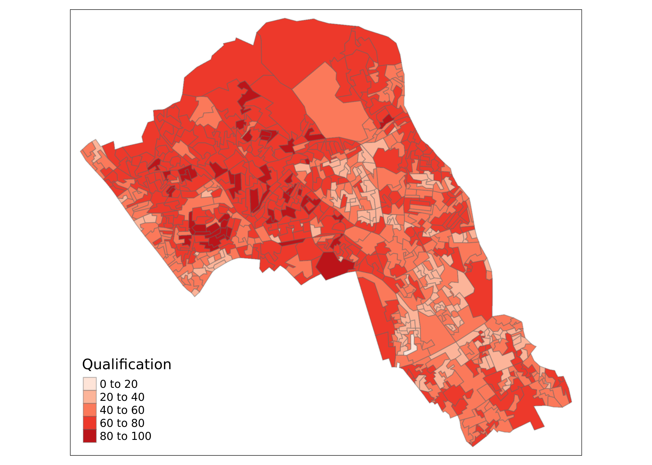
Adding a North Arrow
We can also enter a north arrow with tm_compass().
# north arrow
tm_shape(OA.Census) +
 tm_fill("Qualification", palette = "Reds") +
 tm_borders(alpha=.4) +
 tm_compass()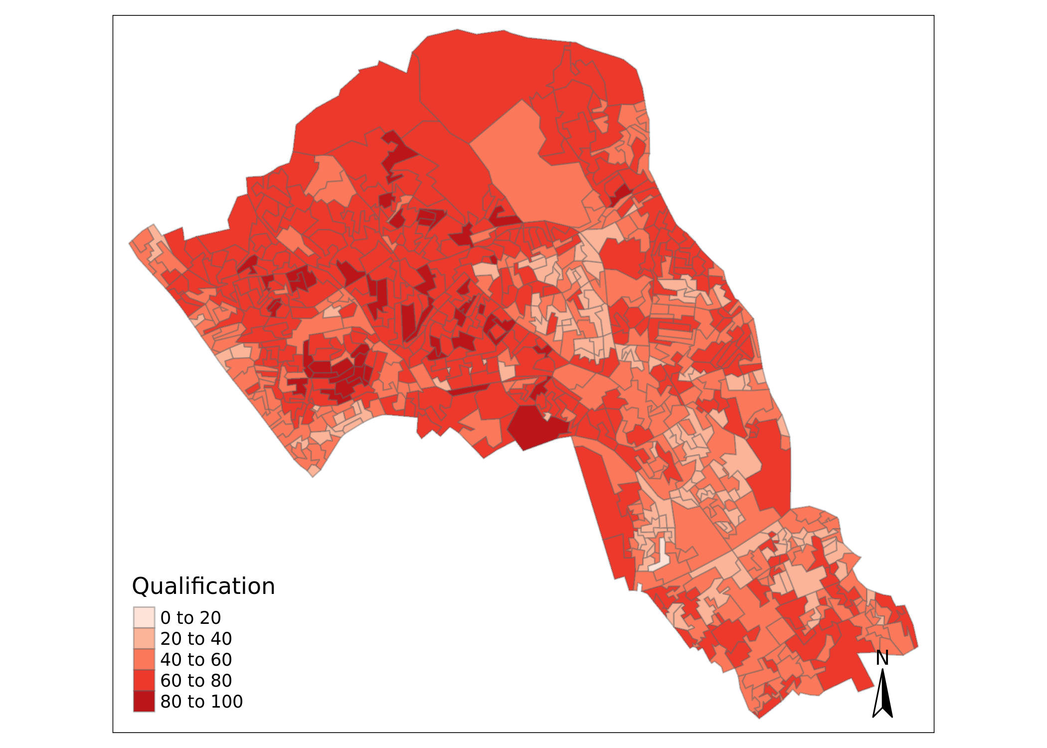
Editing the Layout of the Map
It is possible to edit the layout using the tm_layout() function. In the example below we have also added in a few more commands within the tm_fill() function.
# adds in layout, removes frame
tm_shape(OA.Census) +
 tm_fill("Qualification", palette = "Reds", style = "quantile",title = "% with a Qualification") +
 tm_borders(alpha=.4) +
 tm_compass() +
 tm_layout(title = "Camden, London", legend.text.size = 1.1, legend.title.size = 1.4, legend.position = c("right", "top"), frame = FALSE)
Saving the Shapefile
Finally, we can save a new shapefile with the census data attached by simply running the following code. The “.” denotes the file will be saved in the current working directory. If you would like to save to a different folder then replace the full stop with the file path of the folder.
st_write(OA.Census, dsn = "worksheet_data/Census_OA_Shapefile.geojson", driver="GeoJSON")

# save and then reload (not strictly necessary now, but this is the syntax for reloading data in the future)

OA.Census<-st_read(dsn = "worksheet_data/Census_OA_Shapefile.geojson")
Mapping Point Data
In the previous section we produced maps of areal data – with each output area representing the characteristics of the group of people who live within it. As we have seen this can create some challenges associated with how representative the areas are of the data, which in the case of social science means the people, that have been recorded. Challenges associated with the MAUP arise from the aggregation of point data into areas, something that can be avoided in many circumstances (it is often done to preserve privacy or reduce the size of a dataset to a manageable level for analysis). With occurrences of a crime or case of a disease, for example, the exact location is important so we map them as points.
We will be handling house price paid data originally made available for free by the Land Registry. The data is formatted as CSV where each row is a unique house sale, including the price paid in pounds and the postcode. Prior to this practical, the data file was joined to a Office for National Statistics (ONS) postcode lookup table which allows us to join the x and y coordinates and Office for National Statistics geographic units for each postcode (this is how we know which output area each postcode falls within).
# load the house prices csv file
houses <- read.csv("worksheet_data/camden_house_price_2022.csv")
Whilst it is possible to plot this data using the standard plot() in R. It is not being handled as spatial data as demonstrated below. It is simply an X,Y scatterplot from the oseast1m and osnrth1m columns (these are the Easting and Northing values according to the British National Grid and they are in meters)
# 2D scatter plot
plot(houses$Easting, houses$Northing)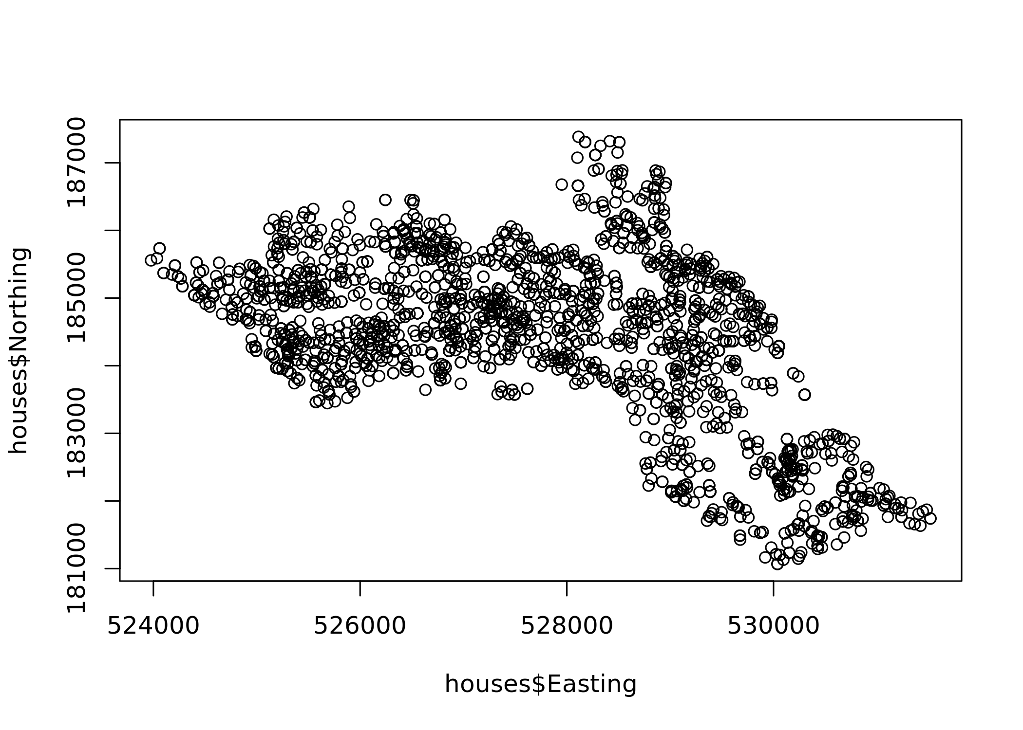
Therefore, we need to assign spatial attributes to the CSV so it can be mapped properly in R. To do this we will need to load the sf package, this package provides classes and methods for handling spatial data. Now we can convert the standard data.frame into a spatial format. To do this we will need to set what the data is to be included, what columns contain the x and y coordinates, and what projection system we are using.
library(sf) # if not already loaded

# create a House.Points spatial object. Remember the crs argument is for the 'coordinate reference system' explained in Map Projections (above).

House.Points  <- st_as_sf(x = houses,
           coords = c("Easting", "Northing"),
           crs = st_crs(OA.Camden)$"proj4string")

plot(House.Points)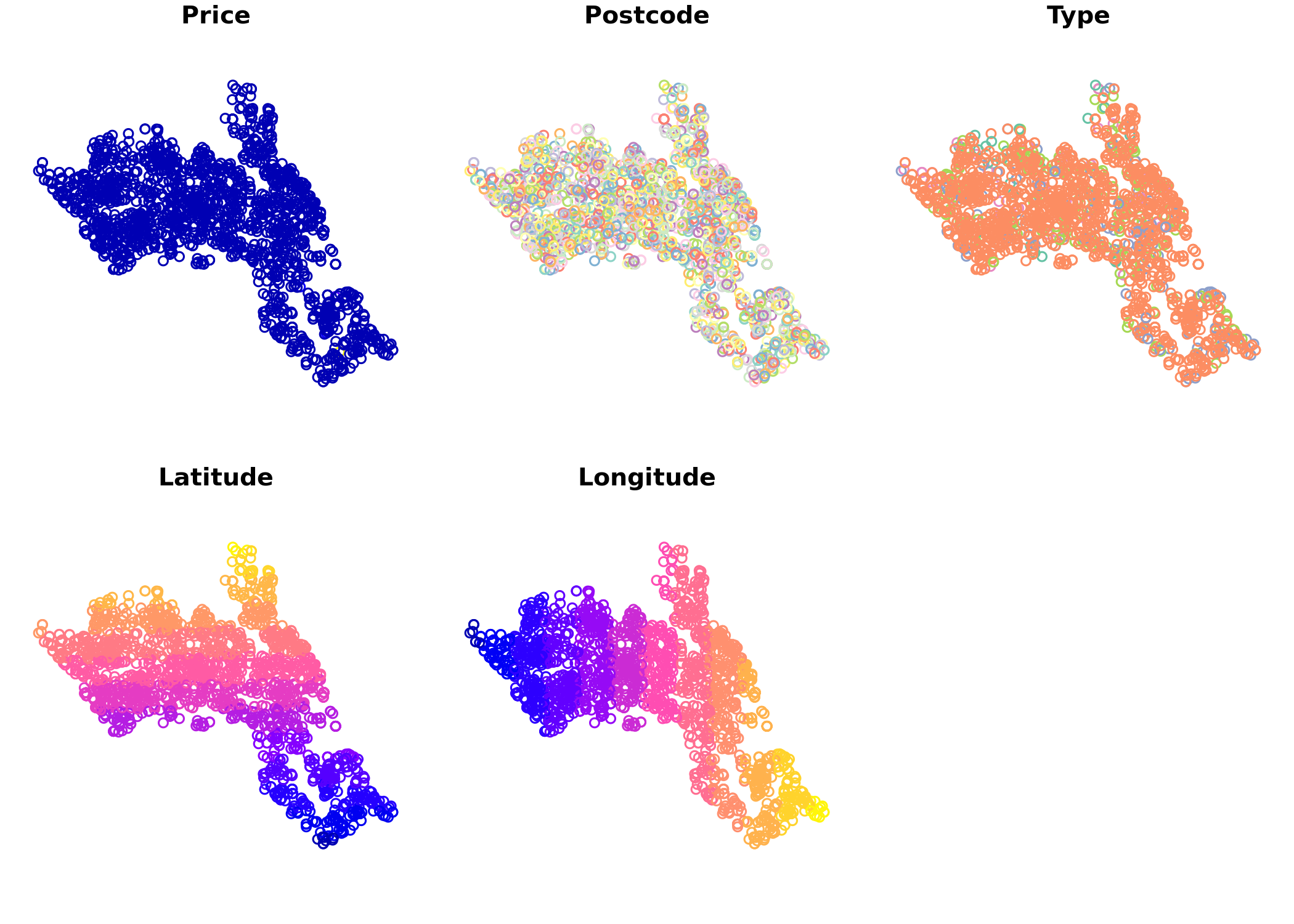
Now R undertands this as spatial data so we can start to map it properly as well as analyse it with spatial packages. Before we map the points, we can first create a base map using the output area boundaries using the tmap functions.
# This plots a blank base map, we have set the transparency of the borders to 0.4
tm_shape(OA.Census) + tm_borders(alpha=.4)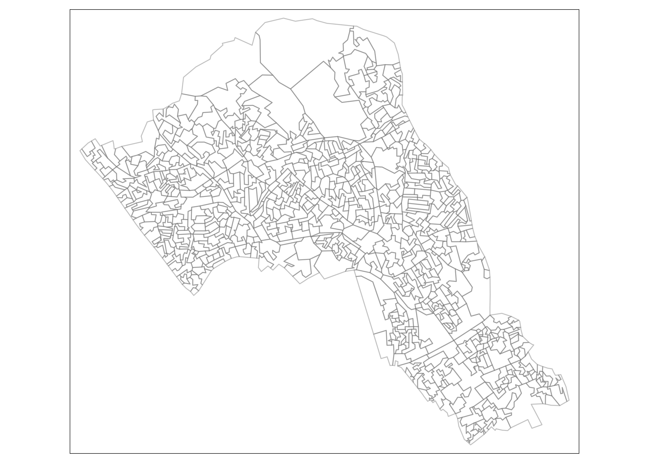
We can now add on the points as an additional tm_shape in our map. So here, we copy in the same code to make the base map, add on a plus symbol, then enter the details for the points data for them to be layered on top. The additional arguments for the points data can be summarised as:
tm_shape(polygon file) + tm_borders(transparency = 40%) + tm_shape(our spatial points data frame) + tm_dots(what variable is coloured, the colour palette and interval style)
Which is entered into R like this:
# creates a coloured dot map
tm_shape(OA.Census) + tm_borders(alpha=.4) +
tm_shape(House.Points) + tm_dots(col = "Price", palette = "Reds", style = "quantile")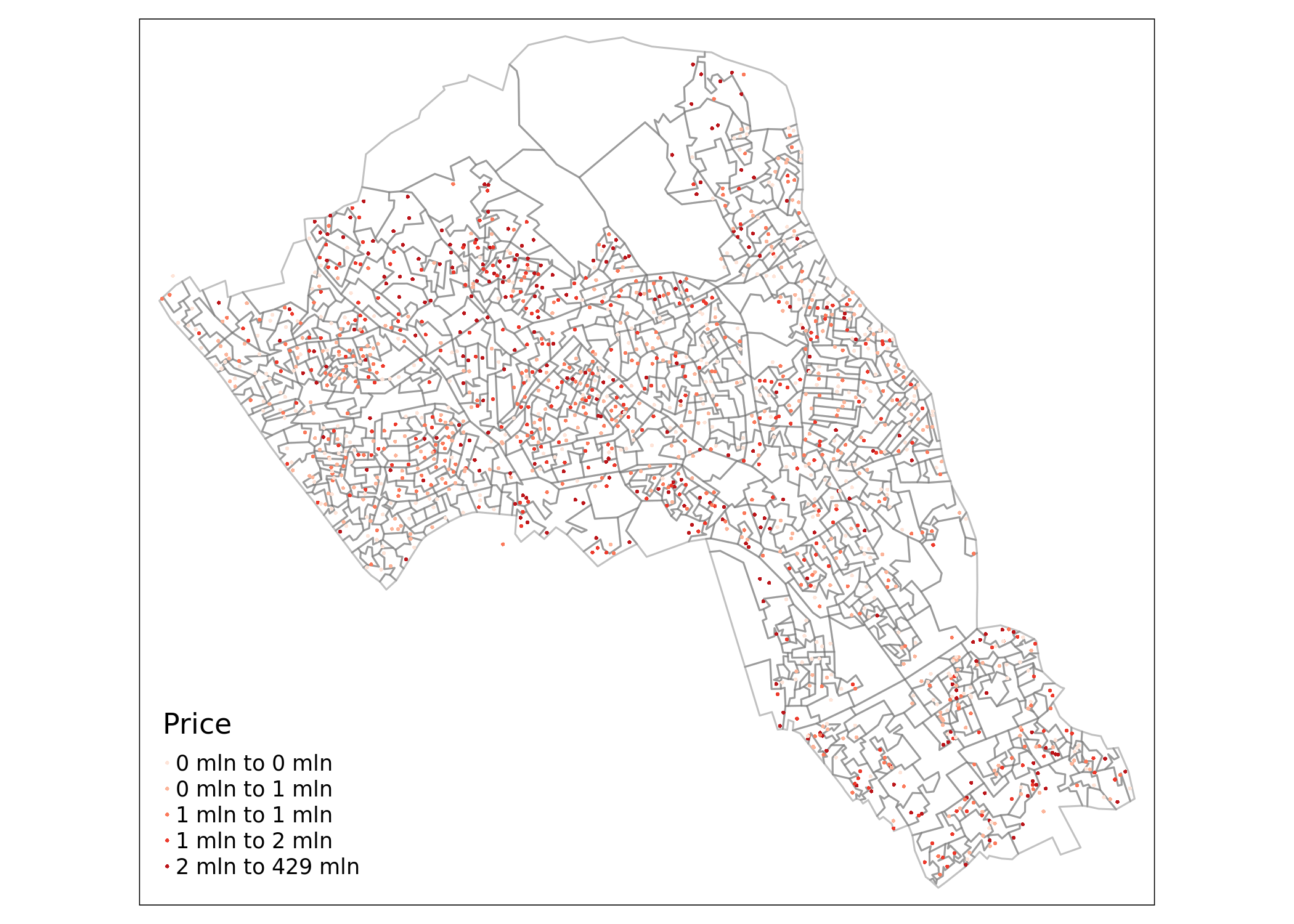
We can also add in more arguments within the tm_dots() function for points like we would with tm_fill() for polygon data. Some arguments are unique to tm_dots(), for example the option to add a title.
You’ll spot that the numbers are quite large (ie millions) and tmap is using the ‘mln’ abbreviation. If you would prefer a numeric legend then you can simply create a new column of the price/1,000,000.
House.Points$Price_Mil<- House.Points$Price/1000000And then use this in the tmap code. We can also add tm_layout() and tm_compass() as we did in the previous practical.
tm_shape(OA.Census) +
 tm_borders(alpha=.4) +
 tm_shape(House.Points) +
 tm_dots(col = "Price_Mil", scale = 1.5, palette = "Purples", style = "quantile", title = "Price Paid (£ Millions)") +
 tm_compass() +
 tm_layout(legend.text.size = 1.1, legend.title.size = 1.4, frame = FALSE)
Proportional Symbols
Finally it is also possible to create proportional symbols in R. To do it in tmap, we replace the tm_dots() function with the tm_bubbles() function which has similar arguments. In the example below, the size and colours are both set as the price column.
tm_shape(OA.Census) +
 tm_borders(alpha=.4) +
 tm_shape(House.Points) + tm_bubbles(size = "Price", col = "Price", palette = "Blues",style = "quantile", legend.size.show = FALSE, title.col = "Price Paid (£)") +
 tm_layout(legend.text.size = 1.1, legend.title.size = 1.4, frame = FALSE)
We can also make the polygon shapefile display one of our census variables as a choropleth map as shown below. In this example we have also added some more parameters within the tm_bubbles() function to create thin borders around the dots.
tm_shape(OA.Census) +
 tm_fill("Qualification", palette = "Reds", style = "quantile", title = "% Qualification") +
 tm_borders(alpha=.4) +
 tm_shape(House.Points) + tm_bubbles(size = "Price", col = "Price", palette = "Blues", style = "quantile", legend.size.show = FALSE, title.col = "Price Paid (£)", border.col = "black", border.lwd = 0.1, border.alpha = 0.1) +
 tm_layout(legend.text.size = 0.8, legend.title.size = 1.1, frame = FALSE)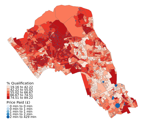
By this point you may be struggling with the legend overlapping the main part of the map. One fix is to increase the plot window size. If this doesn’t work try adding legend.outside=TRUE to the tm_layout() options.
Saving the Spatial file
Finally, we can write the newly formed House.Points object to our working directory, in a geojson format
st_write(House.Points, dsn = "worksheet_data/Camden_House_Sales_2022.geojson", driver="GeoJSON")Final Task
Once you have completed the worksheet go to the data.police.uk website and click on the “Data” button. Download data for the Metropolitan Police for the most recent July.
Select the data for Camden and focus on that borough, then create a dot map showing the spread of crime types across the borough.
Remember you can use the house price data steps above as a template.
Two tips:
First, there are often multiple crimes at the same location so you will need to aggregate the data to get a count of each crime type at each location. Maybe like this:
#By using FUN=length we are asking that the aggregate function counts the number of times a crime.ID appears at a location.
crime_count<- aggregate(police_data$Crime.ID, by=list(police_data$Longitude, police_data$Latitude,police_data$LSOA.code,police_data$Crime.type), FUN=length)

#We need to rename our columns (note these are abbreviated from the originals)
names(crime_count)<- c("Long","Lat","LSOA","Crime","Count")
Second, the columns containing the locations of the crime are ‘longitude’ and ‘latitude’ and these are in the WGS84 projection rather than British National Grid. So here’s a hint at the code you might need to make the spatial object from the csv. It is not the exact code so you will need to tweak to your own object name, column types etc.
crime_count_sf<-st_as_sf(x = crime_count,
           coords = c("Long", "Lat"),
           crs = "+init=epsg:4326")

plot(crime_count_sf)
Reading
Geographical Information Systems: This is a book chapter I co-authored and whilst its title is about “Geographic Information Systems (GIS)” which is the software framework for storing and analysing spatial data it makes the case for why spatial data and their analysis is important.
Uncertainty and context in GIScience and geography: challenges in the era of geospatial big data: A recent editorial for a special edition of the International Journal of Geographical Information Science. It (and the special edition in full) has some nice examples of where uncertainty is still unavoidable in many parts of our analysis.