Week 9: Point Pattern Analysis
Slides for this week can be downloaded here.
First lets load the packages and load the point data.
library(sf)
library(spatstat)
library(tmap)

#load the Camden house sales data and specify the coordinate reference system. Don't worry about the warning in this case.

House.Points <- st_read("worksheet_data/Camden_House_Sales_2022.geojson")

House.Points<- st_set_crs(House.Points, 27700)
The maps below need an outline for Camden. You can download a file of all London Boroughs here for upload to the RStudio server. You then need to extract Camden.
london <- st_read("worksheet_data/london_boroughs.geojson")

camden<- london[grepl('Camden', london$NAME),]
st_crs(camden) <- 27700
We now have all of our data set up so that we can start the analysis using spatstat. The first thing we need to do is create an observation window for spatstat to carry out its analysis within – we’ll set this to the extent of the Output Areas we just loaded
window<- as.owin(camden)spatstat has its own set of spatial objects that it works with (one of the delights of R is that different packages are written by different people and many have developed their own data types) – it does not work directly with the SF objects we are used to, so for point pattern analysis, we need to create a point pattern (ppp) object.
House.ppp <- ppp(x=st_coordinates(House.Points)[,1],y=st_coordinates(House.Points)[,2],window=window)We can now plot this ppp object.
plot(House.ppp,pch=16, main="House Sales in Camden")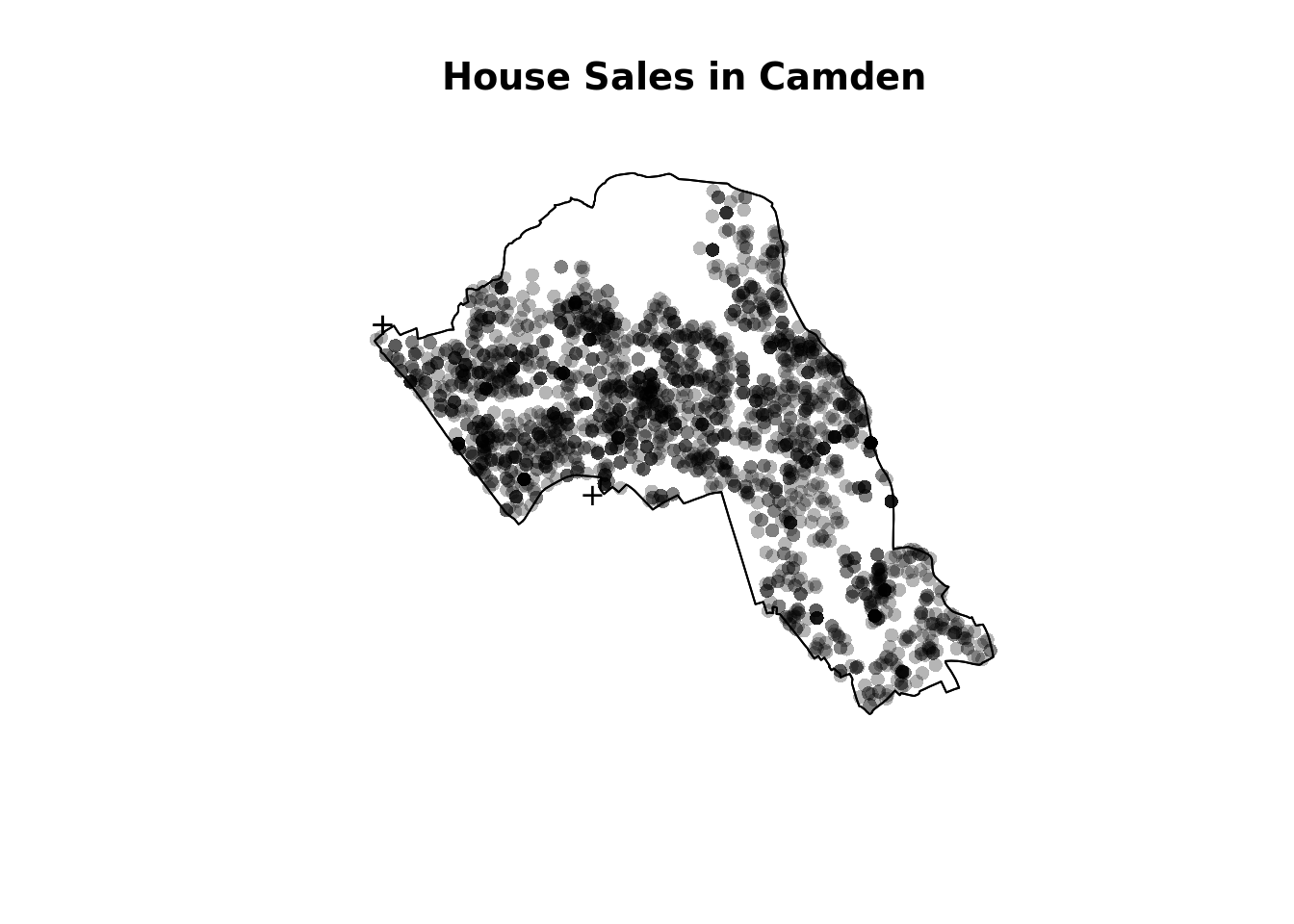
Quadrat Analysis
We are interested in knowing whether the distribution of points in our study area differs from ‘complete spatial randomness’ – CSR. The most basic test of CSR is a quadrat analysis. We can carry out a simple quadrat analysis on our data using the quadrat count function in spatstat.
#count the points in that fall in a 20 x 20 grid overlaid across the window
plot(quadratcount(House.ppp, nx = 20, ny = 20),col="red")
In our case here, want to know whether or not there is any kind of spatial patterning associated with the houses/ flats for sale in Camden. This means comparing our observed points with a statistically likely (Complete Spatial Random) distribution, based on the Poisson distribution.
Using the same quadratcount function again (for the same sized grid) we can save the results into a table:
#run the quadrat count
Qcount<-data.frame(quadratcount(House.ppp, nx = 20, ny = 20))

#put the results into a data frame
QCountTable <- data.frame(table(Qcount$Freq, exclude=NULL))

#view the data frame
QCountTable
#check the data type in the first column - if it is factor, we will need to convert it to numeric
class(QCountTable[,1])## [1] "factor"#You can see the class is indeed a factor so we need to change it to a numeric class
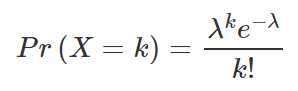
QCountTable[,1]<- as.numeric(levels(QCountTable[,1]))OK, so we now have a frequency table – next we need to calculate our expected values. These give us a sense of what a distribution might look like without any spatial clustering. We can use the Poisson distribution for this. The formula for which is below, where lambda is the mean house sales across the area and k the number of house sales in each grid cell.
The steps for this calculation are set out below.
#calculate the total house sales (Var * Freq) - this just multiplies the count of each house sale by the frequency that those counts occur across the map.
QCountTable$total <- QCountTable[,1]*QCountTable[,2]
#calculate mean
sums <- colSums(QCountTable[,-1])
sums
## Freq total
## 215 2300#and now calculate our mean Poisson parameter (lambda)
lambda <- sums[2]/sums
lambda<- lambda[1] #we just need the first value
#calculate expected using the Poisson formula from above - k is the number of house sales counted in a square and is found in the first column of our table...
QCountTable$Pr <- ((lambda^QCountTable[,1])*exp(-lambda))/factorial(QCountTable[,1])
#now calculate the expected counts and save them to the table
QCountTable$Expected <- round(QCountTable$Pr * sums[1],0)
QCountTable#Compare the frequency distributions of the observed and expected point patterns
plot(QCountTable$Freq, col="Red", type="o", lwd=3,xlab="Number of House Sales (Red=Observed, Blue=Expected)", ylab="Frequency of Occurrences")
points(QCountTable$Expected, col="Blue", type="o", lwd=3)
Comparing the observed and expected frequencies for our quadrat counts, we can observe that there is a very high frequency count around zero not seen in the Poisson, and some peaks in value counts. Does this indicate that our pattern is close to Complete Spatial Randomness (i.e. no clustering or dispersal of points)?
To check we can use the quadrat.test function, built into spatstat. This uses a Chi Squared test to compare the observed and expected frequencies for each quadrat (rather than for quadrat bins, as we have just computed above). If the p-value of our Chi-Squared test is < 0.05, then we can reject a null hyphothesis that says “there is complete spatial randomness in our data”. What we need to look for is a value for p > 0.05. If our p-value is > 0.05 then this indicates that we have CSR and there is no pattern in our points. If it is < 0.05, this indicates that we do have clustering in our points. What does our value suggest?
teststats <- quadrat.test(House.ppp, nx = 20, ny = 20)
teststats
plot(House.ppp,pch=16,cex=0.5, main="House Sales in Camden")
plot(teststats, add=T, col = "red")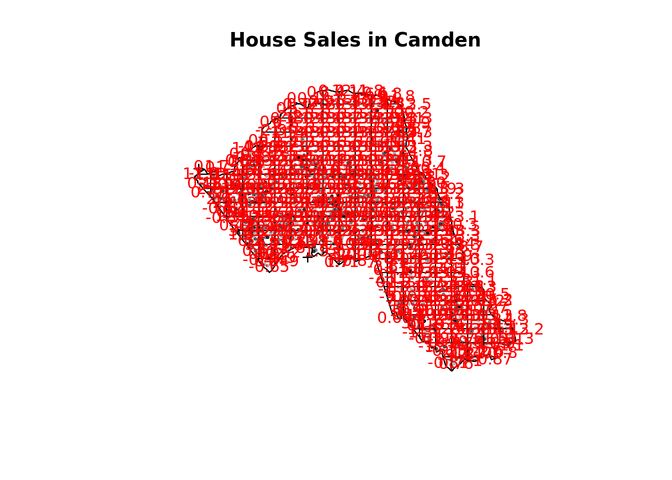
You should enlarge this map as much as possible – within it you will see 3 values for each grid square. Top left of each grid cell is observed value, top right is expected and the bottom is the Pearson residual.
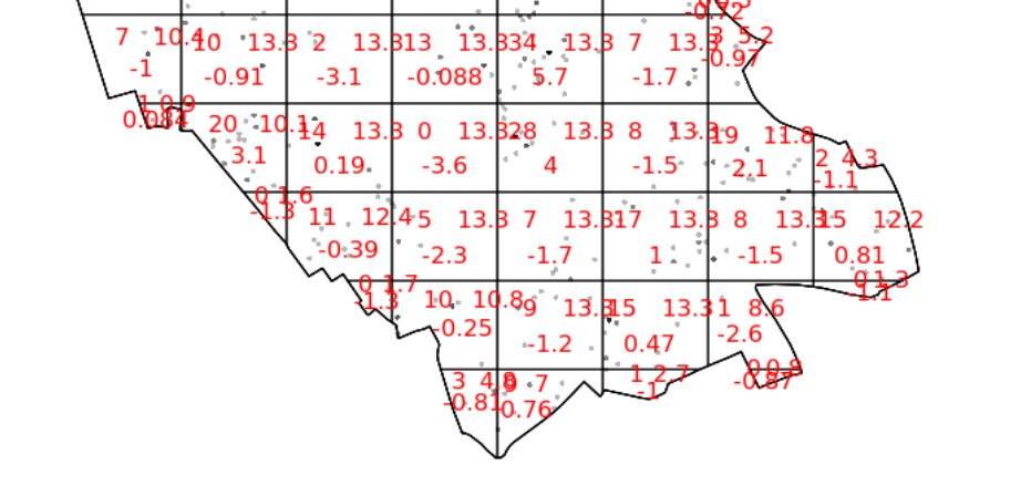
So we can see that the indications are there is spatial patterning for house sales in Camden – at least for this particular grid. Note the warning message – some of the observed counts are very small (0) and this may affect the accuracy of the quadrat test. Recall that the Poisson distribution only describes observed occurrences that are counted in integers – where our occurrences = 0 (i.e. not observed), this can be an issue. We also know that there are various other issues that might affect our quadrat analysis, such as the modifiable areal unit problem.
In the new plot, we can see three figures for each quadrat. The top-left figure is the observed count of points; the top-right is the Poisson expected number of points; the bottom value is the Pearson residual value, or (Observed – Expected) / Sqrt(Expected).
Try experimenting…
Try running a quadrat analysis for different grid arrangements (2 x 2, 3 x 3, 10 x 10 etc.) – how does this affect your results?
Ripley’s K
One way of getting around the limitations of quadrat analysis is to compare the observed distribution of points with the Poisson random model for a whole range of different distance radii. This is what Ripley’s K function computes.
We can conduct a Ripley’s K test on our data very simply with the spatstat package using the kest function.
K <- Kest(House.ppp, correction="border")
plot(K)
The plot for K has a number of elements that are worth explaining. First, the Kpois(r) line in Red is the theoretical value of K for each distance window (r) under a Poisson assumption of Complete Spatial Randomness. The Black line is the estimated values of K accounting for the effects of the edge of the study area.
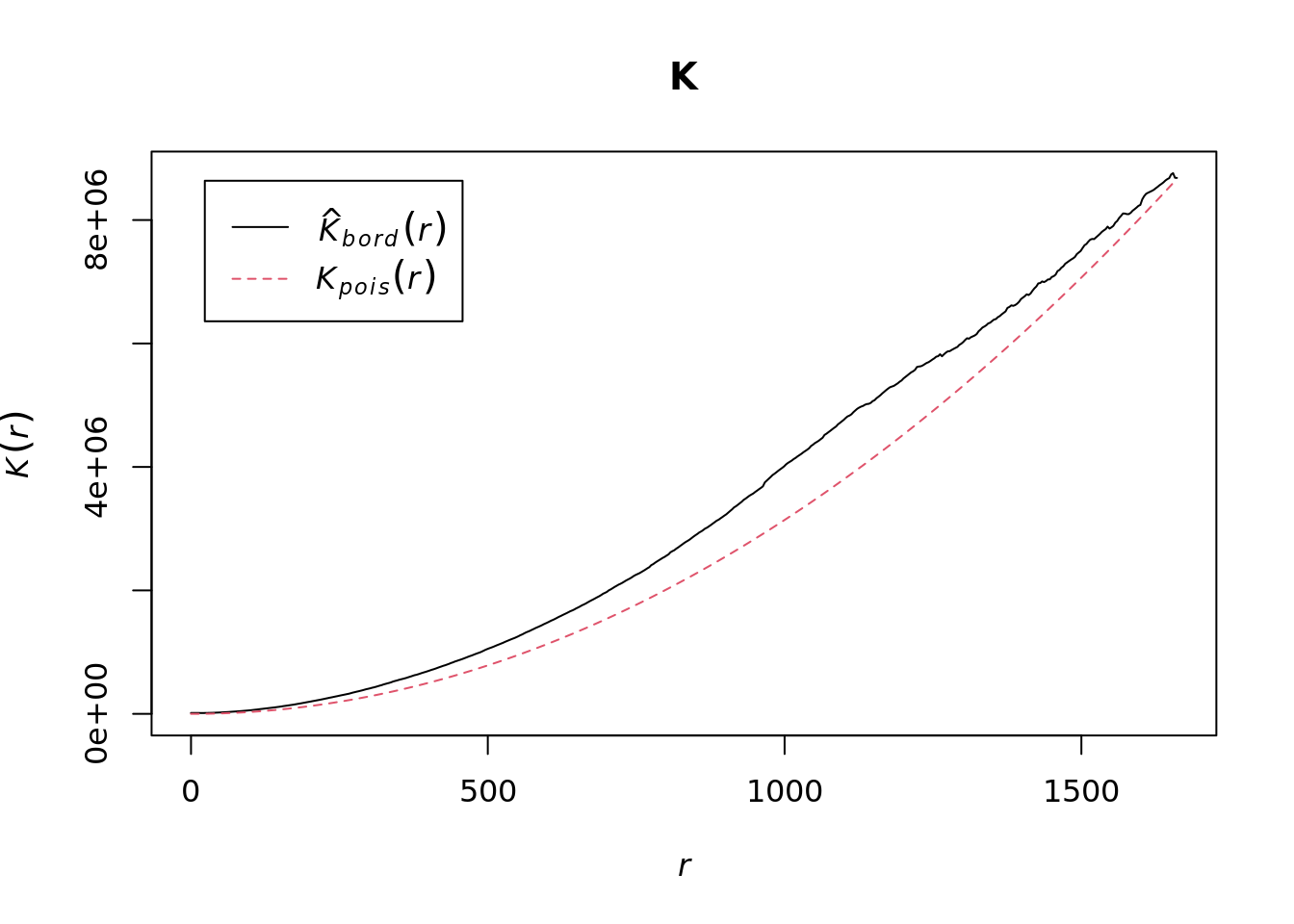
Where the value of K falls above the red line, the data appear to be clustered at that distance. Where the value of K is below the line, the data are dispersed. From the graph, we can see that house sales appear to be clustered in Camden.
Density-based spatial clustering of applications with noise: DBSCAN
Quadrat and Ripley’s K analysis are useful exploratory techniques for telling us if we have spatial clusters present in our point data, but they are not able to tell us WHERE in our area of interest the clusters are occurring. To discover this we need to use alternative techniques. One popular technique for discovering clusters in space (be this physical space or variable space) is DBSCAN. For the complete overview of the DBSCAN algorithm, read the original paper by Ester et al. (1996) or consult the Wikipedia page.
The power of DBSCAN comes from its ability to group points together that may not form compact clusters but that are clearly related. Here is a toy example of what this means in practice. You will need to install/ activate the factoextra package so we can do a couple of the plots. You should also load the toy dataset named ‘multishapes’.
library(factoextra)
data("multishapes")

#subset the two columns we need
df <- multishapes[, 1:2]

#plot the data to see how it looks

plot(df)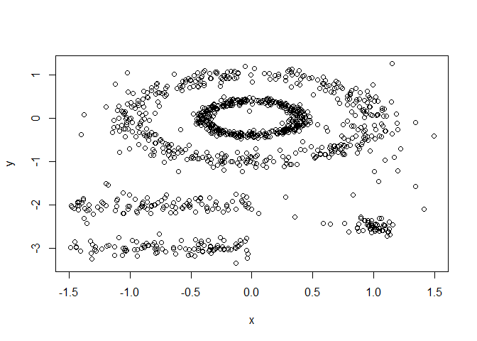
You can see how some point are clearly related to one another but they don’t form a tight group, which is what most non-spatial clustering algorithms look for. We can test this using the code below
set.seed(123) #we need this to ensure a consistent clustering result with the K-Means algorithm
km.res <- kmeans(df, 5, nstart = 25) #Kmeans is a common type of clustering algorithm.
fviz_cluster(km.res, df,  geom = "point",
             ellipse= FALSE, show.clust.cent = FALSE,
             palette = "jco", ggtheme = theme_classic())
As you can see the elipse shapes formed by the ponts have been broken up, this doesn’t make much sense in many spatial contexts. For example we might be clustering road traffic accidents that follow the length of road. DBSCAN therefore does a much better job of handling this.
set.seed(123)

library(dbscan)

#Run DBSCAN

db <- dbscan(df, eps = 0.15, MinPts = 5)

# Plot DBSCAN results
fviz_cluster(db, data = df, stand = FALSE,
             ellipse = FALSE, show.clust.cent = FALSE,
             geom = "point",palette = "jco", ggtheme = theme_classic())
As you can see – this is much better. Each shape has been captured by the algorithm.
DBSCAN requires you to input two parameters: 1. Epsilon – this is the radius within which the algorithm with search for clusters 2. MinPts – this is the minimum number of points that should be considered a cluster. 100 metres is probably a good place to start for epsilon and we will begin by searching for clusters of at least 4 points…
#first extract the coordinates from the spatial points data frame
House.Points.coords <- as.data.frame(st_coordinates(House.Points))
#now run the dbscan analysis
db <- dbscan(House.Points.coords, eps = 100, MinPts = 4)
#now plot the results
plot(House.Points.coords, col=factor(db$cluster), main = "DBSCAN Output", frame = F, asp=T)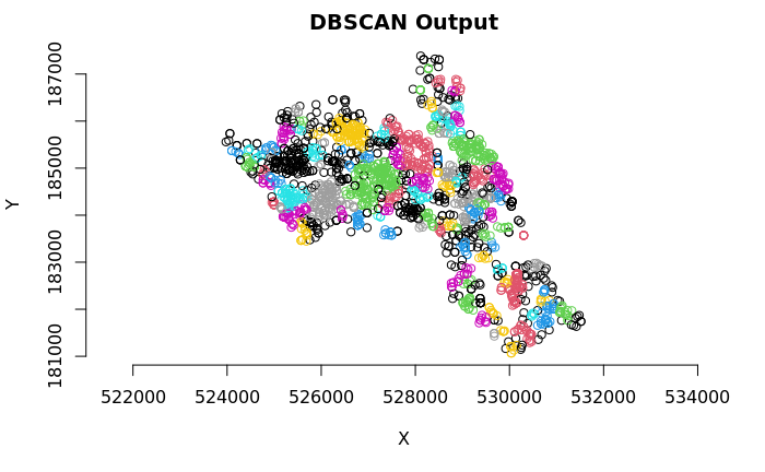
As you can see many different clusters have emerged – adjust the epsilon value to see how the results may change. Why is this the case?
The challenge, therefore, is that epsilon has a big impact on the output but it canbe entirely subjective. One researcher could opt for one value whilst another would go for a higher one. To help mitigate this we can look for an elbow in our dataset.
The idea is to calculate, the average of the distances of every point to its k nearest neighbors. The value of k will be specified by the user and corresponds to MinPts, so there is still some subjectivity. Next, these k-distances are plotted in an ascending order. The aim is to determine the “knee”, which corresponds to the optimal eps parameter where a sharp change occurs along the k-distance curve. Conceptually it’s similar to what we are looking for with Ripley’s K in the sense that we want to know if there is a distance threshold above which it is unlikely that points are related. The function kNNdistplot() creates the k-distance plot we need to evaluate this.
kNNdistplot(House.Points.coords, k =  5)

#You can use the code below to draw a line where the elbow appears to be
abline(h = 215, lty = 2)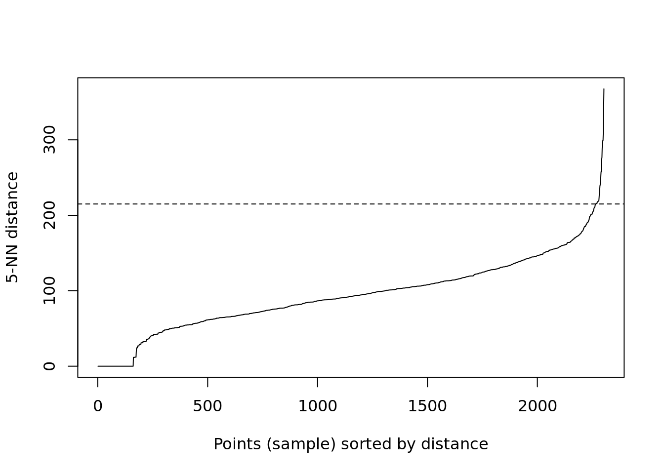
Based on the above plot it looks like the elbow really takes off at 215, but you can see its still a bit vague since the steeper rise starts around 150. This is the kind of plot you can include to show the assumptions you are making in your analysis so readers understand your process. What’s clear though is that 100 metres is too low for the eps value, so we can respecify to 215 metres.
#now run the dbscan analysis
db <- dbscan(House.Points.coords, eps = 215, MinPts = 4)
#now plot the results
plot(House.Points.coords, col=factor(db$cluster), main = "DBSCAN Output", frame = F, asp=T)
The result here is very different and suggests almost no clustering at all – this would make sense really as we don’t expect house sales to cluster.
Task 1
Create a DBSCAN crime map of anti-social behaviour for the London Borough of Kensington and Chelsea in December 2022. Data can be downloaded from the data.police.uk website.
You should also take a moment to read this. It gives a good overview of point pattern analysis.
Kernel Density Estimation
Here is an excellent summary of some of the background and theory behind KDE. A MUST READ.
The following code will let us run a kernel density estimation, we will use the functions available from the SpatialKDE package so this will need to be installed the first time you use it.
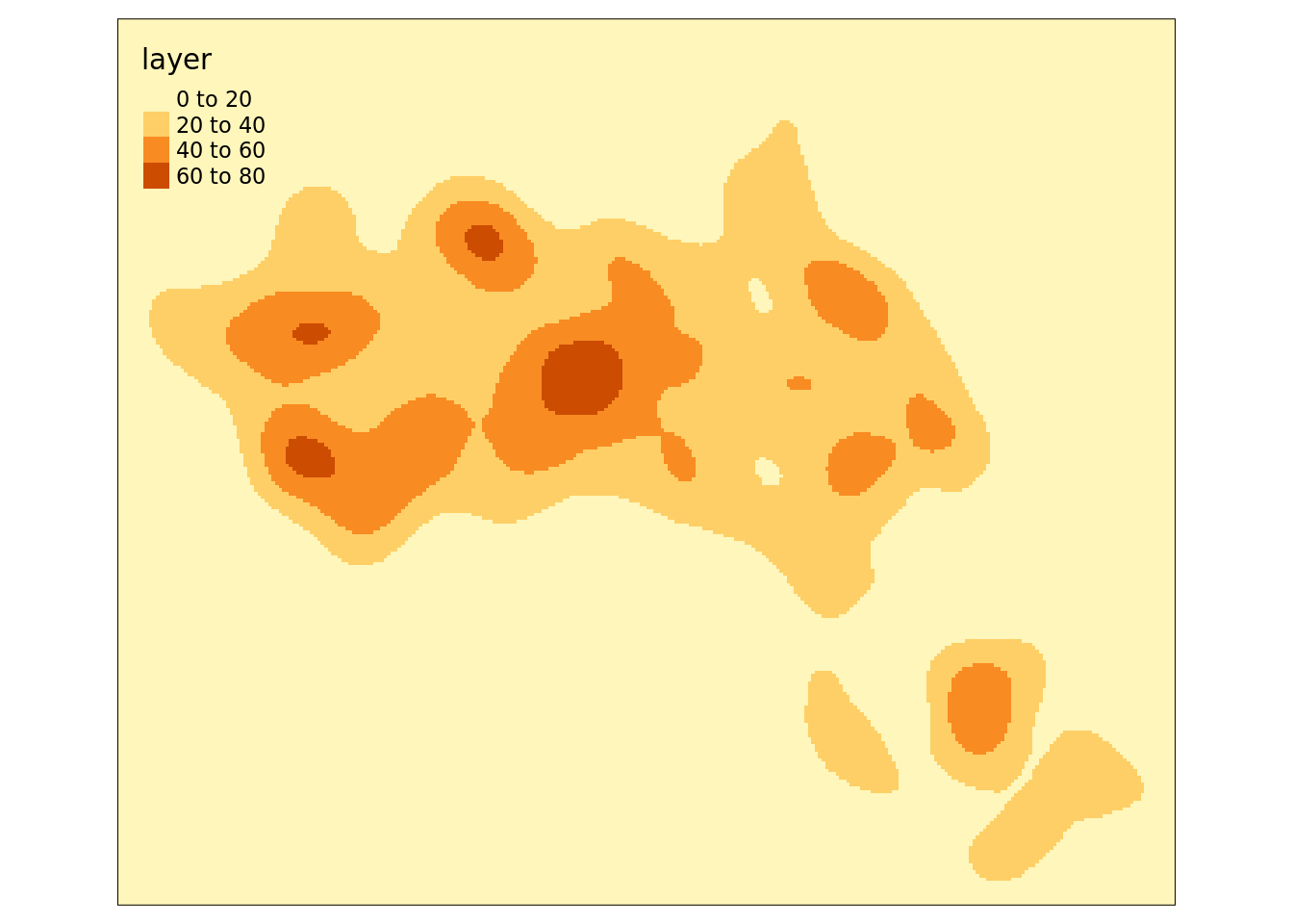
In order to calculate the density we first create a grid – or raster – from the extent of the House.Points object and will grid cells the size we specify. In this case we specify a cell_size of 25, which means each cell is 25 metres by 25 metres. This is quite small but creates a nice smooth density surface.
library(SpatialKDE)

raster <- create_raster(House.Points, cell_size = 25)

kde_estimate_raster <- kde(House.Points, band_width = 500, grid = raster)

tm_shape(kde_estimate_raster)+tm_raster()
Next we then do the kernel density estimate, incorporating the House.Points, the raster grid and a bandwidth parameter. We set a bandwidth of 500 metres.
We can also create contour plots in R. Simply enter contour(kde) into R. To map the raster in tmap, we first need to ensure it has been projected correctly.
We can just about make out the shape of Camden. However, in this case the raster includes a lot of empty space, so we can mask (or clip) the raster by the output areas polygon and tidy up the graphic.
# mask the raster by the Camden Boundary polygon
masked_kde <- raster::mask(kde_estimate_raster, camden)

tm_shape(masked_kde) + tm_raster() 
Task 2:
Create a crime hotspot map (using KDE) of anti-social behaviour for the London Borough of Kensington and Chelsea in December 2022.
Is this a more effective way of mapping crime compared to DBSCAN?
Reading
Identifying spatial concentrations of surnames: A paper I wrote during my PhD that utilises KDE with in the context of surname analysis.